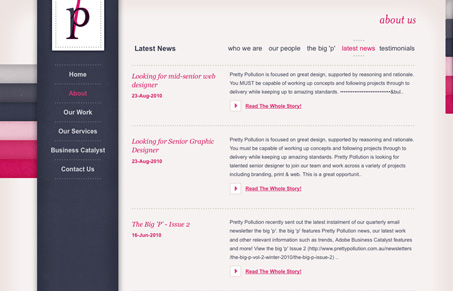
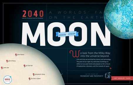
Really beautiful colors on this design, I also love the dark blue with that slight texture. It almost feels like cloth. I like the blocky nature of the elements in contrast to those colors and slight texture. I like that slide out box in the top right, I like the idea of it, but not the final execution of the elements within that box. Really nice looking website!
Posts Tagged ‘webkit’
icelab.com.au
04
Nov
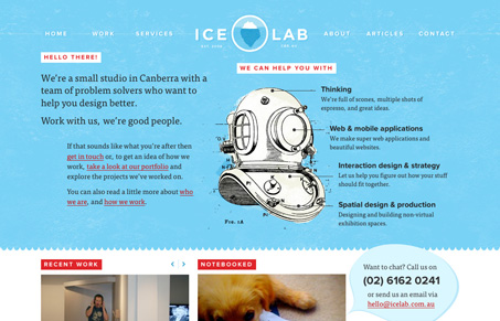
This is a really beautiful website, the colors and light textures mixed in with some great illustration work make for a super great experience. Looking at the experience of the site there are lots of great little spots that just shine, like the mouse over on the logo and the “back to top†link in the footer area. The sub pages have enough variance to keep it interesting too. Really great site.


