RSS
 

Posts Tagged ‘infographic’

Vizualize.me Beta: Turning Your LinkedIn Resume in Infographics

30 Aug

vizualize_me.jpg
There seems to be a commercial market emerging around the idea of automizing the creation of infographics. Toronto based start-up vizualize.me [vizualize.me] is currently developing an online application that can automatically translate any online LinkedIn profile into an online infographic. In particular, the new service aims to overcome the issue of reading overly long or highly complex resumes by showing the same information in a more readable and attractive way. The start-up has been coding the online application only since the last 2 months, and is currently still in private beta.

First peeks behind the beta service show how this can become particularly useful for those that like to change jobs often, have a high amount of skills or know quite a lot of languages (unfortunately, my current own resume is not that compelling). The infographics are automatically generated through logging in with LinkedIn credentials. One can still edit each individual item, change the 'theme', 'colors', 'fonts' or the 'background' image. 'Themes' actually include different visualization techniques, which currently include a horizontal or vertical bar graph slash timeline and a more risky arc diagram-style approach.

While the idea seems certainly useful, one would certainly wish for the availability of more subdued visual styles, in particular for those people who appreciate more classical visual styles when applying for high-end, important jobs. I also foresee some critical comments on the color palette for the 'language' world map.

Notably, Visual.ly is also betting on the future of semi-automized online infographics, as it is currently in the process of launching an online infographics authoring tool.
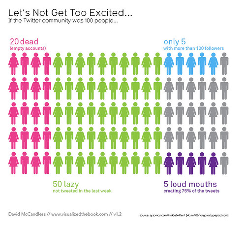


Of Twitter and infographics

09 Jul
If the Twitter community was 100 people. by mkandlez, on Flickr
Creative Commons Attribution-Noncommercial 2.0 Generic License  by  mkandlez 

I love this infographic because it condenses the original report into a bite-sized nugget that is easy to understand. Its creator probably had to take some creative and interpretive liberties, but he was entitled to.

And it looks like I fall in the blue 5%. I don’t tweet enough to be in that purple group!


Tagged: infographic, twitter


Foursquare Surpasses 10 Million Users [INFOGRAPHIC]

20 Jun

Foursquare hit a big milestone over the weekend: It surpassed the 10 million user mark, becoming the first location-based social network to do so.

The startup, which launched in March 2009, posted the following infographic on its blog to celebrate the announcement Monday:


The infographic highlights, among other things:

  • Accelerated growth over time: It took the startup five months to get its first 100,000 users and roughly seven weeks to get its last million.
  • Its growing global reach: 358 million checkins have been made outside of the U.S.
  • The most popular checkin locations in the U.S.: Old Navy, Bank of America, 7-Eleven, Home Depot and Target all top the list.
  • A few fun facts: New York City Mayor Mike Bloomberg is also the Foursquare mayor of City Hall in NYC, and nearly 80,000 Foursquare mayors are ousted each day.

More About: foursquare, infographic

For more Startups coverage:


Infographically Illustrating the Scarcity of Natural Gas Reserves in the World

17 Jun

natural_gas_reserves.jpg
Natural Gas [geblogs.com] designed by Information is Beautiful (slash David McCandless) is the latest addition to G.E.'s already impressive collection of interactive infographics, which already includes works like Pentagram's CFO Outlook and Contrasting the Drivers of Innovation.

The Natural Gas infographic illustrates various factual statistics about the scarcity of this natural resource, and includes a view on how many cubic meters or years that are left before the availability of gas will run out, an overview of the top 7 countries with reserves, yearly producers and biggest consumers, and contrasts the availability of natural gas against that of oil and coal.


Just How Dangerous Is Sitting All Day? [INFOGRAPHIC]

09 May


Sitting down, which most of us do for at least eight hours each day, might be the worst thing we do for our health all day.

We’ve been preaching the benefits of stand-up desks for a while around here — and no one needs this good news more than social media-obsessed web geeks. A recent medical journal study showed that people who sit for most of their day are 54% more likely to die of a heart attack.

And our readers are receptive to the idea, too. In fact, in a recent poll, three-fourths of you said you already used a stand-up desk or you’d like to try one.

So if you need more convincing, check out these graphically organized stats from Medical Billing and Coding. We like it for the information it contains, but we love it for the Saul Bass, Vertigo-esque graphics.

Click to see full-size image.

Source: medicalbillingandcoding.org

More About: health, infographic, sitting down, stand-up desks

For more Tech & Gadgets coverage:


Web Design Evolution: Two Decades of Innovation [INFOGRAPHIC]

17 Apr


The web has come a long way since Tim Berners-Lee created the first website way back in 1991. Here’s an infographic that takes you on a tour of web design, starting with those humble beginnings, and bringing you all the way up to the present day.

It’s like getting into a time machine, where the tremendous progress design has made on the World Wide Web over the past two decades is all laid out in front of you.

Follow along this extensively researched infographic from KISSmetrics, showing us exactly how far we’ve come from those early days where wide pages of text with hyperlinks in between ruled the roost. Do you remember when an animated .gif graphic of a letter folding up and flying into an envelope was seen as the highest of technology? We’re starting to feel nostalgic.

Please note: This graphic is so huge, we had to shrink it to fit our format, but if you’re having a hard time reading it, click the graphic for an enlargement.

Graphic courtesy KISSmetrics

More About: infographic, kissmetrics, Tim Berners-Lee, trending, web design, Web Design evolution

For more Dev & Design coverage:


Are You Sure It’s Not a Banana?

30 Mar

funny graphs - Are You Sure It's Not a Banana?

‘Cept Banana Is Weird in English Too


Graph by:

nelde

Submitting 1 LOLVoting 100 TimesVoting 10 Times

Via: made it myself


Crazy infographic explains the timelines in Source Code [Chart Porn]

17 Mar
What is Duncan Jones' Source Code? This gorgeous infographic breaks down each source code cycle, in an attempt to explain just how the time-bending science in this film works. More »
 

Teaching the Mechanical Principles of a 1950s Navy Computer

15 Mar

analog_computer.jpg
How do you shoot a remote and fast moving ship back in the time 'computers' existed out of gear assemblies, rotary disks, sprockets, chains, cams, differentials, and a very good knowledge of algebra and trigonometry?

If a how-to explanation of the analog computer does not interest your geeky mind, then consider: how do you explain complex mathematically-driven machinery using simple infographic animation and narration, back in 1953 (and so, no After Effects, you know...)?

In short, the 50's era training film series explains how a mechanical computer was used to aim guns on a ship. Compared to today's digital computers, it almost looks like Rube Goldberg's abacus, but in it's day it was a game changer that proved devestating. Watch the series of (school television like) videos below.

Via boing boing and Engadget.

See also Walt Disney Mars and Beyond movie and Powers of 10 movie.


Social Compare: Visually Compare the Size of Objects and Concepts

03 Mar

social_size.jpg
Social Compare [socialcompare.com] sees a conceptual gap between social networking and visual size comparison. The online tool enables everyone to easily compare the size of all sorts of artefacts, like objects (e.g. iPad vs. iPad 2), persons (e.g. Obama vs. Sarkozy), countries (e.g. USA vs. France) and the like. All visual comparisons can be saved to be shared on social networks or be embedded directly on blog post or website. In addition, size "tables" allow comparison of things that have no visual counterpart, such as Internet browsers, car performance statistics or sports and activities.

Ultimately, Social Compare believes it can become an new social community to create and share easily interactive and collaborative comparison tables. More information also watchable in a short introduction movie below.

See also Sizeasy - Visual Size Comparison