The clearest picture I have of what PricewaterhouseCoopers does is of two dudes in tuxedos holding a briefcase with the envelopes that announce the winners at the Oscars. But, clearly, with 163,000 employees in 151 countries they do more than that. They are one of the "Big Four" professional services firms — the three others are Deloitte Touche Tohmatsu, Ernst & Young, and KPMG — and boast gross revenues of 26.2 billion USD (fiscal year 2009). Officially, they "provide industry-focused assurance, tax and advisory services to enhance value for their clients." Yesterday was the official announcement that PricewaterhouseCoopers would be changing its name to PwC, keeping the mouthful of a name as the full name of the global organization for legal purposes. PwC also introduced a new identity created by the London office of Wolff Olins.
"We think our new brand expression visually distinguishes PwC in the same way that the quality and expertise of our people differentiates the experience of working with PwC," said Dennis Nally, chairman, PwC International. "Underlying the visual elements is what the PwC brand really stands for -- how we are viewed by our clients, our people and our stakeholders. Beyond our capabilities and experience, we want PwC to be known for building great relationships with clients that help them create the value they're looking for."
– Press Release
Brand identity film introducing all the elements. (Roll over to see controller).
I have always found the old logo hard to believe; that a multibillion-dollar firm would use such a quirky, unfocused wordmark as its logo. It was endearing in the way that you look at a possum and think "Aw, what an ugly poor little booger you are. Now scram!" The new icon is hard to digest at first, as it's not exactly clear what it is. At first I thought it was a digitized flower that a C-level executive would wear on his suit pocket to soften his look or appear as he cares about some cause. It's not a flower. But then there is the underscore, a cue that something came before it or that something else is about to happen. The reality is that the icon is just a series of boxes that stretch and genuflect to, I think, represent the various facets of what PwC has to offer. Still, I'm unclear what it is, but if this were 1971 I would also be unclear what the Nike swoosh was. For a firm of this size, of this influence, and the kind of clients and work it does for them, anything that's beyond the scope of a wordmark is an extremely bold move. This icon is as bold and innovative as it gets in this very exclusive category.
Logo animation.
Logo animation.
The typography is not a sans serif. Imagine that. It's possible to design a contemporary-looking logo without resorting to rounded sans. I have always been a fan of hard-angled serifs and this one really struts those chiseled looks. The only thing that originally jumped out at me is that the "w" is italic, giving it a slightly jarring contrast against the two roman letters, but I'm willing to accept that it made more visual sense to do it this way than all of them straight, as the roman "w" might have been too monotonous.


Brochures and other collateral.
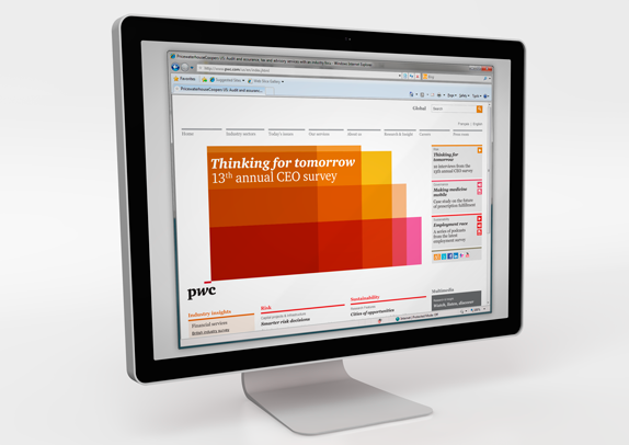
The great thing about this work is that the logo is merely the beginning. It provides the framework for the rest of the identity, which is absolutely stunning. It has amazing flexibility while establishing resolute consistency. Again, you have to remember what kind of firm this is for, it's not some small start-up that can run with something like this. This is fresh and agile. This is the most encouraging sign in all of 2010 that interesting, daring work can be done along with corporate clients.


Details of the sign.

Thanks to Renee Bortoli for first tip.

Don't forget to cast your vote about this post online
