This guide examines the infinite-like variety of CSS resets created by web developers and designers across the world.
While almost all of these CSS resets are generally provided free for public use (many through Creative Commons licensing), it is incumbent upon you to check the terms of use before putting them to use in your projects.
This guide follows Part 1, where the history of CSS resets was discussed; you’re advised to read that before this one to get the most out of this guide.
This is a three-part series of articles on the topic of CSS resets.
In putting together this guide, the 2007 collection of resets by Jeff Starr — who, as an aside, has contributed articles on Six Revisions — was used as a jumping-off point.
"Hard" Reset
As discussed in Part 1 of this series, the original version of the "hard" reset was by web designer Andrew Krespanis:
* {padding:0; margin:0;}
It wasn’t long before folks added border: 0; and outline: 0; to the list of properties, giving us:
* {padding:0; margin:0; border: 0; outline: 0;}
Because of the universal selector (*), this succinct style rule has a powerful transformative effect on any web page in which it is used.
Unfortunately, because of the well-documented ill effects of such an all-encompassing selector, many designers have moved away from this method towards something more controlled.
Tantek Çelik’s undohtml.css (2010 Version)
Tantek Çelik, who is thought to have kick-started the use of CSS resets back in 2004, updated his reset this year. What follows is the updated version of undohtml.css:
/* undohtml.css */
/* (c) 2004-2010 Tantek Çelik. Some Rights Reserved. http://tantek.com */
/* This style sheet is licensed under a Creative Commons License.      */
/*             http://creativecommons.org/licenses/by/2.0              */

/* Purpose: undo some of the default styling of common browsers        */

/* link underlines tend to make hypertext less readable,
   because underlines obscure the shapes of the lower halves of words */
:link,:visited,ins { text-decoration:none }

/* no list-markers for nav lists, default markers work well for item lists */
nav ul,nav ol { list-style:none }

/* avoid browser default inconsistent heading font-sizes */
/* and pre/code/kbd too */
h1,h2,h3,h4,h5,h6,pre,code,kbd { font-size:1em; }

/* remove the inconsistent (among browsers) default ul,ol padding or margin  */
/* the default spacing on headings does not match nor align with
   normal interline spacing at all, so let's get rid of it. */
/* zero out the spacing around pre, form, body, html, p, blockquote as well */
/* form elements are oddly inconsistent, and not quite CSS emulatable. */
/*  nonetheless strip their margin and padding as well */
dl,ul,ol,li,
h1,h2,h3,h4,h5,h6,
html,body,pre,p,blockquote,
form,fieldset,input,label
{ margin:0; padding:0 }

/* who thought blue linked image borders were a good idea? no abbr borders */
abbr, img, object,
a img,:link img,:visited img,
a object,:link object,:visited object
{ border:0 }

/* de-italicize address,abbr */
address,abbr { font-style:normal }

/* get rid of ad frames inserted by local wifi connections e.g. AnchorFree */
iframe:not(.auto-link) { display:none ! important; visibility:hidden ! important; margin-left: -10000px ! important  }

/* more varnish stripping as necessary... */
The comments in the stylesheet explain the idea behind the update, but to reiterate, here is a breakdown of what the updated file does:
- Removes underlines (
text-decoration: none) from links
- Removes style properties from ordered/unordered lists
- Resizes heading elements (
<h1> through <h6>) as well as the pre, code, and kbd elements
- Removes the margins and paddings from most HTML elements
- Removes the border around linked images (i.e.
<a><img /></a>)
- Removes italicization of
address and abbr elements
- Renders
iframes invisible, mostly to stop "ad frames inserted by local wifi connections" from appearing
Poor Man’s Reset
The "poor man’s reset" sets the margin, padding, font-size, and borders of the html and body elements instead of all elements. This not only removes the reliance on the universal selector, but is also more conservative with what elements and CSS properties are reset.
html, body {padding: 0; margin: 0;}
html {font-size: 1em;}
body {font-size: 100%;}
a img, :link img, :visited img {border: 0;}
Siolon Reset
In 2008, Chris Poteet developed a hybrid reset, incorporating the universal selector reset for a number of CSS properties, along with some selected (and idiosyncratic) reset values for individual elements such as table and li:
* {vertical-align: baseline; font-family: inherit; font-style: inherit; font-size: 100%; border: none; padding: 0; margin: 0;}
body {padding: 5px;}
h1, h2, h3, h4, h5, h6, p, pre, blockquote, form, ul, ol, dl {margin: 20px 0;}
li, dd, blockquote {margin-left: 40px;}
table {border-collapse: collapse; border-spacing: 0;}
Poteet says the "idea is that you intercept the default browser stylesheet (that is used first in the cascade), reset, and then apply generic styles including margin/padding."
Inman Reset
Designer/developer Shaun Inman used the following targeted global reset on his personal site:
body, div, dl, dt, dd, ul, ol, li, h1, h2, h3, h4, h5, h6, pre, form, fieldset, input, p, blockquote, table, th, td, embed, object {padding: 0; margin: 0;}
table {border-collapse: collapse; border-spacing: 0;}
fieldset, img, abbr {border: 0;}
address, caption, cite, code, dfn, em, h1, h2, h3, h4, h5, h6, strong, th, var {font-weight: normal; font-style: normal;}
ul {list-style: none;}
caption, th {text-align: left;}
h1, h2, h3, h4, h5, h6 {font-size: 1.0em;}
q:before, q:after {content: '';}
a, ins {text-decoration: none;}
The Inman Reset is reminiscent of a terser version of Eric Meyer’s Reset CSS.
Tripoli Reset
One of the most far-reaching resets outside of Eric Meyer’s Reset CSS is the Tripoli Reset by David Hellsing. It is intended to work along with a foundational stylesheet to rebuild the CSS after the reset tears it down.
* {margin: 0; padding: 0; text-decoration: none; font-size: 1em; outline: none;}
code, kbd, samp, pre, tt, var, textarea, input, select, isindex, listing, xmp, plaintext {font: inherit; font-size: 1em; white-space: normal;}
dfn, i, cite, var, address, em {font-style: normal;}
th, b, strong, h1, h2, h3, h4, h5, h6 {font-weight: normal;}
a, img, a img, iframe, form, fieldset, abbr, acronym, object, applet, table {border: none;}
table {border-collapse: collapse; border-spacing: 0;}
caption, th, td, center {text-align: left; vertical-align: top;}
body {line-height: 1; background: white; color: black;}
q {quotes: "" "";}
ul, ol, dir, menu {list-style: none;}
sub, sup {vertical-align: baseline;}
a {color: inherit;}
hr {display: none;} /* we don't need a visual hr in layout */
font {color: inherit !important; font: inherit !important; color: inherit !important;} /* disables some nasty font attributes in standard browsers */
marquee {overflow: inherit !important; -moz-binding: none;}
blink {text-decoration: none;}
nobr {white-space: normal;}
Hellsing’s reset addresses many deprecated HTML elements — often by disabling them — such as the <blink> and <marquee> elements, which could be handy for projects that are used by several people with varying levels of HTML knowledge. Some developers love the Tripoli Reset, others consider it major overkill.
Dan Schulz’s Reset
In August 2008, Dan Schulz, a vastly talented web designer who has since passed away, posted his idiosyncratic version of a "global" reset (which he extensively documented in the SitePoint thread he posted it in):
/* CSS RESET RULES */
html, body, a, abbr, acronym, address, area, b, bdo, big, blockquote, button, caption, cite, code,
col, colgroup, dd, del, dfn, div, dl, dt, em, fieldset, form, h1, h2, h3, h4, h5, h6, hr, i, img,
ins, kbd, label, legend, li, map, object, ol, p, param, pre, q, samp, small, span, strong, sub,
sup, table, tbody, td, textarea, tfoot, th, thead, tr, tt, ul, var {
    margin: 0;
    padding: 0;
    vertical-align: baseline;
}

body {
    background: #FFF;
    color: #000;
    font: 85%/1.5 verdana, arial, helvetica, sans-serif;
}

code, pre {
    white-space: pre;
}

del {
    text-decoration: line-through;            /* it's deleted text - show it as such */
}

dfn {
    font-style: italic;
    font-weight: bold;
}

em {
    font-style: italic;
}

fieldset {
    border: 0;
    display: inline;
}

h1, h2, h3, h4, h5, h6 {
    font: bold 1em/1.5 georgia, garamond, "times new roman", times, serif;
}

img {
    border: 0;
    vertical-align: bottom;
}

ins {
    text-decoration: none;
}

strong {
    font-weight: bold;
}

tt {
    display: block;
    margin: 0.5em 0;
    padding: 0.5em 1em;
}

.skip {
    position: absolute;
    left: -999em;
}
Schulz explained that he didn’t want to use the universal selector, but he did want to zero out the margins and padding on most elements. Since he always coded under Strict doctype, he didn’t bother resetting deprecated HTML elements. Schulz set basic font families, and went into some detail about font sizing. He used some of Meyer’s work on Reset CSS, adding a few "bug-squashing" inclusions.
Thierry Koblentz’s base.css
In March 2010, developer/designer Thierry Koblentz decided to turn the idea of a "global reset" on its head and created a base stylesheet that reset many browser defaults, not necessarily to zero, but to a value he wanted to begin his designs with.
Koblentz’s base.css is big, but much of it has to do with extensive comment documentation:
/*
 * base.css | v0.4 (06132010) | Thierry Koblentz
 *
 * The purpose of this styles sheet is to set default styles for common browsers and address common issues (missing scrollbar, extended buttons in IE, gap below images, etc.)
 *
 * See: http://thinkvitamin.com/design/setting-rather-than-resetting-default-styling/
 *
 * Changes in this version:
 *    - input, button, textarea, select, optgroup, option {line-height: 1.4 !important;} (to override FF's default styling)
 *    - styling <ol> inside <ul> (merci Goulven)
 */

/* using height:100% on html and body allows to style containers with a 100% height
 * the overflow declaration is to make sure there is a gutter for the scollbar in all browsers regardless of content
 * note that there is no font-size declaration set in this rule. If you wish to include one, you should use font-size: 100.01% to prevent bugs in IE and Opera
 */
html {
  height: 100%;
  overflow-y: scroll;
}
/* not all browsers set white as the default background color
 * color is set to create not too much contrast with the background color
 * line-height is to ensure that text is legible enough (that there is enough space between the upper and lower line)
 */
body {
  height: 100%;
  background: #fff;
  color: #444;
  line-height: 1.4;
}

/* this choice of font-family is supposed to render text the same across platforms
 * letter-spacing makes the font a bit more legible
 */
body, input, button, textarea, select {
  font-family: "Palatino Linotype", Freeserif, serif;
  letter-spacing: .05em;
}
h1, h2, h3, h4, h5, h6 {
  font-family: Georgia, "DejaVu Serif", serif;
  letter-spacing: .1em;
}
pre, tt, code, kbd, samp, var {
  font-family: "Courier New", Courier, monospace;
}

/* These should be self explanatory
 */
h1 {font-size: 1.5em;}
h2 {font-size: 1.4em;}
h3 {font-size: 1.3em;}
h4 {font-size: 1.2em;}
h5 {font-size: 1.1em;}
h6 {font-size: 1em;}

h1, h2, h3, h4, h5 {font-weight: normal;}

/* styling for links and visited links as well as for links in a hovered, focus and active state
 * make sure to keep these rules in that order, with :active being last
 * text-decoration: none is to make the links more legible while they are in a hovered, focus or active state
 * a:focus and :focus are used to help keyboard users, you may change their styling, but make sure to give users a visual clue of the element's state.
 * outline:none used with the pseudo-class :hover is to avoid outline when a user clicks on links
 * note that these last rules do not do anything in IE as this browser does not support "outline"
 */
a:link {color: #000;}
a:visited {text-decoration: none;}
a:hover {text-decoration: none;}
a:focus {text-decoration: none;}
a:focus,:focus {outline: 1px dotted #000;}
a:hover,a:active {outline: none;}

/*
 * This one is commented out as it may be overkill (users who use both a mouse and the keyboard would lose keyboard focus)
 * Besides, this may create a performance issue
 * html:hover a {outline: none;}
 */

/* margin and padding values are reset for all these elements
 * you could remove from there elements you do not used in your documents, but I don't think it'd worth it
 */
body, p, dl, dt, dd, ul, ol, li, h1, h2, h3, h4, h5, h6, pre, code, form, fieldset, legend, input, button, textarea, blockquote, th, td {
  margin: 0;
  padding: 0;
}

/* this is to prevent border from showing around fieldsets and images (i.e., images inside anchors)
 */
fieldset, img {
  border: 0;
}

/* to prevent a gap from showing below images in some browsers
 */
img {vertical-align: bottom;}

/* Styling of list items
 * This styles sheet contains a class to apply on lists to reset list-type and margin on LIs
 */
ol li,
ul ol li {list-style-type: decimal;}
ul li {list-style-type: disc;}
ul ul li {list-style-type: circle;}
ul ul ul li {list-style-type: square;}
ol ol li {list-style-type: lower-alpha;}
ol ol ol li {list-style-type: lower-roman;}

/* These should be self explanatory
 * I believe *most* UAs style sub and sup like this by default so I am not sure there is value to include these rules here
 */
sub {
  vertical-align: sub;
  font-size: smaller;
}

sup {
  vertical-align: super;
  font-size: smaller;
}

/* color is to make that element stands out (see color set via body)
 * padding is used so Internet Explorer does not cut-off descenders in letters like p, g, etc.)
 */
legend {
  color: #000;
  padding-bottom: .5em;
}

/* according to Eric Meyer's reset: tables still need 'cellspacing="0"' in the markup
 */
table {
  border-collapse: collapse;
  border-spacing: 0;
}

/* caption and summary are very important for tabular data but because caption is nearly impossible to style across browsers many authors do not use it or use display:none to "hide" it (which is almost the same as not using it).
 * so to prevent such workaround, I am positioning this element off-screen
 */
caption {
  position: absolute;
  left: -999em;
}

/* all th should be centered unless they are in tbody (table body)
 */
th {text-align: center;}
tbody th {text-align: left;}

/* See Eric Meyer's article about Fixed Monospace Sizing
 * http://meyerweb.com/eric/thoughts/2010/02/12/fixed-monospace-sizing/
 */
code {color: #06f;}
code, pre {font-family: "Courier New", monospace, serif; font-size: 1em;}

/* This should be self explanatory
 */
blockquote, q, em, cite, dfn, i, cite, var, address {
  font-style: italic;
}

/* to prevent some browsers from inserting quotes on "q" and "p" ("p" in blockquotes)
 */
blockquote p:before, blockquote p:after, q:before, q:after {content: '';}

/* These should be self explanatory
 */
th, strong, dt, b {
  font-weight: bold;
}

ins {
  text-decoration: none;
  border-bottom: 3px double #333;
}

del {text-decoration: line-through;}

abbr,
acronym {
  border-bottom: 1px dotted #333;
  font-variant: normal;
}

/* Creating white space (vertical gutters) via padding
 * most authors do not set right/left padding or margin on these elements, they rather use an extra wrapper or style the container with padding to create the left and right gap/gutter they need
 * I find that the latter creates less robust layouts because it leads authors to mix padding with width which creates issue with the broken box model (IE5 or IE6 in quirks mode)
 * so imho, setting this style using the child combinator (i.e., div > h1) should be the best way to do it, but unfortunately IE 6 does not support such syntax, so I have to go with the following + a reset (see next rule)
 */
h1, h2, h3, h4, h5, h6, p, pre, ul, ol, dl, fieldset, address {padding:0 30px;}

/* this is to reset the left/right gaps (created by the previous and next rules) on nested elements
 */
dd p, dd pre, dd ul, dd ol, dd dl, li p, li pre, li ul, li ol, li dl, fieldset p, fieldset ul, fieldset ol {
  padding-right: 0;
  padding-left: 0;
}

/* These should be self explanatory
 */
dd {
  padding-left: 20px;
  margin-top: .5em;
}

li {margin-left:30px;}

/* we cannot use padding on a table to create left and right gaps (as we do with the elements above), instead we use margin
 */
table {
  margin-right: 30px;
  margin-left: 30px;
}

/* we use margin for hr for the same reason we do for table
 */
hr {
  margin-right: 30px;
  margin-left: 30px;
  border-style: inset;
  border-width: 1px;
}

/* top margin solution */
/* this is my approach to create white space between elements, you do not have to adhere to it
 * rather than stylling these elements with top and bottom margin, or simply bottom margin I only use top margin
 */
h1, h2, h3, h4, h5, h6, p, pre, dt, li, hr, legend, input, button, textarea, select, address, table {margin-top: 1.2em;}

/* top padding solution */
/* this is a different approach which may be less frustrating for novice because it avoids running into collapsing margin and allows to clear floats while preserving space above the element
 * if you decide to give this a try, then comment out the above rule and uncomment the two next ones
 */
 /*
 h1, h2, h3, h4, h5, h6, p, pre, dt, dd, li, legend, address {padding-top: 1.2em;}
 hr, input, button, textarea, select, table {margin-top: 1.2em;}
 */

/* form elements
 * this should not affect the layout of the labels unless you style them in a way that padding applies
 * if I include this here it is mostly because when labels are styled with float and clear, top padding creates a gap between labels (bottom margin would, but not top margin)
 */
label {padding-top: 1.2em;}

/* line height helps to set the vertical alignment of radio buttons and check boxes (remember to group these in fieldsets)
 */
fieldset {line-height: 1;}

/* vertical alignment of checkboxes (a different value is served to IE 7)
 */
input[type="checkbox"] {
  vertical-align: bottom;
  *vertical-align: baseline;
}

/* vertical alignment of radio buttons
 */
input[type="radio"] {vertical-align: text-bottom;}

/* vertical alignment of input fields for IE 6
 */
input {_vertical-align: text-bottom;}

/* a specific font-size is set for these elements
 * the line-height is to override FF's default styling
 */
input, button, textarea, select, optgroup, option {
  font-size: .9em;
	line-height: 1.4 !important;
}

/* this is to fix IE 6 and 7 which create extra right/left padding on buttons
 * IMPORTANT: because IE 6 does not understand the first selector below, you need to apply the class "inputButton" to all input of type="button" in your documents
 * the first declaration is for IE 6 and 7, the second one for IE 6 only, the third one is for all browsers.
 */
button,
input[type="submit"],
input[type="reset"],
input[type="button"],
.inputButton {
  *overflow: visible;
  _width: 0;
  padding: .2em .4em;
}

/* classes
 * to style elements with the default padding and margin we set on headings, paragraphs, lists, etc.
 * for example, this class could be used on a DIV inside a blockquote or a DIV inside a FORM, etc.
 */
.block {
  padding: 0 30px;
  margin-top: 1.2em;
}

/* to swap padding for margin
 * for example, this class could be used on a heading you'd style with a bottom border
 */
.padding2margin {
  margin-right: 30px;
  margin-left: 30px;
  padding-right: 0;
  padding-left: 0;
}
/* list items are styled by default with markers (disc, etc.) and left margin
 * if you apply the class "noMarker" to a list, its items won't display markers and won't have left margin
 */
.noMarker li {
  list-style: none;
  margin-left: 0;
}
Koblentz’s base.css does a number of things other resets do not, including:
- Forcing a gutter for a vertical scrollbar
- Incorporating an IE button fix
- Prevention of what he calls "mysterious gaps below images"
- Stopping the descender of some letters from being cut off inside
<legend> elements in IE
- Vertically aligning checkboxes and radio buttons with their label
- Setting a default color background for the document
- Styling lists by default
- Creating horizontal and vertical whitespace
Like some other resets, Koblentz warns that base.css includes IE "hacks" that prevent the stylesheet from validating.
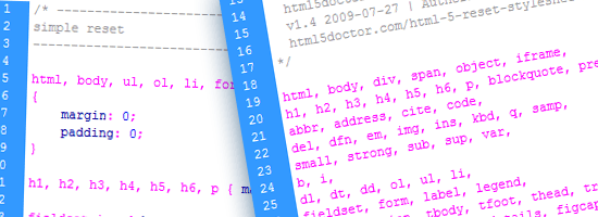
Simple Reset
In April 2010, Russ Weakley gave us a much more targeted and limited reset, which he called Simple Reset.
/* ----------------------------
simple reset
---------------------------- */

html, body, ul, ol, li, form, fieldset, legend
{
	margin: 0;
	padding: 0;
}

h1, h2, h3, h4, h5, h6, p { margin-top: 0; }

fieldset,img { border: 0; }

legend { color: #000; }

li { list-style: none; }

sup { vertical-align: text-top; }

sub { vertical-align: text-bottom; }

table
{
	border-collapse: collapse;
	border-spacing: 0;
}

caption, th, td
{
	text-align: left;
	vertical-align: top;
	font-weight: normal;
}

input, textarea, select
{
	font-size: 110%;
	line-height: 1.1;
}

abbr, acronym
{
	border-bottom: .1em dotted;
	cursor: help;
}
In his explanation of Simple Reset, he noted that it removed margins and padding only from selected elements, as opposed to the wholesale removal made by the resets that rely on the universal selector.
Other things Simple Reset does:
- Removes top margins on paragraphs and headings
- Removes borders from fieldsets and images
- Sets table borders and spacing
- Sets values for a number of table-related elements (such as
<th> and <td>)
- Applies
font-size and line-height to form elements
- Removes list item bullets
- Gives attributes to the rarely styled
<abbr> and <acronym> elements
- Gives a vertical alignment value to
<sup> and <sub> elements to avoid line-height issues
Weakley reminded CSS reset users: "As with any of the resets, you should do what you feel comfortable doing!"
He echoed Eric Meyer in reminding users of Reset CSS that these style rules are not "self-contained black box[es] of no-touchiness," but tools to be used, tweaked, and modified for the project’s needs.
CSS Mini Reset
Designer Vladimir Carrer combined elements from Weakley’s and Meyer’s resets to create what he called the CSS Mini Reset:
/* CSS Mini Reset */

html, body, div, form, fieldset, legend, label
{
 margin: 0;
 padding: 0;
}

table
{
 border-collapse: collapse;
 border-spacing: 0;
}

th, td
{
 text-align: left;
 vertical-align: top;
}

h1, h2, h3, h4, h5, h6, th, td, caption { font-weight:normal; }

img { border: 0; }
It is much less overarching than either Weakley’s or Meyer’s efforts, focusing primarily on resetting margins and padding, stripping default values from table elements, resetting headings to normal font weight, and removing borders from margins.
Carrer says that CSS Mini Reset is best used "when you actually don’t want to reset everything."
Carrer based his reset on Azbuka, an earlier and much more complex effort at a typographically-based reset and base stylesheet he created in 2009.
Soft Reset
Around the same time Carrer released his reset, web designer Mark Aplet contributed his Soft Reset. Aplet explained that his reset "attempts to hone in and reset only the properties that really need to be reset, leaving some styling to the browser."
/* Soft Reset */
body, div, dl, dt, dd, h1, h2, h3, h4, h5, h6, pre, code, form, fieldset, legend, input, textarea, p, blockquote, th, td { margin:0; padding:0; }
table { border-collapse:collapse; border-spacing:0; }
fieldset, img { border:0; }
h1, h2, h3, h4, h5, h6, address, caption { font-style:normal; font-size:100%; font-weight:normal; }
caption, th { text-align:left; }
ol.listreset, .listreset ol, ul.listreset, .listreset ul, .listreset li { margin:0; padding:0; list-style:none; }
Aplet’s .listreset class was inspired by Nicole Sullivan’s Object Oriented CSS, (OO CSS) stating that reusable classes are "performance freebies." On large-scale sites, he says that abstracting CSS "can greatly improve your application performance" and "save you hundreds of lines of code."
Less is More Reset
In June 2007, Web developer Ed Eliot provided an even more stripped-down reset; something he called the Less is More reset:
body {
padding: 0;
margin: 0;
font: 13px Arial, Helvetica, Garuda, sans-serif;
*font-size: small;
*font: x-small;
}
h1, h2, h3, h4, h5, h6, ul, li, em, strong, pre, code {
padding: 0;
margin: 0;
line-height: 1em;
font-size: 100%;
font-weight: normal;
font-style: normal;
}
table {
font-size: inherit;
font: 100%;
}
ul {
list-style: none;
}
img {
border: 0;
}
p {
margin: 1em 0;
}
Less is More, Eliot explains, "only affects the elements I most often find myself needing to reset."
There are hacks in the stylesheet that handle some IE issues (highlighted above); unfortunately, they render the CSS invalid when checked against W3C standards.
For those who insist on validation, Eliot recommends moving them to a separate file and using conditional comments.
The Visibility:Inherit Reset
In August 2009, web designer Eric Watson made his own base stylesheet available. It included a small but powerful reset, shown below:
/* -------------------- Resets --------------------- */
body, form, fieldset, ol, ul, li, h1, h2, h3, h4, h5, h6, p {
margin:0;
padding:0;
}
img {
border:0; /* kills Gecko bug when img's are placed inside links */
vertical-align:bottom; /* set vertical align to bottom for IE */
}
Homebrewed CSS Reset
Jeffrey Way at Nettuts+ shared a method for creating your own reset file. The steps he includes for homebrewing your own reset.css are:
- Zeroing out margins and padding on many elements
- Taking control of font sizing
- Creating "default" classes for elements you will use in all of your designs
Way shared his own home-brewed reset.css at the end of his discussion (shown below):
body, html, div, blockquote, img, label, p, h1, h2, h3, h4, h5, h6, pre, ul, ol,
li, dl, dt, dd, form, a, fieldset, input, th, td
{
margin: 0; padding: 0; border: 0; outline: none;
}

body
{
line-height: 1;
font-size: 88% /* Decide for yourself if you want to include this. */;
}

h1, h2, h3, h4, h5, h6
{
font-size: 100%;
padding: .6em 0;
margin: 0 15px;
}

ul, ol
{
list-style: none;
}

a
{
color: black;
text-decoration: none;
}

a:hover
{
text-decoration: underline;
}

.floatLeft
{
float: left;
padding: .5em .5em .5em 0;
}

.floatRight
{
float: rightright;
padding: .5em 0 .5em .5em;
}
HTML5 Resets
Many professionals are eager to dance with the cute new kid on the block: HTML5. Here are some projects that deal with CSS reset in HTML5.
HTML5Reset
Rich Clark and the folks at HTML5Reset have given us an expansive reset crafted for HTML5.

The project comes in several flavors; here is the Bare Bones version:
/*
html5doctor.com Reset Stylesheet
v1.6.1
Last Updated: 2010-09-17
Author: Richard Clark - http://richclarkdesign.com
Twitter: @rich_clark
*/

html, body, div, span, object, iframe,
h1, h2, h3, h4, h5, h6, p, blockquote, pre,
abbr, address, cite, code,
del, dfn, em, img, ins, kbd, q, samp,
small, strong, sub, sup, var,
b, i,
dl, dt, dd, ol, ul, li,
fieldset, form, label, legend,
table, caption, tbody, tfoot, thead, tr, th, td,
article, aside, canvas, details, figcaption, figure,
footer, header, hgroup, menu, nav, section, summary,
time, mark, audio, video {
    margin:0;
    padding:0;
    border:0;
    outline:0;
    font-size:100%;
    vertical-align:baseline;
    background:transparent;
}

body {
    line-height:1;
}

article,aside,details,figcaption,figure,
footer,header,hgroup,menu,nav,section {
    display:block;
}

nav ul {
    list-style:none;
}

blockquote, q {
    quotes:none;
}

blockquote:before, blockquote:after,
q:before, q:after {
    content:'';
    content:none;
}

a {
    margin:0;
    padding:0;
    font-size:100%;
    vertical-align:baseline;
    background:transparent;
}

/* change colours to suit your needs */
ins {
    background-color:#ff9;
    color:#000;
    text-decoration:none;
}

/* change colours to suit your needs */
mark {
    background-color:#ff9;
    color:#000;
    font-style:italic;
    font-weight:bold;
}

del {
    text-decoration: line-through;
}

abbr[title], dfn[title] {
    border-bottom:1px dotted;
    cursor:help;
}

table {
    border-collapse:collapse;
    border-spacing:0;
}

/* change border colour to suit your needs */
hr {
    display:block;
    height:1px;
    border:0;
    border-top:1px solid #cccccc;
    margin:1em 0;
    padding:0;
}

input, select {
    vertical-align:middle;
}
The CSS reset is based on Eric Meyer’s Reset CSS. As explained by Clark, it goes significantly farther than your average global reset stylesheet. It removes elements that have been deprecated from the HTML5 specs, adds new HTML5 elements to remove default padding, margins, and borders, and corrects the frequently repeated "unstyling" of the :focus pseudo-class.
Clark notes that some of the code included in the HTML5 reset is there more by personal preference than anything else (a caveat that is essentially true of all the resets available).
The creators of HTML5Reset says that although the reset is not "the end-all and beat-all" solution, they think that "it’s a fairly good starting place that anyone can take and make their own."
Clark explained some of his thinking behind the HTML5 reset:
When I decided to create a reset stylesheet for HTML5, it was primarily for a project I was working on and figured I might as well release it to be used, modified and improved by the community at large. The main differences from Eric’s stylesheet … are the removal of those absent elements in HTML5, including the new elements and declaring those as block level elements (something that will later be built into browser stylesheets and can be removed from the reset). Also included is some baseline styling for the mark element and a few other bits that I tend to use in every project so it makes sense for me to include them. I also decided to remove the default anchor styling from Eric’s stylesheet so that the outline wasn’t suppressed on links. It has a comment in Eric’s original but rarely seemed to get changed by authors. This highlights one of the biggest issues with CSS resets — you have to craft your own that works for you and for specific projects. It’s unlikely that a reset that works for one site will be exactly what’s required for the next. I’d always suggest using a reset as a starting point and then modifying it for your own needs.
CSS Reset – Refreshed
Web designer Jeffrey King updated Meyer’s original reset for HTML5; his revision is called CSS Reset – Refreshed:
/* v1.2 | 20100218 */

/* Eric Meyer's original CSS Reset is found at
   http://meyerweb.com/eric/tools/css/reset/ */

/* This version's permalink is
   http://kingdesk.com/articles/css-reset/ */

html, body, div, span, applet, object, iframe,
h1, h2, h3, h4, h5, h6, p, blockquote, pre,
a, abbr, acronym, address, big, cite, code,
del, dfn, em, font, img, ins, kbd, q, s, samp,
small, strike, strong, sub, sup, tt, var,
b, u, i, center,
dl, dt, dd, ol, ul, li,
fieldset, form, label, legend,
table, caption, tbody, tfoot, thead, tr, th, td,
section, article, aside, hgroup, header,
footer, nav, dialog, figure, menu,
video, audio, mark, time, canvas, details {
	margin: 0;
	padding: 0;
	border: 0;
	outline: 0;
	font-size: 100%;
	vertical-align: baseline;
	background: transparent;
	}
section, article, aside, hgroup, header,
footer, nav, dialog, figure, figcaption {
	display: block;
	}
body {
	line-height: 1;
	}
ol, ul {
	list-style: none;
	}
blockquote, q {
	quotes: none;
	}
blockquote:before, blockquote:after,
q:before, q:after {
	content: '';
	content: none;
	}
:focus { /* remember to define focus styles! */
	outline: 0;
	}
ins { /* remember to highlight inserts somehow! */
	text-decoration: none;
	}
del {
	text-decoration: line-through;
	}
table { /* markup tables with 'cellspacing="0"' */
	border-collapse: collapse;
	border-spacing: 0;
	}
HTML5 Boilerplate
Let’s end the guide with a wildly popular project that many of us are constantly talking about: Paul Irish’s and Divya Manian’s HTML5 Boilerplate, a fully developed "framework" — the creators say that it isn’t a framework — that includes a robust, HTML5-friendly reset.
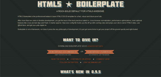
The CSS reset in HTML5 Boilerplate is an amalgamation of HTML5Reset and Eric Meyer’s Reset Reloaded + HTML5 baseline.
/*
  html5doctor.com Reset Stylesheet (Eric Meyer's Reset Reloaded + HTML5 baseline)
  v1.4 2009-07-27 | Authors: Eric Meyer & Richard Clark
  html5doctor.com/html-5-reset-stylesheet/
*/

html, body, div, span, object, iframe,
h1, h2, h3, h4, h5, h6, p, blockquote, pre,
abbr, address, cite, code,
del, dfn, em, img, ins, kbd, q, samp,
small, strong, sub, sup, var,
b, i,
dl, dt, dd, ol, ul, li,
fieldset, form, label, legend,
table, caption, tbody, tfoot, thead, tr, th, td,
article, aside, canvas, details, figcaption, figure,
footer, header, hgroup, menu, nav, section, summary,
time, mark, audio, video {
  margin:0;
  padding:0;
  border:0;
  outline:0;
  font-size:100%;
  vertical-align:baseline;
  background:transparent;
}

article, aside, details, figcaption, figure,
footer, header, hgroup, menu, nav, section {
    display:block;
}

nav ul { list-style:none; }

blockquote, q { quotes:none; }

blockquote:before, blockquote:after,
q:before, q:after { content:''; content:none; }

a { margin:0; padding:0; font-size:100%; vertical-align:baseline; background:transparent; }

ins { background-color:#ff9; color:#000; text-decoration:none; }

mark { background-color:#ff9; color:#000; font-style:italic; font-weight:bold; }

del { text-decoration: line-through; }

abbr[title], dfn[title] { border-bottom:1px dotted; cursor:help; }

/* tables still need cellspacing="0" in the markup */
table { border-collapse:collapse; border-spacing:0; }

hr { display:block; height:1px; border:0; border-top:1px solid #ccc; margin:1em 0; padding:0; }

input, select { vertical-align:middle; }

/* END RESET CSS */
Clark (one of the creators of HTML5Reset) says that HTML5 Boilerplate "really highlights how the web community is very good at sharing and opening up for public use."
Conclusion
There are many options for setting your CSS to baseline defaults, as can be seen above. What’s important to note is that you should use what works best for you and the project at hand. You can use an already-existing reset stylesheet, piece several of them together, or build your own from scratch; the choice is yours.
The third and final part of this series discusses the ongoing debate on whether or not we should reset our CSS in our site builds.
This is a three-part series of articles on the topic of CSS resets.
Related Content
About the Author
 Michael Tuck is an educator, writer, and freelance web designer. He serves as an advisor to the Web Design forum on SitePoint. When he isn’t teaching or designing sites, he is doing research for the History Commons. You can contact him through his website, Black Max Web Design.




 Michael Tuck is an educator, writer, and freelance web designer. He serves as an advisor to the

 Amazing. I’m literally in complete awe as i write this post, under the glow of the


