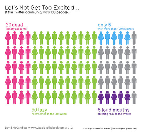
I love this infographic because it condenses the original report into a bite-sized nugget that is easy to understand. Its creator probably had to take some creative and interpretive liberties, but he was entitled to.
And it looks like I fall in the blue 5%. I don’t tweet enough to be in that purple group!
Tagged: infographic, twitter

