RSS
 

Archive for September, 2011

FLOWCHART: Navigating NPR's Top 100 Science Fiction and Fantasy Books

26 Sep

Over the summer, NPR solicited the input of its listeners to rank the top science fiction and fantasy books of all time. Over 60,000 people voted for the top picks which were then compiled into a list by their panel of experts. The result? This list of 100 books with a wide range of styles, little context, and absolutely no pithy commentary to help readers actually choose something to read from it.

We at SF Signal have, once again, come to the rescue. This flowchart is designed to help you follow your tastes, provide context, and fulfill (indeed exceed!) any need for pithy commentary you might harbor.


Designer's Note: This is the mightiest flowchart I have ever encountered let alone tried to develop. There are (obviously) 100 end points and over 325 decision points. A chart of this size presents a number of readability challenges. For people with lower resolution monitors, netbooks, or tablets, this 3800 x 2300 image is going to a scroll-fest. But it's totally worth it.

Update: Those looking for a printable version of this flowchart will find happiness here. This is a 300 DPI bitmap version that should print nicely on 11x17 tabloid paper. Warning! The file is 26MB compressed and a whopping 173MB when unzipped.

Update 2: As Neil Gaiman so astutely pointed out, the novel Stardust, unlike the movie, contains no pirates. Turns out he's an authority on the subject. This egregious error has been corrected and we'd love to appeal @neilhimself's ruling of this being not quite the greatest flowchart in human history.


[Click image for larger version]

Click to embiggen


This is a blog post from SF Signal. Subscribe via RSS, Twitter or Facebook.


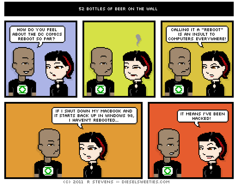
52 Bottles of Beer on the Wall

26 Sep

espresso vs toaster vs tea kettle

Pale Suzie does not like change. Ever.

Fun Fact: I was born on Planet Lunch and rocketed to Earth as an infant only to discover I had a Super-Appetite!


Yes, Google Drive Is Coming. For Real This Time.

24 Sep
gdrive_shot

About a month ago, some additions to the code in Chromium (the open source browser behind Chrome) suggested that the long-fabled “GDrive” may be on the verge of actually launching. A week later, user-facing proof started appearing. Then earlier today, sharp-eyed social media consultant, Johannes Wigand, spotted something interesting during a presentation at a Google-sponsored event: something that sure looks a lot like Google Drive.

And it is.

Over the past month, we’ve been able to dig up more information about Google Drive. First of all, it is very real. And it is being used internally at Google. Of course, it was also real back in 2007 and 2008 before it was eventually killed. But talking to employees back then who saw and used the service all agreed that it was pretty wonky and not ready for prime time. This new version is expected to be much better.

As you can see in Wigand’s picture (above, with important elements circled by me), Google Drive on the web will essentially be Google Docs rebranded. This shouldn’t be a big surprise since Google has been positioning Docs as a sort of Google Drive since early 2010. The difference is that Google specifically didn’t want to call it that at the time. Now they do.

And it makes a lot more sense. Few people are using Google Docs for online storage beyond the files they use in Docs. Most still probably don’t even realize they can. Something as simple as changing the name to Google Drive should help with that. There will also be a new “My Google Drive” area for various folders in Google Drive. There will be other Drive-specific tools as well.

But here’s the real key: there will also be native syncing software that you install on your various computers and mobile devices. Yes, like Dropbox.

This was also true back in the day with GDrive, but again, the service (codenamed: Platypus) was said to be very buggy. Now it is said to work well. If you have a document on your computer that you want to move to another one, you simply drag and drop it into this new Google Drive sync app. Or, of course, you can use the web.

We haven’t heard the timetable for the Google Drive roll-out, but we imagine it will be fairly soon. Again, Google is using this internally right now and has been for some time. One thing that Google may be waiting for is Ice Cream Sandwich, the new version of Android due next month. There may be some built-in Google Drive component to it (though that’s just me speculating). And it seems that it will be at least a part of Chrome, and more importantly, Chrome OS.

Expect Google Drive to reside at drive.google.com (not live yet). It’s not clear how docs.google.com (the current home of Docs) will be used — perhaps as the home of the word processor app or maybe it will just redirect. Also not clear is how Google will allocate storage for this service, but presumably it will be the same as they currently do for Docs/Gmail/etc. You get a certain (ever-increasing) amount for free, and if you need more, you can buy it.


Company: Google
Website: google.com
Launch Date: July 9, 1998
IPO: NASDAQ:GOOG

Google provides search and advertising services, which together aim to organize and monetize the world’s information. In addition to its dominant search engine, it offers a plethora of online tools and platforms including: Gmail, Maps and YouTube. Most of its Web-based products are free, funded by Google’s highly integrated online advertising platforms AdWords and AdSense. Google promotes the idea that advertising should be highly targeted and relevant to users thus providing them with a rich source of information....

Learn more


Why Being Relaxed Makes Us Spend Too Much Money

21 Sep

The typical casino is an intentionally unpleasant place. The ceiling is low and the sight lines are hidden, producing a claustrophobic effect. The lights are dim and the air is filled with the clatter of randomness, as slot machines spit out coins and sound effects. The floor is a labyrinth of drunk gamblers and card tables, making it all but impossible to navigate. (There are also no clocks, so people have no idea what time it is.)

Why are casinos so uncomfortable? The standard explanation is that the cavernous spaces are meant to confuse, like a maze with a convoluted escape route. In other words, the gaming room is really a trap. After all, if we can’t locate the exit, then perhaps we’ll linger for a little bit longer. We’ll lose more money to the house.

In recent years, however, the design of high-end casinos has undergone a dramatic shift. The ceilings are no longer low and oppressive; the layout is straightforward; the exits are obvious. Many gambling experts trace this shaft back to the Bellagio, the massive luxury resort in Las Vegas built in 1998 by Steve Wynn. For the first time, the casino experience was engineered to be mostly pleasant, filled with flowers, tasteful chandeliers and marble floors.

The redesign of the casino had a profound effect on revenues: in 1999, the Bellagio set the record for gaming income in Vegas. (The hotel remains one of the highest earners in Vegas, even though it’s antiquated by the standards of the Strip.) It turned out that when people felt comfortable – when they were put in a relaxed and pleasant environment – they were more willing to take irrational risks, to place losing bets on games of chance.

There’s now some interesting evidence to explain the Bellagio phenomenon. A new paper in the Journal of Marketing Research, led by psychologist Michel Tuan Pham at Columbia Business School, probes the effect of relaxation on consumer behavior. It turns out that people who feel relaxed spend far more freely than those who feel less at ease, even when they are in an equivalent emotional state.

The research was straightforward. The scientists began by exposing several hundred undergraduates – they ended up testing more than 670 subjects – to a variety of carefully pretested stimuli, including short videos and pieces of music. Some of these clips and songs were known to lull people into a state of calm contentment. (One relaxation video, for instance, consisted of ten minutes of tranquil nature scenes set to soft music.) After being assigned to either the “relaxed” or the “pleasant but not relaxed” condition, subjects were then asked to assess the monetary value of various products.

Here is where the data gets interesting: those who felt more relaxed spent more money. In one experiment, the subjects had to bid on a digital camera in a simulated auction. While those in the control condition made bids that closely approximated the actual value of the camera, the relaxed subjects made bids that, on average, were about 15 percent higher than the market price. And it’s not just cameras: the same effect was observed across a large variety of products and experiences, from spa treatments to ice cream sundaes. Feeling relaxed even increased the willingness of subjects to bid on risky activities, such as a bungee-jumping session.

Why does relaxation turn us into spendthrifts? When we feel safe, we are better able to fully focus on the potential rewards at stake. Instead of worrying about price, we can contemplate the advantages of having a sophisticated camera, or the thrill of falling through the air. As the psychologists demonstrated in subsequent experiments, those subjects who were more relaxed thought less about particulars – the specific cost of the gadget or the dangers of the risky behavior – and more about the abstract pleasures they were trying to purchase.

And this returns us to casinos. At first glance, casinos are faced with a daunting psychological challenge: they have to persuade people to play games in which the odds are stacked against them. They have to convince their customers that losing money to a random number generator or a pair of dice is a lovely way to spend an afternoon. Given this intimidating mission, casinos need all the help they can get, which is why they’ve long been interested in design. The casinos know that architecture has cognitive consequences, influencing our mood and spending decisions.

The problem for Vegas is that, for decades, they subscribed to the wrong model of design. They assumed that the way to get people to take outlandish risks was to trap them inside the building, to make it too difficult to leave. But that was almost certainly a big mistake. Why? Because claustrophobic and confusing rooms aren’t relaxing. Instead of being put at ease, we end up slightly anxious, all too aware of the fact that we are losing money to a machine, that we just got fleeced by the house.

The Bellagio was the first modern casino to get it right. Because it emphasized the importance of relaxation – it treated the casino as an extension of the hotel lobby, not as a place to suffer through on the way to the lobby – it helped influence gamblers to take bigger risks. Because it’s when we feel safe that we act most recklessly, that we’re most likely to think about the potential rewards of the game and ignore the fact that we just lost hundreds of dollars. Relaxation is the opposite of vigilance. And vigilant people don’t play the slots.

Of course, this psychological principle doesn’t just apply to casinos. The researchers argue that luxury retail spaces have long emphasized a relaxing aesthetic in order to make consumers less sensitive to the extravagant prices. As a result, we worry less about overpaying for a Louis Vuitton bag or a Rolex watch, and think instead about the abstract virtues of the brand. We have been lulled into squandering money.

PS. This is also a reminder that it’s a bad idea to shop while on vacation.


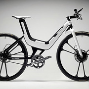
Ford E-Bike Concept

21 Sep
Apparently someone decided that building four-wheel vehicles just wasn't enough. The Ford E-Bike Concept ($TBA) is the storied automaker's look at two-wheeled transportation, and true to typical automotive concepts, it...

Visit Uncrate for the full post.


The true meaning of The Singularity

21 Sep

The true meaning of The Singularity – The true nature of Ray Kurzweil's “Singularity” is not some army of post-apocalpytic robot overlords stomping and rolling across a nuked cityscape of wind-blasted rubble and skyscraper stumps zapping errant humans with noisy laser beams. It's a world of smug electronic umbrella-stands, digital lawnmowers that unfriend you on Facebook if you pave your garden, and web-enabled sofas that refuse the dust-busting attentions of automated vacuum cleaners…

The true meaning of The Singularity is a post from: Sciencebase Science Blog


Stubbornness Increases the More People Tell You You’re Wrong

20 Sep

By Duncan Geere, Wired UK

A group of psychologists working at HP’s Social Computing Research Group has found that humans are more likely to change their minds when fewer, rather than more, people disagree with them.

The team conducted an experiment asking several hundred people to choose between two pieces of furniture. After a varying amount of time, they were asked to choose again between the items, but told that a certain number of other people had preferred the opposite item.

The results showed that a small amount of social pressure to reverse an opinion was far more effective in getting people to change their minds than if the pressure was much greater. When an overwhelming number of people were shown as having made a different choice, people tended to stick with their original selections.

There are two conflicting theories of social influence at work here. Psychological reactance theory says that when we’re exposed to opposition to our beliefs, our self-preservation instincts kick in to make us stick to them. Social influence and conformity theory, however, suggests that being socially connected with others is important to humans, and we’ll reverse an opinion if we feel like it’ll let us “belong” to a group — the “peer pressure” effect.

The psychologists believe that the first theory becomes more powerful when we’re confronted by the opinions of many others, but the latter kicks in when we’re in a smaller social group. That chimes with earlier work done by the same team that shows that votes on rankings are influenced by our desire to impact the choices of others. We like to have an influence.

The next step for the team is to bring quality into the equation. Is it volume of recommendations, or the source of those recommendations, that carries more influence? If 1,000 strangers recommend something, but four close friends differ, who would you side with?

The full research paper is available on HP’s website.

Image: HP

Source: Wired.co.uk

See Also:


How do Americans spend their days?

20 Sep

How Americans spend their day -full

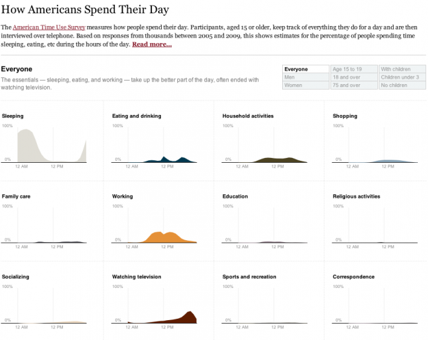
One of my favorite data graphics is an interactive piece by The New York Times that shows how Americans spend their day, based on the American Time Use Survey (ATUS). I've also been wanting to play with Mike Bostock's Data-Driven Documents, or D3 for short, for a while now. So put the two together, and this is what I got.

Main takeaway: we spend most of our time sleeping, eating, working, and watching television.

I followed the NYT aesthetic mostly for myself. I've found that a good way to learn is to try to copy something you like, and then use what you learn to do your own thing.

The NYT version was a stacked area chart with a number of interactions that made the data easier to read. I took a different route and split up some of the main activities, such as sleeping, eating, and working, into separate time series charts to see if it allowed you to see anything new. Showing separate charts at once places more focus on comparisons than on the distributions.

There was one challenge with the data that I didn't anticipate. ATUS provides a table of percentages by hour, but you'll notice with the NYT graphic the numbers are per ten minutes. You can actually calculate this with the ATUS microdata, which is basically the raw survey data from a few thousand respondents. I did this at first but lost patience, because I really just wanted to play with D3 rather than spend all my time building estimates.

I went with the hourly data which are averages for the sample population. The demographic breakdowns were only available in PDF, so I had some data entry fun, too. Luckily, I got my hands on Able2Extract (going off of Matthew Ericson's advice) to ease some of the pain.

Once the graphic was done, I noticed that the transitions are actually a nice way to show differences. For example, if you look at the time use for men and then women, the differences are subtle, but because the change is animated it's easier to spot. I think I knew this already, but probably never thought about it very deeply.

Anyways, it was fun playing around with D3. The beginning learning curve was kind of steep for me, but now that I know my way around a little better, I'm expecting more fun to come.

Mess around with the final graphic here. Let me know what you think.

[How Americans Spend Their Day]


Lesser Amount of Cholesterol May Prevent Brain Tumors – Heal Blog (blog)

18 Sep

Zee News

Lesser Amount of Cholesterol May Prevent Brain Tumors
Heal Blog (blog)
According to the US researchers of the journal Cancer Discovery, glioblastoma, the most fatal form of brain cancer, can be treated by hampering the access of cholesterol in the body which serves as food for some brain tumors. ...
Liver X Receptor Agonist Ups Glioblastoma Cell DeathDoctors Lounge

all 36 news articles »


Add wasabi to your broccoli for a cancer-fighting boost [Food Science]

16 Sep
If you're a spicy food fan, take heart as combining certain piquant foods with broccoli may give the vegetable a much more powerful cancer-fighting kick. More »