
Advertise here with BSA
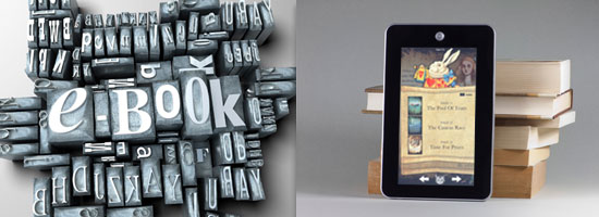
The father of the e-book passed away last week. Michael Hart, founder of Project Gutenberg, died Tuesday, September 6, at the age of 64. Considered by most to be the man that jumpstarted the move toward digital books, Hart created the first fully digitized public document by hand-typing the Declaration of Independence into a University of Illinois computer.
That was back in 1971, and Project Gutenberg has arguably paved the way for what we now know as e-readers and, most importantly, e-books.
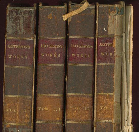 Project Gutenberg aims to digitize and make freely available a wide array of books. Image source: Wikimedia Commons
But back in Hart’s Gutenberg days, the main purpose of the project was to provide wide and free access to information. It made sense for these digital archives to be simply that — electronic replicas of the books they were representing.
It seems that even though e-readers are everywhere, the publishing industry, editors, and writers seem to have forgotten that they’re working with an entirely new, quite powerful medium.
No wonder there are so many lamenting the fall of The Noble Book, an artifact that smells like everything that’s good in the world. The gritty pages turn with a pleasing swish, and on each page are margins within which you can make your notes.
You can leave a physical mark in the physical world with physical book. And now, here comes this electronic doppelganger that attempts with its page-turning and bookmark metaphors to be just like what we’ve all come to know and love, The Noble Book.
What we have now is an imposter.
Hyperbole aside, e-book dissidents dismiss largely based on nostalgia and sentimentality of the time that once-was, much like what happened when the television moved into the living room, crowding out the Wholesome Radio.
But the arrival of the e-book is not like that of the television; televisions offered an entirely new dimension to radio. The vast majority of e-books offer little more added value than an ability to carry more books at once than ever before.
What We’ve Got Now
The e-book is falling short of its potential. Perhaps this is because innovation takes a long time, and adoption rates for new experiences are painfully slow. Whatever the reason, it’s time to take a long, hard look at what e-books are, what they should be, and what they can be.
Instead of waiting around for the publishing industries to create the Next Big Thing in terms of experiences, I can think of no better pool of minds to address than the growing troops of user experience designers.
With only a few exceptions (see below), e-books are facsimiles of print. Not much more, not much less. Most of the innovation in the industry is heading toward making e-books even more like printed materials, like improving refresh rates and producing better e-ink.
But why bother, when print is by no means on its way out? While I’m not writing an article to discuss why print will be around for at least several more decades (and I’ll eat my neighbor’s hat if I’m wrong, of course), this likelihood is important to keep in mind.
Imagine if the quality of music on cassette tapes and CDs were of equal fidelity. Also figure that people had been listening to cassette tapes for decades, had historically sentimental feelings toward them, and spent hours upon hours holding them in their hands.
If CDs really had nothing more to offer than cassette tapes (other that the fact that they were thinner and could hold more information), what would be their justification?
Rethinking the Direction
There are minds out there, slightly crazy minds, taking up this discussion with the academic communities, but we all know where that ends up — in trade journals that only a select few read.
The future of the e-book is a very exciting issue to many a futurist and thinker, and many are advocating the push away from the paper-doppelgangers.
Transliterature
Ted Nelson is one such man. A visionary and, some say, quite quirky, he’s like the Kurzweil of documents. Nelson coined many important terms that ushered us into a new age of technology: hypertext was his, as was virtuality. So was teledildonics. Nelson was also the first person to actually try to build out what the Internet is, in essence — a series of hyperlinked documents. He failed, of course, but many of the big names in the Web’s history credit Nelson as an essential player in the game.
 Ted Nelson firmly believes in a bright future for electronic documents, and fights for their innovation. Image source: Wikimedia Commons
Nelson, now in his 70s, has a lot to say now about electronic formats of documents. For instance:
"A document is not necessarily a simulation of paper. In the most general sense, a document is a package of ideas created by human minds and addressed to human minds, intended for the furtherance of those ideas and those minds. Human ideas manifest as text, connections, diagrams and more: thus how to store them and present them is a crucial issue for civilization."
While he’s not talking specifically about e-books, shouldn’t the same ideas apply? Nelson further outlines what he proposes happen to the medium for electronic books, and each proposal takes advantage of the technologies at hand, all the while taking into account more literary issues, such as narrative, structure, and experience.
Programming Languages Must Evolve
Someone a little lower profile but arguably just as visionary is Nick Montfort of MIT. As an associate professor of digital media, Montfort has his fingers deep in the missed-potential-of-e-books pie.
He works heavily in the future of books — particularly interactive poetry and fiction. Montfort and his team are trying to make not only the concept of the electronic book medium evolve, but the concept of the art as well (narrative, in this case).
He proposes that programming languages must evolve before e-books move beyond simply simulating the traditional paper reading experience.
Most importantly, Montfort discusses and stresses the storage and processing capacity of computers (and e-books) and how they can transform the idea of what we call a book, a story, a poem, and so on. This is the spirit Montfort’s academic work embodies, as well as most working in digital media.
None of this is to say, however, that there aren’t a few bold newcomers to the e-book scene taking chances.
The Future of E-Books
Not all e-books are created equal. There are a handful of designers, writers, and publishers that have caught on to the idea that the e-reader allows for new possibilities.
They’ve understood that in order to create a more autonomous e-book (one that’s divorced from its paper predecessors), they have to start creating unique experiences. By doing so, they’re demonstrating the simply awesome potential of what the future of the electronic book looks like.
Bundling Multimedia Content
Observe first Enhanced Editions, a small but significant step in autonomy’s direction. Founded by James Bridle (one of the most influential people in publishing, according to the Evening Standard), this company bundles an e-book’s text with lots of extra content, such as author interviews, notes, and audio book accompaniment, read by the authors themselves. There are commentaries included, as well, just like with DVDs.
While Enhanced Editions aren’t available for most e-books, there are a number of popular titles available, such as Stephen King’s beast Under the Dome, Philip Pullman’s The Good Man Jesus and the Scoundrel Christ, and The Audacity of Hope by Barack Obama. Check out the links to see the various features the different books offer; not every Enhanced Edition offers tons of extra content. It is, rather, catered to the specific book. With Under the Dome, for instance, there are only excerpts from the full audio book, but there are little commentaries attached from characters living under said dome.
Cinematic E-Books
The move toward a more cinematic electronic book is also being explored.
The Atavist, a new long-form article platform, recently made a great trailer for one of its authors’ pieces.
Following that trend, there’s even an app that attaches sound effects and soundtracks to whatever book you’re reading, given the book is one on the Booktrack Bookshelf. Granted these soundtracks have very proprietary functionality at the moment (there are only a few titles this close to their recent launch), but the effort to more fully immerse readers in their stories is clear and tangible.
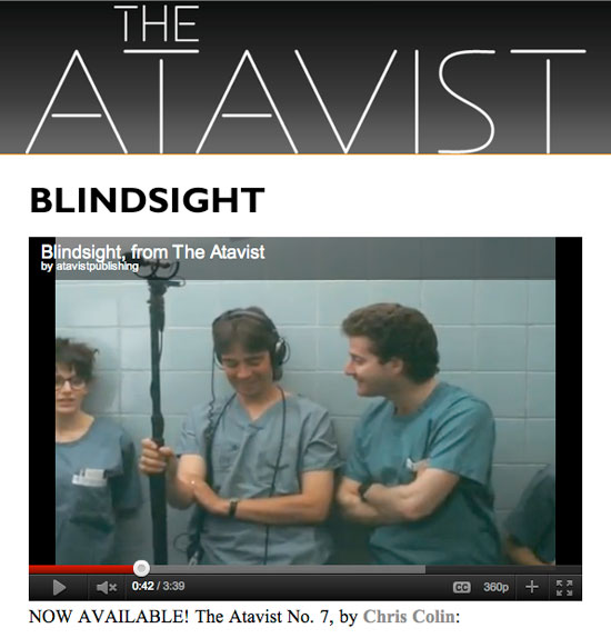 The Atavist pairs one of its long-form articles with a theatrical trailer.
Interactive, Immersive E-Books
Some endeavors take immersion to the next level, and many of these contenders are children’s books. Take The Fantastic Flying Books of Mr. Morris Lessmore, for instance.
The storybook is immersive with a haunting soundtrack, moving narrative, and excellent visuals. This book probably turned out so well because it accompanies a great little short film (and that it deals directly, in the narrative, with the sentimentality and nostalgia that come along with books), but it still successfully walks the balance between interactivity and readability. After all, past a certain threshold of interactive features, you no longer have a book. You have a video game.
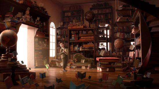 A screen from Morris Lessmore, from Moonbot Studios.
Morris Lessmore handles it well, as do several other children’s books. Alice for the iPad, for instance, takes elements of the classic story and draws special attention to them, employing the tech of the iPad to do the narrative justice (and does so brilliantly).
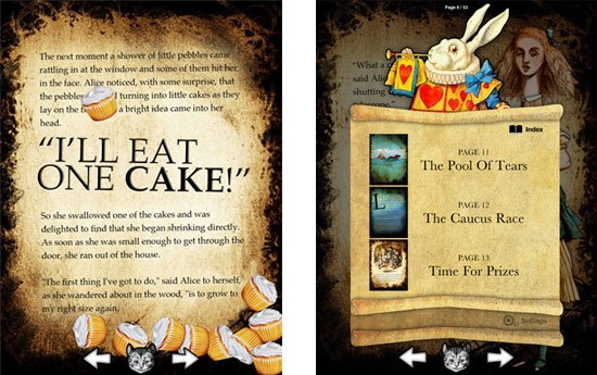 Alice for iPad takes advantage of the iPad’s sensors to encourage fun bits of interactivity while reading.
But interactivity and immersion aren’t just for kids. The most immediate and relevant example is a perfect illustration of what reference books may become.
The Elements is simple enough — it’s a periodic table, in essence. But rather than just be a series of textbook-like page simulations about the periodic table’s residents, this Theodore Gray table allows readers to virtually interact with the elements on the iPad’s touchscreen, manipulate them, and even make calculations based on the element’s information; the app connects to Wolfram Alpha to gather the most up-to-date information about whatever element the reader is asking after — the current price of gold, for instance.
 Not only is Theodore Gray’s Elements visually gorgeous, but it’s interactive and surprisingly immersive, too.
As you can see, as publishers pump out digital copies of bestsellers, there are out-of-the-box thinkers pushing the technology to the appropriate next level.
Why We Need to Rethink the E-Book Format
When I write, I like to create my own little reader persona, and edit according to his response of my article.
In this case, I hear him sitting on my shoulder, prodding me incessantly with short sharp pokes to the neck: "Who cares if you think e-books aren’t what they should be? They’re sellin’ just fine, so what does it matter? Why does any of this matter?"
Well played, little shoulder-man.
But it does matter, because every day, I see editors and designers scurrying with their focus groups to figure out what the secret is to electronic content, what exactly people want from an e-book or magazine.
When no immediate answers present themselves, the process (generate content, send to press, squeeze into iPad format and tack on some extra videos) simply repeats itself ad infintum.
Presently, the e-book is in the wrong hands — it does not belong with the publishing industry at large. It’s a new medium, not an amendment to an existing one. Or at least that’s how it should be.
Print’s going to be around for a while (and this is why):
- Print, in most cases, is more accessible and inexpensive. In order to enjoy e-books, you have to be able to afford an e-reader. And that’s simply not everyone.
- Corporate and governmental behavior, aside from that of the consumer, is a huge driving force in large-scale technological change. Sociologists and analysts explain a dependence on hard copies: the so-called paperless office has been predicted for decades. It’s nowhere near close.
- Sentimentality is a powerful force in sales (think about holiday commercials and diamond ads), and can easily oust logic.
So instead engaging in the battle of print versus electronic books (and there are battles everywhere), we should instead be asking what justifies the e-book, if it’s only a paper simulator?
It’s arguably less accessible (and I’m talking on a grand scale, not just middle-upper class Americans). Sure it saves trees — potentially — but book production hasn’t decreased enough to make a difference, and the environmental cost of e-readers is still up for debate; after all, with new versions of Kindles, Nooks, and iPads coming out incessantly, e-waste will build.
In the words of the futurist and Harvard man John Naisbitt, "strategic planning is worthless unless there is first a strategic vision." There has been too little vision in the way of the e-book, for all its financial success.
E-books shouldn’t just be a facsimile of what they may one day replace. With all the technology they’re riding on, e-books have the potential to take the narrative experience to new heights.
Related Content
About the Author
 Kristina Bjoran is a science writer based in San Francisco, California. She works in editorial at Wired magazine and is a managing editor at UX Booth. Connect with her on Twitter, Facebook and Google+.


 Designing a great user interface can be a challenge, even for the most seasoned designer. Countless factors need to be taken into consideration and the difference between a good UI and a great one often boils down to paying close attention to the smallest details.


")


 It would be nice if time just marched along in an orderly fashion, one second after another, each of equal length, 31,556,926 times per year, but that's not the way the world works. Years are actually a bit shorter than we pretend they are, so we invented little tricks - algorithms, if you will - to compensate. The Gregorian calendar adds an extra day to its shortest month every four years to adjust for the discrepancy. My native tribe, however, also uses a


