You’ve heard it plenty of times before: We’re at the precipice of a transition in the way we, as developers, do things. Leading the way are future standards like CSS3 and HTML5, both already partially implemented in 4 out of the 5 major web browsers, with IE9 promising support, empowering us with new ways of making interactive and rich user experiences.
Just how awesome is CSS3? Find out by checking out these 10 experiments and demos that push the capabilities of the specs.
1. Our Solar System
This experiment presents our solar system’s planetary orbits (fast-forwarded, of course) by utilizing CSS3’s border-radius, transform, and animation. Additionally, hovering over the names of each planet on the right displays an animated tooltip using CSS (learn how to make CSS3 animated tooltips). You can read about how this experiment was developed from this walkthrough by Alex Girón, the creator of this stellar CSS3 demonstration. The animation, at the moment, only works on the WebKit browsers (Google Chrome and Safari).
2. CSS3 Ads Versus Flash Ads
Flash animated web banners are notorious for being intrusive in the user’s experience. Ad-blocking apps can turn these off by looking for all embedded Flash objects on a web page and hiding them. However, using CSS3 animation, these Flash ads can be mimicked in functionality, but will be harder to disable with third-party software. In this experiment, several ads were recreated using CSS3, and the results are almost identical to their Flash-constructed counterpart.
3. CSS3-Man
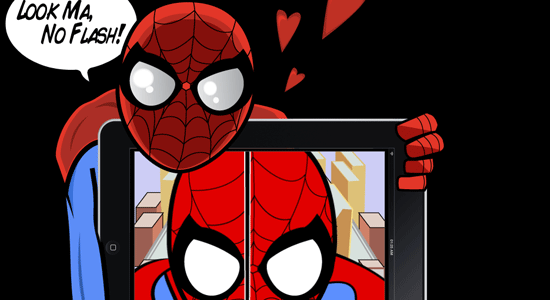
This is a robust animation sequence inspired by the Spider-Man animated television series in the 60’s. Making the sequence work involved using CSS3’s transform, @key-frame and rotate; a bit of jQuery was used to preload the images as well as HTML5 for the audio. The creator wrote an explanation of how the CSS3-Man animated sequence works, which will give you a general idea of the level of effort involved in this amazing experiment.
4. The Man From Hollywood
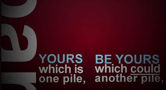
This demonstration is an animated sequence (based on kinetic typography) that explores a way in which we can replace rich animation components such as Flash or After Effects. This proof of concept chiefly utilizes advanced CSS selectors and CSS3 animation, however, it’s not purely CSS since JavaScript was used to toggle element classes on and off.
5. Anigma
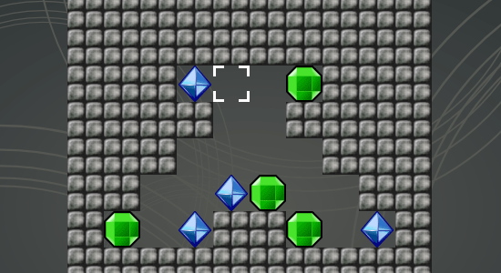
We often use Flash (or Silverlight) for rich and interactive web-based video games. This CSS3 demonstration is a puzzle game and a proof-of-concept of how we can use open standards to create games — though admittedly, not as facile as Flash yet if you compare it to Flash games on sites like Kongregate. HTML5’s <audio> element was used to embed the sound.
6. Animated Polaroids
This demonstration is of stacked images that look like Polaroids. Hovering over a photograph transitions it smoothly to the front of the stack, making for an interesting interaction for presenting your photo gallery. The demo was made by leveraging transition, transform, dynamic psuedo-selectors (to animate the target element), as well as stylistic properties such as box-shadow for visual effects. Read the tutorial on how this was constructed if you’d like to learn how this was developed.
7. CSS3 Music Player Menu
With HTML5’s <audio> and <video> APIs, which will enable us to utilize multimedia without dependence from proprietary plugins, we’ll eventually have a need for GUIs that provide our users with controls for the media we serve them. Though we could use static images in conjunction with other HTML elements (such as buttons) to build these interfaces, using just HTML and CSS to render media controls mean we’ll have a more malleable solution. This user interface for a music player was built using only CSS3 (gradient, border-radius, box-shadow and all that good stuff). Read the explanation on how this was contructed in this tutorial.
8. Sliding Vinyl with CSS3
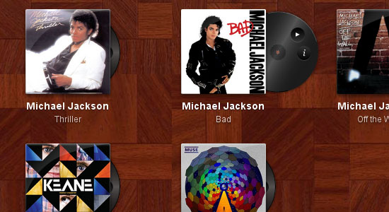
This demonstration, found in the ZURB Playground, takes vinyl album covers that, when hovered on, animates the sliding out of a vinyl record that contains additional controls ("more information" and "play"). This proof of concept could one day be used as an elegant web-based interface for a site that plays music when combined with HTML5’s <audio> API.
9. Gabriel Sharp’s Small Planet
This animated cartoon sequence depicts a fast-forwarded cycle of day and night. It works on WebKit browsers (Safari and Chrome) using the @keyframes CSS3 property for moving and transitioning PNG images.
10. Falling Leaves
WebKit presents the capabilities of CSS3’s animate property with a spectacularly smooth demonstration of falling leaves. Tip: Use your browser’s "view source" feature to read the source code of the demonstration — the code’s well documented with explanations of how it works. Read WebKit’s blog post about the animate property to get a better feel for all the possibilities.
Related Content
- CSS3 Techniques You Should Know
- Basic CSS3 Techniques That You Should Know
- 20 Useful Resources for Learning about CSS3
- Related categories: CSS and Web Development
About the Author
 Jacob Gube is the Founder and Chief Editor of Six Revisions. He’s also a web developer/designer who specializes in front-end development (JavaScript, HTML, CSS) and also a book author. If you’d like to connect with him, head on over to the contact page and follow him on Twitter: @sixrevisions.


