
Archive for the ‘Google Reader’ Category
The smell of freshly-cut grass is actually a plant distress call [Mad Science]
26
Aug
How to Use Illustrations to Spice Up Your Web Design Work
26
Aug

Graphic illustrations have become commonplace in today’s web design. They can add a unique branding element into an otherwise bland world of templates and corporate logos.
Although just 5 years ago you would be hard-pressed to find many websites looking for illustrators, times have changed, and we’re on the brink of many new and exciting web design trends.
Illustrations that come in the form of beautiful background scenery, animals and mascots for branding, or even cartoon versions of authors and designers can be found all over web design portfolios spanning the globe. Web illustrators and branding gurus have become a staple and have come to be high in demand in the web design industry.

I’ll be touching upon a few tips for incorporating illustrations in your web designs by looking through a handful of websites that use illustrations effectively.
I’m talking about digging deeper into the bedrock of design; truly searching for what makes illustrations "click" in the mind of our website visitors.
Why Branding is So Important
When you build a website, you want the look and feel of the design to be an extension of your business. Whether this means incorporating an already existing logo into the design or creating a memorable experience, the site needs to fit your brand.
When visitors fall into your site, you also want to make sure it leaves a lasting impact. By this, I mean that you want them to remember your site.
Illustrations help a lot with making a site memorable because with an eye-catching graphic scene or vector artwork, the page jumps out and has a visual element that’s unique just to that site. This is what helps your brand stick like fresh sap out of a maple tree!
Users eat creativity up; it shows that you really care about your brand and your site to go through the trouble of incorporating illustrations, which are difficult to conceptualize and pull off effectively in the context of websites.
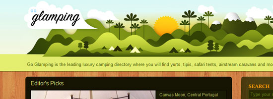
Let’s take a look at a good example of how illustrations can be used effectively to establish a brand identity: an SEO company called ten24 Media.
Their site uses a background of a circus tent with a beautiful skyline and open grassy fields to entice readers into the upper area of the web design. The concept of using circus tents as a central illustrative element is from creative wordplay: their name spelled out is "tentwentyfour media." The web layout includes a brief description of what they do, as well as a link to their Services page ("Enter the Show").

The branding is consistent throughout the site; continuing onto other pages, you’ll see the circus tent outline near the top navigation links.

In addition, the site’s footer contains more grassy hills.

All these illustrative elements keep the whole site feeling very innovative and fun — the perfect positive emotions you want to create, especially to dispel negative misconceptions some people have about the SEO profession.
Simple Illustrations Work Well
Never underestimate the power of a simple illustration. Adding too much to your design will overwhelm your readers and have the opposite effects you are looking for.
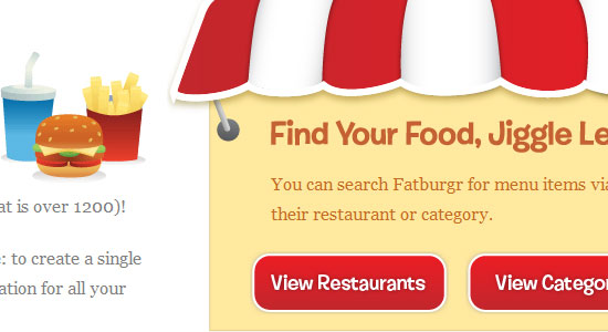
Fatburgr is an interesting web application. Many would classify their design into the realm of new age "Web 2.0" gradients and fluff, but the concept actually stands for itself.

Just browsing the site is appealing and you can enjoy the cartoony aspects of each area.
The footer is good for a few laughs as well. Imagining the detail put into such a web design is breathtaking.

You can recognize each piece and understand how it ties into the overall site brand. Even the buttons and text areas have additional creative effects added to them.
Keeping content where it belongs will help your readers decipher what you’re trying to say a lot faster. Easy-to-read paragraphs with large enough font sizes and plenty of spacing is essential — simplicity at it’s best.
Another concept to take away from this example is the importance of typography.

Typography should match your illustration design concepts; they should be big, and almost pop out to your visitors — something illustrations and simpler structures can complement.
Implementing Your Illustrations into the Site’s User Interface
The next point I want to discuss is creating harmony with the site’s functions and the illustrations you use.
You can see this happening with Forrst, a new community for designers and developers for sharing code snippets and snapshots.
Although currently in private beta, you can check out their homepage with a flourishing background of trees and wooded areas.

In the foreground, you can see a park ranger parading around with a Forrst badge attached to his uniform. You can also see a brief description of the site and informative signs transposed on wooded backgrounds. This all adds to the ambiance of the site, including the clever "log in" log floating on what appears to be some sort of cloud.
And if that were all, you could consider Forrst quite the visual inspiration.
However, they push the use of illustrations further. You can go beneath the ground into the dirt below to see a sign up form. You can apply for membership quickly with just a few details, and the web form looks great.

A design like this can get complicated and will require plenty of skills. To produce this level of illustrative work could take years of practice in software like Adobe Illustrator to master, but they can be just the perfect touch in boosting your site design into the big leagues.
Never Use Illustrations Just for Aesthetics
Looking good is important. But adding design elements just to fancy up your site is the wrong attitude because a web design is a functional product.
All elements of your design should hold a purpose and have importance, including the addition of beautiful intricate illustrations.
Do you really need illustrations? How do they help meet your site’s objectives? These are a couple of questions you should be answering constantly as you conceptualize and execute your illustration ideas.
Sit down with a pen and paper to draft up ideas before even stepping into the digital world. This will help hash out a lot more ideas at once without locking yourself into the medium you use to design websites with.
Using similar ideas for inspiration can help a lot. CSS and graphic design galleries can be found everywhere. Go through a few and take notes on how their designs play out. Do they go a bit overboard compared to what you want? Maybe they don’t use color correctly? How does their content mesh with their illustrations?

Asking these questions will help get you on track. It’s always a long process when designing for the web. Keeping your designs in line with check and balances is a very handy skill to master.
The examples above are just simple ideas, but larger concepts can be implemented to realizing amazing results. Not everybody is an illustrator; I certainly don’t claim to be anywhere near an expert in creating illustrations like Brad Colbow or the guy over at Behind the websites. But with the power of Twitter and other networking tools, it’s not very difficult to meet very creative and talented designers from all over the world.
Your website’s design is a very important piece of the puzzle. It’s the part of a website your users can actually see.
Further Reading
Here are a few articles and resources on the topic of illustrations in web design.
How to Create an Illustrative Web Design in Photoshop
This step-by-step web design tutorial goes over the creation of a web design that has an illustrative landscape baked right in.
30 Creative Illustrative Website Headers
Here is a showcase of website headers that have illustrative design elements.
30 Beautiful Photoshop Illustration Tutorials
Not comfortable with Adobe Illustrator? This is a roundup of Photoshop tutorials to help you become a better illustrator.
30 Creative Examples of Illustrations in Web Design
Here is another showcase of web designs that feature illustrations.
Getting Comical with Brad Colbow
For inspiration, this is an interview of Brad Colbow who is both a web designer and an illustrator. By the way, check out his The Brads comic series, a comical look at the life of web designers.
Related Content
- How to Use Retro Colors in Your Designs
- Make High-Impact Backgrounds for Your Designs with Photoshop
- 50 Stylish Navigation Menus for Design Inspiration
- Related categories: Web Design and Graphic Design
About the Author
 Jake Rocheleau is a social media enthusiast and an Internet entrepreneur. Having spent over 4 years working freelance web design, he frequently writes articles involving new-age design concepts and personal motivation. You can find him all around the web via Google Profile or on Twitter as @jakerocheleau.
Google Talk
25
Aug
I gave a tech talk at Google headquarters on the arrow of time, which was a lot of fun. Must be what all of Silicon Valley was like back in the boom days — pool tables, free food, volleyball, and lots of smart people everywhere. Rather than a lecture hall, the talks are held in a big lobby space where people are regularly walking through, so that passers-by can become intrigued and start listening. Also, it became clear during the questions that at least one Google employee is concerned about how to preserve intelligent life past the 10100 year mark when our universe will be nothing but empty space. Glad they’re thinking long-term!
Here is the talk, which is basically at a popular level, although I felt empowered to use the word “logarithm†without explanation. I’ve also tried to collect other talks by me onto one page, for those who just can’t get enough. (Hi, Mom!)
300,000 Largest Websites Visualized with Favicons
25
Aug


An interesting visualization over at Nmap.org shows the favicons of the 300,000 biggest websites on the Internet (according to Alexa), with the size of the favicons corresponding to sites with the most traffic.
The data has been gathered through a “large-scale scan of the top million websites,†performed in “early 2010″ using the Nmap Security Scanner, a powerful network scanning tool used by many online security professionals.
The smallest icons, explain the folks from Nmap, correspond to sites with approximately 0.0001% reach, and rescaled to 16×16 pixels. The largest icon belongs to Google, and it’s 11,936 x 11,936 pixels large; for comparison, Mashable’s favicon (located below and to the left of Facebook) is 640 × 640 pixels large. Of course, to explain Google’s icon in its full size, you need to check out the zoom-enabled, interactive version.
The visualization is also available as a humongous poster, available here.
[via Gizmodo]
Reviews: Facebook, Google, Internet, Mashable
More About: Alexa, favicon, visualization, website
For more Tech coverage:
- Follow Mashable Tech on Twitter
- Become a Fan on Facebook
- Subscribe to the Tech channel
- Download our free apps for iPhone and iPad
Corporate Website Design: Creative and Beautiful Solutions
25
Aug
 |
What do corporate websites have in common with other people’s children? Three things: they have their charm, like finger-paintings on the refrigerator; they can be useful, if infrequently; they are usually admired only by the people who created them.
While designers know that a user’s experience on a website has a large impact on the way that customer will interact with them, impressing that concept on the corporate establishment has taken a very long time. Trends in design are making their way into corporate web, albeit slowly; with patience and a little luck, businesses will soon start to consider carefully coded and appropriately functional design as important as their mission statement and recent sustainability reports.
One unfortunate fact is evident above all else: despite having plenty of money at their disposal, many corporations are lost in sterile MS Word-esque designs that are more stagnant than a museum exhibit… though at least museums have dinosaurs and mummies and stuff. Here’s hoping we all will get new corporate clients soon.
Below, we present some interesting corporate websites, although the insight they offer may not be immediately apparent. This review is not about aesthetics or visual appeal, but rather about the design solutions the sites exhibit. In fact, corporate websites aren’t as visually arresting as you might think, so if the appeal isn’t immediately apparent in the previews below, take a moment to visit and interact with each of them.
[Offtopic: by the way, did you know that we are publishing a Smashing eBook Series? The brand new eBook #3 is Mastering Photoshop For Web Design, written by our Photoshop-expert Thomas Giannattasio.]
Beautiful Corporate Websites
Levi Strauss & Co
With its website, Levis demonstrates that it has not only a strong flair for style and interactivity, but a rich sense of history. Hover over or click the photographs to see some of the company’s defining moments; ever known for its sense of identity, Levis draws you into its past, present and future, excellently breaking through to customers and inviting them to stay.

McDonald’s
By simplifying and softening the navigation, McDonald’s opens the entire screen up to use as canvas for their product. Harmonious colors in the typography complement the food (and exploit the visual association with hamburgers), while the vivid photography does not obscure surrounding elements.

Starbucks
Gentle colors and careful hierarchy of elements aside, Starbucks’ strength is in the details. The navigation exhibits an attention to hierarchy not often seen on corporate websites, while offering alternative destination links, should you find yourself in the wrong section. Such consideration for the user would be a welcome trend in design going into 2011.

Sony
You’ll see that this is a link to Sony Canada’s website. While the navigation and theme is the same as its American counterpart, the experience here is different: here you can see short films in which people relate their experiences of how Sony technology has enriched their lives. Best of all, a floating meter lets you sort stories into categories, giving you control of the content. Brilliantly executed.

The Ones You Would Expect
Adidas
Few websites employ a grid design that is at once so rigid and flexible. Individual modules expand and contract to allow for dynamic exploration—a lot of fun, particularly because the website has so many parts to explore. The only thing to note is that images do not obviously reflects the content they open to display, necessitating the standard top-menu — an important point in usability.

Citroen
While the technique of using tiny images to fill a shape has been done a million ways, Citroen takes an old technique to the next level. Draw your cursor across the world to see the photos dance around it, beckoning you to select a region. An excellent use of a landing page, effectively drawing in users without information inundation.

Fender Guitars
While you may need to be a guitar player to fully appreciate the beautiful lines and tones of Fender products, you need only a pair of eyes to appreciate the simplicity and functionality of Fender’s website. Unobtrusive navigation at the top and hot links lower down make way for a large stage on which Fender can showcase the stars of its website: its beautiful instruments.

Heinz
One of the most recognizable brands in the world, Heinz has intelligently focused its website on its consumers. Rotate the globe by clicking on photos to see simple recipes from around the world. A design brilliantly suited to users of any skill level, Heinz has found a new means to engage their customers and entice them to visit more.

Prologue Films
Any company that designs opening credits and effects for movies needs a keen aesthetic sense, and Prologue Films’ visual dynamic is evident on its website. A clean grid with gray tones puts the company’s custom type and effects (an impressive collection) front and center, the same technique made famous by artists and photographers. Using a pop-up window for the content, though, is ill-advised.

Rolex
The beauty of this website is in Rolex’ masterful attention to detail. With the gorgeous products on display, the eye almost misses the clever tricks contained therein, such as the clock face that adjusts to your time zone. The intuitive user experience reinforces the notion that great design blends together. When it works right, it’s seamless.

Steinway & Sons
Lucky for us, Steinway invests as much effort into its website as it does into its pianos. Elegant type and warm subtle imagery grace this design and project an image of quality, undoubtedly the intended effect.

The Ones You Should Have Thought Of
Aflac
While a blue and white palette is nothing new, Aflac has mastered the use of subtle gradients to enhance type. Smartly assembled, this site is intuitive and easily digestible. The clever part is the horizontal scrolling frame, a visual hook aptly used here to display customer testimonials.

American Standard
A gorgeous website; American Standard exemplifies grid design, employing the majority of frame as a news scroller. Intelligent use of color, elegant type and thoughtful spacing make this website particularly easy on the eyes.

Avery Dennison
At first glance, this might look like the website of any old manufacturer of office supplies. At second glance, though, brilliant little touches leap out:: the subtle grid, the attention to readability, the side-scrolling frame that harmonizes type, color and imagery. Oddly dissonant, the side and top navigations make this website looks almost as if it were a composite of different designs over time, a curiosity.

Con Edison
While the Con Edison website doesn’t have much to look at, the section for the annual report has been capably executed. Great attention to space, clean type and subtle movement are all used to great effect in this section where Con Edison addresses its corporate responsibility.

Grow Interactive
Most interactive firms don’t have exciting websites, which makes Grow stand out all the more. Grow demonstrates an expert use of type and illustration, moving your eye in perfect circles over the page, and nuances like the small interactive animals along the footer make it stand out among its peers.

PGI (formerly Premiere Global)
Here is another rare instance of a Canadian version surpassing its regional siblings. A playful take on the boxed blog/corporate theme, the website for PGI puts an interactive panel into the fold, an attractive way to draw users further into the website. The layout and color elements are evidence of authentic design acumen.

Rohm and Haas
This Fortune 500 company knows how to engage visitors online, with interactive features coming from every angle. The innovation in its products is reflected in the playfulness of the website, which encourages users to explore. Careful, effective use of otherwise familiar textures and themes support an engaging concept, to good effect.

Society for Environmental Graphic Design
While the inclusion of an organization of graphic designers in this showcase is no surprise, SEGD shines in its presentation of simple yet powerful elements. As any designer can attest, bold colorful shapes can easily run a design off course, but that isn’t the case here. SEGD has married vivid color with effective usability, creating a website that is smooth and wonderfully user-friendly.

Virb
Recently rebranded and redesigned, Virb demonstrates a capable grasp of visual elements even in this placeholder page: good typography, ample white space, soft shapes and forms — akin more to social media than standard corporate toadery, excellently indicative of the target demographic.

The Ones You Might Not Know About
Acro Media
A Web development firm that knows exactly when to stick to the grid and when to break boundaries. The most impressive parts of this website are the way certain elements react to hovering, such as the company name in yellow at the top left. Mousing over it flips the logo around to display a toll-free number. Clever.

AgencyNet Interactive
The spirit of AgencyNet is clearly the team of creatives behind its work. Showing the team at work (and play) behind the scenes in the office is refreshing, well executed and a great way to engage viewers to learn about the company.

AmoebaCorp
A small creative firm, AmoebaCorp shows expert use of type on its website. The type establishes a strong hierarchy, enabling the content and navigation to coexist on the left without confusing the user about functionality.

Imaginary Forces
Less is more with Imaginary Forces, which displays its brilliant work as prominently as possible by cluttering the screen as little as possible. Even without the showcased work, the website would stand out: take away the grand images, and you’d still have a clever arrangement of type and navigation, which is more than can be said of most websites.

Kurylowicz & Associates
This Polish architecture firm has produced a website that bleeds inspiration from every pixel. Elegant in its use of gray tones, this website combines line, shape and space in a way no other website does. Perhaps it took an engineer to think abstractly enough to design with such abandon, but the result is brilliance online, from start to finish.

Vancouver Convention Centre
Aside from the harmonious colors and subtle grid that frames the content, the Vancouver Convention Centre succeeds by going the extra mile to make its website visitors feel local: the “Cheers!†factor in action. Not many websites impart a sense of belonging with their welcome; that this one does makes a strong case for using heart as a design tool as much as shape, color and texture.

What Have We Learned Today, Bobby?
Finding beautiful corporate websites proved to be quite a challenge, and we had to make a number of unusual choices along the way. We sought regional versions of international websites, for instance, because multi-national companies present a number of differences among their sister websites. Bizarrely, did you know that many Fortune 500 companies don’t even have websites? Or worse, have non-working ones?
Admittedly, the word “corporate†is pretty loose in definition here. For the sake of impartiality, we did not discriminate by industry or field. We were more interested in collecting websites that employ interesting techniques. Because innovative and fresh stand out on the Web whatever the industry, putting aside traditional definitions is crucial.
For further reading on corporate websites and design, you may be interested in Corporate Blog Design: Trends and Examples, published August 2009.
Would you like to see more similar showcases on SM?
Would you like to see more similar showcases on Smashing Magazine?online survey
(al)
© Bobby Foley for Smashing Magazine, 2010. | Permalink | Post a comment | Add to del.icio.us | Digg this | Stumble on StumbleUpon! | Tweet it! | Submit to Reddit | Forum Smashing Magazine
Post tags: showcases
Inception Movie Plot Explained Through Mac OS X’s Folder Hierarchy
24
Aug
Here's a piece of silliness that should definitely put a smile on your face, though we warn you that there are spoilers ahead.
If you've seen Inception, you know the ridiculousness that is idea of a meta dream world. But if you can't seem to wrap that concept around your head, then perhaps this explanation will lay it out for you in laymen's terms. Jonah Ray, host of the Web Soup, posted a nifty graphic in his Tumblr explaining the many levels of Inception's dream hierarchy using Mac OS X folders. It's a pretty clever way to unravel the mystery behind the movie. Check it out for yourself. 
Follow this article's author, Florence Ion, on Twitter.

Planets Weighed Using Pulsar Flashes
23
Aug

The rotating corpses of massive stars can help scientists weigh the planets in the solar system. By carefully timing radio blips from spinning stellar leftovers called pulsars, astronomers have measured the masses of all the planets from Mercury to Saturn, plus all their moons and rings.
Until now, the only way to figure out the mass of a planet was to send a spacecraft past it. The spacecraft’s orbit is determined by the gravitational oomph of the planet (plus whatever moons lay within the spacecraft’s orbit), which in turn depends on the planet’s mass. The new method is the first to let astronomers weigh planets from the comfort of Earthbound observatories.
“That’s what’s remarkable about this technique,†said space technologist William Folkner of NASA’s Jet Propulsion Laboratory, a co-author of a study in the upcoming issue of Astrophysical Journal. “I can’t think of any other way to measure masses of planets from the Earth.â€Â
The new method relies on the clock-like regularity of a class of neutron stars called pulsars, the rapidly spinning remains of massive stars that died in supernova explosions. Pulsars shoot tight beams of radio waves into space that sweep across the sky like a lighthouse, so from Earth they appear to blink or pulse.
Because the Earth is always moving around the sun, the time it takes for these radio blips to reach us is always changing. To get rid of this effect, astronomers calculate when the pulse should reach the solar system’s center of mass, or barycenter — the point around which all the mass in the solar system moves. But because the planets’ arrangement around the sun is constantly changing, the barycenter moves around with respect to the sun, too.
To pin down the center of mass at a given time, astronomers use a special table of where all the planets are, called an ephemeris, plus values for the masses of the planets taken from previous space missions. If the masses are slightly wrong, then a regular, repeating pattern of timing errors appears in the pulsar data. For instance, if Jupiter’s mass is a bit off, then an error appears every twelve years, once for every time Jupiter orbits the sun. Correcting the value for Jupiter’s mass makes the error disappear.
“You can see that 12 year wiggle in timing of neutron stars,†Folkner said. “That tells you how far the sun is from the solar system barycenter, which tells you what the mass of Jupiter is.â€
An international team of scientists used three different radio telescopes, the 1000-foot-wide Arecibo telescope in Puerto Rico, the 210-foot Parkes telescope in Australia and the 328-foot Effelsberg telescope in Germany to time the blips from four different pulsars over a period of 5 to 22 years. They then used computer models to use the pulsars’ times to calculate the masses of Mercury, Venus, Mars, Jupiter and Saturn.
The masses the team found are not as accurate as the best measurements from spacecraft flybys, but they’re close. The measurement for Jupiter, for instance, was found to be 0.0009547921 times the mass of the sun. This value is more accurate than the mass determined from the Pioneer and Voyager spacecraft, and less accurate than, but consistent with, the value from the later Galileo spacecraft, which includes more decimal places.
“Our error bars are larger than those of these spacecraft measurements,†said study co-author Andrea Lommen of Franklin & Marshall College. “We are admitting freely that you should still use the mass of Jupiter measured from the spacecraft, but it’s comforting to know that our measurement agrees with that.â€
The new method is also the first that can measure the masses of everything in a planetary system, including moons and rings.
“Spacecraft flybys don’t tell us the mass of everything in the Jupiter system, only the parts inside the spacecraft orbit,†Folkner said. “With this pulsar timing mechanism, we’re sensitive to the entire system, including the moons that are outside the orbit of any spacecraft that have flown by.â€
The technique is actually a stepping stone to studying something even more exotic: ripples in space-time called gravitational waves that were predicted by Einstein but have never been observed. The timing of pulsar blips should change slightly whenever a gravitational wave goes by, but in order to see these changes, astronomers have to subtract out all the other noise that could alter the pulsar’s clock.
This study is “a graphic demonstration that you really have to understand the solar system really well if you’re going to be able to confidently detect gravitational radiation,†commented astronomer Scott Tremaine of the Institute for Advanced Study in Princeton, New Jersey, who was not involved in the new work. “If they can continue to develop these techniques to the point where they can detect gravitational waves, that will be a dramatically important event.â€
Image: The sun, Earth and Jupiter orbit a common center of mass. David Champion, MPIfR
See Also:
- Missing Link in Pulsar Evolution Is a Cannibal
- Pulsar’s Explosion May Show Rare Stellar Evolution
- Elusive Supermassive-Black-Hole Mergers Finally Found
- Black Hole Found in Unexpected Place
- Citizen Scientists Make First Deep Space Discovery With Einstein@Home
Follow us on Twitter @astrolisa and @wiredscience, and on Facebook.
Planets Weighed Using Pulsar Flashes
23
Aug
The rotating corpses of massive stars can help scientists weigh the planets in the solar system. By carefully timing radio blips from spinning stellar leftovers called pulsars, astronomers have measured the masses of all the planets from Mercury to Saturn, plus all their moons and rings.
Until now, the only way to figure out the mass of a planet was to send a spacecraft past it. The spacecraft’s orbit is determined by the gravitational oomph of the planet (plus whatever moons lay within the spacecraft’s orbit), which in turn depends on the planet’s mass. The new method is the first to let astronomers weigh planets from the comfort of Earthbound observatories.
“That’s what’s remarkable about this technique,†said space technologist William Folkner of NASA’s Jet Propulsion Laboratory, a co-author of a study in the upcoming issue of Astrophysical Journal. “I can’t think of any other way to measure masses of planets from the Earth.â€Â
The new method relies on the clock-like regularity of a class of neutron stars called pulsars, the rapidly spinning remains of massive stars that died in supernova explosions. Pulsars shoot tight beams of radio waves into space that sweep across the sky like a lighthouse, so from Earth they appear to blink or pulse.
Because the Earth is always moving around the sun, the time it takes for these radio blips to reach us is always changing. To get rid of this effect, astronomers calculate when the pulse should reach the solar system’s center of mass, or barycenter — the point around which all the mass in the solar system moves. But because the planets’ arrangement around the sun is constantly changing, the barycenter moves around with respect to the sun, too.
To pin down the center of mass at a given time, astronomers use a special table of where all the planets are, called an ephemeris, plus values for the masses of the planets taken from previous space missions. If the masses are slightly wrong, then a regular, repeating pattern of timing errors appears in the pulsar data. For instance, if Jupiter’s mass is a bit off, then an error appears every twelve years, once for every time Jupiter orbits the sun. Correcting the value for Jupiter’s mass makes the error disappear.
“You can see that 12 year wiggle in timing of neutron stars,†Folkner said. “That tells you how far the sun is from the solar system barycenter, which tells you what the mass of Jupiter is.â€
An international team of scientists used three different radio telescopes, the 1000-foot-wide Arecibo telescope in Puerto Rico, the 210-foot Parkes telescope in Australia and the 328-foot Effelsberg telescope in Germany to time the blips from four different pulsars over a period of 5 to 22 years. They then used computer models to use the pulsars’ times to calculate the masses of Mercury, Venus, Mars, Jupiter and Saturn.
The masses the team found are not as accurate as the best measurements from spacecraft flybys, but they’re close. The measurement for Jupiter, for instance, was found to be 0.0009547921 times the mass of the sun. This value is more accurate than the mass determined from the Pioneer and Voyager spacecraft, and less accurate than, but consistent with, the value from the later Galileo spacecraft, which includes more decimal places.
“Our error bars are larger than those of these spacecraft measurements,†said study co-author Andrea Lommen of Franklin & Marshall College. “We are admitting freely that you should still use the mass of Jupiter measured from the spacecraft, but it’s comforting to know that our measurement agrees with that.â€
The new method is also the first that can measure the masses of everything in a planetary system, including moons and rings.
“Spacecraft flybys don’t tell us the mass of everything in the Jupiter system, only the parts inside the spacecraft orbit,†Folkner said. “With this pulsar timing mechanism, we’re sensitive to the entire system, including the moons that are outside the orbit of any spacecraft that have flown by.â€
The technique is actually a stepping stone to studying something even more exotic: ripples in space-time called gravitational waves that were predicted by Einstein but have never been observed. The timing of pulsar blips should change slightly whenever a gravitational wave goes by, but in order to see these changes, astronomers have to subtract out all the other noise that could alter the pulsar’s clock.
This study is “a graphic demonstration that you really have to understand the solar system really well if you’re going to be able to confidently detect gravitational radiation,†commented astronomer Scott Tremaine of the Institute for Advanced Study in Princeton, New Jersey, who was not involved in the new work. “If they can continue to develop these techniques to the point where they can detect gravitational waves, that will be a dramatically important event.â€
Image: The sun, Earth and Jupiter orbit a common center of mass. David Champion, MPIfR
See Also:
- Missing Link in Pulsar Evolution Is a Cannibal
- Pulsar’s Explosion May Show Rare Stellar Evolution
- Elusive Supermassive-Black-Hole Mergers Finally Found
- Black Hole Found in Unexpected Place
- Citizen Scientists Make First Deep Space Discovery With Einstein@Home
Follow us on Twitter @astrolisa and @wiredscience, and on Facebook.
Install a local email SMTP Server with Mercury
23
Aug
Page edited by Ben Shoemate
Step by step instructions to install a local email server.
What it does
At the end of these steps you will have an email server running on your computer. That is an email account that people can send email to and you can check it or send email to other people. It will be running on port 25 which is not secure, but good for development and other tasks (like migrating email).
Why?
- Test sever to send email in local development
- Set up local email box to upload old email to Gmail or other cloud based email services
Steps
1) Download the software for windows - http://download-us.pmail.com/m32-472.exe![]() (or go to - http://www.pmail.com/downloads_s3_t.htm
(or go to - http://www.pmail.com/downloads_s3_t.htm![]() and get the one marked - Mercury/32 Mail Transport System for Win32 and NetWare Systems v4.72)
and get the one marked - Mercury/32 Mail Transport System for Win32 and NetWare Systems v4.72)

2) Run it

3) Go through the steps of the wizard, here are the screen shots.

|

|

|

|

|

|

|

|

|

|

|

|

|

|

|
|
4) Launch it - go to start, Program Files, Mercury for Win 32
(you may want to rearrange your windows) go to windows > Tile
5) Configure to route mail sent locally to the web. Your going to use gmail to send mail.

|

|

|

|

|

|

|
|
6) Create some user mailboxes: Configuration > Manage Local Users

|

|

|
7) Congrats - you now have an email server running at localhost, on port 25 and an email address test@localhost
8) to test it
