RSS
 

Archive for the ‘Google Reader’ Category

What Potential Impact Can HTML5 Have on SEO?

22 Jun

Advertise here with BSA


What Potential Impact Can HTML5 Have on SEO?

Although still a work in progress, HTML5 is the next major revision of the HTML standard. HTML, which is the markup language that allows us to structure and present our web content, is the primary factor in search engine optimization efforts. HTML gives search engines the needed context they need to understand what’s contained in a web page.

How might HTML5 change the way we approach SEO? What are the possible impacts of HTML5 in search engine algorithms? In this article, I will attempt to answer these questions.

Web Page Segmentation and Increased Semantics

One key component of HTML5 is that it adds new elements that help us better express what’s on a web page. This helps improve web page segmentation so that different parts — such as the header, footer, main content area, etc. — can be easily be distinguished from one another.

Once HTML5 becomes more widely adopted, search engines can use these new elements to help them find page elements of interest to them.

Currently, we use <div> elements to organize and segment a web page.
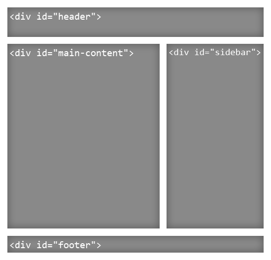
The issue with using <div> elements is that the element is meaningless. It doesn’t add semantic value or give context to what’s inside it.

With new elements such as <header>, <article>, <aside> and <footer>, the segmentation of the web page becomes more meaningful.
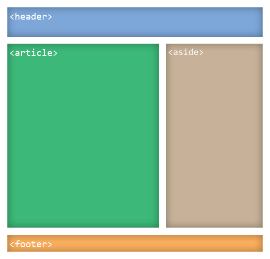
The benefit of this is that it will allow search engines to easily crawl the website, possibly skipping sections such as <footer> or <header> or using them for different indexing purposes (such as identifying copyright information or finding the site’s name or logo). Search engine indexing will thus be more efficient, meaningful and possibly more advanced.

HTML5 Elements That Can Affect Search Engine Indexing

Below are some new HTML5 elements that can have a direct impact on SEO.

<article>

You probably already know the importance content plays in your website’s search engine ranking.

The new <article> element is probably one of the most important additions to HTML5 when it comes to SEO. It allows you to indicate the main content of a web page.

One potential change to search engine indexing is that search engines may put more weight on the content inside the <article> element.

<section>

The <section> element is meant to indicate various sections on a page. The advantage is that each section can have its separate HTML heading. This can give search engines a better understanding of how the web page is segmented and structured. Search engines might be able to tease out the information hierarchy of the HTML document based on <section> tags.

<header>

The <header> element can give search engines a clue as to where the site name and logo is on a web page or where the primary navigation is (as this is often the place where navigation menus reside).

<footer>

In web design, a footer usually contains auxiliary information such as copyright information, licensing terms, privacy policy information, links to static pages, and links to social media profiles. This section could be used by search engine spiders to identify items related to copyright, terms of use, privacy policies and social media profiles.

Since <footer> contains auxiliary information, will its content be heavily discounted in search engine algorithms? Possibly.

<nav>

This new element can give search engine indexing algorithms clues to the information architecture of your website, (just like how sitemaps help them gain a better understanding of the website’s structure).

Link Types

One of the ways search engine rankings are determined is through hyperlinks in a web page. Search engines study links in a web page to see what web pages it points to as well as to see what web pages point to it.

Link types in HTML5 allow us to give our links better meaning. This gives search engines greater context for each link they encounter.

You are probably familiar with rel="nofollow", which was a non-standard rel value in HTML4 that many search engines use to identify links that the current web page doesn’t endorse. The new link types, which also use the rel attribute, works the same way.

New attribute values like rel="author" and rel="license" essentially allow us to describe our links better. The rel="prev" and rel="next" attributes, which is a link that points to another web page that is related to the current web page, can be used in circumstances where a blog post is broken up into several web pages.

Below is a table containing interesting link types for <a> elements that can influence search engine indexing in the future.

Link Type Description
alternate Links to an alternate presentation of the current web page
author Links to a web page related to the author of the web page
external Links pointing to external domains
help Links pointing to relevant help pages
license Links to licensing terms of the current document
next In a series of web pages, this links to the next web page
nofollow Indicates that the link is not endorsed by the site
prev In a series of web pages, this links to the previous web page

See a full list of link types here.

Improved Media Handling

The addition of native multimedia elements such as <audio> and <video> can mean increased interoperability with search engines. Google, for example, presents YouTube videos in search engine results. Google already indexes images in Google Images. We could see video and audio being treated like images indexed in Google Images.

Related Content

About the Author

Adam Heitzman is a web designer/developer with a strong background in SEO. He’s a Managing Partner at HigherVisbility, a Memphis-based internet marketing agency that offers a full range of marketing services ranging from SEO, Pay Per Click Marketing, Web Design and Development, and Social Media Marketing. Connect with HigherVisibility on Facebook and Twitter.


Google Launches New Drag and Drop AppsScript Interface Design Tool

21 Jun

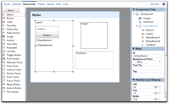
Apps Script logo Today Google announced a new tool for Apps Script, the scripting language for Google Apps: Apps Script GUI Builder. Apps Script lets admins automate tasks and extend the functionality Google Apps (see our coverage). The new GUI Builder tool will make it easier to build forms and other interactive elements into Google Apps.

You can find the new feature in the Apps Script Editor by clicking on File and then "Build a user interface."

Sponsor

GUI Builder

According to the announcement, you can use the interfaces built with GUI builder in "a Spreadsheets dialog, on a Sites page, or as a standalone web service at its own URL." Once an app is completed, it can be published to users through the Share menu or in a spread sheet using the sheet.show() method.

A limited subset of UiApp widgets are currently supported, but Google promises to expand the list soon.

Google notes that some users have created extremely complex applications using App Script in the past, so we expect to see even more use now.

Discuss


New York Times Reduces Character Limit of Readers’ Comments by 60%

21 Jun


The New York Times has announced it’s cutting the character limit on site comments from 5,000 to 2,000. In Twitter terms that’s like going from 36 tweets to slightly more than 14 — a 60% drop.

According to a note on the site’s homepage Monday, “The shorter length will allow for an improved experience for commenters and readers alike.”

The statement is good news for readers who roll their eyes when commenters hog the soapbox. But for Internet users who view commenting as an opportunity to see reactions that would have otherwise been limited to personal letter or email, it’s a step in the wrong direction. Though 14 tweets’ worth of discussion is still a fair amount, the change opens the door for further character cutting in the future.

The new limit was inspired by feedback from readers and Times employees, Aron Pilhofer, editor of interactive news, told The Wrap.

“5,000 [characters] is a lot,” Pilhofer said. “That’s not a comment, that’s an article.”

The shorter character limit will change community behavior. Readers who are used to writing essay-length comments may become more blunt as they aim to get to their point faster. Or they may work around the limit by breaking thoughts into multiple comments. Still, the shorter length will help Times moderators get through comments more quickly, allowing them to quell inappropriate threads with greater speed.

In late May the BBC dropped its limit to 400 characters — 20 characters less than is allowed for a Facebook status update.

The BBC’s character cut inspired Martin Belam, lead user experience and information architect at The Guardian, to survey the comment character counts of a range of U.S. and UK news media sites. Here’s a sample of his findings, updated to include The New York Times‘ recent change:

Website,Comment Character Count
BBC News400
Facebook (status update)420
YouTube500
Daily Mail1,000
The Huffington Post1,800*
The New York Times2,000
The Sun2,000
The Washington Post3,000
The Times (U.K.)3,000
The Guardian5,000
Facebook (comment)8,000
CNN10,000
Al Jazeera10,000
The Telegraph10,000

*The actual limit imposed on Huffington Post is 250 words, which equates to 1,820 characters.

What do you think of The Times‘ comment character cut? Will it truly make for a more inviting commenting space or is the site infringing on commenters’ rights? Sound off in the thread below — we won’t cut you off.

Mashable’s comment character limit: 16,384

More About: commenting, comments, community, new york times

For more Media coverage:


Building UI in Apps Script just got a whole lot easier!

21 Jun
One of the most useful parts of Apps Script is the Ui service. UiApp lets you build a professional looking web app in just a few lines of code. Some of our users have built incredibly complex apps this way, all hosted by Google and running in any modern browser.

For a lot of users, though, UiApp seems a bit daunting. It can be hard to visualize how small changes to your code affect the look of your app, or how adding a component in one place of the UI can shift the positioning of a component in another place. We know what that’s like - we write scripts too! That’s why we’re excited to unveil the new Apps Script GUI Builder.

Creating User Interfaces by Drag and Drop

The GUI Builder lets you construct user interfaces for your scripts quickly and easily. Simply draw the application, set some properties, and you are ready to go! You can use a GUI you’ve constructed this way inside a Spreadsheets dialog, on a Sites page, or as a standalone web service at its own URL.

To use what you’ve built with the GUI Builder inside an app, use this snippet of code:
function doGet() {
var app = UiApp.createApplication();
var component = app.loadComponent(“MyGui”);
app.add(component);
return app;
}

The new loadComponent method loads your GUI and makes it available to the app. Then you can add it to the app like any other component. You can also add it inside another panel, instead of at the root of the app.

GUI Elements created in the Builder behave exactly as if you had created them in code. If you want to reference them in a script, you can do so with the app.getElementById() method. Every element from the GUI will have an ID property (you’ll see it in the GUI Builder) and you can use those to reference components and change them. For example, in the code below we are changing the text color of a button to red.
var button = app.getElementById(“Button1”);
button.setStyleAttribute(“color”, “red”);

Extending the User Interface

Of course, you can do anything you like with these references, such as adding new widgets to panels, or removing widgets created in the builder. You can also use these references to add only part of a GUI to an app. Suppose that inside your GUI is an AbsolutePanel called “Panel1”. This code displays only that panel:
function doGet() {
var app = UiApp.createApplication();
var component = app.loadComponent(“MyGui”);
app.add(component.getElementById(“Pane1l”));
return app;
}

Advanced Features of GUI Builder

Finally, you can add a component to the same app multiple times. If you do this, however, you need to do something extra to make sure that the ID properties don’t collide. Since every element in the GUI has an ID from the builder, you have to specify a different prefix for each copy of the app that you load. This code adds a GUI from the GUI Builder to the same app twice:
 var component = 
app.add(app.loadComponent(“MyGui”), {prefix: “a”});
app.add(app.loadComponent(“MyGui”), {prefix: “b”});

You can reference individual elements from each copy using these prefixes. “Button1” becomes “aButton1”, and so on.

Publishing Applications to your users

Once you’ve built a GUI, you can can enable your app as a web service from the Share > Publish as Service menu in the script editor. That will give you a URL for your app, and you’ll see the GUI you built right away! You can also show a GUI inside a spreadsheet using the sheet.show() method.

The GUI Builder currently supports a subset of UiApp widgets, but you can expect that set to continue to grow until all widgets are supported. In the meantime, you can augment a GUI with code, as is demonstrated above. We’ll also continue to improve UiApp - we’ve been listening to your feedback, and we have a lot of excited things planned.

Getting Started

GUI Builder can be accessed from the Apps Script Editor. Click File > Build a user interface and start building interfaces.

You keep building great apps. We’ll keep making it easier.

Corey Goldfeder profile

Corey is a Google software engineer on the Apps Script Project, based in New York. He has previously worked on Similar Shape search for 3DWarehouse, and as a robotics researcher before joining Google.


Want to weigh in on this topic? Discuss on Buzz


Inbox Influence shows political contributions by the people in your email

21 Jun

While browser plugins like Rapportive tell you the social networks that people in your email belong to, Inbox Influence, from the Sunlight Foundation, uses their data from Influence Explorer, Transparency Data, and Party Time to show a different type of network in your inbox.

Inbox Influence is a new tool from the Sunlight Foundation that allows you to see the political contributions of the people and organizations that are mentioned in emails you receive. This easy-to-use tool can be used for researching influence background on corporate correspondence, adding context to newspaper headlines or discovering who is behind political fundraising solicitations.

Available for major browsers, the plugin is straightforward to use. Just install it like you would any other plugin, and then open Gmail in your browser. In the sidebar (where the ads usually are), you'll see contribution information for people in your inbox.

How much political influence is in your inbox?

[Inbox Influence]


Foursquare Surpasses 10 Million Users [INFOGRAPHIC]

20 Jun

Foursquare hit a big milestone over the weekend: It surpassed the 10 million user mark, becoming the first location-based social network to do so.

The startup, which launched in March 2009, posted the following infographic on its blog to celebrate the announcement Monday:


The infographic highlights, among other things:

  • Accelerated growth over time: It took the startup five months to get its first 100,000 users and roughly seven weeks to get its last million.
  • Its growing global reach: 358 million checkins have been made outside of the U.S.
  • The most popular checkin locations in the U.S.: Old Navy, Bank of America, 7-Eleven, Home Depot and Target all top the list.
  • A few fun facts: New York City Mayor Mike Bloomberg is also the Foursquare mayor of City Hall in NYC, and nearly 80,000 Foursquare mayors are ousted each day.

More About: foursquare, infographic

For more Startups coverage:


Google To FCC: Stop Letting The Voice Network Tail Wag The Internet Dog

20 Jun

The Internet carries nearly 160 times more traffic than voice networks in North America, yet many of the regulations and inter-carrier traffic fees are based on the quickly receding era when voice networks ruled. Google calls this the “Tail Wagging The Dog” in a letter to the FCC (embedded below) urging them not to impose antiquated per-minute voice traffic fees on IP networks. This is becoming an issue as IP voice traffic approaches that of traditional circuit-switched voice traffic. Google’s lawyers write in their letter:

Standalone voice traffic already is decreasing markedly relative to other forms of communications traffic; in fact, as depicted in the attached, the majority of voice traffic will be IP-based in just a few years. Accordingly, the FCC should not allow what amounts to the very small tail of legacy voice wireline services to wag the very large dog of all communications traffic exchange. In particular, per-minute voice traffic origination and termination charges are a persistent but unwelcome relic from the circuit-switched telephony era, and not best-suited for modern IP traffic and networks.

Google illustrates the changing nature of the network in a series of dramatic slides. Back in 1997, U.S. Internet traffic was only 3,300 terabytes per month, compared to 54,000 terabytes per month for the voice network. Three years later in 2000, voice traffic peaked at 66,000 terabytes per month, while Internet traffic had grown more than eightfold to 28,000 terabytes oer month.

By 2005, consumer IP traffic had reached 669,000 terabytes per month (with 2 terabytes of that being IP voice traffic), while voice traffic had shrunk to 48,000 terabytes per month.

In 2010, consumer IP traffic in North America completely dwarfed voice traffic with 5.7 terabytes per month versus 36,000 for the aging voice network. What’s more, IP voice traffic (Skype, Google Voice, etc.) accounted for 21,000 terabytes per month, or nearly 60 percent of what was going over the old switched network.

All of these networks, both data and voice, are going to IP networks. By 2015, Google estimates that consumer IP traffic in North America will more than triple again to 19.4 million terabytes per month, whereas the voice network will shrink further to 26,000 terabytes per month. And IP voice traffic will be almost as big at 21,000 terabytes per month (See top slide). The entire letter with all the slides is embedded below.


Could Kickstarter Be Better Than Government Grants for Artists?

17 Jun


Artist Molly Crabapple has just been given $17,000 to lock herself in a paper-covered room for five days and make art until the walls are covered.

But that sum didn’t come from the National Endowment for the Arts or a wealthy patron; Crabapple, like many in her subversive art-making shoes, turned to Kickstarter to find funding for the stunt.

In her Kickstarter proposal, she outlined the basic premise of the project, dubbed “Molly Crabapple’s Week in Hell.” Anyone who donated a dollar to the effort would get to watch a live stream of the whole five-day shebang. Anyone who pledged $10 or more would get to name an animal for inclusion in the artwork; donations of $20 or more would get an actual piece of the ink-filled paper sent to them. And backers who fronted $1,000 or more would get an absinthe-infused lunch with the artist.

Crabapple set a $4,500 fundraising goal; so far, the total raised is $17,000 — enough to make a short film about the project, which Crabapple says will debut online shortly after Crabapple’s Week in Hell wraps.


Why Art Needs the Web


This is a project that Crabapple says could never have existed without the Internet.

“I mean, before the Internet, I could have gotten a room and markers,” she told Mashable in an email. “But funding it? Pre-selling an entire body of yet-to-be-created-art in an alternative space? Even the logistics of finding the space and gathering my staff would have been infinitely harder offline”

Historically, the kinds of projects that do best on Kickstarter are actually film and music. Over the past two years, these two categories have accounted for more than $32.7 million in fundraising — more than every other category combined.

Crabapple says the Week in Hell is her third Kickstarter project. She did a Kickstarter proposal last year to help fund SketchyCon, a gathering of organizers for Crabapple’s unique life drawing events, Dr. Sketchy’s Anti Art School. And she did ker second Kickstarter project just a couple months ago to fund a stop-motion paper puppet film.

“An artist like me (ie a poxy illustrator who dropped out of school) has basically no chance with the grant system, and Kickstarter has been amazing for helping me bring my most ambitious projects to life,” said Crabapple.


Why Grants Don’t Work


While entrepreneurship projects such as the ill-fated Diaspora do exist on Kickstarter, they get relatively little attention on the site when compared to the overwhelming popularity of the arts. For artists who seek funds to further their dreams, the crowdfunding model of Kickstarter is something of a godsend. Gone are the lengthy, difficult grant application processes and the endless pitching to would-be patrons.

As Crabapple told us, “I once sat through the introductory session for applying for a Brooklyn Artists Grant. In between the forms filled out in 8-plicate, having to have a nonprofit organization sponsor you, and the fact that the grant was forbidden from covering the entire cost of the project, I figured it was probably just easier to earn the money.

“A Kickstarter is populist and fast, where a grant is elitist and foot-dragging.”

Crabapple said she was surprised, though, that the project got so much interest and so many pledges.

“Week in Hell is a deeply personal project, and there’s always a risk of those coming off as horrifically wanky. I posted it with some trepidation on Sunday at midnight, and woke up to find it funded. In my fever dreams I never would have imagined such an incredibly warm, generous response.”

Keep an eye out for the Week in Hell event, as well as subsequent photos and film, to take place from September 3 through 8 in a secret location in Manhattan.

Image courtesy of Facebook, TheLegion

More About: funding, fundraising, grants, kickstarter, Molly Crabapple, National Endowment for the arts, NEA, trending

For more Media coverage:


Apple will soon have enough cash to buy almost all their competitors

17 Jun

Apple will soon have enough cash to buy almost all their competitors

When Apple next announces their financial results, they should have close to $70 billion in the bank, which according to Asymco will be enough to buy all their manufacturing competitors with the exception of Samsung. That includes HTC, Nokia, RIM, LG, Motorola, and Sony Ericsson. (Google and Microsoft aren’t manufacturers, they’re platform vendors.)

The more remarkable thing is that as market values of phone vendors continue to decline, Apple’s cash will continue to grow dramatically. Indeed, a time may soon come when Apple’s cash will be worth more than the entire phone industry.

I’ll say it again — North Carolina isn’t a data center, it’s a money bin.

[Asymco]

Apple will soon have enough cash to buy almost all their competitors is a story by TiPb. This feed is sponsored by The iPhone Blog Store.

TiPb - The #1 iPhone, iPad, and iPod touch Blog


Screen Resolution ≠ Browser Window

17 Jun

When I tweeted this and then followed up with this, I got comments like this. That comment has a perfectly valid point.

We often talk about screen resolution, which is not the relevant statistic when thinking about what space our website's visitors have available. The relevant statistic is browser window size. So why do we talk about screen resolution so much? Well probably because in the most popular analytics software in the world, Google Analytics, it's the only data you get.

(The Google Analytics team is aware of this)

And so, what are we to do? Well, start measuring browser size, for one.

But first, a word.

What if we figured out all kinds of data about our visitors browser sizes. What is to be done with this data once we have it? If @beep has taught us anything, it's that we can and should accomodate to browsers of any shape and size.

But still, having information is never a bad thing. Smarter men and women than me may see things I do not and think of reasonable actions to take based on this data.

Getting the Data

Since Google Analytics can't currently help us, we'll need to run some JavaScript on the page ourselves to get the data. jQuery makes it easy to measure sizes as well as make and Ajax call to POST the data to a script that can save it:

$.ajax({
  type: "POST",
  url: "/savedata.php",
  data: {
    width        : $(window).width(),
    height       : $(window).height(),
    screen_width : screen.width,
    screen_height: screen.height
  }
});

Now we just need that script savedata.php to be ready to accept and save that data. First we need a database, so here's a simple structure for one:

I'm no MYSQL expert, but this is what exporting the structure from phpMyAdmin gave me:

CREATE TABLE `data` (
  `id` int(11) NOT NULL auto_increment,
  `width` int(11) NOT NULL,
  `height` int(11) NOT NULL,
  `screen_width` int(11) NOT NULL,
  `screen_height` int(11) NOT NULL,
  KEY `id` (`id`)
) ENGINE=MyISAM AUTO_INCREMENT=72141 DEFAULT CHARSET=utf8 AUTO_INCREMENT=72141 ;

And now my wicked primitive script for saving the POSTs:

<?php

	$dbhost = 'localhost';
	$dbuser = 'db_user_name';
	$dbpass = 'db_password';

	$conn = mysql_connect($dbhost, $dbuser, $dbpass) or die ('Error connecting to mysql');

	$dbname = 'db_name';
	mysql_select_db($dbname);

	$width         = mysql_real_escape_string($_POST['width']);
	$height        = mysql_real_escape_string($_POST['height']);
	$screen_width  = mysql_real_escape_string($_POST['screen_width']);
	$screen_height = mysql_real_escape_string($_POST['screen_height']);

	$sql = "INSERT INTO data ( width,  height,  screen_width,  screen_height)
	      VALUES           ($width, $height, $screen_width, $screen_height)";

	if (!mysql_query($sql, $conn)) {
		die("Error:" . mysql_error());
	}

	echo "1 Record Added";

	mysql_close($conn);

?>

That's what I did on CSS-Tricks for one day. If you'd like, here's the complete data I collected as SQL.

Looking At The Results

Remember: ALL of this data was collected from css-tricks.com. So it's a bunch of designer nerds, probably. It's only relevant to this site and sites with very similar audiences.

First, the borin' ol screen resolution data. I got this by querying 500 random samples of data and laying div's of that size on top of each other with as light of gray as I could make. Incidently, its rgba(0,0,0,0.004), because rgba(0,0,0,0.003) is pure white (weird).

Notice the rather hard lines. Monitors only come in so many sizes. Makes sense. Here's what happens when we do the same thing with browser window sizes though:

Much more blurry. Also makes sense. Even as I write this my browser is at some very arbitrary sizing, probably about 80% of my screen resolution. Click those images above to see them bigger. You'll notice that whatever visible hard edges there are in the browser size version, they are exactly 20px narrower than the screen size counterpart. Interesting.

If I tint the screen sizes red and the browser sizes green and put them on top of each other, this is what we get:

Notice on the outside edges the tint stays red. Not a lot of people who have extremely wide monitors have their browser window open that wide. I know I don't. Let's look at the stats for "full screen" browsers. How many people browser full screen, or with their browser window "maximized" so to speak. Well if you query only for entries where the window and the screen resolution are exactly the same, very few, less than 1%, but it get's interesting:

Totally full screen0.85%
Within 50px of full screen1.06%
Within 100px of full screen9.67%
Within 200px of full screen61.18%

So very few people browse full screen, but the majority of people browse pretty close to full screen. As speculation, it's likely the Windows folks are the ones browsing full screen, as that's much more natural behavior on that operating system. But now "full screen" is a big deal in OS X Lion, maybe that will start effecting this stuff.

If we put this stuff to a spread and use the entire data set, here's one way to break it down:

Width RangeBrowser WindowScreen Resolution
0px - 500px1.13%1.02%
501px - 800px2.01%1.06%
801px - 1000px2.84%0.07%
1001px - 1200px14.91%6.86%
1201px - 1400px40.65%35.57%
1401px - 1600px17.38%17.17%
1601px - 2000px20.41%34.34%
2000px+0.66%3.91%

So where is mobile in all this? Despite reports of massive growth in mobile browsing, which I do not doubt, CSS Tricks has very little mobile traffic.

Let's wrap it up with some quick hits:

  • The most popular screen resolution is 1680 x 1050 with almost 13% of visits having a monitor of that size.
  • Predictably, there is no one browser window size that is far above all others, but leading the pack is 1349 x 667 at 0.75% of visits.
  • The most popular screen resolution ratio is 16:10 with 46% of visits having that. Maybe because a lot of video is 16:9 and monitor makers wanted people to watch that but still have room for some OS chrome? 16:9 is next with 29%, 5:4 with 12%, and 4:3 with 8%.
  • All of those ratios are wider than tall. Turns out only 2% of visitors have screens that are taller than wide (or at least that report that way).
  • Actual browser windows also tend to be wider than tall, with only 3% of visits having dimensions that are taller than wide.
  • Average number of pixels per screen = 1,539,515
  • Average screen resolution = 1526 x 967
  • Average browser window size = 1366 x 784

Huge Thanks

To Jamie Bicknell of Rentedsmile Web Design for helping me wrassle together the MYSQL queries and PHP needed to do anything useful with the data.


Advertise here with BSA

Screen Resolution ≠ Browser Window is a post from CSS-Tricks