Maybe it’s their gooeyness or their unsettling curvature, but these sculptures carved from ripe bananas by Japanese artist y_yamaden are wonderfully creepy.
via Geekologie
photos by y_yamaden
Maybe it’s their gooeyness or their unsettling curvature, but these sculptures carved from ripe bananas by Japanese artist y_yamaden are wonderfully creepy.
via Geekologie
photos by y_yamaden
The web browser is probably one of the most frequently used applications on a person’s computer. For designers and developers, a browser theme can be canvas that provides hours of exposure to the artist or brand willing to create a theme for their fan base.
But with such an extreme landscape orientation and a range of functional obstructions, designing browser themes is a creative endeavor with plenty of pitfalls and gotchas.
There are many things to consider when approaching a new theme — from avoiding copyrighted images to achieving designs that work within the confines of a particular browser.
This guide contains some crucial tips and general guidelines for designing custom browser themes for Chrome, Firefox and Internet Explorer.
 Phoenix Suns browser theme is well balanced with imagery.
The trickiest part of designing browser themes is the variability of the environment. Keeping designs flexible enough to display well in Firefox and Internet Explorer across Linux, Mac and PC, and across different versions of the browsers is essential. For example, Firefox 4 and IE show part of the background graphics in the title bar while Firefox 3.6 and below do not.
Firefox offers the greatest design flexibility especially in the browser chrome, which is the area where the navigation button and URL address bar is located as well as the areas outside of the browser viewport.
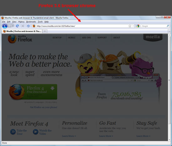 Firefox 3.6 browser chrome in Windows OS.
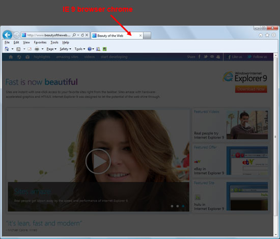 IE 9 browser in Windows OS. Compare the differences with the one above.
When we design a cross-browser theme, Firefox is the baseline from which the other designs evolve.
Below, you’ll see the Indianapolis Colts browser theme shows the diminishing design real estate from Firefox to IE to Chrome.
 Colts Firefox browser theme.
 Colts IE browser theme.
 Colts Chrome browser theme.
The vertical footprint of the design is kept to a minimum. While 200px tall graphics are required for Firefox, the reality is that only the top 85 pixels are usually visible.
For Internet Explorer, the vertical dimension is locked at 50 pixels; and for Chrome, even less.
Designs that rely on the user being able to see the full image may not work as the top or bottom chrome will not always be visible.
The horizontal size of the image has its special considerations as well. As a browser window is enlarged horizontally, the background images will shift. Designers must keep this in mind, as a browser opened at 500 pixels compared to a browser opened at 1024 pixels will have completely different looks from the background image perspective.
 Dimension guidelines for browser themes in our company. The total width of the image is 3000 pixels.
Using images that span the full background or a single element that occupies an entire space is one method to solve the problem, but may also lead to an overly large file size (and thus, a slower-performing theme).
A method to ensure a fully styled background and lower file sizes entails using screened elements, tiled textures or partial images.
These patterned backgrounds can provide a simple elegance, reduced file sizes, greater flexibility, and potentially a more successful design.
Choosing the right file format for your browser theme design is a similar process to deciding what format to use in web designs.
If the images need transparency, use .gif or .png format.
If they’re not transparent, use .jpg as the file format.
Animated components of the design are also available for Firefox and IE. This can be a nice enhancement (for example, in adding twinkling lights to a Christmas tree browser theme), but can easily be overdone. Keep animation to a minimum as it can be distracting to the user.
Firefox allows for animated GIFs or PNGs. IE can only display animated GIFs.
Designers must bear in mind that there are specific elements that need to be visible when creating any design.
For example, in Microsoft Windows, the controls are in the upper right of browser. Chrome, Firefox and IE all have visual differences in tab opacity depending on if a tab is in focus or in background.
The visibility of the design behind navigation controls, address bar, and search boxes also varies across browsers and operating systems.
 Old Comic browser theme is a fun concept with lots of legibility issues.
Remember: the browser is used for hours a day and the user will have to look at the browser theme design every time they fire up their web browser.
Keeping the design pleasing to the eye is a vital criterion to avoiding visual fatigue and a lost user.
Oftentimes, when designing a browser theme, the browser chrome should be the focus because that’s what the user is exposed to for hours at a time.
The "new tab" experience — the event where the user opens a blank tab or opens another browser window — however, also creates theme opportunities within the browser.
In the case of Google Chrome, this is the area least encumbered by restrictions. Rather than a blank page waiting for the user’s next URL, the new tab image can bring a design element to this area. An image is used in Chrome, and HTML in Firefox.
File size is again a consideration to keep the tab loading fast. The browser tab, more and more, has become increasingly functional; it’s become a holding place for new features like search boxes, thumbnail images, and dynamic counts (such as how many unread emails you have in Gmail).
We advise you to put the strength of your design at the bottom so the chance of it being obstructed is limited.
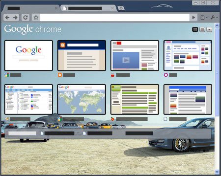 Porsche Panamera browser theme shows off the "new tab" experience.
Now that you’re familiar with some general design considerations for creating browser themes, let’s take a look at some things you should avoid.
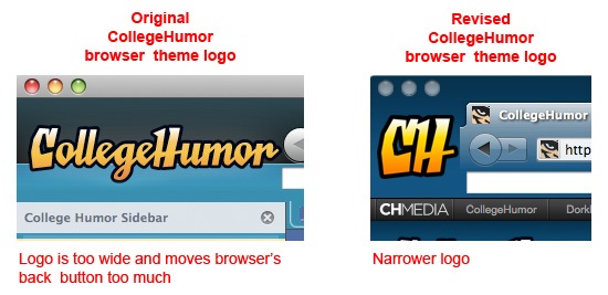
Firefox allows insertion of a logo to the left of the navigation buttons. Your logo can actually shift the entire browser navigational UI to the right.
Users, however, have a strong preference for the browser’s back button to stay where it is — call it "muscle memory" — and it creates frustration if the browser theme moves it too far from its original position. Keep logo width to a minimum.
Designs that rely on the exact placement of vertical elements must be eliminated from consideration because of cross-browser platform variations. For example, background graphical elements can shift upward in some instances and create a conflict between the design and the browser layout.
 Brown University browser theme needed a refresh to fix the misalignment in Firefox 4 created by the horizontal line.
The browser theme offers you a great place to engage your online audience. For companies, it extends their brand to an application that’s widely used.
For designers, browser themes are a challenging place to show off design skills and their creativity in overcoming restrictions imposed by the environment.
Are you interested in getting started building your own custom browser theme? It’s easy to get started. Here are some resources to get you up and running.
 Patrick Murphy is the founder and CEO of BrandThunder(BT). With its extreme makeovers for Internet browsers, BT creates persistent engagement between major brands and their online consumers. BT’s new platform, BT:Engage currently in private beta, gives everyone the tools to build and share their own browser themes.
This showcase rounds up a collection of the most inspiring and outstanding examples of responsive web design. These websites not only look great at full scale monitor resolution, but are designed to gracefully scale according to the user’s screen size. Resize you browser, view the site on a smartphone, tablet or netbook and you’ll see the same design in a range of well presented formats.
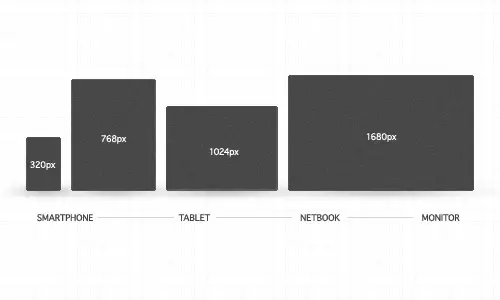
Websites are no longer viewed only on a computer monitor. Smartphones, tablets and netbooks throw a range of resolutions and different screen sizes into the mix for designers to now worry about. The idea of catering for various resolutions isn’t anything new. Back in the days of table based designs designers either chose the fluid or static route. Today’s responsive websites take a similar approach by using fluid widths in percentages and ems, but go a step further by using scalable images and adjustable layouts depending on the browser size.
To achieve this ‘scalability’, CSS media queries are used to apply different page styling according to certain parameters, such as min-width and orientation. The first step is to create a mobile version, but you could go on to customise your design for a range of resolutions.
Ready for some examples? Here’s a roundup of 50 of the most outstanding examples of responsive web designs. Each one is displayed with a preview of both the full size website and an example of a small resolution, but to get the full experience be sure to visit the live site and play around with it yourself.
HTML5 is certainly here to stay, from a numerous list of articles, events and buzz about this latest revision of the HTML standard. Some websites using HTML5 proudly show the official logo and state the sentence “support the future nowâ€. So to support all this buzz and the technology we decided to gather a new list showcasing websites using HTML5.
jStat is a JavaScript library which enables you to perform advanced statistical operations without the need of a dedicated statistical language.
Simply, it focuses on being a real JavaScript-based alternative for languages like R and MATLAB.
The library is standalone, however, for the plotting functionality, it requires jQuery, jQuery UI and jQuery-flot plugin.
Special Downloads:
Ajaxed Add-To-Basket Scenarios With jQuery And PHP
Free Admin Template For Web Applications
jQuery Dynamic Drag’n Drop
ScheduledTweets
Advertisements:
Professional XHTML Admin Template ($15 Discount With The Code: WRD.)
Psd to Xhtml
SSLmatic – Cheap SSL Certificates (from $19.99/year)
Node.js is an amazing new technology, but, unless you’re specifically a JavaScript developer, the process of becoming acquainted with it can quickly become a bit overwhelming. But that’s why we’re here! If you want to really learn how to use Node.js, this set of articles and screencasts will do the trick.
Hi guys, my name is Christopher Roach, and I’ll be your guide throughout this series of screencasts on Node.js. In this series we’ll be using Node to create a simple blog engine, like the one made famous in the popular Ruby on Rails introductory video. The goal of this series is to give you, the viewer, a real feel for how Node works so that, even when working with any of the popular web development frameworks out there, such as Express or Getty, you’ll feel comfortable enough with the inner workings of Node to be able to drop down into its source and make changes to suit your needs as necessary.
Before we get into some of the details of what Node is and why you’d want to use it, I’d like to go ahead and get us started with the installation of Node, since, though super easy, it can take some time.
Node is still very young, and is in active development, so it’s best to install from the source.
Node is still very young, and is in active development, so it’s best to install from the source. That said, Node has very few dependencies, and so compilation is nowhere near as complicated as other projects you may have fought with in the past. To get the code, visit the Node.js website . If you scroll down the page to the download section, you’ll find a couple of choices. If you have Git installed, you can do a clone of the repository and install from there. Otherwise, there’s a link to a tarball that you can download instead. In this video, I’ll keep things simple, and install from the tarball.
While this is downloading, now is a good time to mention that efforts are ongoing to provide a port of Node for Windows, and there are instructions for installing on Windows for Cygwin or MinGW. I believe there are even some binary packages out there that you can install from, but at the time of this writing, it’s primary environment is Unix and Linux based platforms. If you’re on a Windows machine, you can click on the link for build instructions and follow the set of instructions there for a Windows installation or you can install a version of Linux, such as Ubuntu, and install Node there.
When it’s finished download, simply untar and unzip the package with tar -xvf and cd into the directory it created. First we need to do a ./configure, then make, and finally make install. That’s going to take a little time to build, so I’ll let that run in the background and take this opportunity to talk a bit more about Node, and why it’s causing such a stir in the web development community.
Node is JavaScript on the server.
So, if this article and video is your first introduction to Node, you’re probably wondering just what it is and what makes it worth learning when there are already so many other web development frameworks out there to choose from. Well, for starters, one reason you should care is that Node is JavaScript on the server, and let’s face it, if you work on the web, love it or hate it, you’re going to have to work with JavaScript at some point. Using JavaScript as your backend language as well as for the client-side means a whole lot less context switching for your brain.
Oh, I know what you’re thinking: “so Node is JavaScript on the server, well that’s great, but there’ve been other JavaScript on the server attempts in the past that have basically just fizzled.â€
Well, the short answer is: Node is server-side JavaScript finally done right. Where other attempts have basically been ports of traditional MVC web frameworks to the JavaScript language, Node is something entirely different. According to its website, Node is evented I/O for V8 JavaScript, but what exactly does that mean? Let’s start with V8.
V8 is Google’s super fast JavaScript implementation that’s used in their Chrome browser.
Through some really ingenious application of “Just in Time†compilation, V8 is able to achieve speeds for JavaScript that make users of other dynamic languages, such as Python and Ruby, green with envy. Take a look at some of the benchmarks and I believe you’ll be amazed. V8 JavaScript is up there with many JVM-based languages such as Clojure and Java and compiled languages, such as Go in many cases.
JavaScript’s ability to pass around closures makes event-based programming dead simple.
The other key phrase in that statement is evented I/O. This one is the biggie. When it comes to creating a web server you basically have two choices to make when dealing with multiple concurrent connection requests. The first, which is the more traditional route taken by web servers such as Apache, is to use threads to handle incoming connection requests. The other method, the one taken by Node and some extremely fast modern servers such as Nginx and Thin, is to use a single non-blocking thread with an event loop. This is where the decision to use JavaScript really shines, since JavaScript was designed to be used in a single threaded event loop-based environment: the browser. JavaScript’s ability to pass around closures makes event-based programming dead simple. You basically just call a function to perform some type of I/O and pass it a callback function and JavaScript automatically creates a closure, making sure that the correct state is preserved even after the calling function has long since gone out of scope. But this is all just technical jargon and I’m sure you’re dying to see some code in action. I’m going to fast forward a bit to the end of this install, so we can start playing around with our brand new, freshly minted copy of Node.
So, it looks like my build has finally finished; I want to quickly check and make sure that everything went well with the install. To do so, simply run node --version from the command line, and you should see some indication that you’re running the latest version of Node which, at this time, is version 0.4.5. If you see a version print out then you can rest assured that everything went swimmingly and you’re ready to write your first Node app. So, let’s cd back into our home directory and create a new folder to hold all of our work during the course of this series of screencasts. Here I’m simply going to call mine ‘blog‘ and let’s cd into that to get started.
Unlike other frameworks, Node is not strictly for web development. In fact, you can think of Node as a framework for server development of any kind. With Node you can build an IRC server, a chat server, or, as we’ll see in this set of tutorials, an http server. So since we can’t have an introductory tutorial without the obligatory ‘Hello World‘ application, we’ll begin with that.
Let’s create a new file called app.js. Now Node comes with a handfull of libraries to make the development of event-based servers easy. To use one of the available libraries, you simply include its module using the require function. The require function will return an object representing the module that you pass into it and you can capture that object in a variable. This effectively creates a namespace for the functionality of any required module. For the creation of an HTTP server, Node provides the http library. So let’s go ahead and require that now and assign the returned object to the http variable.
Next, we’ll need to actually create our server. The http library provides a function called createServer that takes a callback function and returns a new server object.
The callback function is what Node calls a listener function and it is called by the server whenever a new request comes in.
Whenever an HTTP request is made, the listener function will be called and objects representing the HTTP request and response will be passed into the function. We can then use the response object inside of our listener function to send a response back to the browser. To do so, we’ll first need to write the appropriate HTTP headers, so let’s call the writeHead function on our response object.
The writeHead function takes a couple of arguments. The first is an integer value representing the status code of the request which for us will be 200, in other words, OK. The second value is an object containing all of the response headers that we’d like to set. In this example, we’ll simply be setting the Content-type to ‘text/plain’ to send back plain text.
Once we’ve set the headers, we can send the data. To do that, you’ll call the write function and pass in the data that you wish to send. Here, let’s call the write function on our response object and pass in the string “Hello World“.
To actually send the response, we need to signal to the server that we’re done writing the body of our response; we can do that by calling response.end. The end function also allows us to pass in data as well, so we can shorten up our server code by getting rid of the call to the write function that we made earlier and instead passing in the string “Hello World†to the end function, like so.
Now that we’ve created our server, we need to set it up to listen for new requests. That’s easy enough to do: call the listen function on our server object and pass in a port number for it to listen on; in this case I’ll be using port 8000. The listen function also takes an optional second parameter which is the hostname URL, but since we’re just running this locally, we can safely skip that parameter for now.
Finally, let’s print out a message to let us know that our server is running and on what port it’s listening for new requests. You can do that by calling console.log, just like we would in the browser, and passing in the string “Listening on http://127.0.0.1:8000“. There we go, now let’s run our app by calling node and passing to it the name of the file we want it to execute.
Before we bring this first article and video in the series to a close, let’s flip back over to the terminal and quickly take a look at Node’s REPL.
A REPL, for those unfamiliar with the acronym, stands for Read-Eval-Print-Loop which is nothing more than a simple program that accepts commands, evaluates them, and prints their results.
It’s essentially an interactive prompt that allows you to do pretty much anything that you can do with regular Node, but without all the overhead of creating a separate file, and it’s great for experimentation, so let’s play around a bit with the REPL and learn a bit more about Node.
We’ll first need to stop our server application by hitting Ctrl-C. Then run node again, this time, however, without a filename. Running node without any arguments will bring up the REPL, as we can see here by the change in the prompt. The REPL is very simple: basically you can write JavaScript code and see the evaluation of that code. Despite its simplicity, though, the REPL does have few commands that can come in handy and you can get a look at each of these by calling the .help command at the prompt. Here (refer to screencast) we see a list of four commands, the first of which is the .break command. If you are writing some code that spans several lines and you find that you’ve made some type of mistake, and need to break out for whatever reason, the .break command can be used to do so. Let’s try it out now…
I’m going to create a function here and I’ll just call it foo and open the function body and then hit enter. Notice that, on the next line, rather than seeing the typical greater than symbol, we now see a set of three dots, or an ellipsis. This is Node’s way of indicating to us that we have not yet finished the command on the previous line and that Node is still expecting more from us before it evaluates the code that we’ve typed in. So, let’s go ahead and add a line of code now: we’ll do console.log and we’ll print out the name of the function. Let’s now hit enter, and, again, notice that the ellipsis character is being displayed once more. Node is still expecting us to finish the function at some point. Now let’s assume that I’ve made a mistake and I just want to get back to a normal prompt. If, I continue to hit enter, Node continues displaying the ellipsis character. But, if I call the .break command, Node will break us out of the current command and takes us back to the normal prompt.
Next, we have the .clear command. This one will clear our current context. So if you’ve cluttered up the environment with the creation of several variables and functions and you want a clean slate, simply run the .clear command and Voila, everything magically disappears.
.exit and .helpFinally, there’s the .exit and .help commands. The .help command is fairly obvious, since it’s the command we used to see the list of commands in the first place. The .exit command is equally obvious: you essentially just call it to exit the REPL, like so.
So, that pretty much covers all of the functionality that the REPL provides outside of the evaluation of the code you enter. But before we leave the REPL completely, I’d like to take this opportunity to discuss some differences and similarities between JavaScript in the browser and Node’s flavor of JavaScript. So let’s run Node again and jump back into the REPL.
The first difference between client-side JavaScript and Node is that, in the browser, any function or variable created outside of a function or object is bound to the global scope and available everywhere. In Node though, this is not true. Every file, and even the REPL, has its own module level scope to which all global declarations belong. We’ll see this put to use later in the series when we discuss modules and create a few of our own. But for now, you can see the actual module object for the REPL by typing module at the prompt. Notice that there is a prompt attribute buried a few levels deep in our module object? This controls the prompt that we see when in the REPL. Let’s just change that to something slightly different and see what happens. There now, we have a brand new prompt.
Another difference between Node JavaScript and browser JavaScript is that in the browser, you have a global window object that essentially ties you to the browser environment.
In Node, there is no browser, and, hence, no such thing as a window object. Node does however have a counterpart that hooks you into the operating environment that is the process object which we can see by simply typing process into the REPL. Here you’ll find several useful functions and information such as the list of environment variables.
One similarity that is important to mention here is the setTimeout function. If you’re familiar with client-side JavaScript, you’ve no doubt used this function a time or two. It basically let’s you setup a function to be called at a later time. Let’s go ahead and try that out now.
> function sayHello(seconds) {
...	console.log('Hello ');
...	  setTimeout(function() {
...     console.log('World');
...   }, seconds * 1000);
... }
This will create a function that when called, prints out the string ‘Hello’ and then a few seconds later prints the string ‘World’. Let’s execute the function now to see it in action.
> sayHello(2);
There are a couple of important ideas to take notice of here. First, Ryan Dahl, the creator of Node, has done his best to make the environment as familiar as possible to anyone with client-side JavaScript experience. So the use of names such as setTimeout and setInterval rather than sleep and repeat, for example, was a conscious decision to make the server-side environment match, wherever it makes sense, the browser environment.
The second concept that I want you to be aware of is the really important one. Notice that, when we call sayHello, right after printing the first string, control is immediately given back to the REPL. In the time between when the first string is printed and the callback function executed, you can continue to do anything you want at the REPL’s prompt. This is due to the event-based nature of Node. In Node, it’s near impossible to call any function that blocks for any reason and this holds true for the setTimeout function. Lets call our sayHello function again, however, this time let’s pass in a slightly longer timeout interval to give us enough time to play around a bit and prove our point. I believe 10 seconds should do the trick.
There we see the first string. Let’s go ahead and run some code of our own, how about 2 + 2. Great, we see that the answer is 4 and… there’s our second string being printed out now.
So that brings us to the close of the first episode in this series. I hope this has been a fairly informative introduction to Node for you, and I hope I’ve done a decent enough job of explaining why it’s so exciting, what it has to offer, and just how fun and simple it is to use. In the next episode, we’ll actually start writing some of the code for our blog engine; so I hope you’ll all join me again when things get a bit more hands on. See you then!
Majestic SEO has long had great link data, but their biggest issue has been usability. They sorta built with the approach of "let's give them everything" as a default, and then allowed advanced filtering to be done over the top to generate custom reports.
For advanced users this type of set up is ideal, because you are able to slice and dice it in many ways on your own terms. It allows you to spot nepotistic networks, pinpoint strategies quickly, and generally just give you a good look at what is going on in ways that wouldn't be able to do if you couldn't get all the data in a table. There are so many valuable edge case uses that can't practically be put in a single interface while keeping usability high for the average use.
But for people newer to the SEO game & those looking for a quick source of data the level of options can be a bit overwhelming when compared against something like Open Site Explorer. A parallel analogy would be that when I want to spot check rankings real quick I rely on our rank checker, but if you want to have a variety of in-depth historical views then something like Advanced Web Ranking can be a quite helpful tool.
In an attempt to improve the "at a glance" style functionality Majestic SEO announced their new site explorer, which puts more data at your fingertips without requiring you to open up an Excel spreadsheet:
How much can you use the Majestic Site Explorer?
The system is designed for silver users and above. Silver subscribers can query upto 10 different domains an HOUR. Gold subscribers can query upto 30 different domains an hour and Platinum subscribers can query upto 100 different domains an hour. All levels are subject to fair use terms.
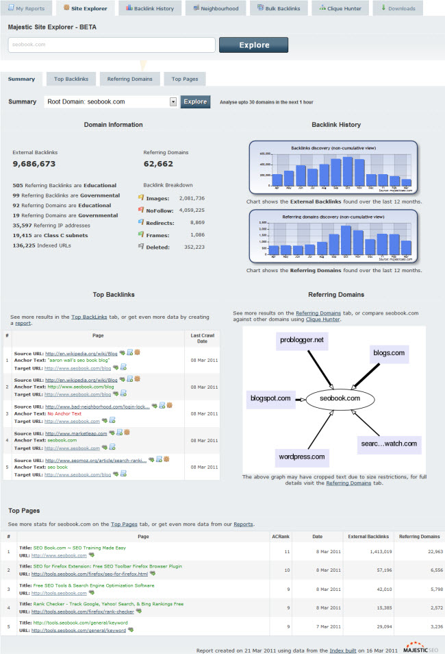
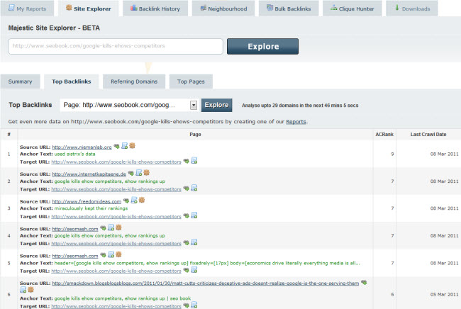
These allow you to view data on a sitewide basis, at the subdomain level, or drill down to individual pages.
Here is an example of a site level report
and if you wanted data down to the URL level, here is an overview of a top few links (note that the report goes on for numerous pages with data)
This update helped Majestic SEO close the gap a bit with Open Site Explorer, but a couple more things they may want to consider doing are
Those features are available via their advanced reports, but making it easier to do some of that stuff in the "at a glance" interface would allow Majestic SEO to provide as a best in breed solution for both the "at a glance" function and the "in-depth deep research" options.
Majestic SEO also announced their new fresh index, which allows you to view fresh link data as recently as within the past day. It doesn't require waiting for a monthly update or such, but offers link data right away. To help spread the word & give everyone a chance to see some of the new features they gave us free discount voucher codes to give out to get a 20% discount on your first month at any level.
If you have any questions about how Majestic SEO works you can sign up & register your own site, which allows you to access many of their features free. As a comparison SEOmoz (which offers Open Site Explorer) is also running a free 1-month trial right now.
Originally posted at Deep Tech