RSS
 

Stephen Colbert Testifies in Congress, in Character

24 Sep
Stephen Colbert testified in a House Judiciary Subcommittee hearing on immigrant farm workers this morning (video here, not embeddable). The hearing got off to an awkward start when Democratic Rep. John Conyers asked the comedian to leave the hearing. Colbert responded, seemingly concerned, that he had only agreed to testify at the request of subcommittee Chairwoman Zoe Lofgren, who then asked him to stay.

Colbert's written testimony, submitted before the hearing, appeared straightforward. He described inviting Arturo Rodriguez, president of United Farm Workers of America, onto his Comedy Central show in July. Rodriguez told Colbert about the UFW's "Take Our Jobs" campaign, which encourages unemployed Americans to try farm labor. Colbert took him up on the offer, spending a day picking beans and packing corn in upstate New York. Lofgren participated in the program with him, prompting her to invite him to testify about his experience.

Colbert joined Rodriguez and two other panelists at today's hearing. Unlike the other panelists, his testimony departed significantly from his written statement. He stayed entirely in character as a conservative talk show host, telling the subcommittee that he was happy to use his "celebrity" and "vast experience spending one day as a migrant farm worker" to draw attention to the issue of farm work -- "I'm hoping my star power can bump this hearing all the way up to CSPAN 1."

A sampling of his satiric offerings:

-"The obvious answer [to the agricultural labor shortage] is for all of us to stop eating fruits and vegetables. And if you look at the recent obesity statistics, you'll see that many Americans have already started. Unfortunately, my gastroenterologist has informed me there is a need for roughage ... Therefore, I am submitting the video of my colonoscopy to the congressional record."

-"I don't want a tomato picked by a Mexican. I want it picked by an American, sliced by a Guatemalan, and served by a Venezuelan, in a spa, where a Chilean gives me a Brazilian."

-Not many Americans have taken Rodriguez up on his offer of farm work, but that may change soon "as I understand many Democrats may be looking for work come November."

-"I'm not a fan of the government doing anything. But I've got to ask, why isn't the government doing anything? ... Like most members of Congress, I haven't read the bill."

During questioning, subcommittee members had some trouble navigating Colbert's faux-serious turf. Conyers, who'd asked Colbert to leave at the beginning of the hearing, pointed out that Colbert's spoken testimony differed significantly from his written one.

Rep. Lamar Smith, a Republican, told Colbert that he would take his jab at congresspeople not reading bills as an implicit endorsement of GOP House members' "Pledge to America," which demands -- among other things -- a 72-hour window to give representatives time to read bills before voting on them. Colbert confirmed this assumption with his always straight face, saying, "I endorse all Republican policies without question."

Smith then asked, "I know you're an expert comedian, an expert entertainer ... but would you call yourself an expert witness?" Colbert cited Rep. Lofgren's invitation to him following their day working together in the fields. Smith asked if one day of farm work made him an expert, to which Colbert replied, "I believe one day of me studying anything makes me an expert."

At the end of the hearing, however, when responding to questions from Democratic Rep. Judy Chu, Colbert seemed close to breaking character. When Chu asked him why he cared about this issue, of all issues, he paused for a long moment before replying, and did not offer any sort of satiric qualifier:

I like talking about people who don't have any power. It seems like some of the least powerful people in the U.S. are those who come to the U.S. and do our work and don't have any rights when they're here. And then we ask them to leave. ... I don't want to take anyone's hardship away from them or diminish [the widespread effects of the recession] ... but migrant workers suffer and have no rights.


Email this Article Add to digg Add to Reddit Add to Twitter Add to del.icio.us Add to StumbleUpon Add to Facebook

United States - Take Our Jobs - John Conyers - Comedy Central - Migrant worker


Verbatim USB Paperclip is ‘Literally Weightless’

23 Sep

Verbatims’s lightweight Clip-it USB drive is certainly handy: when not feeding files to your computer, it can hold together those same files when printed unthinkingly onto pieces of precious paper. The cute Clip-its come in 2GB and 4GB sizes, and a range of colors that would make a packet of jellybeans jealous.

But most interesting to us tech nerds is that Verbatim seems to have solved the problems of gravity. Hans-Christoph Kaiser, Verbatim’s Business Development Manager: “it weighs literally nothing, so it will not cause extra postal charges.” [emphasis added].

So there you have it. The Clip-it USB drive is the world’s first weightless object, a scientific breakthrough that will doubtless change the world. This amazing discovery also proves the rule that inventors seldom see the potential of their own inventions. Seriously, Mr. Kaiser. Is avoiding “extra postal charges” the best application you can think of for your revolutionary anti-gravity material?

Store ‘n’ Go Clip-it USB Drive [Verbatim via OhGizmo]


Change Any Web Page’s Design Instantly with Chrome Extension Stylebot

21 Sep


One of our favorite web browsers just got a cool new tool in the form of Stylebot, a new Chrome extension that allows you to access and modify the CSS for any web page from within the browser.

That’s right — users get a completely customized design experience for any page they choose. The changes they make can be saved for later use and synced across multiple devices.

This is great news for you design enthusiasts as well as for end users with specific needs and wants for their browsing experience. For example, the extension makes web pages with small fonts more accessible by allowing users to increase the font size, and it can make browsing the web less commercial by removing ads.

Stylebot generates a sidebar full of basic and advanced CSS options that allow the end user to manipulate how content is displayed. This tool is simple enough to be used by a moderately competent consumer, but it also has options better suited for those with web design skills. Stylebot can be used to change font attributes, remove advertising, move page elements, change colors, write one’s own CSS selectors and quite a bit more.

Googler Rachel Shearer wrote the following today on the company’s blog:

“For example, a Stylebot user with special reading needs might change a webpage by removing images, picking new text and background colors, and even moving blocks of text around. And Stylebot saves the custom style they create, so the next time they access that page the changes will still be there. Even better, they can sync their saved styles across computers so that webpage will always appear with their preferred style.”

Check out this brief demo video to see Stylebot in action:

Stylebot was created as a Google Summer of Code project by Ankit Ahuja, a computer science student in New Delhi, India. Stylebot is open source and forkable; interested parties can check out Ahuja’s source on GitHub. He said he used elements of other open-source projects, such as Aristo and Firebug, in his work.

What do you think of Stylebot so far? Would you use it to prettify the ugliness that is Craigslist, for example, or to simplify content viewing on a news site?


Reviews: Craigslist

More About: accessibility, chrome, chrome extension, Chromium, CSS, design, designers, Google, google chrome, stylebot, web design

For more Dev & Design coverage:


Top 5 Web Font Design Trends to Follow

21 Sep
This series is brought to you by the Intel AppUpâ„  Developer Program, which provides developers with everything they need to create and then sell their applications to millions of Intel Atomâ„¢ processor-based devices. Learn more here.


The world of web fonts and web typography is exploding. After years of struggle, we’re finally at a point where using real fonts on the web is a viable option.

For web designers, this is huge news because it means a greater degree of control over how content is displayed. For end users, it means a richer web experience.

Thanks to web services like Typekit, Fonts.com Web Fonts, Webtype and others, the opportunities to integrate real fonts on the web is getting better all the time.

Let’s look at five of the biggest trends taking place with web font and web typography design.


1. WOFF as a Standard


The Web Open Font Format, or WOFF, is edging ever closer to becoming the de facto standardized format for using fonts on the web.

Backed by Mozilla, Opera and Microsoft, WOFF allows TrueType, OpenType or Open Font Format fonts to be embedded into web pages.

Right now, WOFF support is built into Firefox 3.6 and above, Google Chrome version 5 and above, Internet Explorer 9, and will be supported in upcoming versions of Safari.

Jason Santa Maria and his Friends of Mighty built Lost World’s Fairs as a way to showcase IE 9 and its support of WOFF. This fantastic piece of typographic web art really shows just how great type can be made to look on the web.


2. Big Foundries Jump on Board


When Adobe announced that they were partnering with Typekit back in August, it was a big move. Historically, the biggest font foundries have led the resistance against getting fonts on the web.

Adobe’s decision was followed recently by the new company, Webtype, a partnership of Ascender, Roger Black and Font Bureau. Similar to Typekit, Webtype offers a way for designers or end users to get high quality fonts for use in their own designs.

Last week, Monotype Imaging formally launched Fonts.com Web Fonts and brought many of the most famous Monotype, Linotype and ITC font families to the web.

At this stage, nearly every major foundry is either offering fonts with web usage licenses or is considering making their fonts usable on the web. Eighteen months ago, that wouldn’t have been a reality. Today it is.


3. Better Letter Control with Lettering.js


When creating the Lost World’s Fairs project, Friends of Mighty realized they would need to have a way to better control individual letters and words to offer proper spacing and better kerning.

Thus, Lettering.js was born. Lettering.js is a JavaScript plugin that allows developers and designers to better control individual letters without having tons of messy markup.

As Dan Rubin recently remarked on Twitter, Lettering.js may just end up having a bigger impact on typography on the web than anyone is expecting.


4. Mobile Support


Fonts.com Web Fonts service and Typekit both offer support for multiple mobile browsers. This continues to increase as more and more mobile browser makers support various aspects of @font-face and draft specifications like WOFF.

It’s not just enough for fonts to look good on the desktop, as more and more web usage shifts to the smartphone, having readable, legible and properly spaced typography on mobile devices will be a bigger and bigger area of interest.

Already companies like Monotype and Typekit are working to make sure that fonts look their best on a number of different screen types and sizes.


5. Font Support in Web Apps


One of the most interesting recent advancements in the web font world has been the ability to choose web fonts when customizing an aspect of a web app. Thanks to Typekit and Google’s Web Font Directory, it’s easy for developers to build these tools into their product.

Already many Tumblr themes are coming with Typekit support and new web services like About.me give users the option to customize their typefaces for various aspects of their profile.

This is a great use of typography on the web because it gives end-users direct interaction with fonts and lets them see directly how different fonts look together and at different sizes.

Web typography is on a tear and we’re at the beginning of a new era of a more beautiful, more legible and more customizable web.


Series supported by Intel AppUpâ„  Developer Program

This series is brought to you by the Intel AppUpâ„  Developer Program, which provides developers with everything they need to create and then sell their applications to millions of Intel Atomâ„¢ processor-based devices. Learn more here.


More Dev & Design Resources from Mashable:


- HOW TO: Be a Hybrid Designer/Developer
- 6 New Mac Apps for Designers and Developers
- Flash vs. HTML5: Adobe Weighs In
- 10 Free Web UI Kits and Resources for Designers
- Top 10 Accessories for Typography Nuts [PICS]

Image courtesy of playgrounder.com


Reviews: Firefox, Google, Google Chrome, Opera, Safari, Tumblr, Twitter

More About: fonts, fonts on the web, monotype, typekit, typography, Web Design Trends Series, web fonts, webtype

For more Dev & Design coverage:


Child Hunger, As Seen At Wal-Mart

21 Sep

by Jacob Goldstein

Wal-Mart Dominates U.S. Retail Economy
Chris Hondros/Getty Images

Why would somebody buy baby formula at midnight?

Bill Simon, the head of Wal-Mart's U.S. operations, answered this question in a talk last week.

And you need not go further than one of our stores on midnight at the end of the month. And it's real interesting to watch, about 11 p.m., customers start to come in and shop, fill their grocery basket with basic items, baby formula, milk, bread, eggs, and continue to shop and mill about the store until midnight, when ... government electronic benefits cards get activated and then the checkout starts and occurs. And our sales for those first few hours on the first of the month are substantially and significantly higher.

And if you really think about it, the only reason somebody gets out in the middle of the night and buys baby formula is that they need it, and they've been waiting for it. Otherwise, we are open 24 hours — come at 5 a.m., come at 7 a.m., come at 10 a.m. But if you are there at midnight, you are there for a reason.

What Wal-Mart calls the "paycheck cycle" has recently been "extreme," Simon said, with lots of shoppers at the beginning of the month and fewer at the end.

Wal-Mart is also seeing an "ever-increasing amount of transactions being paid for with government assistance," he said.

This is what a rising poverty rate looks like.

Here's the full transcript of Simon's talk, which he gave at last week's Goldman Sachs Retail Conference. Hat tip: WSJ


PricewaterhouseCoopersWasALongName

21 Sep

PwC Logo, Before and After

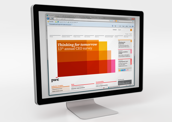
The clearest picture I have of what PricewaterhouseCoopers does is of two dudes in tuxedos holding a briefcase with the envelopes that announce the winners at the Oscars. But, clearly, with 163,000 employees in 151 countries they do more than that. They are one of the "Big Four" professional services firms — the three others are Deloitte Touche Tohmatsu, Ernst & Young, and KPMG — and boast gross revenues of 26.2 billion USD (fiscal year 2009). Officially, they "provide industry-focused assurance, tax and advisory services to enhance value for their clients." Yesterday was the official announcement that PricewaterhouseCoopers would be changing its name to PwC, keeping the mouthful of a name as the full name of the global organization for legal purposes. PwC also introduced a new identity created by the London office of Wolff Olins.

"We think our new brand expression visually distinguishes PwC in the same way that the quality and expertise of our people differentiates the experience of working with PwC," said Dennis Nally, chairman, PwC International. "Underlying the visual elements is what the PwC brand really stands for -- how we are viewed by our clients, our people and our stakeholders. Beyond our capabilities and experience, we want PwC to be known for building great relationships with clients that help them create the value they're looking for."
– Press Release

Brand identity film introducing all the elements. (Roll over to see controller).

I have always found the old logo hard to believe; that a multibillion-dollar firm would use such a quirky, unfocused wordmark as its logo. It was endearing in the way that you look at a possum and think "Aw, what an ugly poor little booger you are. Now scram!" The new icon is hard to digest at first, as it's not exactly clear what it is. At first I thought it was a digitized flower that a C-level executive would wear on his suit pocket to soften his look or appear as he cares about some cause. It's not a flower. But then there is the underscore, a cue that something came before it or that something else is about to happen. The reality is that the icon is just a series of boxes that stretch and genuflect to, I think, represent the various facets of what PwC has to offer. Still, I'm unclear what it is, but if this were 1971 I would also be unclear what the Nike swoosh was. For a firm of this size, of this influence, and the kind of clients and work it does for them, anything that's beyond the scope of a wordmark is an extremely bold move. This icon is as bold and innovative as it gets in this very exclusive category.


Logo animation.


Logo animation.

The typography is not a sans serif. Imagine that. It's possible to design a contemporary-looking logo without resorting to rounded sans. I have always been a fan of hard-angled serifs and this one really struts those chiseled looks. The only thing that originally jumped out at me is that the "w" is italic, giving it a slightly jarring contrast against the two roman letters, but I'm willing to accept that it made more visual sense to do it this way than all of them straight, as the roman "w" might have been too monotonous.

PwC

PwC

Brochures and other collateral.

The great thing about this work is that the logo is merely the beginning. It provides the framework for the rest of the identity, which is absolutely stunning. It has amazing flexibility while establishing resolute consistency. Again, you have to remember what kind of firm this is for, it's not some small start-up that can run with something like this. This is fresh and agile. This is the most encouraging sign in all of 2010 that interesting, daring work can be done along with corporate clients.

PwC

PwC

PwC

PwC

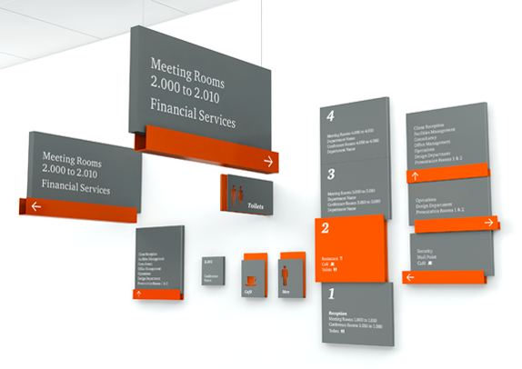
Details of the sign.

PwC

Thanks to Renee Bortoli for first tip.

Vote
Don't forget to cast your vote about this post online

Many thanks to our ADVx3 Partners


Your City’s Segregation Visualized [Maps]

20 Sep
In some ways, this is the most accurate map of Washington, DC I've seen: those colors represent the demographic breakdown of a divided city. Here's how the largest metropolitan areas in the US look after the same treatment. More »


Ten ugly comment spam techniques

20 Sep

Mollom blocks more than 500,000 comment spam attempts a day. That volume provides a unique perspective on the world of comment spammers, including the world's best and worst spam techniques. Below are some excerpts from some of the more interesting spam attempts which we see frequently on Mollom's back end.

1. Some spammers try to embed flash objects in the comments section of a blog post or article. Really? Yes.

Spam techniques flash

2. Spammers randomly generate spam messages as illustrated by the excerpt shown below. Some comment spammers have obviously buggy scripts ...

Spam techniques buggy script

3. Some spammers try to take advantage of other companies’ positive brand and reputation. In the example below, the spammer tries to leverage Facebook's reputation to build a positive Mollom or Akismet reputation of its own.

Spam techniques facebook

4. In the example below, this spammer used a free site building service, webs.com, to build a spam site. If not a free website building service, spammers will abuse incorrectly configured content management systems. Of course, there is some good old shouting too.

Spam techniques good ol shouting

5. A very common spam technique is to copy relevant content from a site, and to sprinkle in some advertising. The excerpt below shows a spam message posted on a blog post that talks about Drupal.

Spam techniques content reuse

6. As strange as it may seem, there are spammers that will simply post gibberish. My unproven theory is that they keep track of the gibberish they posted, and then register the domain after it has a reasonable ranking on Google. Spam first, create the spam pages later. This is one of the more difficult techniques to block for Mollom.

Spam techniques gibberish

7. Then there are spammers who try to leverage image tags to inject image spam in the comments of a blog post.

Spam techniques image

8. Some will try to use OpenID to by-pass e-mail verification.

Spam techniques openid

9. Another trick that spammers will try is to insert the Google ad section start. This tag is normally used by site owners to tell Google about the text and HTML content that they'd like Google to emphasize when matching ads to a site's content. Spammers try to trick Google into believing that their spam comment is the most important content on the page. Could be deadly for your search engine ranking, and could really hurt your advertising revenue. Evil!

Spam techniques google ad section start

10. Last is the simple, but somewhat clever approach of trying to trick spam filters by injecting unnecessary spacing.

Spam techniques spaces
There are other techniques but this should give you a sense of the strategies used by comment spammers. It seems like they are becoming more and more creative every day!


Twitter API Calls Doubled Since April: Now Serving 70,000 Every Second

16 Sep

TwitterHave you ever wondered how much traffic Twitter handles in a given day, or what software sits behind the curtain of the popular service?  A recent presentation reveals some of the answers. Twitter’s incredible growth becomes obvious when you compare the recent numbers to those announced at Chirp.

On September 9th, Twitter’s university recruiting team stopped by UC Berkeley to talk about the company and what it does. The slides from platform engineer Raffi Krikorian’s talk, Twitter by the Numbers, are now online, and they disclose some fascinating technical details about the social media giant’s operations.

Twitter serves over 70 million tweets per day, totaling over 12GB of tweet text alone.  Many of those messages are delivered to client apps and web sites through the Twitter API to the tune of six billion API calls per day (double what was announced at Chirp in April), or about 70,000 API calls per second.  All told, the service generates 8TB of data every day, which is eight times more than the New York Stock Exchange.

Pop quiz, engineers: Your web service needs to deliver real-time message traffic to an asymmetric digraph of over 150 million users.  What database do you use?  WHAT DATABASE DO YOU USE?

    • Shoot the hostage
    • Oracle
    • MySQL
    • Write your own database

      If you’re Twitter, the correct answer is #4:  Create your own database software, call it FlockDB, and release it on github.  (By the way, if you picked option 1, maybe software engineering isn’t the right career choice for you.)

      FlockDB is just one of the home-grown, high-performance software systems Twitter uses to support its tremendous growth.  Others include:

      • hosebird, a “near real-time” streaming API back-end (instead of REST, which is only “pseudo real-time”); and
      • snowflake (also on github), a network service to generate unique IDs at high scale (MySQL couldn’t keep up, and was a single point of failure).

      With a stated goal of supporting “half the world and all its devices,” Twitter faces many engineering challenges.  This peek under the hood (full slides are embedded below) shows that they’re aware of the potential problems, and are working hard to steer clear of the fail whale.

      Via Delyn Simons

      Related ProgrammableWeb Resources

      Twitter Twitter API Profile, 459 mashups


      The Most Powerful Colors in the World

      15 Sep

      When we released our report on the colors of the social web, based on data analyzed by our Twitter theme tool, we were surprised that blue was such a dominant color in people's profile designs. Was Twitter's default color influencing their design decisions? Or is blue really THE most popular and dominant color online? ...We decided to look at the colors in the brands from the top 100 sites in the world to see if we could paint a more colorful picture.

      Share this Post// Tweet

      [click to view in full size]

      Turns out the blue-berry doesn't fall far from the bush. The web landscape is dominated by a large number of blue brands... but Red occupies a large amount of space as well. What's driving this? You might want to say that carefully organized branding research and market tests were done to choose the perfect colors to make you spend your money, but a lot of the brands that have grown to be global web powerhouses, started as small web startups... and while large corporate giants with branding departments spend quite a lot on market research, user testing, branding, etc. Lots of the sites listed above got started with brands created by the founders themselves with little to no research into the impact their color choice would have. I once asked Mark Zuckerberg, the founder of Facebook why he chose blue for his site design... "I'm color blind, it's the only color I can see." ...and now 500 Million people around the world stare at a mostly blue website for hours each week.

      While the initial reasoning for the colors chosen may be trivial, the impact that these dominant players now have in the web world will surely influence the smaller startups that want to share in the positive color associations created by their bigger siblings... Once a rocketship of a web startup takes flight, there are a number of Jr. internet astronauts hoping to emulate their success... and are inspired by their brands. And so Blue and Red will probably continue to dominate, but we can have hope for the GoWalla's, DailyBooth's and other more adventurous brands out there.

      Would A Corporation By Any Other Color, Still Profit As Well?

      Color is an important part of any brand, but along with the actual name of a company... Is it a great brand that builds a great company, or the other way around? Would Google, Google just as well with another name? My guess is yes.

      And almost 10 years ago, Wired Magazine looked at the Colors of the corporate America... Blue & Red dominate again.

      Companies spend millions trying to differentiate from others. Yet a quick look at the logos of major corporations reveals that in color as in real estate, it's all about location, location, location. The result is an ever more frantic competition for the best neighborhood. Here's a look at the new blue bloods. [Wired Magazine]

      The Colors of 1 Million Brand Icons

      And a brand can extend further than just your logo... On the web it reaches into the address bar in the form of a Favicon. It's quite amazing to explore, but the top 1,000,000 website Favicons can be browsed here at Icons of the Web:
      See if you can find the COLOURlovers icon!

      Uh-oh! But Will We Run Out of Color on the Web?

      Last year Francisco Inchauste posted a very interesting article on SixRevisions about the limited resource of color... not in physical form, but in mind share. (Even linking to a post we did a while back about T-Mobile and it's trademark of "Magenta")

      As a designer, it is important to be aware of the trending colors, and how they are being applied in products and work produced today. What really isn’t being discussed by the design world at large though are the limitations being set on color. Color is as free for us to use as the air we breathe… or is it? [SixRevisions]

      The Next Big Color Trend

      You are the next great founder, designer, influencer or creative mind that may build the next Facebook. You have the power to influence future color trends... What colors will you choose?