

via LikeCool via Cracked
The Reader team was saddened to hear that Bloglines will be shutting its doors on October 1. Bloglines was a pioneer in the feed reading space, and for Web 2.0 in general.
We know that nothing will be quite like Bloglines in the hearts of its users, but if you're looking for another online feed reader, we encourage you to give Reader a shot. All you need is a Google account (you already have one if you use Gmail) -- and here's a video to help you get started. It's also very easy to bring your Bloglines subscriptions over, you just have to export them from Bloglines and import them into Reader.
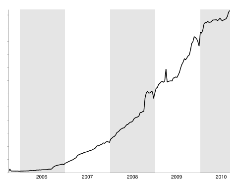
Since Reader's fifth anniversary is also approaching (though it feels like yesterday, Reader was launched on October 7, 2005), we thought it might be a good time to reflect on how Reader has grown over the past few years. While we were busy redesigning (twice!), making friends with Buzz and iGoogle, translating, breaking up, gossiping and playing, more and more people picked up the Reader habit. Here's a graph of Reader users over time (where "user" is defined as someone who has used Reader at least once a week):
And as we found out this past April, Reader users sure do like to read lots of items. Here's another graph, this time of the number of items read per day.

To all our users, new and old, thanks for making a great 5 years!


Stanley Miller performed some of the most famous origin of life experiments, showing that the chemicals thought to be present in the early Earth's atmosphere might react to form amino acids, the building blocks of proteins. But these experiments haven't aged well, through no fault of their own; other scientists have since revised their estimates of what was present in the early atmosphere, raising some doubts as to whether the Miller experiments are especially relevant. A paper released by Nature Chemistry neatly dodges this issue by showing that it might not matter what the Earth looked like—the shockwave of a comet impact can make biological materials regardless of the composition of the atmosphere it crashes into.
In the years since Miller's experiments, we've been better able to image the composition of comets, and have even returned samples of some of the material shed by the comet Wild 2 as it approached the Sun. These have revealed a mixture of simple organic compounds like ammonia and ethanol, but nothing as complex as an amino acid, chemicals that form the building blocks of proteins.

Read the comments on this post


The above image is one of several from Alejo Malia that depict a world in which all the elements of Google Maps — place markers, public transit symbols and even the yellow street view guy — are completely real and physical objects looming over our buildings, streets and heads.
Malia is a Spanish illustrator and designer who, while relatively unknown, has a very strong social media presence. He’s on Twitter, Facebook, YouTube, Blogspot and Flickr.
He uploaded this set of images (titled Google’s World) yesterday, but it’s not his first literal imagination of the technological world of the web; he also produced an image that incorporated Facebook’s “Like†button into a real photograph.
Here’s the rest of the Google’s World set. Enjoy, and be sure and tweet your appreciation at Malia if you like his work.
[Via Gizmodo]


More About: alejo-malia, art, artist, flickr, Google, Google Maps, google's world, illustrations, Illustrator, pics
For more Tech coverage:
Fonts on the web are essentially vector based graphics. That’s why you can display them at 12px or 120px and they remain crisp and relatively sharp-edged. Vector means that their shape is determined by points and mathematics to describe the shape, rather than actual pixel data. Because they are vector, it would make sense if we could do things that other vector programs (e.g. Adobe Illustrator) can do with vector text, like draw a stroke around the individual characters. Well, we can! At least in WebKit. Example:
h1 {
   -webkit-text-stroke-width: 1px;
   -webkit-text-stroke-color: black;
}
Or shorthand:
h1 {
   -webkit-text-stroke: 1px black;
}
Right away, I’m sure you are thinking: “Cool, but only WebKit supports, this, so if I set my text color to white and my background is white, the stroke makes it look cool in WebKit but disappears in other browsers!â€
WebKit has your back on that one, you can set the text color with another proprietary property, so you’re safe for all browsers:
h1 {
   color: black;
   -webkit-text-fill-color: white; /* Will override color (regardless of order) */
   -webkit-text-stroke-width: 1px;
   -webkit-text-stroke-color: black;
}
Shown here with @font-face font Anime Ace 2 by Nate Piekos:

Properly stroked!

Fallback to solid color. Shown here in Firefox
We can take this a bit further by not relying on the WebKit proprietary entirely. We can use the text-shadow property (supported in Firefox, Opera, and IE 9 as well) and simulate a stroke. We’ll use four shadows, each 1px offset of black with no spread, one each to the top right, top left, bottom left, and bottom right. We’ll use remove the WebKit propreitary -webkit-text-fill-color in favor of color since we’re cross-browser compatible now. The only holdout would be IE8 and down, which of course you can use IE specific stylesheets to account for.
h1 {
  color: white;
  text-shadow:
   -1px -1px 0 #000,
    1px -1px 0 #000,
    -1px 1px 0 #000,
     1px 1px 0 #000;
}
This is a stroke using all text-shadow. Pretty close to just as good as a real stroke. The primary issue is that you can only get 1px of stroke this way. Any more, and you see gaps. Any more with WebKit text stroke and there is issues too though, so it’s kind of a horse apiece.
Using both a stroke and a shadow can be a great effect. Let’s toss on a WebKit stroke, the all-around text-shadow stroke, as well as a deeper text-shadow stroke.
h1 {
   -webkit-text-stroke: 1px black;
   color: white;
   text-shadow:
       3px 3px 0 #000,
     -1px -1px 0 #000,
      1px -1px 0 #000,
      -1px 1px 0 #000,
       1px 1px 0 #000;
}
Lookin’ good
If you are familiar with Adobe Illustrator, you may know that you can align a stroke on the inside of a shape, outside, or centered. That option looks like this in the palette:

From left to right: center, inside, outside
For reasons unbeknownst to me, text in Illustrator can only be set to center stroke alignment as well. Once you expand the text into regular vector paths though, all three options become available. Reminder from Sam Frysteen: add a new stroke in the appearance panel and move it below your text (basically mimics outside stroke alignment).

From top to bottom: inside, centered, outside.
Only outside text stroke alignment looks any good at all to me. It’s unfortunate, both for CSS and for Illustrator, that the unchangeable default is centered. The solution is just not to go too crazy with the thickness of your stroke border and things should be OK. Note: the text-shadow-only solution doesn’t have this problem, but also is unable to stroke any more than 1px.
There are other things that vector based graphics programs can do with text. You can squish the letter horizontally / stretch them vertically. This type of text treatment is almost universally frowned upon, so no big loss that we can’t do that. You can also set type on an irregular line (like around a circle). It certainly would be cool to do this with web text. Perhaps we could set text to follow the border path of its parent element.
p.circular {
  width: 200px;
  height: 200px;
  border-radius: 100px;

  /* NOT REAL */
  text-align: border-path;
}
In Illustrator, we can also tell a stroke how to handle sharp corners: rounded, beveled, or mitered. These can have nice effects, are not possible on the web. However, the WebKit handling of corners is pretty nice at its default (whatever it is), and arguably nicer than any of the options in Illustrator.
For the record, you can use any type of color value for the color of WebKit stroke (hex, rgba, hsla, keyword). That means transparent strokes if you want them, which indeed to “stack†in that if strokes overlap each other (common) they will be darker.
As far as WebKit keyframe animation, the stroke color will animate but the stroke width will not.
/* Only the color will change, not the width */
@-webkit-keyframes colorchange {
	0% {
		-webkit-text-stroke: 10px red;
	}
	100% {
		-webkit-text-stroke: 20px green;
	}
}Thanks to Hendra Susanto and Cory Simmons for sending in ideas and demos.


YouTube Instant is a relatively simple app that brings up different YouTube videos while you type. It “predicts†what you’re going to search for and brings up the latest or most popular video related to that subject.
YouTube Instant quickly went viral on Hacker News, Twitter and the blogosphere. It also happened to catch the attention of Chad Hurley, the co-founder and CEO of YouTube. In fact, he was so impressed that he offered Aboukhadijeh a job.
It started with a tweet from Hurley to Aboukhadijeh:

Aboukhadijeh was quick to respond, asking whether it was a legitimate job offer:

Hurley then made it clear that he’s serious:

We can only imagine the back-and-forth DM conversations the two have had since. The moral of the story is this, though: if you build something cool, people will take notice. You could even get a job out or some funding out of it — who knows?
Images courtesy of iStockphoto, sandoclr
More About: Chad Hurley, Google, trending, twitter, youtube, YouTube Instant
For more Social Media coverage:

