RSS
 

Posts Tagged ‘collection’

Real-Time Visualization of Discussions about Breast Cancer on Twitter

12 Sep

breast_cancer_ge.jpg
"Who's talking about breast cancer?" by "socially conscious information visualization firm" Periscopic reveals the currently ongoing discussions on the topic of breast cancer on Twitter.

First, about 1,500 relevant tweets captured within the last 7 hours are collected in a single view that resembles a slowly gravitating space galaxy. Each tweet appears as a unique particle, of which the size depends on how many times it has been retweeted. This highly dense but intuitive view can then be interactively explored and filtered by 3 different interests: 'topics', 'stories' and 'people'. For instance, 'topics' reveals the most used keywords that appeared within these messages (which uses some clever multi-color-coding of the particles to denote overlapping keyword usage), 'stories' show the web links tow external stories that were linked in these tweets, and 'people' ranks the most 'active' Twitter users for this theme.


Google Correlate: Find Search Queries that Correlate with Real-World Data

25 May

google_correlate.jpg
I guess Google Correlate [googlelabs.com] is a dream come true for any person appreciating statistics and social science (or just likes to explore which line graphs match up). It is Google's newest addition to its already rich and powerful collection of data tools, which already include Google Data Explorer, Google Trends, Google Insights for Search, Google Fusion Tables, Google Visualization API, Google Chart API, or Google Wonder Wheel. The online service allows users to find search query patterns which correspond with those of real-world trends, such as those that correlate with winter time (i.e. 'alpine touring', 'colds' and 'wedding soup').

Alternatively, users can upload their own time series data, and let Google's algorithmic wizardry and computing power let do all the hard work in identifying the search queries that match best over time (e.g. those that match 'visualization' or 'crisis'). In addition, queries can be correlated according to their location according to U.S. states, so that it becomes a statistical fact that the annual geographic distribution of rainfall corresponds to search queries like 'Disney vacation packages', 'mildew remover' or 'pink raincoats'.

Oh, and if you really want to know: 'infosthetics' correlates best with 'wikipedia how' and 'tn580', a Brother laser printer.

In other words, Google Correlate provides a glimpse in our our crowd-sourced psyche like never before.

More information available at the Official Google Blog.


Placebook: How Facebook Users Are Distributed around the World

24 Mar

facebook_statistics.jpg
Placebook [geographics.cz] aims to provide a visual overview on how Facebook users are distributed around the world. As a unique feature, any Facebook users can log into the system, in order to receive a map and all relational statistics about their own personal friend network.

The map has been designed in the typical Facebook blue style, and includes a small data graphics dashboard showing the absolute counts of users per country, the proportion of users within a population, and the distribution per age group. Not surprisingly, this project was the 2010 winner of the NACIS Student Web Mapping Competition.

See also Mapping Facebook Connections and Project Palantir.


Twitter Dots: Mapping all Tweets for a specific Keyword

15 Feb

twitter_dots.jpg
Twitter Dots [twitterdots.com] translates individual tweets as simple dots on a geographical world map. It is as simple as that. The actual keyword changes each day.

Still interesting to observe how a timeline animation shows some people still tweet "Good Morning" in the late evening... That or the geographical location might be off for a lot of people (e.g. overseas holidays?).

More information is available here.


Feltron 2010 Annual Report: Infographically Reconstructing his Father’s Life

07 Feb

feltron_2010.jpg
If you are just like me, you might have been anxiously waiting for the day Nicholas Felton would finally release the 6th volume of the infographic series titled the "Feltron Annual Reports". Back in 2005, it set the beginning of the crazy and potentially self-destructing "viral" infographic rage we know all too well today.

So here is version 2010 [feltron.com], visually seductive and detailed as ever, revealing various personal self-tracking parameters that range from international travels and weather reports to US naturalizations and electrocardiogram measurements.

The catch? This year's report seems not to deal about Nicholas Felton himself, but focuses solely on his father, reconstructed by the calendars, slides and other artifacts in Nicholas' possession.

Enjoy!

See also:
. Interview with Felton.
. Video Interview with Felton
. Feltron 2009 Annual Report
. Feltron 2008 Annual Report
. Feltron 2007 Annual Report
. Feltron 2006 Annual Report
. Feltron 2005 Annual Report


LinkedIn InMaps Reveals your Professional Network

24 Jan

linkedin_inmaps.jpg
For anyone blessed with a LinkedIn account, this might be quite interesting: InMaps [linkedinlabs.com] is new service that visualizes the collection of a LinkedIn 'connections' as a single network graph. The work was clearly inspired by the results from the interactive visualization and exploration platform Gephi, as Mathieu Bastian, the driving force behind the Gephi project, now works at LinkedIn Labs.

Each color corresponds to a different group within the professional network, which can be labeled by the user. The graph should allow users to recognize connections that share mutual people, or indentify areas that might be underrepresented.

See also Career Paths.

Thnkx Nicholas and Armando.


Better World Flux: Revealing the Patterns in the World Bank Open Data

12 Jan

better_world_flux.jpg
Better World Flux [betterworldflux.com] is an impressive interactive data visualization created as an entry for the World Bank Apps for Development competition. The project aims to raise awareness for the UN Millennium Development Goals by letting users visualize and share the valuable stories that are hidden in the World Bank Open Data.

Flux basically consists of a powerful histogram view that summarizes the world state for a given year, with the color green representing 'good', and red being 'bad'. Within each color band, a number of countries are aggregated. The width of Flux ribbon corresponds to the total number of people living in those countries. Each country has a color based on a composite score calculated as the geometric mean of the user-selected indicators for any given year. These indicators can include aspects like 'Average years of total schooling', 'Happiness', 'Ratio of female to male primary enrollment', 'Access to Water', or 'Prevalence of HIV'. Users can thus choose the specific indicators and countries, explore the resulting histogram for trends and patterns over time, and share the resulting visualizations online.

Thnkx David!


WikiLeaks Cable Gate: the Visualizations and the Infographics

28 Nov

wikileaks_cable_gate_visualization.jpg
There is the data, and there is the understanding. Somewhere in the middle, the communication. Also visual. See a list of current visualizations of the WikiLeaks Cable Gate data below.

Interactive Visualization
. The Guardian - US embassy cables: browse the database
. Der Spiegel - "The US Embassy Dispatches Interactive Atlas"
. WikiLeaks - "Graphics of the cablegate dataset" (scroll to bottom, created with Tableau Public)
. The New York Times - "Letters between Wikileaks and the U.S. Government" (not really visualizations)(yet?)

Infographics
- The Guardian - "Where are the Wikileaks Cables From?"
. El Pais - "El intercambio de documentos y las zonas calientes del planeta"
. Jef Thorp - " Exploratory Visualization of the Wikileaks #cablegate data"

Data
. Wikileaks
- The Guardian Data Blog

More lists of sources also at Infographics News and datavisualization.ch.

Please add more sources in the comments!


Useful Collection of Cheat-Sheet Desktop Wallpaper for Web Designers

07 Oct

Typical cheatsheets tend to be over-sized documents, far too large to be viewed in its entirety on a desktop and not too handy for the super-fast reference that is needed. To get the full benefit of any cheatsheat, your only real option is to print it out and keep it close at hand. Wouldn’t it be nice if there was an easier way, a quicker way. Of course there is – what good be handier than having a cheatsheet set as your desktop wallpaper? Always there for quick reference, no need to print it out and no need to scroll through an over-long document.

In this post we have rounded up a selection of cheatsheet wallpapers, in various sizes, covering various technologies, like CSS, HTML5, WordPress, Javascript and many more.

WordPress Help Sheet Wallpaper

WordPress Help Sheet Wallpaper
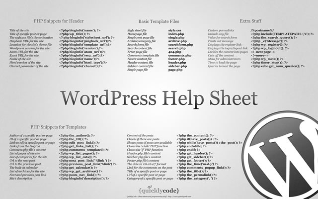
The WordPress Help Sheet Wallpaper is a simple desktop wallpaper listing Basic Template Files, PHP Snippets for the Header, PHP Snippets for the Templates, Extra Stuff for WordPress, based on the WPCandy WordPress Help Sheet.
Download: 2560x1600px.

Drupal Cheat Sheet Desktop Wallpaper

Drupal Cheat Sheet Desktop Wallpaper
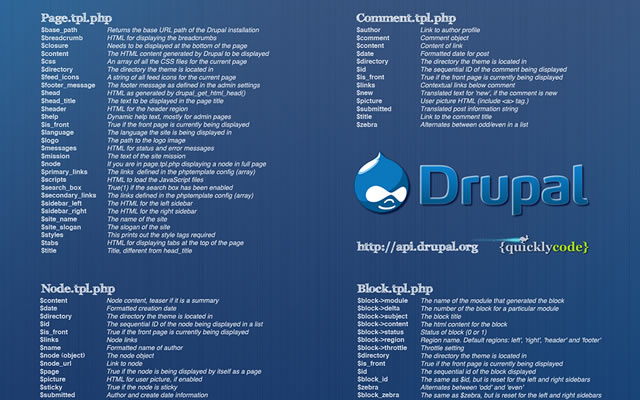
The Drupal Cheat Sheet Desktop Wallpaper is a desktop wallpaper that features the most popular variables of the open source content management system Drupal.
Download: 1024x768px – 1280x800px – 1440x900px – 1680x1050px – 1920x1200px.

HTML5 Canvas Cheat Sheet

HTML5 Canvas Cheat Sheet
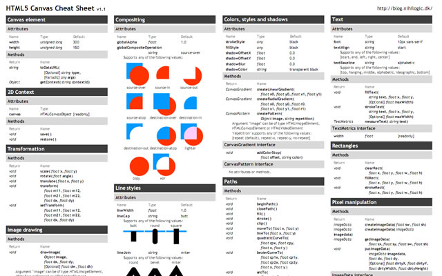
The information on this wallpaper is pretty much just a copy of what is found in the WHATWG specs, just condensed and a little bit easier to read. There are virtually no explanations, and no examples other than some graphics for compositing values. It's basically just a listing of the attributes and methods of the canvas element and the 2d drawing context.
Download: 1388x1027px.

CSS Cheat Sheet Wallpaper in Helvetica

CSS Cheat Sheet Wallpaper in Helvetica
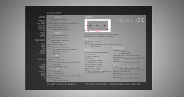
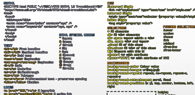
This is the very popular CSS cheat sheet in Helvetica from styl.eti.me. Simplistic in appearance, but very useful for quick referencing. Unfortunately we can not find a working download link for this cool wallpaper, but the good news is they do have a PSD version available. So download it and resize.
Download: CSS Cheat Sheet Wallpaper in Helvetica.

TextMate Shortcuts Wallpaper

TextMate Shortcuts Wallpaper
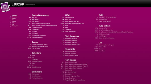
Here is a TextMate wallpaper that will guide you through some of its powerful features and help you get a handle on all of the keyboard shortcuts. The PSD file is also available.
Download: 1280x800px – 1920x1200px.

Yahoo! UI (YUI) Cheat Sheets as Wallpaper

Yahoo! UI (YUI) Cheat Sheets as Wallpaper
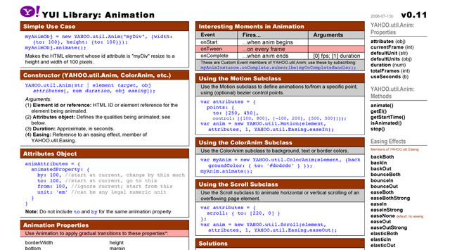
Yahoo! provides a number of cheat sheets for their YUI library widgets however these are all in PDF format and not usable as wallpaper. However, here you will find all of those cheatsheets converted to PNG images of various sizes all for your desktop.
There are wallpapers available for Animation, Calendar, Connection Manager, Dom Collection, Drag & Drop Event, Utility & Custom Event Logger, Slider and TreeView. And all are available in the following desktop sizes: 1400x1050px, 1280x960px, 1165x900px and 1024x768px.
Download: Yahoo! UI (YUI) Cheat Sheets as Wallpaper.

jQuery 1.3 Cheat Sheet Wallpaper

jQuery 1.3 Cheat Sheet Wallpaper
Download: 1440x900px – 1680x1050px – 1920x1200px.

Prototype Dissected Wallpaper

Prototype Dissected Wallpaper
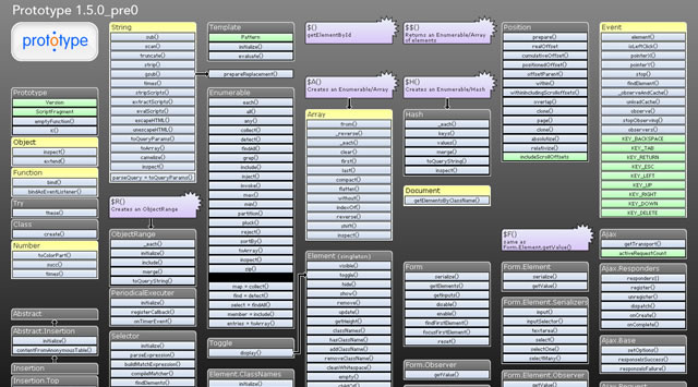
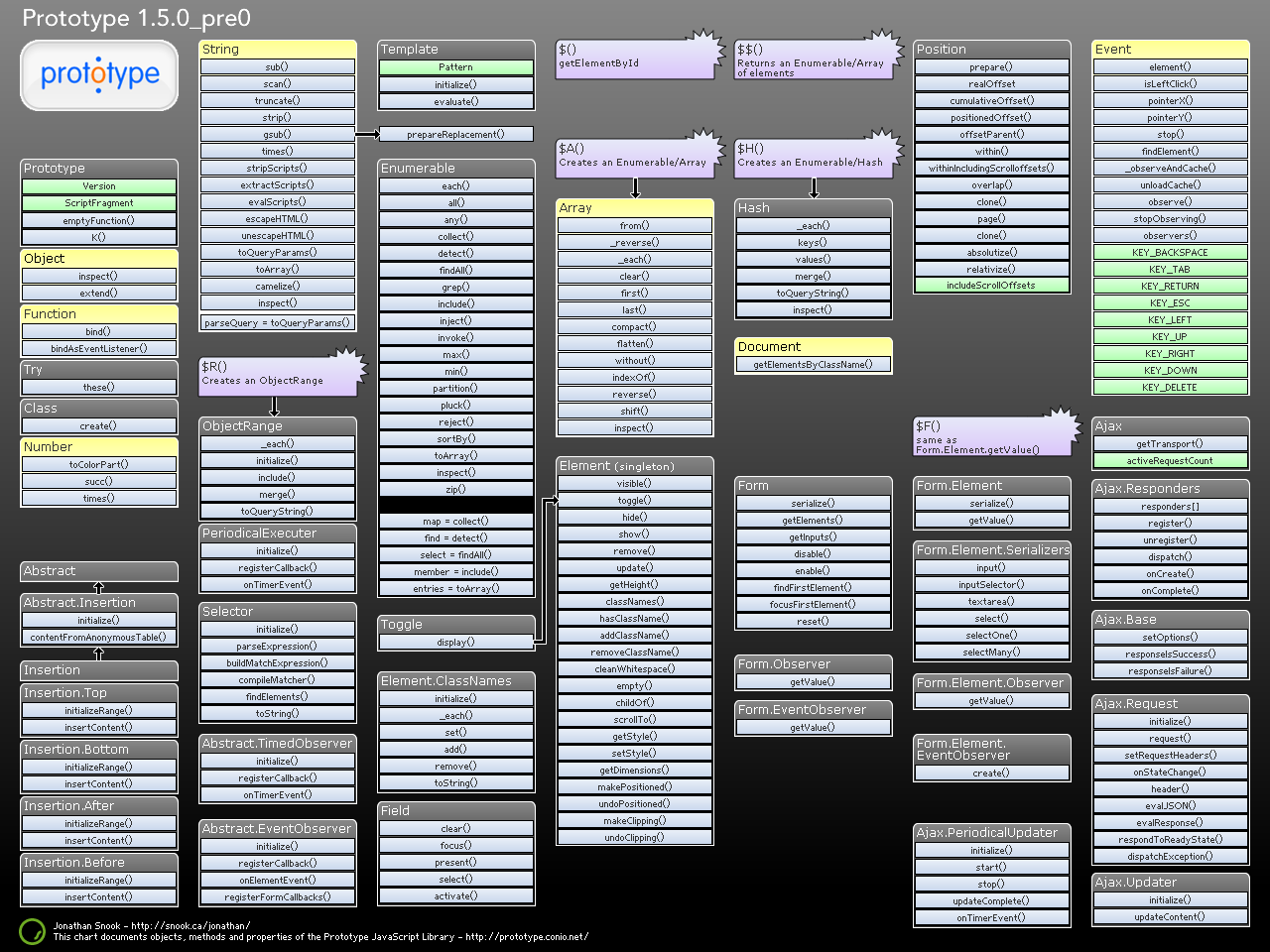
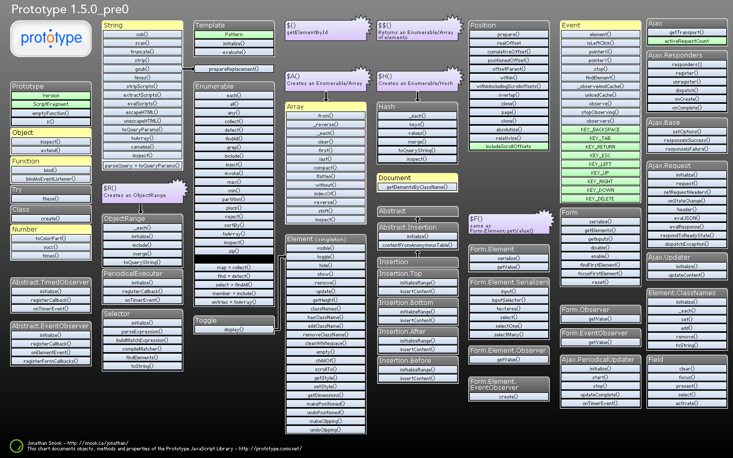
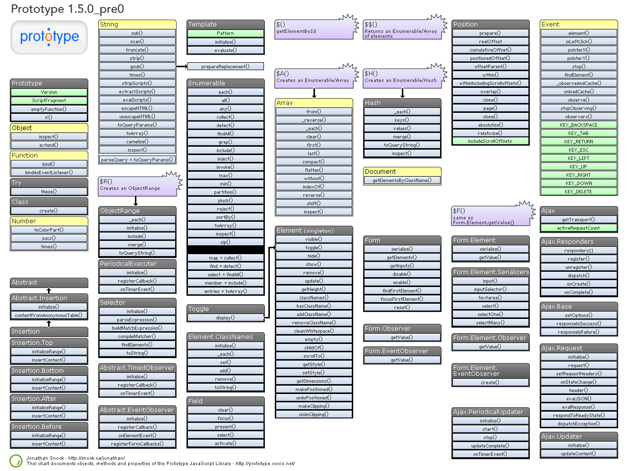
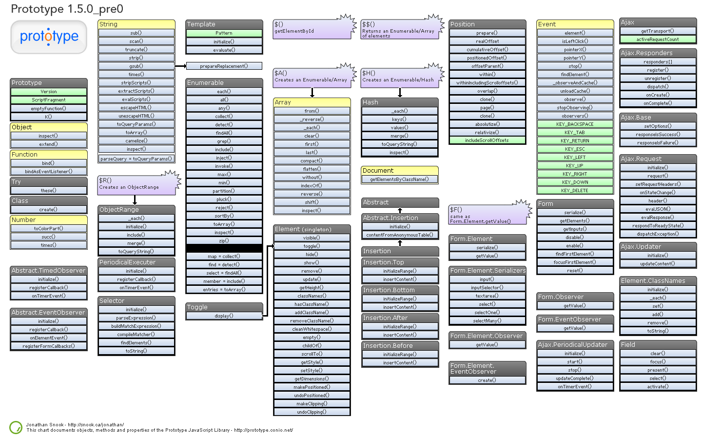
If you need a little help in getting to know Prototype a little better and some help in understanding how the code works, then this is the wallpaper for you. You have a choice of either a dark or white wallpaper, and are available in these sizes: 1280x960px and 1440x900px.
Download: 1280x960px (Dark) – 1440x900px (Dark) – 1280x960px (White) – 1440x900px (White).

Git Cheat Sheet Wallpaper

Git Cheat Sheet Wallpaper
Download: 1100x850px – 3300x2550px.

A Themer's Cheatsheet Wallpaper

A Themer's Cheatsheet Wallpaper
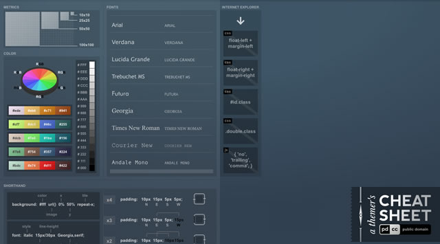
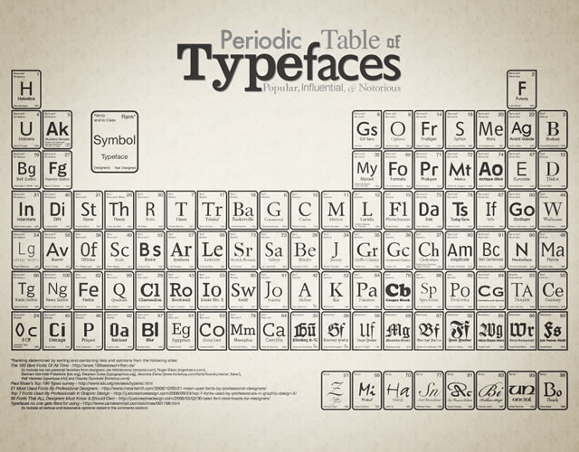
A Themer's Cheatsheet Wallpaper is a quick refresher of web design fundamentals directly on your desktop. It is available for download in several different colors and the original SVG has been released to the Public Domain.
Download: 1280x800px (Blue) – 1280x800px (Red) – 1280x800px (Black) – 1280x800px (Green).

Font Anatomy Wallpaper

Font Anatomy Wallpaper
Download: 1920x1200px.

SEO Wallpapers

SEO Wallpapers
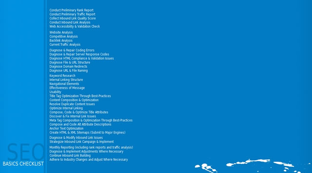
Think of it as a desk reference checklist that is always at your fingertips. From pre-campaign to reporting, the basics (and more) are right here for you to put directly on your desktop.
Download: 1024x768px – 1280x960px – 1280x1024px – 1440x900px.

Periodic Table of Typefaces

Periodic Table of Typefaces
Download: 1024x768px – 1280x800px – 1280x1024px – 1440x900px – 1680x1050px – 1920x1200px.

Color Theory Quick Reference Poster

Color Theory Quick Reference Poster
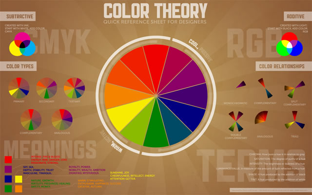
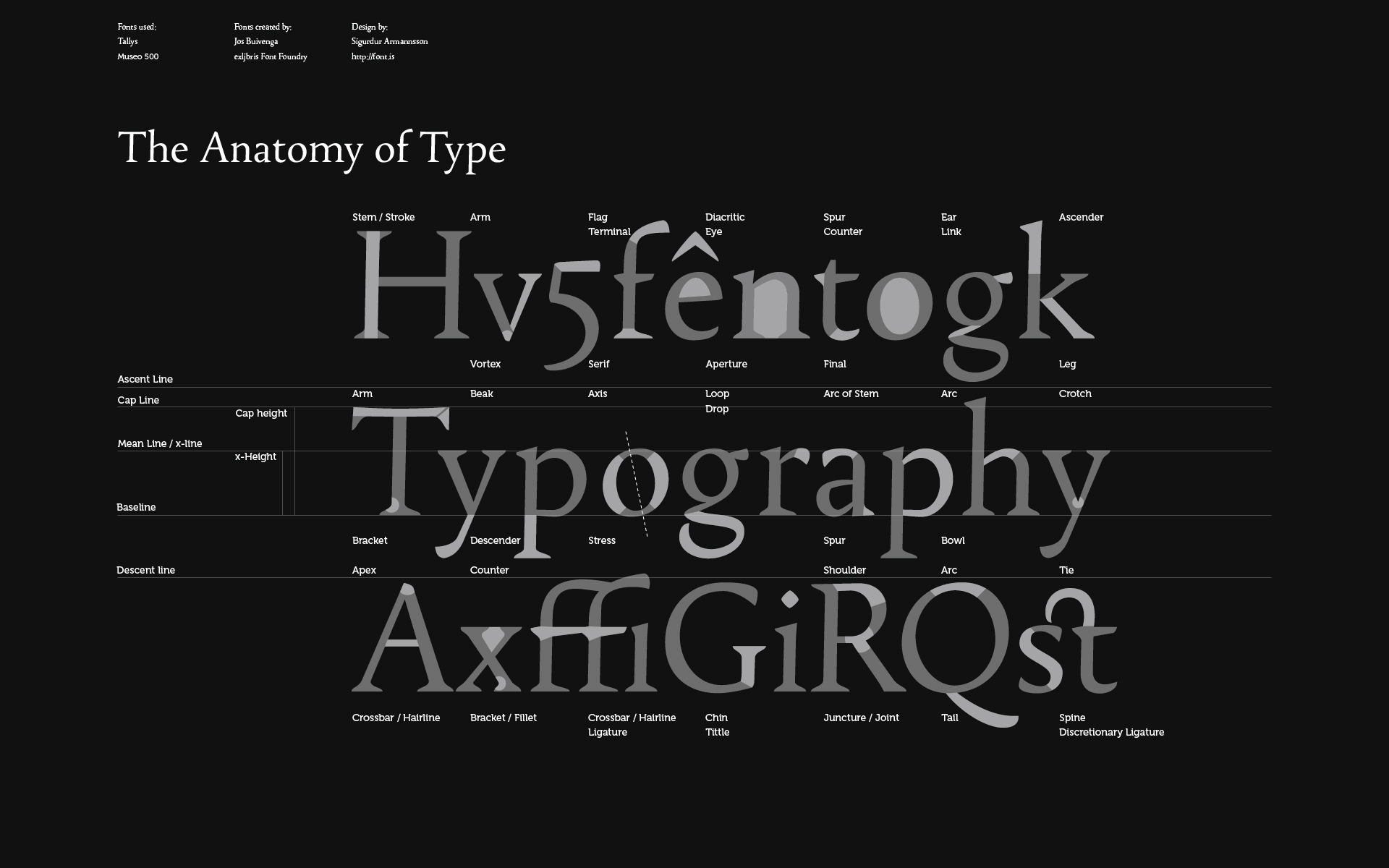
The Color Theory Quick Reference Poster for Designers has all of the basics of color theory contained in one place – specifically, a cool infographic-esque poster. This way, you can quickly reference things that may have slipped to the back of your mind since design school.
Download: 1280x800px – 1440x900px – 1680x1050px – 1920x1200px.

Web Designer Wallpaper

Web Designer Wallpaper
Download: 1280x1024px (White) – 1280x1024px (Dark) – 1680x10050px (Dark) – 1280x1024px (White).

You might also like…

14 Essential WordPress Development and Design Cheat Sheets »
17 Productive Photoshop Cheatsheets and Reference Cards to Download for Free »
The Best Cheat Sheets for Web Designers and Developers (From CSS, Ajax, Perl, Vbscript…) »
CSS References, Tutorials, Cheat Sheets, Conversion Tables and Short Codes »
20 CSS3 Tutorials and Techniques for Creating Buttons »
50 Useful Tools and Generators for Easy CSS Development »
50 Essential Web Typography Tutorials, Tips, Guides and Best Practices »
The Blueprint CSS Framework – Tutorials, How-to Guides and Tools »