RSS
 

Posts Tagged ‘Design’

Responsive Web Design: What It Is and How To Use It

12 Jan

Advertisement in Responsive Web Design: What It Is and How To Use It
 in Responsive Web Design: What It Is and How To Use It  in Responsive Web Design: What It Is and How To Use It  in Responsive Web Design: What It Is and How To Use It

Almost every new client these days wants a mobile version of their website. It’s practically essential after all: one design for the BlackBerry, another for the iPhone, the iPad, netbook, Kindle — and all screen resolutions must be compatible, too. In the next five years, we’ll likely need to design for a number of additional inventions. When will the madness stop? It won’t, of course.

In the field of Web design and development, we’re quickly getting to the point of being unable to keep up with the endless new resolutions and devices. For many websites, creating a website version for each resolution and new device would be impossible, or at least impractical. Should we just suffer the consequences of losing visitors from one device, for the benefit of gaining visitors from another? Or is there another option?

Responsive Web design is the approach that suggests that design and development should respond to the user’s behavior and environment based on screen size, platform and orientation. The practice consists of a mix of flexible grids and layouts, images and an intelligent use of CSS media queries. As the user switches from their laptop to iPad, the website should automatically switch to accommodate for resolution, image size and scripting abilities. In other words, the website should have the technology to automatically respond to the user’s preferences. This would eliminate the need for a different design and development phase for each new gadget on the market.

The Concept Of Responsive Web Design

Ethan Marcotte wrote an introductory article about the approach, “Responsive Web Design,” for A List Apart. It stems from the notion of responsive architectural design, whereby a room or space automatically adjusts to the number and flow of people within it:

“Recently, an emergent discipline called “responsive architecture” has begun asking how physical spaces can respond to the presence of people passing through them. Through a combination of embedded robotics and tensile materials, architects are experimenting with art installations and wall structures that bend, flex, and expand as crowds approach them. Motion sensors can be paired with climate control systems to adjust a room’s temperature and ambient lighting as it fills with people. Companies have already produced “smart glass technology” that can automatically become opaque when a room’s occupants reach a certain density threshold, giving them an additional layer of privacy.”

Transplant this discipline onto Web design, and we have a similar yet whole new idea. Why should we create a custom Web design for each group of users; after all, architects don’t design a building for each group size and type that passes through it? Like responsive architecture, Web design should automatically adjust. It shouldn’t require countless custom-made solutions for each new category of users.

Obviously, we can’t use motion sensors and robotics to accomplish this the way a building would. Responsive Web design requires a more abstract way of thinking. However, some ideas are already being practiced: fluid layouts, media queries and scripts that can reformat Web pages and mark-up effortlessly (or automatically).

But responsive Web design is not only about adjustable screen resolutions and automatically resizable images, but rather about a whole new way of thinking about design. Let’s talk about all of these features, plus additional ideas in the making.

Adjusting Screen Resolution

With more devices come varying screen resolutions, definitions and orientations. New devices with new screen sizes are being developed every day, and each of these devices may be able to handle variations in size, functionality and even color. Some are in landscape, others in portrait, still others even completely square. As we know from the rising popularity of the iPhone, iPad and advanced smartphones, many new devices are able to switch from portrait to landscape at the user’s whim. How is one to design for these situations?

Portrait-landscape in Responsive Web Design: What It Is and How To Use It

In addition to designing for both landscape and portrait (and enabling those orientations to possibly switch in an instant upon page load), we must consider the hundreds of different screen sizes. Yes, it is possible to group them into major categories, design for each of them, and make each design as flexible as necessary. But that can be overwhelming, and who knows what the usage figures will be in five years? Besides, many users do not maximize their browsers, which itself leaves far too much room for variety among screen sizes.

Morten Hjerde and a few of his colleagues identified statistics on about 400 devices sold between 2005 and 2008. Below are some of the most common:

Sizes in Responsive Web Design: What It Is and How To Use It

Since then even more devices have come out. It’s obvious that we can’t keep creating custom solutions for each one. So, how do we deal with the situation?

Part of the Solution: Flexible Everything

A few years ago, when flexible layouts were almost a “luxury” for websites, the only things that were flexible in a design were the layout columns (structural elements) and the text. Images could easily break layouts, and even flexible structural elements broke a layout’s form when pushed enough. Flexible designs weren’t really that flexible; they could give or take a few hundred pixels, but they often couldn’t adjust from a large computer screen to a netbook.

Now we can make things more flexible. Images can be automatically adjusted, and we have workarounds so that layouts never break (although they may become squished and illegible in the process). While it’s not a complete fix, the solution gives us far more options. It’s perfect for devices that switch from portrait orientation to landscape in an instant or for when users switch from a large computer screen to an iPad.

In Ethan Marcotte’s article, he created a sample Web design that features this better flexible layout:

Moreflexible in Responsive Web Design: What It Is and How To Use It

The entire design is a lovely mix of fluid grids, fluid images and smart mark-up where needed. Creating fluid grids is fairly common practice, and there are a number of techniques for creating fluid images:

For more information on creating fluid websites, be sure to look at the book “Flexible Web Design: Creating Liquid and Elastic Layouts with CSS” by Zoe Mickley Gillenwater, and download the sample chapter “Creating Flexible Images.” In addition, Zoe provides the following extensive list of tutorials, resources, inspiration and best practices on creating flexible grids and layouts: “Essential Resources for Creating Liquid and Elastic Layouts.”

While from a technical perspective this is all easily possible, it’s not just about plugging these features in and being done. Look at the logo in this design, for example:

Croppinglogo in Responsive Web Design: What It Is and How To Use It

If resized too small, the image would appear to be of low quality, but keeping the name of the website visible and not cropping it off was important. So, the image is divided into two: one (of the illustration) set as a background, to be cropped and to maintain its size, and the other (of the name) resized proportionally.

<h1 id="logo"><a href="#"><img src="site/logo.png" alt="The Baker Street Inquirer" /></a></h1>

Above, the h1 element holds the illustration as a background, and the image is aligned according to the container’s background (the heading).

This is just one example of the kind of thinking that makes responsive Web design truly effective. But even with smart fixes like this, a layout can become too narrow or short to look right. In the logo example above (although it works), the ideal situation would be to not crop half of the illustration or to keep the logo from being so small that it becomes illegible and “floats” up.

Flexible Images

One major problem that needs to be solved with responsive Web design is working with images. There are a number of techniques to resize images proportionately, and many are easily done. The most popular option, noted in Ethan Marcotte’s article on fluid images but first experimented with by Richard Rutter, is to use CSS’s max-width for an easy fix.

img { max-width: 100%; }

As long as no other width-based image styles override this rule, every image will load in its original size, unless the viewing area becomes narrower than the image’s original width. The maximum width of the image is set to 100% of the screen or browser width, so when that 100% becomes narrower, so does the image. Essentially, as Jason Grigsby noted, “The idea behind fluid images is that you deliver images at the maximum size they will be used at. You don’t declare the height and width in your code, but instead let the browser resize the images as needed while using CSS to guide their relative size”. It’s a great and simple technique to resize images beautifully.

Note that max-width is not supported in IE, but a good use of width: 100% would solve the problem neatly in an IE-specific style sheet. One more issue is that when an image is resized too small in some older browsers in Windows, the rendering isn’t as clear as it ought to be. There is a JavaScript to fix this issue, though, found in Ethan Marcotte’s article.

While the above is a great quick fix and good start to responsive images, image resolution and download times should be the primary considerations. While resizing an image for mobile devices can be very simple, if the original image size is meant for large devices, it could significantly slow download times and take up space unnecessarily.

Filament Group’s Responsive Images

This technique, presented by the Filament Group, takes this issue into consideration and not only resizes images proportionately, but shrinks image resolution on smaller devices, so very large images don’t waste space unnecessarily on small screens. Check out the demo page here.

Filamentgroup in Responsive Web Design: What It Is and How To Use It

This technique requires a few files, all of which are available on Github. First, a JavaScript file (rwd-images.js), the .htaccess file and an image file (rwd.gif). Then, we can use just a bit of HTML to reference both the larger and smaller resolution images: first, the small image, with an .r prefix to clarify that it should be responsive, and then a reference to the bigger image using data-fullsrc.

<img src="smallRes.jpg" data-fullsrc="largeRes.jpg">

The data-fullsrc is a custom HTML5 attribute, defined in the files linked to above. For any screen that is wider than 480 pixels, the larger-resolution image (largeRes.jpg) will load; smaller screens wouldn’t need to load the bigger image, and so the smaller image (smallRes.jpg) will load.

The JavaScript file inserts a base element that allows the page to separate responsive images from others and redirects them as necessary. When the page loads, all files are rewritten to their original forms, and only the large or small images are loaded as necessary. With other techniques, all higher-resolution images would have had to be downloaded, even if the larger versions would never be used. Particularly for websites with a lot of images, this technique can be a great saver of bandwidth and loading time.

This technique is fully supported in modern browsers, such as IE8+, Safari, Chrome and Opera, as well as mobile devices that use these same browsers (iPad, iPhone, etc.). Older browsers and Firefox degrade nicely and still resize as one would expect of a responsive image, except that both resolutions are downloaded together, so the end benefit of saving space with this technique is void.

Stop iPhone Simulator Image Resizing

One nice thing about the iPhone and iPod Touch is that Web designs automatically rescale to fit the tiny screen. A full-sized design, unless specified otherwise, would just shrink proportionally for the tiny browser, with no need for scrolling or a mobile version. Then, the user could easily zoom in and out as necessary.

There was, however, one issue this simulator created. When responsive Web design took off, many noticed that images were still changing proportionally with the page even if they were specifically made for (or could otherwise fit) the tiny screen. This in turn scaled down text and other elements.

Iphonescale in Responsive Web Design: What It Is and How To Use It
(Image: Think Vitamin | Website referenced: 8 Faces)

Because this works only with Apple’s simulator, we can use an Apple-specific meta tag to fix the problem, placing it below the website’s <head> section. Thanks to Think Vitamin’s article on image resizing, we have the meta tag below:

<meta name="viewport" content="width=device-width; initial-scale=1.0">

Setting the initial-scale to 1 overrides the default to resize images proportionally, while leaving them as is if their width is the same as the device’s width (in either portrait or lanscape mode). Apple’s documentation has a lot more information on the viewport meta tag.

Custom Layout Structure

For extreme size changes, we may want to change the layout altogether, either through a separate style sheet or, more efficiently, through a CSS media query. This does not have to be troublesome; most of the styles can remain the same, while specific style sheets can inherit these styles and move elements around with floats, widths, heights and so on.

For example, we could have one main style sheet (which would also be the default) that would define all of the main structural elements, such as #wrapper, #content, #sidebar, #nav, along with colors, backgrounds and typography. Default flexible widths and floats could also be defined.

If a style sheet made the layout too narrow, short, wide or tall, we could then detect that and switch to a new style sheet. This new child style sheet would adopt everything from the default style sheet and then just redefine the layout’s structure.

Here is the style.css (default) content:

/* Default styles that will carry to the child style sheet */

html,body{
   background...
   font...
   color...
}

h1,h2,h3{}
p, blockquote, pre, code, ol, ul{}

/* Structural elements */
#wrapper{
	width: 80%;
	margin: 0 auto;

	background: #fff;
	padding: 20px;
}

#content{
	width: 54%;
	float: left;
	margin-right: 3%;
}

#sidebar-left{
	width: 20%;
	float: left;
	margin-right: 3%;
}

#sidebar-right{
	width: 20%;
	float: left;
}

Here is the mobile.css (child) content:

#wrapper{
	width: 90%;
}

#content{
	width: 100%;
}

#sidebar-left{
	width: 100%;
	clear: both;

	/* Additional styling for our new layout */
	border-top: 1px solid #ccc;
	margin-top: 20px;
}

#sidebar-right{
	width: 100%;
	clear: both;

	/* Additional styling for our new layout */
	border-top: 1px solid #ccc;
	margin-top: 20px;
}

Movingcontent in Responsive Web Design: What It Is and How To Use It

Media Queries

CSS3 supports all of the same media types as CSS 2.1, such as screen, print and handheld, but has added dozens of new media features, including max-width, device-width, orientation and color. New devices made after the release of CSS3 (such as the iPad and Android devices) will definitely support media features. So, calling a media query using CSS3 features to target these devices would work just fine, and it will be ignored if accessed by an older computer browser that does not support CSS3.

In Ethan Marcotte’s article, we see an example of a media query in action:

<link rel="stylesheet" type="text/css"
	media="screen and (max-device-width: 480px)"
	href="shetland.css" />

This media query is fairly self-explanatory: if the browser displays this page on a screen (rather than print, etc.), and if the width of the screen (not necessarily the viewport) is 480 pixels or less, then load shetland.css.

New CSS3 features also include orientation (portrait vs. landscape), device-width, min-device-width and more. Look at “The Orientation Media Query” for more information on setting and restricting widths based on these media query features.

One can create multiple style sheets, as well as basic layout alterations defined to fit ranges of widths — even for landscape vs. portrait orientations. Be sure to look at the section of Ethan Marcotte’s article entitled “Meet the media query” for more examples and a more thorough explanation.

Multiple media queries can also be dropped right into a single style sheet, which is the most efficient option when used:

/* Smartphones (portrait and landscape) ----------- */
@media only screen
and (min-device-width : 320px)
and (max-device-width : 480px) {
/* Styles */
}

/* Smartphones (landscape) ----------- */
@media only screen
and (min-width : 321px) {
/* Styles */
}

/* Smartphones (portrait) ----------- */
@media only screen
and (max-width : 320px) {
/* Styles */
}

The code above is from a free template for multiple media queries between popular devices by Andy Clark. See the differences between this approach and including different style sheet files in the mark-up as shown in the post “Hardboiled CSS3 Media Queries.”

CSS3 Media Queries

Above are a few examples of how media queries, both from CSS 2.1 and CSS3 could work. Let’s now look at some specific how-to’s for using CSS3 media queries to create responsive Web designs. Many of these uses are relevant today, and all will definitely be usable in the near future.

The min-width and max-width properties do exactly what they suggest. The min-width property sets a minimum browser or screen width that a certain set of styles (or separate style sheet) would apply to. If anything is below this limit, the style sheet link or styles will be ignored. The max-width property does just the opposite. Anything above the maximum browser or screen width specified would not apply to the respective media query.

Note in the examples below that we’re using the syntax for media queries that could be used all in one style sheet. As mentioned above, the most efficient way to use media queries is to place them all in one CSS style sheet, with the rest of the styles for the website. This way, multiple requests don’t have to be made for multiple style sheets.

@media screen and (min-width: 600px) {
     .hereIsMyClass {
          width: 30%;
          float: right;
     }
}

The class specified in the media query above (hereIsMyClass) will work only if the browser or screen width is above 600 pixels. In other words, this media query will run only if the minimum width is 600 pixels (therefore, 600 pixels or wider).

@media screen and (max-width: 600px) {
     .aClassforSmallScreens {
          clear: both;
		  font-size: 1.3em;
     }
}

Now, with the use of max-width, this media query will apply only to browser or screen widths with a maximum width of 600 pixels or narrower.

While the above min-width and max-width can apply to either screen size or browser width, sometimes we’d like a media query that is relevant to device width specifically. This means that even if a browser or other viewing area is minimized to something smaller, the media query would still apply to the size of the actual device. The min-device-width and max-device-width media query properties are great for targeting certain devices with set dimensions, without applying the same styles to other screen sizes in a browser that mimics the device’s size.

@media screen and (max-device-width: 480px) {
     .classForiPhoneDisplay {
          font-size: 1.2em;
     }
}
@media screen and (min-device-width: 768px) {
     .minimumiPadWidth {
          clear: both;
		  margin-bottom: 2px solid #ccc;
     }
}

There are also other tricks with media queries to target specific devices. Thomas Maier has written two short snippets and explanations for targeting the iPhone and iPad only:

For the iPad specifically, there is also a media query property called orientation. The value can be either landscape (horizontal orientation) or portrait (vertical orientation).

@media screen and (orientation: landscape) {
     .iPadLandscape {
          width: 30%;
		  float: right;
     }
}
@media screen and (orientation: portrait) {
     .iPadPortrait {
          clear: both;
     }
}

Unfortunately, this property works only on the iPad. When determining the orientation for the iPhone and other devices, the use of max-device-width and min-device-width should do the trick.

There are also many media queries that make sense when combined. For example, the min-width and max-width media queries are combined all the time to set a style specific to a certain range.

@media screen and (min-width: 800px) and (max-width: 1200px) {
     .classForaMediumScreen {
          background: #cc0000;
          width: 30%;
          float: right;
     }
}

The above code in this media query applies only to screen and browser widths between 800 and 1200 pixels. A good use of this technique is to show certain content or entire sidebars in a layout depending on how much horizontal space is available.

Some designers would also prefer to link to a separate style sheet for certain media queries, which is perfectly fine if the organizational benefits outweigh the efficiency lost. For devices that do not switch orientation or for screens whose browser width cannot be changed manually, using a separate style sheet should be fine.

You might want, for example, to place media queries all in one style sheet (as above) for devices like the iPad. Because such a device can switch from portrait to landscape in an instant, if these two media queries were placed in separate style sheets, the website would have to call each style sheet file every time the user switched orientations. Placing a media query for both the horizontal and vertical orientations of the iPad in the same style sheet file would be far more efficient.

Another example is a flexible design meant for a standard computer screen with a resizable browser. If the browser can be manually resized, placing all variable media queries in one style sheet would be best.

Nevertheless, organization can be key, and a designer may wish to define media queries in a standard HTML link tag:

<link rel="stylesheet" media="screen and (max-width: 600px)" href="small.css" />
<link rel="stylesheet" media="screen and (min-width: 600px)" href="large.css" />
<link rel="stylesheet" media="print" href="print.css" />

JavaScript

Another method that can be used is JavaScript, especially as a back-up to devices that don’t support all of the CSS3 media query options. Fortunately, there is already a pre-made JavaScript library that makes older browsers (IE 5+, Firefox 1+, Safari 2) support CSS3 media queries. If you’re already using these queries, just grab a copy of the library, and include it in the mark-up: css3-mediaqueries.js.

In addition, below is a sample jQuery snippet that detects browser width and changes the style sheet accordingly — if one prefers a more hands-on approach:

<script type="text/javascript" src="http://ajax.googleapis.com/ajax/libs/jquery/1.4.4/jquery.min.js"></script>

<script type="text/javascript">
	$(document).ready(function(){
		$(window).bind("resize", resizeWindow);
		function resizeWindow(e){
			var newWindowWidth = $(window).width();

			// If width width is below 600px, switch to the mobile stylesheet
			if(newWindowWidth < 600){ 				$("link[rel=stylesheet]").attr({href : "mobile.css"});	 			} 			// Else if width is above 600px, switch to the large stylesheet 			else if(newWindowWidth > 600){
				$("link[rel=stylesheet]").attr({href : "style.css"});
			}
		}
	});
</script>

There are many solutions for pairing up JavaScript with CSS media queries. Remember that media queries are not an absolute answer, but rather are fantastic options for responsive Web design when it comes to pure CSS-based solutions. With the addition of JavaScript, we can accomodate far more variations. For detailed information on using JavaScript to mimic or work with media queries, look at “Combining Media Queries and JavaScript.”

Showing or Hiding Content

It is possible to shrink things proportionally and rearrange elements as necessary to make everything fit (reasonably well) as a screen gets smaller. It’s great that that’s possible, but making every piece of content from a large screen available on a smaller screen or mobile device isn’t always the best answer. We have best practices for mobile environments: simpler navigation, more focused content, lists or rows instead of multiple columns.

Diggmobile in Responsive Web Design: What It Is and How To Use It

Responsive Web design shouldn’t be just about how to create a flexible layout on a wide range of platforms and screen sizes. It should also be about the user being able to pick and choose content. Fortunately, CSS has been allowing us to show and hide content with ease for years!

display: none;

Either declare display: none for the HTML block element that needs to be hidden in a specific style sheet or detect the browser width and do it through JavaScript. In addition to hiding content on smaller screens, we can also hide content in our default style sheet (for bigger screens) that should be available only in mobile versions or on smaller devices. For example, as we hide major pieces of content, we could replace them with navigation to that content, or with a different navigation structure altogether.

Note that we haven’t used visibility: hidden here; this just hides the content (although it is still there), whereas the display property gets rid of it altogether. For smaller devices, there is no need to keep the mark-up on the page — it just takes up resources and might even cause unnecessary scrolling or break the layout.

Showinghidingcontent in Responsive Web Design: What It Is and How To Use It

Here is our mark-up:

<p class="sidebar-nav"><a href="#">Left Sidebar Content</a> | <a href="#">Right Sidebar Content</a></p>

<div id="content">
	<h2>Main Content</h2>
</div>

<div id="sidebar-left">
	<h2>A Left Sidebar</h2>

</div>

<div id="sidebar-right">
	<h2>A Right Sidebar</h2>
</div>

In our default style sheet below, we have hidden the links to the sidebar content. Because our screen is large enough, we can display this content on page load.

Here is the style.css (default) content:

#content{
	width: 54%;
	float: left;
	margin-right: 3%;
}

#sidebar-left{
	width: 20%;
	float: left;
	margin-right: 3%;
}

#sidebar-right{
	width: 20%;
	float: left;
}
.sidebar-nav{display: none;}

Now, we hide the two sidebars (below) and show the links to these pieces of content. As an alternative, the links could call to JavaScript to just cancel out the display: none when clicked, and the sidebars could be realigned in the CSS to float below the content (or in another reasonable way).

Here is the mobile.css (simpler) content:

#content{
	width: 100%;
}

#sidebar-left{
	display: none;
}

#sidebar-right{
	display: none;
}
.sidebar-nav{display: inline;}

With the ability to easily show and hide content, rearrange layout elements and automatically resize images, form elements and more, a design can be transformed to fit a huge variety of screen sizes and device types. As the screen gets smaller, rearrange elements to fit mobile guidelines; for example, use a script or alternate style sheet to increase white space or to replace image navigation sources on mobile devices for better usability (icons would be more beneficial on smaller screens).

Below are a couple of relevant resources:

Touchscreens vs. Cursors

Touchscreens are becoming increasingly popular. Assuming that smaller devices are more likely to be given touchscreen functionality is easy, but don’t be so quick. Right now touchscreens are mainly on smaller devices, but many laptops and desktops on the market also have touchscreen capability. For example, the HP Touchsmart tm2t is a basic touchscreen laptop with traditional keyboard and mouse that can transform into a tablet.

Touchscreen in Responsive Web Design: What It Is and How To Use It

Touchscreens obviously come with different design guidelines than purely cursor-based interaction, and the two have different capabilities as well. Fortunately, making a design work for both doesn’t take a lot of effort. Touchscreens have no capability to display CSS hovers because there is no cursor; once the user touches the screen, they click. So, don’t rely on CSS hovers for link definition; they should be considered an additional feature only for cursor-based devices.

Look at the article “Designing for Touchscreen” for more ideas. Many of the design suggestions in it are best for touchscreens, but they would not necessarily impair cursor-based usability either. For example, sub-navigation on the right side of the page would be more user-friendly for touchscreen users, because most people are right-handed; they would therefore not bump or brush the navigation accidentally when holding the device in their left hand. This would make no difference to cursor users, so we might as well follow the touchscreen design guideline in this instance. Many more guidelines of this kind can be drawn from touchscreen-based usability.

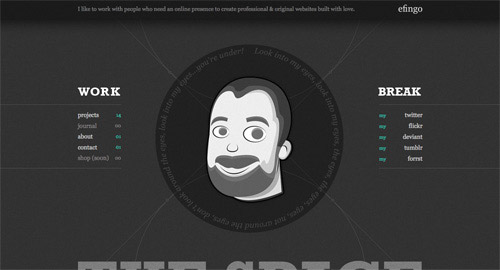
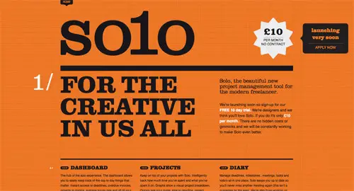
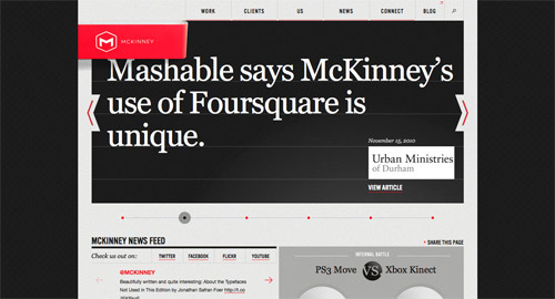
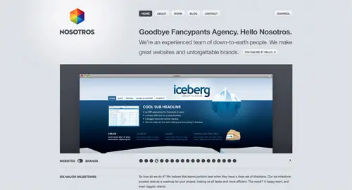
A Showcase Of Responsive Web Design

Below we have a few examples of responsive Web design in practice today. For many of these websites, there is more variation in structure and style than is shown in the pairs of screenshots provided. Many have several solutions for a variety of browsers, and some even adjust elements dynamically in size without the need for specific browser dimensions. Visit each of these, and adjust your browser size or change devices to see them in action.
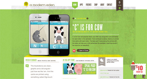
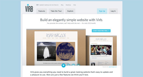
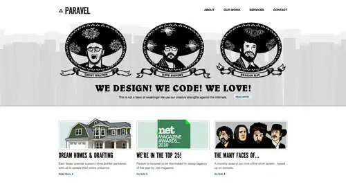
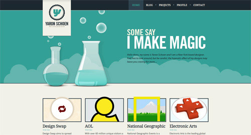
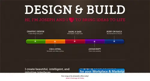
Art Equals Work
Art Equals Work is a simple yet great example of responsive Web design. The first screenshot below is the view from a standard computer screen dimension. The website is flexible with browser widths by traditional standars, but once the browser gets too narrow or is otherwise switched to a device with a smaller screen, then the layout switches to a more readable and user-friendly format. The sidebar disappears, navigation goes to the top, and text is enlarged for easy and simple vertical reading.
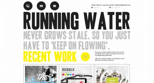
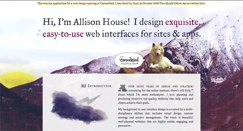
Artequalswork1 in Responsive Web Design: What It Is and How To Use It

Artequalswork2 in Responsive Web Design: What It Is and How To Use It

Think Vitamin
With Think Vitamin, we see a similar approach. When on a smaller screen or browser, the sidebar and top bar are removed, the navigation simplifies and moves directly above the content, as does the logo. The logo keeps its general look yet is modified for a more vertical orientation, with the tagline below the main icon. The white space around the content on larger screens is also more spacious and interesting, whereas it is simplified for practical purposes on smaller screens.
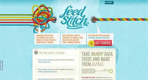
Thinkvitamin1 in Responsive Web Design: What It Is and How To Use It

Thinkvitamin2 in Responsive Web Design: What It Is and How To Use It

8 Faces
8 Faces’ website design is flexible, right down to a standard netbook or tablet device, and expands in content quantity and layout width when viewed on wider screens or expanded browsers. When viewed on narrower screens, the featured issue on the right is cut out, and the content below is shortened and rearranged in layout, leaving only the essential information.

8faces1 in Responsive Web Design: What It Is and How To Use It

8faces2 in Responsive Web Design: What It Is and How To Use It

Hicksdesign
The Hicksdesign website has three columns when viewed on a conventional computer screen with a maximized browser. When minimized in width, the design takes on a new layout: the third column to the right is rearranged above the second, and the logo moves next to the introductory text. Thus, no content needs to be removed for the smaller size. For even narrower screens and browser widths, the side content is removed completely and a simplified version is moved up top. Finally, the font size changes with the screen and browser width; as the browser gets narrower, the font size throughout gets smaller and remains proportional.

Hicksdesign1 in Responsive Web Design: What It Is and How To Use It

Hicksdesign2 in Responsive Web Design: What It Is and How To Use It

Information Architects
Here is a great example of a flexible image. The image in this design automatically resizes after certain “break” points, but in between those width changes, only the side margins and excess white space are altered. On smaller screens and minimized browsers, the navigation simplifies and the columns of navigation at the top fall off. At the design’s smallest version, the navigation simplifies to just a drop-down menu, perfect for saving space without sacrificing critical navigation links.

Informationarchitects1 in Responsive Web Design: What It Is and How To Use It

Informationarchitects2 in Responsive Web Design: What It Is and How To Use It

Garret Keizer
The website for Garret Keizer is fully flexible in wider browsers and on larger screens: the photo, logo and other images resize proportionally, as do the headings and block areas for text. At a few points, some pieces of text change in font size and get smaller as the screen or browser gets narrower. After a certain break point, the layout transforms into what we see in the second screenshot below, with a simple logo, introductory text and a simple vertical structure for the remaining content.
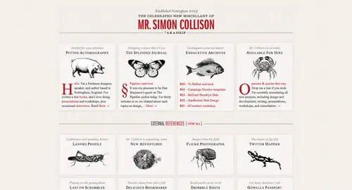
Garretkeizer1 in Responsive Web Design: What It Is and How To Use It

Garretkeizer2 in Responsive Web Design: What It Is and How To Use It

Simon Collison
With four relatively content-heavy columns, it’s easy to see how the content here could easily be squished when viewed on smaller devices. Because of the easy organized columns, though, we can also collapse them quite simply when needed, and we can stack them vertically when the space doesn’t allow for a reasonable horizontal span. When the browser is minimized or the user is on a smaller device, the columns first collapse into two and then into one. Likewise, the horizontal lines for break points also change in width, without changing the size or style of each line’s title text.

Colly1 in Responsive Web Design: What It Is and How To Use It

Colly2 in Responsive Web Design: What It Is and How To Use It

CSS Tricks
On the CSS Tricks website, like many other collapsible Web designs, the sidebars with excess content are the first to fall off when the screen or browser gets too narrow. On this particular website, the middle column or first sidebar to the left was the first to disappear; and the sidebar with the ads and website extras did the same when the browser got even narrower. Eventually, the design leaves the posts, uses less white space around the navigation and logo and moves the search bar to below the navigation. The remaining layout and design is as flexible as can be because of its simplicity.

Csstricks1 in Responsive Web Design: What It Is and How To Use It

Csstricks2 in Responsive Web Design: What It Is and How To Use It

Tee Gallery
As one can see, the main navigation here is the simple layout of t-shirt designs, spanning both vertically and horizontally across the screen. As the browser or screen gets smaller, the columns collapse and move below. This happens at each break point when the layout is stressed, but in between the break points, the images just change proportionally in size. This maintains balance in the design, while ensuring that any images (which are essential to the website) don’t get so small that they become unusable.

Teegallery1 in Responsive Web Design: What It Is and How To Use It

Teegallery2 in Responsive Web Design: What It Is and How To Use It

City Crawlers: Berlin
When varied between larger screen sizes and browser widths, this design remains flexible. It also remains flexible after a few layout pieces collapse into a more vertical orientation for small screens and narrow browsers. At first, the introductory image, logo and navigation image links resize proportionally to accommodate variations in screen and browser widths, as do the blocks of content below. The bottom columns of content eventually collapse and rearrange above or below other pieces, until (at the narrowest point) they are all stacked vertically. In the layout for the smallest screen and narrowest browser, the slideshow is left out altogether, the navigation is moved below the logo and other images are also removed.

Berlin1 in Responsive Web Design: What It Is and How To Use It

Berlin2 in Responsive Web Design: What It Is and How To Use It

Ten by Twenty
Ten by Twenty is another design that does not resort to changing layout structure at all after certain break points, but rather simplifies responsive Web design by making everything fully flexible and automatically resizing, no matter what the screen or browser width. After a while, the design does stress a bit and could benefit from some rearrangement of content. But overall, the image resizing and flexible content spaces allow for a fairly simple solution that accommodates a wide range of screen sizes.

Tenbytwenty1 in Responsive Web Design: What It Is and How To Use It

Tenbytwenty2 in Responsive Web Design: What It Is and How To Use It

Hardboiled Web Design
On wide screens and browsers, all of the content on this simply designed website is well organized into columns, sidebar and simple navigation up top. It’s a fairly standard and efficient layout. On smaller screens, the sidebar is the first to drop off, and its content is moved below the book previews and essential information. Being limited in space, this design preserves its important hierarchy. Whereas on a wider screen we’d look left to right, on a narrower screen we’d tend to look from top to bottom. Content on the right is moved below content that would appear on the left on a wider screen. Eventually, when the horizontal space is fully limited, the navigation is simplified and stacked vertically, and some repeated or inessential elements are removed.

Hardboiled1 in Responsive Web Design: What It Is and How To Use It

Hardboiled2 in Responsive Web Design: What It Is and How To Use It

Teixido
This design features a complex layout that looks inspired by a print style. When viewed on a standard wide computer screen, more portfolio pieces are featured and spanned horizontally across the page. As one moves down the page, more graphics and imagery span the space. On a smaller screen, the portfolio piece is cut down to one, and then eventually left out altogether for very small screens and narrow browsers. The visualizations below collapse into fewer columns and more rows, and again, some drop off entirely for very small screens. This design shows a creative and intelligent way to make a not-so-common layout work responsively.

Teixido1 in Responsive Web Design: What It Is and How To Use It

Teixido2 in Responsive Web Design: What It Is and How To Use It

Stephen Caver
This design has three main stages at which the design and layout collapse into a more user-friendly form, depending on how wide the screen or browser is. The main image (featuring type) is scaled proportionally via a flexible image method. Each “layout structure” is fully flexible until it reaches a breaking point, at which point the layout switches to something more usable with less horizontal space. The bottom four columns eventually collapse into two, the logo moves above the navigation, and the columns of navigation below are moved on top or below each other. At the design’s narrowest stage, the navigation is super-simplified, and some inessential content is cut out altogether.

Stephancaver1 in Responsive Web Design: What It Is and How To Use It

Stephancaver2 in Responsive Web Design: What It Is and How To Use It

Unstoppable Robot Ninja
This layout does not change at all; no content is dropped or rearranged; and the text size does not change either. Instead, this design keeps its original form, no matter what the change in horizontal and vertical space. Instead, it automatically resizes the header image and the images for the navigation. The white space, margins and padding are also flexible, giving more room as the design expands and shrinks.

Unstoppablerobotninja1 in Responsive Web Design: What It Is and How To Use It

Unstoppablerobotninja2 in Responsive Web Design: What It Is and How To Use It

Bureau
This is perhaps the simplest example of a responsive Web design in this showcase, but also one of the most versatile. The only piece in the layout that changes with the browser width is the blog post’s date, which moves above the post’s title or to the side, depending on how much horizontal space is available. Beyond this, the only thing that changes is the width of the content area and the margin space on the left and right. Everything is centered, so a sense of balance is maintained whatever the screen or browser width. Because of this design’s simplicity, switching between browser and screen widths is quick and easy.

Bureu1 in Responsive Web Design: What It Is and How To Use It

Bureu2 in Responsive Web Design: What It Is and How To Use It

CSS Wizardry
Harry Roberts shows that responsive design can also have quite humble uses. If the user has a large viewport, the website displays three columns with a navigation menu floating on the left. For users with a viewport between 481px and 800px, a narrow version is displayed: the navigation jumps to the top of the site leaving the area for the content column and the sidebar. Finally, the iPhone view displays the sidebar under the content area. Harry also wrote a detailed article about the CSS styles he added to the stylesheet in his article “Media queries, handier than you think“. A nice example of how a couple of simple CSS adjustments can improve the website’s appearance across various devices.

Css-wizardry in Responsive Web Design: What It Is and How To Use It

Css-wizardry2 in Responsive Web Design: What It Is and How To Use It

Bryan James
This last design by Bryan James shows that responsive Web design need not apply only to static HTML and CSS websites. Done in Flash, this one features a full-sized background image and is flexible up to a certain width and height. As a result of the design style, on screens that are too small, the background image gets mostly hidden and the content can become illegible and squished. Instead of just letting it be, though, a message pops up informing the user that the screen is too small to adequately view the website. It then prompts the user to switch to a bigger screen. One can discuss if the design solution is good or bad in terms of usability, but the example shows that Flash websites can respond to user’s viewport, too.

Bryanjames1 in Responsive Web Design: What It Is and How To Use It

Bryanjames2 in Responsive Web Design: What It Is and How To Use It

Conclusion

We are indeed entering a new age of Web design and development. Far too many options are available now, and there will be far too many in the future to continue adjusting and creating custom solutions for each screen size, device and advancement in technology. We should rather start a new era today: creating websites that are future-ready right now. Understanding how to make a design responsive to the user doesn’t require too much learning, and it can definitely be a lot less stressful and more productive than learning how to design and code properly for every single device available.

Responsive Web design and the techniques discussed above are not the final answer to the ever-changing mobile world. Responsive Web design is a mere concept that when implemented correctly can improve the user experience, but not completely solve it for every user, device and platform. We will need to constantly work with new devices, resolutions and technologies to continually improve the user experience as technology evolves in the coming years.

Besides saving us from frustration, responsive Web design is also best for the user. Every custom solution makes for a better user experience. With responsive Web design, we can create custom solutions for a wider range of users, on a wider range of devices. A website can be tailored as well for someone on an old laptop or device as it can for the vast majority of people on the trendiest gadgets around, and likewise as much for the few users who own the most advanced gadgets now and in the years to come. Responsive Web design creates a great custom experience for everyone. As Web designers, we all strive for that every day on every project anyway, right?

Further Resources

(al) (vf)


© Kayla Knight for Smashing Magazine, 2011. | Permalink | Post a comment | Add to del.icio.us | Digg this | Stumble on StumbleUpon! | Tweet it! | Submit to Reddit | Forum Smashing Magazine
Post tags: , , , , ,


A Paintbrush Stylus for the iPad [VIDEO]

07 Jan

Finger painting on the iPhone and iPod has become something of a phenomenon, thanks to apps like Brushes [iTunes link] and SketchBook Pro [iTunes link], and the work of high-profile artists like David Kassan, the New Yorker’s Jorge Colombo and David Hockney. In fact, Paris’s Pierre Berge-Yves St. Laurent Foundation is currently running an exhibition featuring Hockney’s iPad paintings until January 30.

But not everyone loves finger painting on the iPad. Like actual finger painting, it’s awkward and imprecise. Unfortunately, the current range of styluses for the iPad aren’t much help — instead of your finger, it feels like painting with a large, round eraser tip.

Which is why I was excited to discover Artists, a new kind of stylus that more closely resembles a paintbrush. It’s made with a long handle and soft bristles, which the creator, @nomadbrush, assures interested parties is “incredibly responsive.”

While it doesn’t look like the brush will necessarily provide the precision myself and others are looking for, it could very well prove more intuitive for artists used to traditional tools.

We’ll have a full review when the stylus comes out in February. Check out the video above in the meantime.

[via Gizmodo]

More About: artists, design, ipad, ipad stylus, stylus

For more Dev & Design coverage:


Showcasing 65 of the Best Website Designs of 2010

27 Dec

Throughout the year I’ve showcased my favourite website designs findings in the Line25 Sites of the Week roundups. This special end of year post showcases the best of the best, pulling together the awesomest designs from all the 2010 Sites of the Weeks into one showcase of super cool sites.

A Modern Eden

View the website

Foundation Six

View the website

Little Black Dress Society

View the website

Themify

View the website

Fudge

View the website

Virb

View the website

Image Mechanics

View the website

Nordkapp

View the website

Dawghouse Design Studio

View the website

Ben the Bodyguard

View the website

Chirp

View the website

Fi

View the website

Fhoke

View the website

Mark Hobbs

View the website

Ideaware

View the website

Analog

View the website

Arbutus

View the website

Pound & Grain

View the website

Simon Collison

View the website

Flourish Web Design

View the website

Lift

View the website

31Three

View the website

80/20

View the website

Ribbons of Red

View the website

Paravel

View the website

Campl.us

View the website

Feedstitch

View the website

Thomas Bishop

View the website

Carsonified

View the website

Box

View the website

Made By Water

View the website

New Adventures in Web Design

View the website

Kaleidoscope

View the website

Yaron Schoen

View the website

Core8

View the website

Fresh01

View the website

Jeroen Homan

View the website

Oliver James Gosling

View the website

Yaili

View the website

Team Excellence

View the website

Pieoneers

View the website

45Royale

View the website

Postbox

View the website

The Visual Click

View the website

Area17

View the website

Adlucent

View the website

Coolendar

View the website

efingo

View the website

Robedwards

View the website

So1o

View the website

Cofa Media

View the website

You Know Who

View the website

Eight Hour Day

View the website

Joey Lomanto

View the website

McKinney

View the website

Amazee Labs

View the website

Review App

View the website

Nosotros

View the website

Allison House

View the website

Iron to Iron

View the website

Galphin Industries

View the website

AwesomeJS

View the website

Savvy

View the website

Rype Arts

View the website

Applicom

View the website


Refrigerator Upgrade Magnet

18 Dec

Refrigerator Upgrade Magnet

Now you can finally make your cheap old fridge look like your neighbor’s modern and expensive high-end model, equipped with ice and water dispensers and digital display, using nothing but a simple magnet.

Who uses those features anyway? No one will ever notice the difference.

Closer inspection, however, will reveal some peculiar options like “Frozen Yogurt,” “Nacho Cheese,” and “Chicken Wings.” Sure to frustrate your friends as they desperately press the “French Fries” button to no avail.

The Refrigerator Upgrade Magnet is yours for $7.95 from Archie McPhee & Co.

(Via 7 Gadgets)


Compositing in Adobe Photoshop: Time-Saving Tips

16 Dec

Advertisement in Compositing in Adobe Photoshop: Time-Saving Tips
 in Compositing in Adobe Photoshop: Time-Saving Tips  in Compositing in Adobe Photoshop: Time-Saving Tips  in Compositing in Adobe Photoshop: Time-Saving Tips

Compositing is a skill and process that spans the entire spectrum of creative industries. At the high end, compositing boasts its own specialized profession in film and television post production and visual effects. Dedicated software such as NUKE and Shake have taken the craft to powerful levels of its own, leaving behind the relatively basic compositing toolset of Adobe Photoshop. However, for many graphics practitioners compositing is a vital everyday process — and as with all pixel-pushing endeavors, Photoshop remains the entry point and hub to learning and ultimately mastering the fundamentals of this important skill.

In this article, I’ll share some of my own time-saving tips for compositing in Photoshop. Tips such as these should never replace a solid understanding of your craft; however, being able to adapt a technique to make it work for you is part of being a creative professional. I encourage you to share your own creative compositing tips in the comments to this article, and think about how you have adapted existing techniques to work for you.

Tip 1: Matching Tones, Channel by Channel

One of the challenges we face when compositing is matching the colors and tones of various images to produce a realistic and convincing composite. This method aims to save you from spending time fiddling around with color balances and layers upon layers of adjustments, by showing you a systematic approach that should become second nature and enhance your compositing skill set.

1 Images in Compositing in Adobe Photoshop: Time-Saving Tips
These are the three images we will composite together

In the following example, we will composite three people into one shot and address the differences in lighting, tone and color balance. I use this technique most often as a way of quickly grouping my subjects into a similar tonal range for further global color adjustments.

1 Placedimages in Compositing in Adobe Photoshop: Time-Saving Tips
Masked images placed on background

In the above image, I have masked out the images and placed them together on a background. (Read on for some time-saving tips on masking.)

The key to this technique is selecting one of the images as your target, and then matching the other two images to the tone and lighting of this target. Out of the three images, I like the colors, tones and contrast in figure 1 the most, so I’ve chosen it as our target.

Throughout this article, you will see that I am using Smart Objects. This is an excellent habit to get into when starting any Photoshop workflow. Smart Objects allow us to perform non-destructive transformations on a layer, as well as non-destructive filtering.

Visual Evaluation

We are now entering the exciting world of greyscale tonal evaluation, deep inside the channels of our RGB image — the bare bones of bitmap imaging. We are going to go through each channel of the image and simply try to match the greyscale luminence levels to the target layer:

1. In the Channels palette, solo the red channel by either clicking the channel or using the keyboard shortcut Cmd/Ctrl + 3. You should see the entire image in greyscale, representing the luminance values of red.

2. Select the layer for figure 2 and add a Curves adjustment layer just above it. Make this adjustment layer a clipping mask by Alt/Opt clicking between the two layers in the layer palette. You could also select the adjustment layer and use the keyboard shortcut Cmd/Ctrl + Alt/Opt + G. Now select the red channel inside Curves.

1 RedCurves in Compositing in Adobe Photoshop: Time-Saving Tips

3. Now make a quick, overall visual evaluation of the two images: make a point right in the middle of your curve. If the mid-tones in your target layer (figure 1) look darker than your current layer (figure 2), move the midpoint down to darken the layer to better match your target. If the tones in the target appear lighter than your current layer, move the midpoint up to lighten the layer and better match your target. Use small increments, and continuously use your eyes to evaluate the changes.

If things don’t look quite right still, locate the lightest shade of grey (but not white, as this could be a specular highlight — not something you want to factor in much, with compositing) on the target image, and do the same with figure 2. With your eyes darting between these two greyscale shades, move the white slider on the Curves dialog box until the shades visually match. Next, do exactly the same process with the darkest part of the image, moving the black slider in the Curves dialog.

1 RedAdjustments in Compositing in Adobe Photoshop: Time-Saving Tips
Curves adjustments for the red channel

4. Swap over to the blue channel, by either clicking the channel in the Channels palette or using the keyboard shortcut Cmd/Ctrl + 4. Select the blue channel within the Curves dialog box. Perform the same adjustment, starting by creating a center point on the curve, and dragging until the mid-tones in your image match those in the target.

1 BlueCurves in Compositing in Adobe Photoshop: Time-Saving Tips
Curves adjustments for the blue channel

5. Repeat these adjustments for the green channel. Click the green channel in the Channels palette or use the keyboard shortcut Cmd/Ctrl + 5.

1 GreenAdjustments in Compositing in Adobe Photoshop: Time-Saving Tips
Curves adjustments for the green channel

6. You can now revert back to your RGB composite image by selecting the RGB channel in the Channels palette, or by using the keyboard shortcut Cmd/Ctrl + 2, and review the changes you have made. It is sometimes necessary to reduce the opacity of the adjustment layer if the change has been too drastic. Toggle the visibility of the adjustment layer to see a “before” and “after” for your adjustment. As we are using adjustment layers, our changes are non-destructive, so it is always possible to go back into the channels and curves to make further adjustments at any time.

7. Now, repeat steps 1–6 for figure 3, adjusting the curves per channel as before.

1 BeforeAfter1 in Compositing in Adobe Photoshop: Time-Saving Tips
(From left) “before” and “after” adjustments to figure 2

1 BeforeAfter2 in Compositing in Adobe Photoshop: Time-Saving Tips
(From left) “before” and “after” adjustments to figure 3

The registered changes make an excellent starting point to a compositing task, providing the perfect platform for further color corrections and adjustments. It is very rare that the image will be perfect at this stage, but the images will be more homogeneous and in a better relative condition to each other than before.

1 Composite in Compositing in Adobe Photoshop: Time-Saving Tips

As you get more comfortable with this technique, start adding additional points to your curves by sampling tones from your image using the Curves sampler tool.

Tip 2: Gradient Map with Soft Light

Although this is not essentially a compositing technique, it is an especially useful adjustment to perform on a composited image, where the colors and tones often require this type of homogeneous tweaking and subtle realignment. This technique works well as a final adjustment to an image. It has the effect of bringing all colors and tones slightly closer together, whilst still retaining their independence and relevance to the whole image.

1. Add a new Gradient Map Adjustment layer on top of all other layers. You will want to make sure that the layer thumbnail is selected, and not the layer mask thumbnail which is usually selected as default.

2. Next, turn off the visibility of the gradient map layer by deselecting either the eyeball next to the layer, or the eyeball at the bottom of the Gradient Map Adjustment panel.

2 GradientLayer in Compositing in Adobe Photoshop: Time-Saving Tips
Open a Gradient Map Adjustment layer, turning off visibility

3. Click on the gradient bar in the gradient map dialog box to open up the gradient editor. As default the gradient map is set to a black to white gradient — not particularly useful for this technique, but actually quite handy at giving us an initial idea of the direction the dark to light tones we will select, should be going in.

We are going to set ten points on the gradient bar — with colors picked directly from our image — going from darkest to lightest. First, click on the black point of the gradient and hover over the image; you should see the Eyedropper tool. Locate the very darkest point of your image and click; if it is black or very close to black, you won’t see much change in your gradient map. Now click just below the gradient bar, a small space away from the gradient point you just changed, to add a new gradient point.

Don’t worry about the distance between the points at this stage; we can change this at the end. Hover over your image again, select the next darkest area, and click. Continue with this process, adding progressively lighter points to the gradient bar all the way down to the white point, changing that to the lightest color in your image. You should aim to have ten points in total, although a few more or less is fine. Try to space out the points evenly before pressing OK.

2 GradientSamples in Compositing in Adobe Photoshop: Time-Saving Tips
Sample ten colors from your image on the gradient bar

4. Turn on the visibility of the gradient map layer once more. You will probably see a frightening rendering of your carefully composited image, and you may be wondering now what you have just gone and done. Don’t worry; this is to be expected. Change the gradient map layer’s blending mode to Soft Light and reduce the opacity until you are happy with the image once more. Check the change by toggling the adjustment layer visibility on and off.

2 BeforeComposte in Compositing in Adobe Photoshop: Time-Saving Tips
Before
2 Composte1 in Compositing in Adobe Photoshop: Time-Saving Tips
After

Tip 3: Black & White Overlay

This is a great, quick trick for compositing that is perfect for those times when simply closing the job is a priority. The effect applies a stylized adjustment which tempers the colors in the image and increases contrast, especially useful in stylized shots such as sports imagery. The effect of the adjustment immediately makes the images more congruent, and this is what compositing is about.

1. Add a new Black & White adjustment layer above all layers you want to affect, and set the adjustment layer’s blending mode to Overlay.

3 Bw in Compositing in Adobe Photoshop: Time-Saving Tips
Add the Black & White adjustment layer

2. The great thing about the Black & White adjustment layer is the amount of control it gives you over the desaturation effect you have made. Adjust the color balances in the adjustment panel, and finally reduce the opacity of the layer to an effect you are happy with.

3 Composite in Compositing in Adobe Photoshop: Time-Saving Tips
Final image with Black & White adjustment layer (set to overlay)

Tip 4: Lighting Direction

Often, one of the most difficult aspects of compositing is dealing with the direction light is coming from. Different images may be lit with the same intensity, with the same coloring and within the same tonal range, yet if the direction of the light is different, it can be fatal to the realism of the image.

4 Images in Compositing in Adobe Photoshop: Time-Saving Tips

The images above will be composited into one shot with an efficient, non-destructive way of addressing light directionality.

4 Placed in Compositing in Adobe Photoshop: Time-Saving Tips
Masked images placed on background

Once masked and placed on the background, we can see that the light on the two buildings is coming from opposite directions. We could flip one of the buildings horizontally, but this is often not an option in cases where we need to preserve the original angle and direction of an image.

Painting Shadows and Highlights

We will choose the light direction we wish to maintain, out of the two, and only work on the layer which we need to change. There are a multitude of methods for painting in shadows, so my main piece of advice is: do it non-destructively. Try this method:

1. Add a new Curves adjustment layer above the layer you wish to affect. Make this adjustment layer a clipping mask by Alt/Opt clicking the line beneath the layer in the layer palette. You could also select the adjustment layer, and use the keyboard shortcut Cmd/Ctrl + Alt/Opt + G.

2. Make a point on the middle of the curve and move downwards to darken the layer. Fill the adjustment layer’s mask with black, and paint with a soft white brush into the layer mask to add shadow.

4 Shadow in Compositing in Adobe Photoshop: Time-Saving Tips
Shadow added to building

3. Reduce the opacity until you are happy with the effect. You can always paint back into the layer, or use lower-opacity brushes, to get the effect just right.

4. To neutralize the shadow which exists on the wrong side of this same building, repeat the process by adding another Curves adjustment layer and setting it as a clipping mask. Add a mid point to your curve and move the curve upward to lighten the image. Fill the adjustment layer mask with black, and paint with a white brush over the shadow you wish to remove. Reduce the opacity quite a lot, until the shadow is no longer prevalent.

Of course the composited image is still nowhere near perfect, but that change in lighting has made a difference which now lets us imagine these images could exist in the same world; that’s a great starting point for a compositing task.

4 Highlight1 in Compositing in Adobe Photoshop: Time-Saving Tips
Shadow is neutralized

Tip 5: Super-quick Previewing Using Blending Modes

Blending modes and tools offer a really powerful set of compositing features which can be used to speed up a lot of tasks. The following is a very simple trick which many people know about, but often forget.

Here is the scenario: you need to composite an image of a glass of milk on an image of a table.

5 Milk in Compositing in Adobe Photoshop: Time-Saving Tips5 Table in Compositing in Adobe Photoshop: Time-Saving Tips
Sourced images for compositing

You have sourced the images you think would work together, and you need to check if the glass will sit realistically on the table, if the angles will line up and if the perspective will be convincing. However, you are so squeezed for time that even a rough trace of the glass would take too long. Luckily for you, the glass of milk has a black background.

Removing Black or White

Photoshop offers ready-made blending modes for removing black and white from one layer placed on top of another. The Multiply blending mode will render white pixels transparent, while the Screen mode does the same with black pixels. Both blending modes will also affect how other tones in your layer interact with the layer below, so unless this effect is something you are going for, this technique is usually best used to preview images which are on solid black or white backgrounds. This is massively time saving, and is a great way of ensuring you are happy with the image before you commit to masking it out.

This can also help you when sourcing images for a time-sensitive task; knowing that solid black or white backgrounds can be so easily removed for previewing will help you identify the images most appropriate for your use.

5 CompositedGlass in Compositing in Adobe Photoshop: Time-Saving Tips
Preview of how the elements fit, using only blending modes

Tip 6: Masking

Masking out an image is key to almost all compositing workflows, and is often the most time-consuming, tedious part. You have two main areas of masking to choose from when an image needs to be isolated from its surroundings. Manual masking is the preferred method of most top graphics professionals: usually this means using the pen tool, brushing in Quick Mask mode, or using the images channels to create an Alpha Channel mask. Alternatively, automatic masking can be effected from an ever-increasing range of tools and third-party plug-ins within Photoshop. Which method you choose will often be determined by how much time you have, the complexity of the task and the intended use of the image.

Rather than going through every masking technique (there are plenty of resources out there, if you want to learn about how each tool works), here is a quick run down of some time savers.

Quick Mask for Web Imagery

It might sound obvious as a time-saving trick, but when you need to mask an image in super-quick time, the Quick Mask really can be a life saver. I use it for Web imagery, as the edge details will then not be so apparent at the fixed pixel view the user will have. It is also important to choose an image with decent contrast between your masking subject and its background, or the Quick Selection tool will not do a great job with really tough selections.

6 Quick-selection in Compositing in Adobe Photoshop: Time-Saving Tips
Quick Mask tool

Know Your Background Color

You can often save a lot of time masking, if you know and bear in mind what background your masked image will be composited on. Keep you goal in mind; when you need to get the job done, release your mind from the constraints of perfect masking and do the bare minimum!

Refine Edge

The Refine Edge tool set is a very powerful, non-destructive set of tools to help you refine any selection that is currently active. It can save you time, in fixing problem edges you may have encountered with other selection tools. The values in the Refine Edge dialog box remain constant from one adjustment to the next, meaning this tool can also be great for ensuring the edges of composited images have the same level of softness, smoothing and contrast.

For Photoshop CS5 only: Photoshop CS5 has a time- and frustration-saving tool lodged inside its Refine Edge feature which can yield outstanding results. When it comes to masking fine details, every designer will tell you that hair is the most challenging. The Edge Detection tool allows you to identify the unwanted colors in your image while intelligently masking edge details; it can effectively identify the finest hair details and mask them out in a non-destructive dialog box, with minimal work on your part, and do a very convincing job.

6 Refine-edge in Compositing in Adobe Photoshop: Time-Saving Tips
Refine Edge dialog box

Pen Tool

One thing I always do with the Pen tool, is keep a finger hovered over the Alt key; this is really useful as at any point, you can hold it down to move just one handle, and to freeze the corresponding handle in place. You can also Alt-click any point on your path to toggle between a corner point and a smooth point.

Conclusion

There is no shortcut to becoming proficient on your chosen tool or in your chosen craft, be it Photoshop or anything else; but once you have mastered a tool and understand its power, it is then up to you to do what you do best: be creative with it. This means looking at those everyday tasks you do, the time limitations you are faced with and your ability to improvise. Look under the hood once in a while, and be creative and inventive with everything you do!

Further reading

(wcp) (vf)


© Daniel Durrans for Smashing Magazine, 2010. | Permalink | Post a comment | Add to del.icio.us | Digg this | Stumble on StumbleUpon! | Tweet it! | Submit to Reddit | Forum Smashing Magazine
Post tags: , ,


Font Discovery Services for Designers

13 Dec

As web and graphic designers, fonts play an increasingly bigger role in our work. Sometimes, a client gives us a logo that’s really just a 200 pixel wide jpeg image rather than a true vector based logo. The task of figuring out what font is used in that logo used to be tricky, if not impossible.

Thankfully, the surge of web based design tools benefits this situation, and there are a few font discovery services available online that can save hours of work looking for a specific font.

First, let’s talk about how these sites work. Usually a file of with your font is uploaded (or linked via a url) to the site, then scanned to find glyphs that match a font. This only works with letters with spacing, so sometimes a bit of Photoshop work needs to be done to separate letters that have been kerned and tracked very closely together.

Once your image is uploaded, a list of the closest fonts is given, usually with links to either download or purchase the font.

For the What the Font service from MyFonts, the first step is to upload or link an image. Then comes the character selection screen, where your image shows up split into as many characters as the site can see, with a text box beneath.

If it’s an easy one, What the Font will have these character boxes filled in with the correct letters, although the user is supposed to make sure the text box is the character highlighted in the image before going to the last step.

Character boxes are supposed to be left blank if no valid character is highlighted from your font, so that the system doesn’t pick up the wrong font. Testing a few logos on here, What the Font did a good job of finding the correct font, but only with separation.

In my experience the system works about half the time, of course this is totally dependent on your file, but What the Font did miss some widely used (and well spaced) fonts from some of the samples I tried. What the Font does have an iPhone app available, where users can bring font discovery with them on the road.

The WhatFontIs service is very similar to What the Font in the way it works, but they’ve added one little touch that seems to help a lot: the ability to select if an image is on a dark background where the image is inverted prior to processing.

This lets darker images and logos be used. One of the best things about WhatFontIs is that on the results page the font matches are shown with the characters selected, creating the word you were looking for in a list of possible font matches. This is very similar to the way well known free font directory DaFont allows most fonts to be previews with a word or phrase.

The service itself seemed to perform at the same level as What the Font, but interestingly enough the results on some of my test images returned a completely different lists of font matches. There’s also a selection to look for just free fonts, commercial fonts, or both.

These two font discovery tools are very useful for web and graphic designers that need to quickly and efficiently find a specific font for a project. What has your experience been with font discovery services?


What Does Web Design Say About Your Small Business?

13 Dec


This post originally appeared on the American Express OPEN Forum, where Mashable regularly contributes articles about leveraging social media and technology in small business.

If you’ve ever been horrified by the design of a small or local business website, you’re not alone. There are so many aesthetic travesties out there, and worse, many small businesses still don’t even have a website. One recent study concluded that a paltry 54% of small businesses maintain a home on the web.

Your business doesn’t need an elaborate multimedia site, but you do need an eye-pleasing and informative destination. After all, you wouldn’t (purposefully) hang an ugly sign on your storefront or office. Why would you present an ugly website to your prospects?

With this in mind, we spoke to some professional web designers about their favorite small business websites. They explained why these sites make sense for each company and why the design is an asset to their business.


Make Business Personal at First Click


Go Realty Website

Jacob Gube, a web developer and the founder/chief editor of Six Revisions, looks at North Carolina real estate firm Go Realty’s website as a way to personalize a sometimes impersonal industry.

“They put a great deal of emphasis towards humanizing the process of buying a home,” said Gube. “To most real estate companies, you’re customer record ID #67343, budget range $200,000 to $225,200, but to Go Realty, you’re the Johnsons with a baby girl named Amy. They convey this personality through their site design.”

Gube notes Go Realty’s very welcoming website that puts people first and properties second.

“The home page has a beautiful image slider that flips through photos of the people they’ve dealt with, with short descriptions of their stories. They have a Fan Mail section that flips through messages from happy clients,” said Gube. “When you see all that, as a prospective home buyer and client, you’d think, ‘Wow, these guys will take care of me.’ ”

When it comes to something as personal as purchasing a home, this is a smart design choice. While it may be the inclination of many companies to put products front and center, a page of property listings can be less inviting than a satisfied customer.

“I think for a real estate company, they have a truly unique angle and they have a web design that manages to convey their core message,” Gube noted.


Accentuate Your Products With Complementary Design


Hardgraft Image

Shopping carts and product galleries have become staples of the e-commerce landscape, but that doesn’t mean they have to look stale. If you sell attractive products, make sure they live on an attractive website.

Tim Van Damme, a freelance web developer based in Belgium who knows a thing or two about web aesthetics, cites online retailer Hardgraft as a case study in minimalism and product display.

“Their website is beautifully designed, featuring just a couple of products with large, beautiful photographs. They’re clearly targeting the more fashion-aware web nerds this way,” said Van Damme.

The site sells cases and sleeves for electronics, as well as handbags and wallets. The sleek modern products sit nicely on a clean, modern website. The presentation is complementary, and there’s nothing to distract the eye from the merchandise. A site like this expresses organization and straightforwardness — qualities your customers are always after.

“Their products are pretty expensive, yet every conference I go to I see multiple of them in the audience,” Van Damme noted.


Sell to the Right Consumers, Visually


If you’re targeting a certain customer demographic, good web design can help.

Kelli Shaver, a web app developer who specializes in user interfaces and experiences, points to Gazel, Inc., purveyors of unique, organic bath towels and robes. Its website evokes a sense of luxury that befits the customers who can afford these products.

“Clearly the site is targeting environmentally conscious consumers with expendable incomes and sophisticated tastes,” said Shaver, noting Gazel is not your typical e-commerce website. “The focus seems more on educating customers about the products than simply selling those products. The combined effect of the colors, typography, textures, and photography just feels expensive and high-quality.”

In essence, the site “feels” like the products it’s selling, and that goes a long way toward user experience, according to Shaver.

“Nearly everything about the site is inviting. Rich, warm colors and earth tones give the visitor a feeling of calm,” she said. “The slide show on the landing page, in addition to showcasing some of the company’s product, also brings in a lot of texture.”

The takeaway here should be that if your customers feel at home on your website, they’re more likely to browse and buy. That may seem obvious, but think about who your customers really are as you develop your web presence. Your web designer won’t know this, so be sure to communicate it effectively. The branding payoff can be big.


Informational Sites Don’t Have to Be Boring


SWFWMD Image

If you thought some small business websites were rough, visit a government agency online sometime. They can be notorious for bad design, poor navigation, and a general disinterest in Web 2.0 functionality.

Not so with the Southwest Florida Water Management District, says Chris Coyier, a web designer and blogger at CSS-Tricks.

“The home page is OK, but the site actually gets better and more interesting the deeper you go,” said Coyier, noting the exceptional layout of the recreation page, and the pages for individual locations administered by the department.

“The most important part they got right was thinking about what the mindset of an actual user of the site is like — in this case, me,” said Coyier. “It’s easy to browse by featured locations, type of activity, and specific regions, all of which were of interest to me, so it was fun to click around.”

This site could so easily have gone with black and white bullet lists, but instead went the extra mile to draw the user in with design.

“The aesthetics are totally appropriate for an outdoors kind of site — tans and greens and browns with flourishes of plant life,” said Coyier. “The location-specific pages are amazing. Everything I would want to see: photos, maps, specifics on what you can do, rules, etc. The visuals are great, but the information architecture is the best feature.”


More Business Resources from Mashable:


- 5 Design Trends That Small Businesses Can Use in 2011
- 10 Free WordPress Themes for Small Businesses
- 5 Beautiful Tumblr Themes for Small Businesses
- 10 Free Drupal Themes for Small Business
- 5 Big Social Media Questions from Small Business Owners

Image courtesy of Flickr, Mike Rohde.


Reviews: Flickr

More About: business, design, small business, web design, Web Development

For more Business coverage:


The Large Pocket Shirt, For The Tablet Enthusiast

06 Dec


So the Galaxy Tab and a few other devices are just small enough to fit into a back pocket (some back pockets, anyway) but what about an iPad or similar device? Where are you supposed to put that, if you’re just going out to the store and don’t want to carry a bag, yet somehow still want to have your iPad with you?

My friend, allow me to introduce the Large Pocket Shirt.

It’s a white shirt with one big-ass pocket on it. What can you put in the pocket? Many things. iPads, notepads, bag lunches, baby kangaroos — the possibilities are so much greater than regular-size pockets. You could even put a spare Large Pocket Shirt in the pocket. That would blow some minds.

They cost $30 each — shipping is free and they’ll be available on the 10th.

[via The Awesomer]


70+ Brilliant Examples Of Photo Manipulation Art

30 Nov

Throughout history, great designers always found new ways to show their creativity to express themselves and create new trends and techniques to remark their work apart from the rest of the crowd. Photo manipulation is an art in itself, that requires a skill and precision as we know, it is one of the most creative artforms to come out of the digital age.

This presentation shows an amazing collection of photo manipulation art related to nature, photography, objects, illustrations, HDR as well as some abstract and fantasy-related concepts. Hopefully, everybody will find something interesting to ignite their creativity.


You may be interested in the following related articles as well.

Please feel free to join us and you are always welcome to share your thoughts even if you have more reference links related to other photo manipulation art that our readers may like.

Don’t forget to Subscribe to our RSS-feed subscribe to our RSS-feed and Follow us on Twitter follow us on Twitter — for recent updates.


Brilliant Examples of Photo Manipulations Art

Photo manipulation can serve as an excellent source of inspiration. Infect, we, designers, can derive inspiration from almost everything around, and this collection can fulfills your design inspiration related needs as we can promise you that when you start browsing them further in details it will surely refresh your memory.


instantShift - Brilliant Photo Manipulations Art

instantShift - Brilliant Photo Manipulations Art

instantShift - Brilliant Photo Manipulations Art

instantShift - Brilliant Photo Manipulations Art

instantShift - Brilliant Photo Manipulations Art

instantShift - Brilliant Photo Manipulations Art

instantShift - Brilliant Photo Manipulations Art

instantShift - Brilliant Photo Manipulations Art

instantShift - Brilliant Photo Manipulations Art

instantShift - Brilliant Photo Manipulations Art

instantShift - Brilliant Photo Manipulations Art

instantShift - Brilliant Photo Manipulations Art

instantShift - Brilliant Photo Manipulations Art

instantShift - Brilliant Photo Manipulations Art

instantShift - Brilliant Photo Manipulations Art

instantShift - Brilliant Photo Manipulations Art

instantShift - Brilliant Photo Manipulations Art

instantShift - Brilliant Photo Manipulations Art

instantShift - Brilliant Photo Manipulations Art

instantShift - Brilliant Photo Manipulations Art

instantShift - Brilliant Photo Manipulations Art

instantShift - Brilliant Photo Manipulations Art

instantShift - Brilliant Photo Manipulations Art

instantShift - Brilliant Photo Manipulations Art

instantShift - Brilliant Photo Manipulations Art

instantShift - Brilliant Photo Manipulations Art

instantShift - Brilliant Photo Manipulations Art

instantShift - Brilliant Photo Manipulations Art

instantShift - Brilliant Photo Manipulations Art

instantShift - Brilliant Photo Manipulations Art

instantShift - Brilliant Photo Manipulations Art

instantShift - Brilliant Photo Manipulations Art

instantShift - Brilliant Photo Manipulations Art

instantShift - Brilliant Photo Manipulations Art

instantShift - Brilliant Photo Manipulations Art

instantShift - Brilliant Photo Manipulations Art

instantShift - Brilliant Photo Manipulations Art

instantShift - Brilliant Photo Manipulations Art

instantShift - Brilliant Photo Manipulations Art

instantShift - Brilliant Photo Manipulations Art

instantShift - Brilliant Photo Manipulations Art

instantShift - Brilliant Photo Manipulations Art

instantShift - Brilliant Photo Manipulations Art

instantShift - Brilliant Photo Manipulations Art

instantShift - Brilliant Photo Manipulations Art

instantShift - Brilliant Photo Manipulations Art

instantShift - Brilliant Photo Manipulations Art

instantShift - Brilliant Photo Manipulations Art

instantShift - Brilliant Photo Manipulations Art

instantShift - Brilliant Photo Manipulations Art

instantShift - Brilliant Photo Manipulations Art

instantShift - Brilliant Photo Manipulations Art

instantShift - Brilliant Photo Manipulations Art

instantShift - Brilliant Photo Manipulations Art

instantShift - Brilliant Photo Manipulations Art

instantShift - Brilliant Photo Manipulations Art

instantShift - Brilliant Photo Manipulations Art

instantShift - Brilliant Photo Manipulations Art

instantShift - Brilliant Photo Manipulations Art

instantShift - Brilliant Photo Manipulations Art

instantShift - Brilliant Photo Manipulations Art

instantShift - Brilliant Photo Manipulations Art

instantShift - Brilliant Photo Manipulations Art

instantShift - Brilliant Photo Manipulations Art

instantShift - Brilliant Photo Manipulations Art

instantShift - Brilliant Photo Manipulations Art

instantShift - Brilliant Photo Manipulations Art

instantShift - Brilliant Photo Manipulations Art

instantShift - Brilliant Photo Manipulations Art

instantShift - Brilliant Photo Manipulations Art

instantShift - Brilliant Photo Manipulations Art

instantShift - Brilliant Photo Manipulations Art


More Resources


Find Something Missing?

While compiling this list, it’s always a possibility that we missed some other great artwork. Feel free to share it with us.


How To Use the “Seven Deadly Sins” to Turn Visitors into Customers

18 Nov

Advertisement in How To Use the “Seven Deadly Sins” to Turn Visitors into Customers
 in How To Use the “Seven Deadly Sins” to Turn Visitors into Customers  in How To Use the “Seven Deadly Sins” to Turn Visitors into Customers  in How To Use the “Seven Deadly Sins” to Turn Visitors into Customers

Since the beginning of time, people have exploited the human desire to sin so that they could achieve their goals. Finding out what causes people to sin helps us understand the triggers which prompt people to take an action. The Web has made it even easier to exploit these tendencies to sin, in order to build user engagement and excitement about your service or product. In this article we’ll show examples of how successful companies exploit the tendency to conduct all the famous Seven Deadly Sins, and in turn generate momentum with their website visitors. Ready? Let’s roll.

Sin #1: Pride

Pride is defined as having an excessively high opinion of oneself. You must remember someone from your school days who had an extremely high sense of their personal appearance or abilities. That’s pride at work. On the Web, this sin will help you sell your product. Every website visitor wants to be associated with a successful service that other people might find impressive.

People want to say: “Yes, Fortune 500 companies use this tool and I use it as well,” or “Yes, I got on the homepage of Dribbble in front of thousands of other designers; that’s the type of work I do.” In all these examples, people are proud of their achievements and the website helps them show their pride. Here are examples of this first sin in action:

Showing off your customers. People want to use tools that big brands use. SEOmoz does a great job of fronting up the logos of famous companies that pay for their tools, with a simple call to action prompting you to be as successful as these top brands. This entices users to try this tool: “I want to use something big brands use.”

Prideseomoz in How To Use the “Seven Deadly Sins” to Turn Visitors into Customers

Full Interactive View | Summary view

Fronting up the top users. People want to be considered the best. You are proud to be nominated or picked to be the best. You brag about it to your friends. You mention your accomplishments to your significant other. You want to to be picked as the best one, over thousands of others. Dribbble fronts up top designs on their homepage. This forces people to use their website more and more, to get to the top. A little pride on your site just might get many more customers to use your service.

Dribble in How To Use the “Seven Deadly Sins” to Turn Visitors into Customers

Full Interactive View | Summary view

Sin #2: Gluttony

Most people think of gluttony in terms of eating. However, the more generic definition of this sin is over-consuming something to the point that it is wasted. It’s a desire to consume more than you can possibly consume. On the Web, companies use this sin to seduce the user into signing up by promising an endless supply of goods.

How many times have you seen “Unlimited” as one of the motivators to get you to buy a tool or service? We are a consumer generation. We want more and more awesome functionality and coolness for our money. The more a website promises us for our money, the more likely you are to sign up. Here are examples of this sin in action:

Glut-flickr in How To Use the “Seven Deadly Sins” to Turn Visitors into Customers

Full Interactive View | Summary view

The unlimited gluttony of features for a cheap price drives people to sign up for a product or service. If you want to attract user’s attention, create a valuable offer and provide unlimited resources for customers to use or collect.

Glut-survey in How To Use the “Seven Deadly Sins” to Turn Visitors into Customers

Full Interactive View | Summary view

Sin #3: Sloth

In the modern view, “sloth” means laziness and indifference. Let’s face it, some of us are extremely lazy by nature. If we don’t have to do something, we’d rather not do it. On the Web, this sin is seen as making tasks overly simple and easy for potential customers. Products and services which “do all the hard work for you” win customers over. Here are some examples of this technique in action:

Making posting a blog post ridiculously easy from anywhere. Posterous is another example of sloth. Don’t want to invest too much time in a blog post? Want to just email or text message your blog post to post it? Solved. Now you don’t have to worry about the formatting, the look and feel, or any other details. You just email the text for your blogs and Posterous takes care of all the details.

Making finances ridiculously easy. Mint is a great example of sloth. Who really wants to spend their time looking for the best interest rates for their savings accounts? Who wants to track their spending? All I have to do is give Mint my financial details and it will tell me where I’m overspending, and also look through thousands of banks to give me the best deals. The tagline reads: “We download and categorize your balances and transactions automatically every day—making it effortless to see graphs of your spending, income, balances, and net worth.” I could do all this on my own, but I’m lazy, and I want someone else to do this for me.

Sin #4: Envy

Envy is when you want something others have. You’re so envious of people that have a status or possession you want, that you’re willing to do what ever it takes to get. On the Web you see this in envy for reward points, followers, friends, and private invites. Here are examples of this in action:

Achieving a status. Mayorship in Foursquare is a great example of this. Ever hear something like this from someone you know: “Who has the mayorship of the Starbucks I go to? Oh, he has only 35 check-ins. I’ll totally beat him next week.” People want that “mayor” status. They’re envious of the person that has it. This drives people to use Foursquare more and more to achieve that status.

Envy-four in How To Use the “Seven Deadly Sins” to Turn Visitors into Customers

Full Interactive View | Summary view

Rockmelt is a web browser that can be downloaded only per invite. The developers portray the browser as “your browser, re-imagined.” They ask folks who want to join, to connect via Facebook and request an invite. Once you’ve done it, your friends on Facebook who already use Rockmelt can see that you asked for an invite and send you one through the browser’s interface.

Rockmelt in How To Use the “Seven Deadly Sins” to Turn Visitors into Customers

You might also check up on whether existing members share invite codes on Twitter. This exclusivity creates envy in people who don’t have invites. This envy fuels their desire to constantly seek an invite to Rockmelt, all the time. Once you actually become a user of the tool, you feel like you’re part of an exclusive club and are strongly encouraged to engage with the tool.

Give people something to envy on your website, and you’ll see more loyal users engaging with your service or product.

Sin #5: Lust

Lust is usually thought of as excessive sexual desire. On the Web, this sin translates into our desire to buy sexy, shiny things which not all of us can afford. Websites use interactivity with large, bold, rotating images to seduce us into buying the gadget. Here is an example of lust in action:

Providing the ability to play around and view the product. In web design, lust is often triggered by professional product photography which appears shining, attractive and exclusive in its own right. Rolex’s website is an example of this. The sliding gallery encourages the site visitors to explore the site which is not just a showcase of Rolex’s products, but rather an exhibition of company’s image, style, philosophy and branding.

Rolex in How To Use the “Seven Deadly Sins” to Turn Visitors into Customers

Rolex tells the story about the quality of its products, their precision and aesthetic appeal. Notice how the designers provide animations and various views for each product, making it more interesting and desireable.

Volkswagen does a good job of seducing people into buying their cars. Its interactive website lets you customize and build your own version of the car you’re interested in. It is even possible to paint the car in whichever color you like. The process of pimping your car in the way you want, makes you lust over the car you’ve just “created.” In this example, our lust for shiny things is exploited. The more we interact with the Volkswagen website, the more we want to buy their product.

Vwlust1 in How To Use the “Seven Deadly Sins” to Turn Visitors into Customers

Full Interactive View | Summary view

Sin #6: Greed

Greed is an overly excessive pursuit of status, power and wealth. It’s the desire to have more than you need or deserve. The pursuit is so strong that one would go through any means necessary to fulfill it. On the Web, this sin is seen in the desire to gain influence, followers and power.

Being hungry for more Twitter followers. Twitter is the perfect example of a website where all of us are hungry for more followers. The famous wars of Ashton Kutcher, Oprah, CNN and Britney Spears for more followers, shows us how greed gets the best of us. The more followers we have, the more influence we have over people. All of us are greedy for these followers.

Getting power through more Digg followers. The original model behind Digg was very simple: you “digg” a specific piece of news, or a website. Your friends see this, and “digg” this same article, moving it to the top. The top articles on the Digg homepage get millions of people checking them out. The more friends you have, the easier it is for you to move any news to the top. A person who has 500,000 friends can move a story to the top of Digg in minutes, as opposed to someone who is just starting out. People at the top have much more power over everyone else. The greed for friends on Digg is what keeps us hungry for more.

In these examples above, we are hungry to gain influence and power and want to engage with the  service to fulfill our goal.

Sin #7: Wrath

Last but not least, wrath is defined as uncontrolled feelings of rage, anger and hatred. On the Web, this sin is used by companies to generate gossip and buzz around their product or service.

Encouraging criticism. Amazon is a perfect example of using wrath to create controversy and more engagement with the product. The website fronts up the most helpful critical review, right beside the most helpful, favorable review. This prompts the shoppers to respond to these reviews and to add their own reviews, as they try the product out.

Amazonwrath in How To Use the “Seven Deadly Sins” to Turn Visitors into Customers

Full Interactive View | Summary view

Catering to frustration. The Consumerist is a perfect example of using consumer frustration to generate content and activity on a website. Giving angry shoppers the ability to vent and to express their frustrations, generates tremendously long discussions and activity on the website. The concept of consumer anger is rooted deep in the Consumerist tagline:

Consumerist in How To Use the “Seven Deadly Sins” to Turn Visitors into Customers

Furthermore, as you use the website and vent your anger about products, you get even more worked up about banners such as these (found on the Consumerist website):

Wrath-Consumerist-2 in How To Use the “Seven Deadly Sins” to Turn Visitors into Customers

Conclusion

You can now see in what way the results sinning on the Web generate for your business. Keep in mind that when companies try to get their customers to sin too hard, it’s usually very apparent and often results in drawing potential customers away. It’s important to maintain a good balance between sin and common sense. Next time you’re creating a website for a product or service, think back to these examples of the Seven Deadly Sins in action and see how you can use them to your advantage. Now go out there and get your customers to sin. What are you waiting for?

(ik)(vf)


© ZURB for Smashing Magazine, 2010. | Permalink | Post a comment | Add to del.icio.us | Digg this | Stumble on StumbleUpon! | Tweet it! | Submit to Reddit | Forum Smashing Magazine
Post tags: , , , , , , , , ,