RSS
 

Posts Tagged ‘Design’

22 Stunning Portfolio Designs for your Inspiration

20 Oct

A portfolio is a wonderful way to showcase artworks online and promote yourself. Here is a collection of exciting portfolio designs. The main aim of these websites is to draw users’ attention and attract potential buyers. Let’s have a look!

A online portfolio is a gallery of excellent and engaging artworks. It tells a lot about designer’s skills, his/her inner world and powerful imagination. It is also an act of communication and an effective tool for self-promotion. Portfolio is often the only thing a person sees before deciding whether or not to contact you. It can be various forms but the most successful and profitable one – is online-portfolio. We live in a digital age, so let’s take its benefits and create websites that are eye-catching, creative and accessible. Take the advantage of the Internet and showcase your works online, extend the borders and present your projects not only in a native country but also in the whole world.

The portfolio appearance is better when it has a minimal style, rich interactive elements and is easy to use. Frame your work in such unique way and provide a really unrivalled experience that can not only attract users’ attention but also show your capabilities as a designer, photographer or a simply talented artist. Don’t underestimate the role of a content, cause this part of the portfolio is really important. Let people know who you are and where you’re from. This is always not only interesting but also useful information, some clients prefer to work with people nearby or in the same time zone. And one more of the ruses – you can place your initials in the logo and in a such brainy way make a brand from your name :) .

If you are stuck with your first or next portfolio design and need new fresh thoughts, look through our showcase and we are sure that you’ll find inspirational ideas. This roundup features 22 original portfolio websites that present different styles, including illustrated, nature-inspired, textured, minimal style and others. Let’s have a look at this amazing artworks that are really worthy of your attention and time. Notice that every screenshot is clickable and leads to the website itself.

Daniel Gutierrez

Beautiful portfolio design with captivating chocolate layout, simple but neat grid-based gallery and cute paper kitten in the header.

daniel gutierrez

Go On Web

The following portfolio is created using HTML 5. Cloth imitating background that changes its color while you scroll is really stunning solution.

go on web

Snopp Media

Truly creative and lively portfolio design with funny faces in cardboard holes. It introduces Snopp Media in a sincere and outgoing manner.

snopp media

Thought & Theory

It’s amazing how some absolutely simple and unpretentious designs can be so much pleasant to look and high quality. Thought & Theory Portfolio is definitely among them.

theory

Joe Nyaggah

This portfolio is clean, simple and featured with some spicy details – great design. Orange owl grabs attention at the first sight.

Joe NYaggah

Squared eye

Professional portfolio features a list of clients this company has worked with.

squared eye

friendly duck

Beautiful portfolio with a grey layout and friendly funny duck with a thought balloon in the header.

friendly duck

Fuzzco

Clean and pleasant design with a creative header and changeable picture centred.

fuzzco

Kenny Meyers

Website uses big bold typography and vivid colors to give visitors memorable experience. Funny comic character in the header attracts attention at a glance.

kenny meyers

Puppetbrain

This portfolio website has very vibrant striking colors and a short friendly statement about what the agency offers.

puppetbrain

PSD to XHTML Conversion

The introduction block in the top of the page blend vivid imagery with big typography.

PSD to XHTML

DaZa

Horizontally centred layout with a scrolling text in the header.

daza

NEWRAFAEL

Portfolio with an amazing photo by Matthew Stone as a background.

newrafael

Mutant Labs

Stylish website portfolio with the button “follow us” in the right corner of the page.

mutant lab

Nosotros

Nosotros portfolio provides prominent data visualization and info-graphics.

nosotros

Camellie

Splendid, original illustration is the spice that makes this site look more than awesome.

camellie

Toy.ny

Bright colors and modest, minimal Flash animation which beautifully renders the typo, provide an enjoyable visual and content exploration experience.

toy

Fat-Man Collective

This portfolio website will win your sympathy immediately with its amusing Flash effects and creative content presentation.

love

Pirolab

A great number of stunning visual effects and all this beauty is without Flash.

pirolab

MopStudio

The appearance of this portfolio is everything but ordinary, creative Japanese web design.

MopStudio

Odd Web Things

This portfolio design stands out against the crowd of others. When pressing the mouse in the header instead of a number appears a cute picture, really unexpected solution.

odd web things

Booreiland

Booreiland’s portfolio gives users a perfect opportunity to jump through the sections on the website.

booreiland


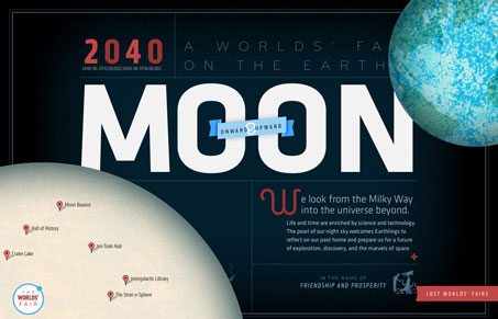
lostworldsfairs.com/moon/

12 Oct


This is the “Moon” website or page from the Lost World’s Fairs website project designed by Jason Santa Maria.

I love this design for “Moon”, the visual depth is really nice. I also love the movement as you scale your browser window down and then back up. The little illustrations are sweet too. It’s really hard to believe this is done with web fonts.


Useful Collection of Cheat-Sheet Desktop Wallpaper for Web Designers

07 Oct

Typical cheatsheets tend to be over-sized documents, far too large to be viewed in its entirety on a desktop and not too handy for the super-fast reference that is needed. To get the full benefit of any cheatsheat, your only real option is to print it out and keep it close at hand. Wouldn’t it be nice if there was an easier way, a quicker way. Of course there is – what good be handier than having a cheatsheet set as your desktop wallpaper? Always there for quick reference, no need to print it out and no need to scroll through an over-long document.

In this post we have rounded up a selection of cheatsheet wallpapers, in various sizes, covering various technologies, like CSS, HTML5, WordPress, Javascript and many more.

WordPress Help Sheet Wallpaper

WordPress Help Sheet Wallpaper
The WordPress Help Sheet Wallpaper is a simple desktop wallpaper listing Basic Template Files, PHP Snippets for the Header, PHP Snippets for the Templates, Extra Stuff for WordPress, based on the WPCandy WordPress Help Sheet.
Download: 2560x1600px.

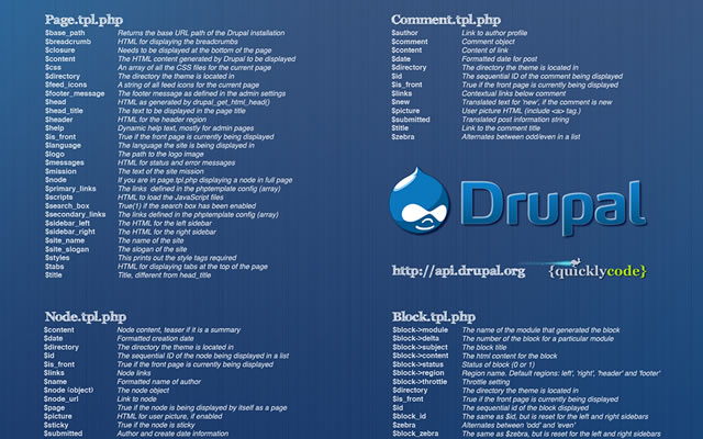
Drupal Cheat Sheet Desktop Wallpaper

Drupal Cheat Sheet Desktop Wallpaper
The Drupal Cheat Sheet Desktop Wallpaper is a desktop wallpaper that features the most popular variables of the open source content management system Drupal.
Download: 1024x768px – 1280x800px – 1440x900px – 1680x1050px – 1920x1200px.

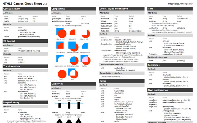
HTML5 Canvas Cheat Sheet

HTML5 Canvas Cheat Sheet
The information on this wallpaper is pretty much just a copy of what is found in the WHATWG specs, just condensed and a little bit easier to read. There are virtually no explanations, and no examples other than some graphics for compositing values. It's basically just a listing of the attributes and methods of the canvas element and the 2d drawing context.
Download: 1388x1027px.

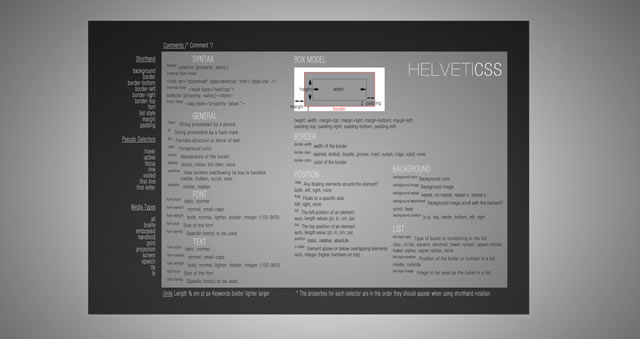
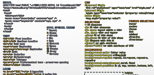
CSS Cheat Sheet Wallpaper in Helvetica

CSS Cheat Sheet Wallpaper in Helvetica
This is the very popular CSS cheat sheet in Helvetica from styl.eti.me. Simplistic in appearance, but very useful for quick referencing. Unfortunately we can not find a working download link for this cool wallpaper, but the good news is they do have a PSD version available. So download it and resize.
Download: CSS Cheat Sheet Wallpaper in Helvetica.

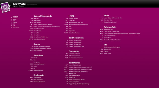
TextMate Shortcuts Wallpaper

TextMate Shortcuts Wallpaper
Here is a TextMate wallpaper that will guide you through some of its powerful features and help you get a handle on all of the keyboard shortcuts. The PSD file is also available.
Download: 1280x800px – 1920x1200px.

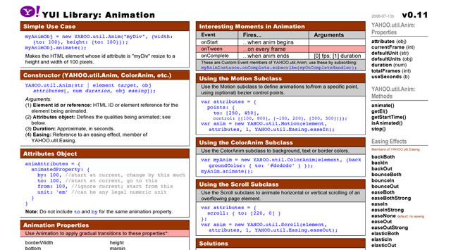
Yahoo! UI (YUI) Cheat Sheets as Wallpaper

Yahoo! UI (YUI) Cheat Sheets as Wallpaper
Yahoo! provides a number of cheat sheets for their YUI library widgets however these are all in PDF format and not usable as wallpaper. However, here you will find all of those cheatsheets converted to PNG images of various sizes all for your desktop.
There are wallpapers available for Animation, Calendar, Connection Manager, Dom Collection, Drag & Drop Event, Utility & Custom Event Logger, Slider and TreeView. And all are available in the following desktop sizes: 1400x1050px, 1280x960px, 1165x900px and 1024x768px.
Download: Yahoo! UI (YUI) Cheat Sheets as Wallpaper.

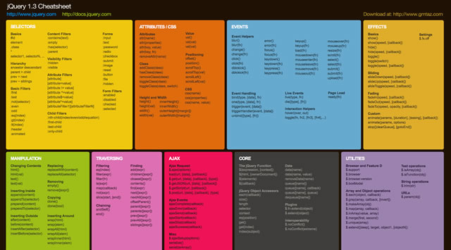
jQuery 1.3 Cheat Sheet Wallpaper

jQuery 1.3 Cheat Sheet Wallpaper
Download: 1440x900px – 1680x1050px – 1920x1200px.

Prototype Dissected Wallpaper

Prototype Dissected Wallpaper
If you need a little help in getting to know Prototype a little better and some help in understanding how the code works, then this is the wallpaper for you. You have a choice of either a dark or white wallpaper, and are available in these sizes: 1280x960px and 1440x900px.
Download: 1280x960px (Dark) – 1440x900px (Dark) – 1280x960px (White) – 1440x900px (White).

Git Cheat Sheet Wallpaper

Git Cheat Sheet Wallpaper
Download: 1100x850px – 3300x2550px.

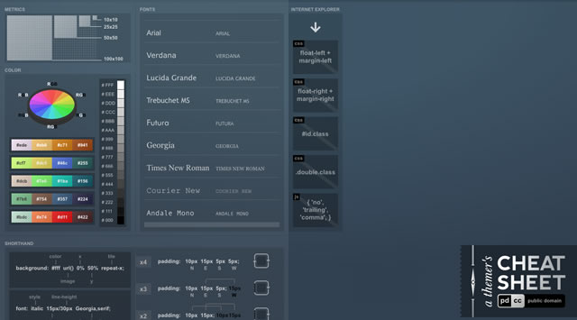
A Themer's Cheatsheet Wallpaper

A Themer's Cheatsheet Wallpaper
A Themer's Cheatsheet Wallpaper is a quick refresher of web design fundamentals directly on your desktop. It is available for download in several different colors and the original SVG has been released to the Public Domain.
Download: 1280x800px (Blue) – 1280x800px (Red) – 1280x800px (Black) – 1280x800px (Green).

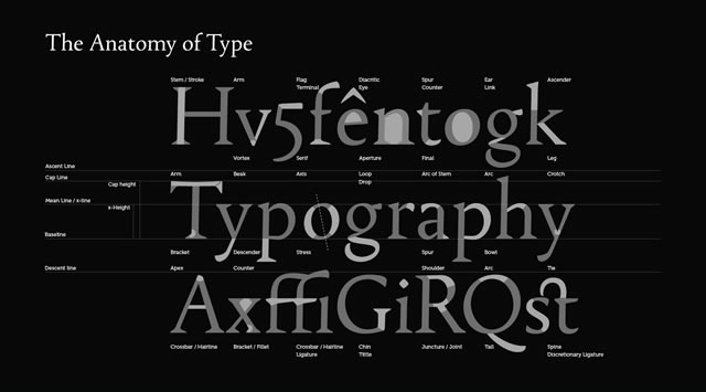
Font Anatomy Wallpaper

Font Anatomy Wallpaper
Download: 1920x1200px.

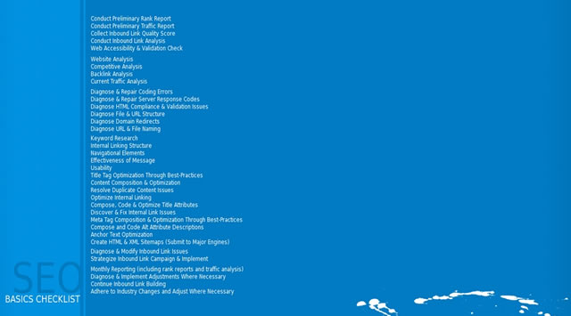
SEO Wallpapers

SEO Wallpapers
Think of it as a desk reference checklist that is always at your fingertips. From pre-campaign to reporting, the basics (and more) are right here for you to put directly on your desktop.
Download: 1024x768px – 1280x960px – 1280x1024px – 1440x900px.

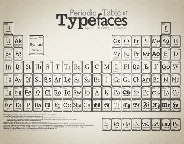
Periodic Table of Typefaces

Periodic Table of Typefaces
Download: 1024x768px – 1280x800px – 1280x1024px – 1440x900px – 1680x1050px – 1920x1200px.

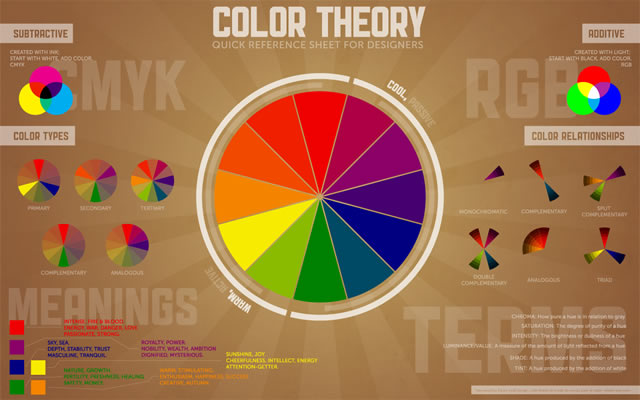
Color Theory Quick Reference Poster

Color Theory Quick Reference Poster
The Color Theory Quick Reference Poster for Designers has all of the basics of color theory contained in one place – specifically, a cool infographic-esque poster. This way, you can quickly reference things that may have slipped to the back of your mind since design school.
Download: 1280x800px – 1440x900px – 1680x1050px – 1920x1200px.

Web Designer Wallpaper

Web Designer Wallpaper
Download: 1280x1024px (White) – 1280x1024px (Dark) – 1680x10050px (Dark) – 1280x1024px (White).

You might also like…

14 Essential WordPress Development and Design Cheat Sheets »
17 Productive Photoshop Cheatsheets and Reference Cards to Download for Free »
The Best Cheat Sheets for Web Designers and Developers (From CSS, Ajax, Perl, Vbscript…) »
CSS References, Tutorials, Cheat Sheets, Conversion Tables and Short Codes »
20 CSS3 Tutorials and Techniques for Creating Buttons »
50 Useful Tools and Generators for Easy CSS Development »
50 Essential Web Typography Tutorials, Tips, Guides and Best Practices »
The Blueprint CSS Framework – Tutorials, How-to Guides and Tools »


Change Any Web Page’s Design Instantly with Chrome Extension Stylebot

21 Sep


One of our favorite web browsers just got a cool new tool in the form of Stylebot, a new Chrome extension that allows you to access and modify the CSS for any web page from within the browser.

That’s right — users get a completely customized design experience for any page they choose. The changes they make can be saved for later use and synced across multiple devices.

This is great news for you design enthusiasts as well as for end users with specific needs and wants for their browsing experience. For example, the extension makes web pages with small fonts more accessible by allowing users to increase the font size, and it can make browsing the web less commercial by removing ads.

Stylebot generates a sidebar full of basic and advanced CSS options that allow the end user to manipulate how content is displayed. This tool is simple enough to be used by a moderately competent consumer, but it also has options better suited for those with web design skills. Stylebot can be used to change font attributes, remove advertising, move page elements, change colors, write one’s own CSS selectors and quite a bit more.

Googler Rachel Shearer wrote the following today on the company’s blog:

“For example, a Stylebot user with special reading needs might change a webpage by removing images, picking new text and background colors, and even moving blocks of text around. And Stylebot saves the custom style they create, so the next time they access that page the changes will still be there. Even better, they can sync their saved styles across computers so that webpage will always appear with their preferred style.”

Check out this brief demo video to see Stylebot in action:

Stylebot was created as a Google Summer of Code project by Ankit Ahuja, a computer science student in New Delhi, India. Stylebot is open source and forkable; interested parties can check out Ahuja’s source on GitHub. He said he used elements of other open-source projects, such as Aristo and Firebug, in his work.

What do you think of Stylebot so far? Would you use it to prettify the ugliness that is Craigslist, for example, or to simplify content viewing on a news site?


Reviews: Craigslist

More About: accessibility, chrome, chrome extension, Chromium, CSS, design, designers, Google, google chrome, stylebot, web design

For more Dev & Design coverage:


Websites for scifi’s most famous evil corporations, based on real-life corporate websites [Design]

03 Sep
The best science fiction movies are only as good as the evil corporations they feature. But what sort of websites would Weyland-Yutani or OCP have? Artist Mikko Vartio imagines their websites, with a noticeable resemblance to some real-life corporate sites. More »


Numberclips

12 Jul

Numberclips - 0 to 9.jpeg

Fun (and maybe useful)! Numberclips via Grass Roots Modern


The Evolution of The Logo

06 Jul


Smashing-magazine-advertisement in The Evolution of The Logo
 in The Evolution of The Logo  in The Evolution of The Logo  in The Evolution of The Logo

Logo design has been a controversial subject in the design press lately. One branding professional recently claimed that logo design is not that hard to do and another said that logos are dead; some rebutted while others concurred. Why all the fuss?

We live in a Brand Era, where branding is in, and for some, aspiring to the Paul Rand style of logo craftsmanship is about as hip and contemporary as writing your invoices with a quill. Yes, logo design is only one facet of the powerful force that we call brand identity. Yes, a branded design environment can communicate sophisticated brand meaning without much (any?) usage of logos. But some ‘brand gurus’ or ‘brand evangelists’ (translation: ‘bastions of corporate pretension’) seem to enjoy making hyperbolic pronouncements just to sound shocking or cutting-edge. Logo design is not dead. The technological advancements and tumultuous industries of our century are causing its role in our culture to evolve.

Perhaps this clamorous debate is cause for a look at where logo design comes from, what state it’s in currently, and where it’s headed in the future. Where does a logo ultimately derive its power from? If we’re so hung up on divining what this Brand Era means for our clients, can we envision a Post-Brand Era?

[By the way, did you know we have a brand new free Smashing Email Newsletter? Subscribe now and get fresh short tips and tricks on Tuesdays!]

Symbolism

The history of logo design begins with the roots of human expression. In fact, the fundamental power of symbols remains most important element of logo design. A logo has meaning because it draws on centuries of signs and symbols (including the alphabet) in human literary and visual language. A logo designer who uses an image of an apple, for example, is drawing on centuries of potent symbolic usage. For most Western viewers, the image of an apple summons our associations with nature, food, the ‘forbidden fruit’ in the Garden of Eden, Snow White, Apple computers, et cetera. To design a logo with symbolic resonance is to participate in the lineage of social dialogue.

Pottery in The Evolution of The Logo

Fragment of a vase, third millennium B.C. The figures on this vase bear a striking similarity to the cave paintings of Lascaux and even to contemporary imagery like the Puma logo. These similarities reveal the harmony and union of human communication over great distances of time and geographic location.

To communicate effectively with design, it’s important to view the big picture of human communication and mythology. Logo design as we know it today is a strategy that rose to popularity with brands and corporations of the twentieth century. However, people and organizations have been identifying themselves with an enormous variety of marks, signatures, and emblems for centuries. In terms of visual communication, a modern company that represents itself with a logo, color scheme, and slogan is not very different from a 15th century royal court that invoked identity and unity through the use of family crests, uniforms, and religious symbolism.

In semiotics (the study of signs and symbols and their use or interpretation), human communication is discussed in terms of signs and signifiers. Signs can take the form of words, images, flavors, or even odors: things that have no intrinsic meaning until we invest it in them. We perceive, understand, and negotiate the world around us by investing meaning in all manner of signs and symbols. In the West, an image of a snake signifies evil. But without our Western cultural and mythological associations (many of which are rooted in the Bible), a serpent is just a serpent.

Greek in The Evolution of The Logo

Greek signature seals, fifth century B.C. Affluent Greek citizens used these molded stamps to sign or endorse documents. Using an animal image to identify oneself has a long history predating famous animal logos like Lacoste and Penguin.

Symbols are highly subjective and dependent upon cultural reference. The swastika, for example, is a symbol that was used by various cultures across the globe for over 5,000 years to symbolize a variety of positive meanings including good luck, life, sun, power, and strength. In fact, the word swastika comes from the Sanskrit svastika, which means “good fortune” or “well-being.” Sadly, those meanings have all been usurped by the atrocities of the Nazi party. No symbol has inherent meaning of its own, but when maligned by indelible association with war and unspeakable tragedy, a simple symbol like the swastika can be transformed into a potent talisman capable of eliciting an intense reaction from the viewer. Our complex emotional responses to rudimentary images reveals the profound depth of our relationship with the visual world around us.

The meaning of a logo is often an elusive concept, and two top professionals may disagree about whether a particular logo is a masterpiece or an abomination. This subjective nature of meaning in logography is part of the beauty and wonder of the craft.

Historical Identifying Marks

A wide variety of stamps, symbols, and signatures have been used to identify people over the centuries. Here are a few.

Marks in The Evolution of The Logo

Printer’s marks, late fifteenth century

The printer’s marks above are variations on an ‘orb and cross’ theme, symbolizing the idea that “God shall reign over Earth.”

Aldus in The Evolution of The Logo

Aldus Manutius, printer’s trademark, c.1500.

This printer’s trademark symbolizes a beautiful paradox. It was used in conjunction with an epigram reading “Make haste slowly.” Swiftness is visually represented by the speedy sea animal and stillness is represented by the anchor.

Rembrandt1 in The Evolution of The Logo

Rembrandt ‘branded’ his authorship on his paintings with a variety of signatures during the course of his career, but the distinctive ‘R’ and unique personality of the letterforms provide unity to the marks.

Corporate Identity

The industrial revolution profoundly expanded the reach and power of mass production and the marketing used to promote it. Corporations now found that a simple identifying mark was insufficient for distinguishing themselves amongst growing competition in broadening markets. “The national and multinational scope of many corporations made it difficult for them to maintain a cohesive image, but by unifying all communications from a given organization into a consistent design system, such an image could be projected, and the design system enlisted to help accomplish specific corporate goals.” (Meggs’ History of Graphic Design, by Philip B. Meggs and Alston W. Purvis).

In other words, the logo was now being used as one element in a broader system of visual elements used to identify the entire output of a corporation — many of which were becoming larger and more powerful than any had every been before.

Here are some notable developments in the evolution of identity design.

Wiener Werkstätte

The Wiener Werkstätte was a manufacturing and marketing enterprise founded in Vienna in 1903 — decades before graphic designers were doing work that was officially recognized as corporate identity. This group of craftsmen and designers were true trailblazers.

Werkstatte3 in The Evolution of The Logo

Marks of the Werkstätte, left to right: Werkstätte monogram, rose logo, logo for Galerie Miethke designed by Kolo Moser

Werkstatte in The Evolution of The Logo

Wiener Werkstätte letterhead printed in ‘Wiener Werkstätte blue,’ 1914. The group’s obsession with squares and grids is evident here.

A trademark was proposed for the Werkstätte, but designer Josef Hoffman proposed a complete graphic identity. The appearance of the group’s letters and articles was unified by four elements: the Werkstätte’s red rose symbol plus the monogram marks of the Werkstätte, the designer, and the producer. These standard elements, along with the use of the square as a decorative motif, were used to design everything from invoices to wrapping paper.

Werkstatte2 in The Evolution of The Logo

Now that’s dedication to designing an immersive brand environment: the Werkstätte logo forged into the handle of a cupboard key.

Identity Masters

Westinghouse in The Evolution of The Logo

Westinghouse logo and annual report designed by Paul Rand

Extraordinarily influential designers like Paul Rand, Milton Glaser, and Alan Fletcher helped shape the graphic identity of consumer culture during the second half of the twentieth century. Rand, for example, designed many ubiquitous logos and his varied identity work for IBM became a benchmark in the industry. These great designers have been covered in depth elsewhere (check out ‘The world’s best logo designers?’ by David Airey), so we won’t spend too much time on them here.

Music Television

“The move of information from the printed page to other media has changed the nature of graphic identity. The MTV logo, which emerges from an unexpected metamorphosis, is probably the ultimate in animated identity.” -The New York Times, September 1996

Mtv in The Evolution of The Logo

The MTV logo was designed by the now-defunct studio Manhattan Design in the early 1980’s. Former Manhattan Design member Frank Olinsky tells the story behind the creation of this logo here.

This logo was a revolution in corporate identity because it adapted to the language of television and shattered standing notions about the ‘rules’ of logo use. In the early 80’s, television had become a ubiquitous medium. The MTV logo adapted to the nature of this medium by exploiting the speed and motion of the moving image: it was regularly animated, shattered, decorated, erased, and reborn in the course of a brief station identification spot. This showed that logos could be adaptive vessels for graphic identity and demolished the notion that trademarks should always be presented in a consistent, static form. The logo had evolved to fit the culture of the television era.

The Brand Era

“In order to be successful multinational corporations, you need to produce brands, not products.” -Naomi Klein

Lebron in The Evolution of The Logo

Lebron James is deified in a Nike desktop wallpaper ad. The Swoosh is tiny; the brand is huge. For some, Nike epitomizes successful branding. For others, it’s the poster child for deceptive marketing, sweatshop labor, and unethical business practices.

Now that the whole world has been branded, the Twentieth Century approach to branding is old school. I’ll call our present day in age the Brand Era. The logo has evolved from a mark of quality on a product to a visual distillation of a cultural ideal — one that’s capable of accruing or asserting brand equity in a variety of marketing environments and inspiring great allegiance among consumers. “In this corporate formula,” says Naomi Klein, “the brand has little to do with the life of the product. Rather, it is a free-standing idea. The goal of the successful brand has become nothing short of transcendence from the world of things.”

In this twenty-first century brand space, Nike is no longer a shoe company — it is a concept that represents transcendence through sports. Consider the Nike ad above: Lebron James is deified in a Christ-like pose and with religious language (‘witness,’ ‘believe’), both of which imply spiritual transcendence. In the case of Michael Jordan, the star was granted superhuman powers in Nike ads (picture him achieving flight, suspended midair en route to the hoop). In the corner floats the simple, austere Swoosh. In this context, the logo is a sponge, soaking up the ‘brand equity’ created by themes of transcendence and flight as well as the basketball star’s fame/endorsement/deification.

‘Brand evangelists’ now use all kinds of lofty language to describe ‘brand worlds’ and ‘branded landscapes.’ At best, this kind of language describes creative brand strategy that can provide organizations with an innovative approach to defining themselves in today’s corporate culture — a place where tumultuous economies and rapid technological change require constant adaptation. At worst, this kind of behavior is an attempt to pull the pretentious wool over the novice client’s eyes, using ostentatious language to leverage the sale of mediocre design and commonplace brand strategy. None of us entered this field to become snake oil salesmen, so don’t pitch like them.

A Post-Brand Era?

Times Square in The Evolution of The Logo

Ask someone standing in Times Square if logo design is dead. Image: ‘Times Square Parade’ by Alexander Chen

In this era, the brand is bigger and more powerful than ever. Brands have become so big that some people have logo tattoos (physically branded with a brand) while celebrities like Martha Stewart and Oprah Winfrey have successfully developed themselves into personal mega brands. Brands like Nike have transformed themselves into lifestyle choices that consumers can integrate into their own identity. How much further can we go? What comes next?

Naomi Klein has noted that the many successful brands have already achieved “transcendence from the world of things,” meaning that the dissemination of a brand’s identity has become more valuable than its production of physical commodities. Technology will soon liberate brands from the visible world even further, as companies enter the fields of nanotechnology, synthetic life production, virtual space, and more. What will ‘brand identity’ mean for a person who has branded cells injected into their body to eradicate cancer? And you thought the favicon was small. Brands will occupy startling new environments (like the bloodstream) in the 21st Century.

The MTV logo famously introduced a logo that could undergo a costume change during every performance. How else can a logo break the rules to adapt? Is there a way to explode the logo, to decentralize it? What about a logo that consisted of separate elements that could be displayed on their own or joined together to create a unified whole? If branded products exist on a molecular level that’s invisible to the naked eye, could they project external holographic brand identity?

The role of brand identity in the future remains to be seen. But it appears as though — barring the apocalypse or some Naomi Klein-inspired activist revolution — brands will continue to expand into new areas. Just as most industries are dealing with abrupt transitional periods due to the disruptive effects of technology, so is ours. In fact, their transitional periods become our transitional periods, because they are our clients.

As brand identity designers, merely designing a logo for a client is not good enough. It is also unacceptable to stand on the cultural sidelines or design with our heads in the sand. We must be students of the changing cultures around us. We must take active roles in the use of design to strengthen and navigate the futures of the industries, people, and causes we believe in.

The Road Ahead

For now, brand identity design is thriving. Branded design environments (like a website with an integrated design strategy expressing brand qualities) can coexist with traditional logo design. In the future — as always — it’s creative thinking that will lead the way. One valuable asset will be the willingness to take a risk when it comes time to develop a strategy for a brand’s visual persona. The faster technology propels our culture, the more design risk-takers we’re going to need.

Whatever changes may come, one thing will remain. As graphic artists and designers, we possess the power (just as any two year-old with a crayon does) to ascribe meaning to the world around us. We put an expressive face on raw information. The fundamental desire of humans to understand the world in visual terms is a desire that we can understand and foster. Graphic design’s ability to provide meaning and useful information will prove more valuable than ever during uncertain and challenging times.

Partial Bibliography

  • Typography and Graphic Design: from Antiquity to Present by Roxane Jubert
  • Meggs’ History of Graphic Design by Philip B. Meggs and Alston W. Purvis
  • Graphic Design: A Concise History by Richard Hollis
  • No Logo by Naomi Klein
  • Wiener Werkstätte: Design in Vienna 1903-1932 by Christian Brandstätter

© Dan Redding for Smashing Magazine, 2010. | Permalink | Post a comment | Add to del.icio.us | Digg this | Stumble on StumbleUpon! | Tweet it! | Submit to Reddit | Forum Smashing Magazine
Post tags:


The Evolution of The Logo

06 Jul


Smashing-magazine-advertisement in The Evolution of The Logo
 in The Evolution of The Logo  in The Evolution of The Logo  in The Evolution of The Logo

Logo design has been a controversial subject in the design press lately. One branding professional recently claimed that logo design is not that hard to do and another said that logos are dead; some rebutted while others concurred. Why all the fuss?

We live in a Brand Era, where branding is in, and for some, aspiring to the Paul Rand style of logo craftsmanship is about as hip and contemporary as writing your invoices with a quill. Yes, logo design is only one facet of the powerful force that we call brand identity. Yes, a branded design environment can communicate sophisticated brand meaning without much (any?) usage of logos. But some ‘brand gurus’ or ‘brand evangelists’ (translation: ‘bastions of corporate pretension’) seem to enjoy making hyperbolic pronouncements just to sound shocking or cutting-edge. Logo design is not dead. The technological advancements and tumultuous industries of our century are causing its role in our culture to evolve.

Perhaps this clamorous debate is cause for a look at where logo design comes from, what state it’s in currently, and where it’s headed in the future. Where does a logo ultimately derive its power from? If we’re so hung up on divining what this Brand Era means for our clients, can we envision a Post-Brand Era?

[By the way, did you know we have a brand new free Smashing Email Newsletter? Subscribe now and get fresh short tips and tricks on Tuesdays!]

Symbolism

The history of logo design begins with the roots of human expression. In fact, the fundamental power of symbols remains most important element of logo design. A logo has meaning because it draws on centuries of signs and symbols (including the alphabet) in human literary and visual language. A logo designer who uses an image of an apple, for example, is drawing on centuries of potent symbolic usage. For most Western viewers, the image of an apple summons our associations with nature, food, the ‘forbidden fruit’ in the Garden of Eden, Snow White, Apple computers, et cetera. To design a logo with symbolic resonance is to participate in the lineage of social dialogue.

Pottery in The Evolution of The Logo

Fragment of a vase, third millennium B.C. The figures on this vase bear a striking similarity to the cave paintings of Lascaux and even to contemporary imagery like the Puma logo. These similarities reveal the harmony and union of human communication over great distances of time and geographic location.

To communicate effectively with design, it’s important to view the big picture of human communication and mythology. Logo design as we know it today is a strategy that rose to popularity with brands and corporations of the twentieth century. However, people and organizations have been identifying themselves with an enormous variety of marks, signatures, and emblems for centuries. In terms of visual communication, a modern company that represents itself with a logo, color scheme, and slogan is not very different from a 15th century royal court that invoked identity and unity through the use of family crests, uniforms, and religious symbolism.

In semiotics (the study of signs and symbols and their use or interpretation), human communication is discussed in terms of signs and signifiers. Signs can take the form of words, images, flavors, or even odors: things that have no intrinsic meaning until we invest it in them. We perceive, understand, and negotiate the world around us by investing meaning in all manner of signs and symbols. In the West, an image of a snake signifies evil. But without our Western cultural and mythological associations (many of which are rooted in the Bible), a serpent is just a serpent.

Greek in The Evolution of The Logo

Greek signature seals, fifth century B.C. Affluent Greek citizens used these molded stamps to sign or endorse documents. Using an animal image to identify oneself has a long history predating famous animal logos like Lacoste and Penguin.

Symbols are highly subjective and dependent upon cultural reference. The swastika, for example, is a symbol that was used by various cultures across the globe for over 5,000 years to symbolize a variety of positive meanings including good luck, life, sun, power, and strength. In fact, the word swastika comes from the Sanskrit svastika, which means “good fortune” or “well-being.” Sadly, those meanings have all been usurped by the atrocities of the Nazi party. No symbol has inherent meaning of its own, but when maligned by indelible association with war and unspeakable tragedy, a simple symbol like the swastika can be transformed into a potent talisman capable of eliciting an intense reaction from the viewer. Our complex emotional responses to rudimentary images reveals the profound depth of our relationship with the visual world around us.

The meaning of a logo is often an elusive concept, and two top professionals may disagree about whether a particular logo is a masterpiece or an abomination. This subjective nature of meaning in logography is part of the beauty and wonder of the craft.

Historical Identifying Marks

A wide variety of stamps, symbols, and signatures have been used to identify people over the centuries. Here are a few.

Marks in The Evolution of The Logo

Printer’s marks, late fifteenth century

The printer’s marks above are variations on an ‘orb and cross’ theme, symbolizing the idea that “God shall reign over Earth.”

Aldus in The Evolution of The Logo

Aldus Manutius, printer’s trademark, c.1500.

This printer’s trademark symbolizes a beautiful paradox. It was used in conjunction with an epigram reading “Make haste slowly.” Swiftness is visually represented by the speedy sea animal and stillness is represented by the anchor.

Rembrandt1 in The Evolution of The Logo

Rembrandt ‘branded’ his authorship on his paintings with a variety of signatures during the course of his career, but the distinctive ‘R’ and unique personality of the letterforms provide unity to the marks.

Corporate Identity

The industrial revolution profoundly expanded the reach and power of mass production and the marketing used to promote it. Corporations now found that a simple identifying mark was insufficient for distinguishing themselves amongst growing competition in broadening markets. “The national and multinational scope of many corporations made it difficult for them to maintain a cohesive image, but by unifying all communications from a given organization into a consistent design system, such an image could be projected, and the design system enlisted to help accomplish specific corporate goals.” (Meggs’ History of Graphic Design, by Philip B. Meggs and Alston W. Purvis).

In other words, the logo was now being used as one element in a broader system of visual elements used to identify the entire output of a corporation — many of which were becoming larger and more powerful than any had every been before.

Here are some notable developments in the evolution of identity design.

Wiener Werkstätte

The Wiener Werkstätte was a manufacturing and marketing enterprise founded in Vienna in 1903 — decades before graphic designers were doing work that was officially recognized as corporate identity. This group of craftsmen and designers were true trailblazers.

Werkstatte3 in The Evolution of The Logo

Marks of the Werkstätte, left to right: Werkstätte monogram, rose logo, logo for Galerie Miethke designed by Kolo Moser

Werkstatte in The Evolution of The Logo

Wiener Werkstätte letterhead printed in ‘Wiener Werkstätte blue,’ 1914. The group’s obsession with squares and grids is evident here.

A trademark was proposed for the Werkstätte, but designer Josef Hoffman proposed a complete graphic identity. The appearance of the group’s letters and articles was unified by four elements: the Werkstätte’s red rose symbol plus the monogram marks of the Werkstätte, the designer, and the producer. These standard elements, along with the use of the square as a decorative motif, were used to design everything from invoices to wrapping paper.

Werkstatte2 in The Evolution of The Logo

Now that’s dedication to designing an immersive brand environment: the Werkstätte logo forged into the handle of a cupboard key.

Identity Masters

Westinghouse in The Evolution of The Logo

Westinghouse logo and annual report designed by Paul Rand

Extraordinarily influential designers like Paul Rand, Milton Glaser, and Alan Fletcher helped shape the graphic identity of consumer culture during the second half of the twentieth century. Rand, for example, designed many ubiquitous logos and his varied identity work for IBM became a benchmark in the industry. These great designers have been covered in depth elsewhere (check out ‘The world’s best logo designers?’ by David Airey), so we won’t spend too much time on them here.

Music Television

“The move of information from the printed page to other media has changed the nature of graphic identity. The MTV logo, which emerges from an unexpected metamorphosis, is probably the ultimate in animated identity.” -The New York Times, September 1996

Mtv in The Evolution of The Logo

The MTV logo was designed by the now-defunct studio Manhattan Design in the early 1980’s. Former Manhattan Design member Frank Olinsky tells the story behind the creation of this logo here.

This logo was a revolution in corporate identity because it adapted to the language of television and shattered standing notions about the ‘rules’ of logo use. In the early 80’s, television had become a ubiquitous medium. The MTV logo adapted to the nature of this medium by exploiting the speed and motion of the moving image: it was regularly animated, shattered, decorated, erased, and reborn in the course of a brief station identification spot. This showed that logos could be adaptive vessels for graphic identity and demolished the notion that trademarks should always be presented in a consistent, static form. The logo had evolved to fit the culture of the television era.

The Brand Era

“In order to be successful multinational corporations, you need to produce brands, not products.” -Naomi Klein

Lebron in The Evolution of The Logo

Lebron James is deified in a Nike desktop wallpaper ad. The Swoosh is tiny; the brand is huge. For some, Nike epitomizes successful branding. For others, it’s the poster child for deceptive marketing, sweatshop labor, and unethical business practices.

Now that the whole world has been branded, the Twentieth Century approach to branding is old school. I’ll call our present day in age the Brand Era. The logo has evolved from a mark of quality on a product to a visual distillation of a cultural ideal — one that’s capable of accruing or asserting brand equity in a variety of marketing environments and inspiring great allegiance among consumers. “In this corporate formula,” says Naomi Klein, “the brand has little to do with the life of the product. Rather, it is a free-standing idea. The goal of the successful brand has become nothing short of transcendence from the world of things.”

In this twenty-first century brand space, Nike is no longer a shoe company — it is a concept that represents transcendence through sports. Consider the Nike ad above: Lebron James is deified in a Christ-like pose and with religious language (‘witness,’ ‘believe’), both of which imply spiritual transcendence. In the case of Michael Jordan, the star was granted superhuman powers in Nike ads (picture him achieving flight, suspended midair en route to the hoop). In the corner floats the simple, austere Swoosh. In this context, the logo is a sponge, soaking up the ‘brand equity’ created by themes of transcendence and flight as well as the basketball star’s fame/endorsement/deification.

‘Brand evangelists’ now use all kinds of lofty language to describe ‘brand worlds’ and ‘branded landscapes.’ At best, this kind of language describes creative brand strategy that can provide organizations with an innovative approach to defining themselves in today’s corporate culture — a place where tumultuous economies and rapid technological change require constant adaptation. At worst, this kind of behavior is an attempt to pull the pretentious wool over the novice client’s eyes, using ostentatious language to leverage the sale of mediocre design and commonplace brand strategy. None of us entered this field to become snake oil salesmen, so don’t pitch like them.

A Post-Brand Era?

Times Square in The Evolution of The Logo

Ask someone standing in Times Square if logo design is dead. Image: ‘Times Square Parade’ by Alexander Chen

In this era, the brand is bigger and more powerful than ever. Brands have become so big that some people have logo tattoos (physically branded with a brand) while celebrities like Martha Stewart and Oprah Winfrey have successfully developed themselves into personal mega brands. Brands like Nike have transformed themselves into lifestyle choices that consumers can integrate into their own identity. How much further can we go? What comes next?

Naomi Klein has noted that the many successful brands have already achieved “transcendence from the world of things,” meaning that the dissemination of a brand’s identity has become more valuable than its production of physical commodities. Technology will soon liberate brands from the visible world even further, as companies enter the fields of nanotechnology, synthetic life production, virtual space, and more. What will ‘brand identity’ mean for a person who has branded cells injected into their body to eradicate cancer? And you thought the favicon was small. Brands will occupy startling new environments (like the bloodstream) in the 21st Century.

The MTV logo famously introduced a logo that could undergo a costume change during every performance. How else can a logo break the rules to adapt? Is there a way to explode the logo, to decentralize it? What about a logo that consisted of separate elements that could be displayed on their own or joined together to create a unified whole? If branded products exist on a molecular level that’s invisible to the naked eye, could they project external holographic brand identity?

The role of brand identity in the future remains to be seen. But it appears as though — barring the apocalypse or some Naomi Klein-inspired activist revolution — brands will continue to expand into new areas. Just as most industries are dealing with abrupt transitional periods due to the disruptive effects of technology, so is ours. In fact, their transitional periods become our transitional periods, because they are our clients.

As brand identity designers, merely designing a logo for a client is not good enough. It is also unacceptable to stand on the cultural sidelines or design with our heads in the sand. We must be students of the changing cultures around us. We must take active roles in the use of design to strengthen and navigate the futures of the industries, people, and causes we believe in.

The Road Ahead

For now, brand identity design is thriving. Branded design environments (like a website with an integrated design strategy expressing brand qualities) can coexist with traditional logo design. In the future — as always — it’s creative thinking that will lead the way. One valuable asset will be the willingness to take a risk when it comes time to develop a strategy for a brand’s visual persona. The faster technology propels our culture, the more design risk-takers we’re going to need.

Whatever changes may come, one thing will remain. As graphic artists and designers, we possess the power (just as any two year-old with a crayon does) to ascribe meaning to the world around us. We put an expressive face on raw information. The fundamental desire of humans to understand the world in visual terms is a desire that we can understand and foster. Graphic design’s ability to provide meaning and useful information will prove more valuable than ever during uncertain and challenging times.

Partial Bibliography

  • Typography and Graphic Design: from Antiquity to Present by Roxane Jubert
  • Meggs’ History of Graphic Design by Philip B. Meggs and Alston W. Purvis
  • Graphic Design: A Concise History by Richard Hollis
  • No Logo by Naomi Klein
  • Wiener Werkstätte: Design in Vienna 1903-1932 by Christian Brandstätter

© Dan Redding for Smashing Magazine, 2010. | Permalink | Post a comment | Add to del.icio.us | Digg this | Stumble on StumbleUpon! | Tweet it! | Submit to Reddit | Forum Smashing Magazine
Post tags:


Just Tweet It – The Directory for Twitter Users

07 Oct

Just Tweet It was created to make it easier for people using the popular micro-blogging service Twitter to find other “Tweeters” with similar interests.


All you need is a Twitter account to get started, then head over to Just Tweet It and add yourself to some categories and find others that share your interests, search for friends and keep up with the latest in your field.

You can subscribe to the main Just Tweet It blog and/or the Directory Feed ! If you’d like to follow twitter updates you can follow @justtweetit.

Designed and Created by Dani McDaniel and Adelle Charles.

Related Posts

 
Comments Off on Just Tweet It – The Directory for Twitter Users

Posted in Uncategorized