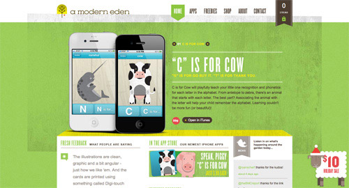
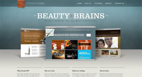
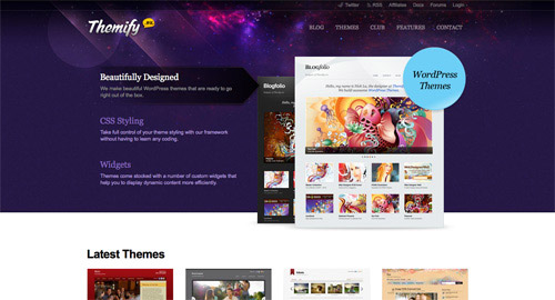
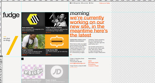
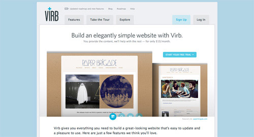
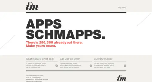
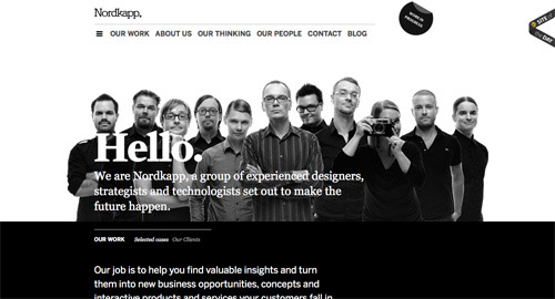
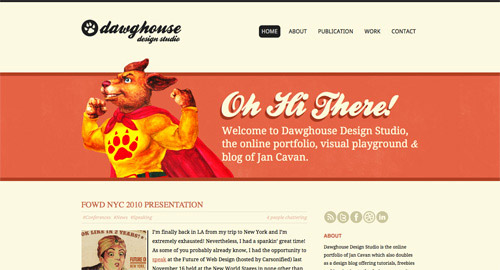
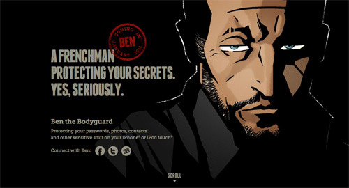
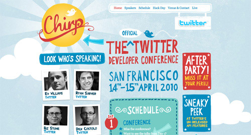
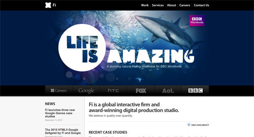
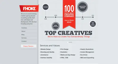
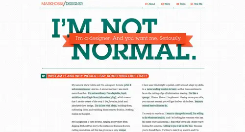
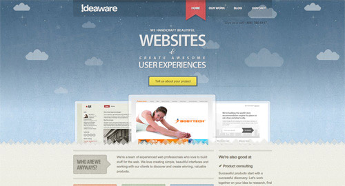
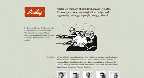
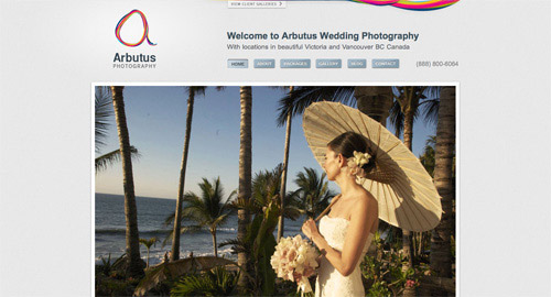
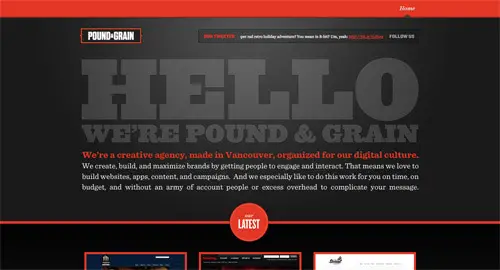
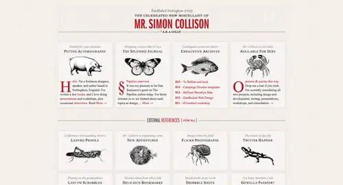
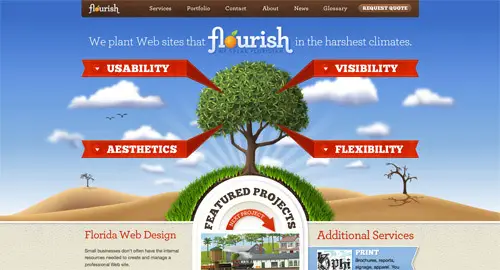
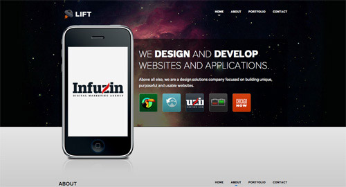
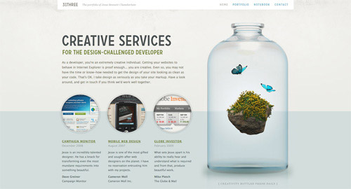
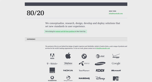
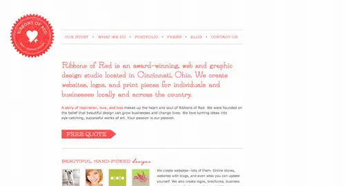
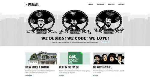
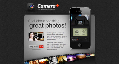
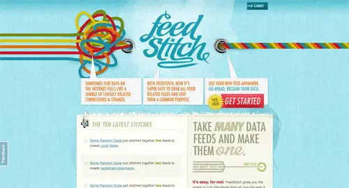
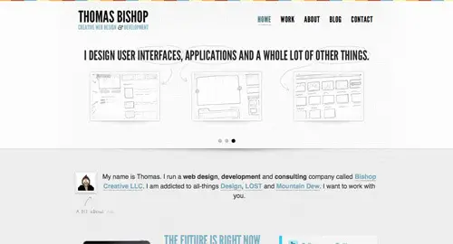
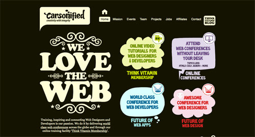
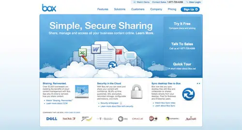
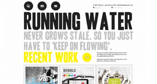
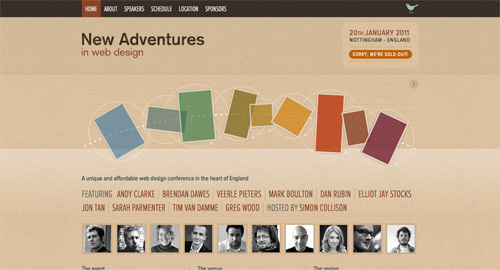
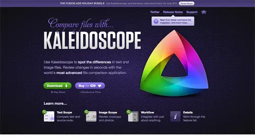
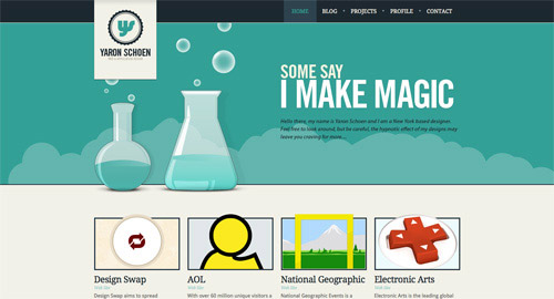
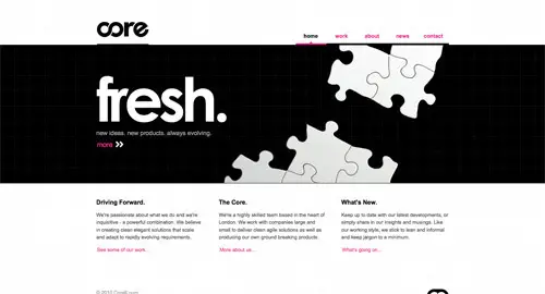
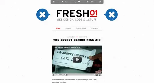
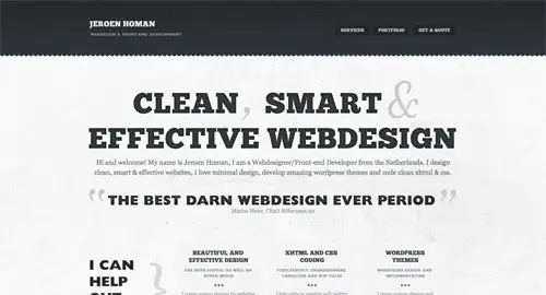
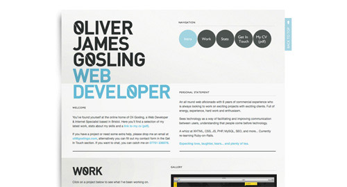
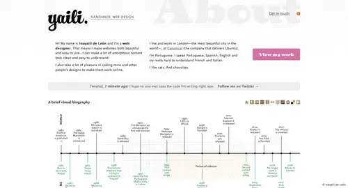
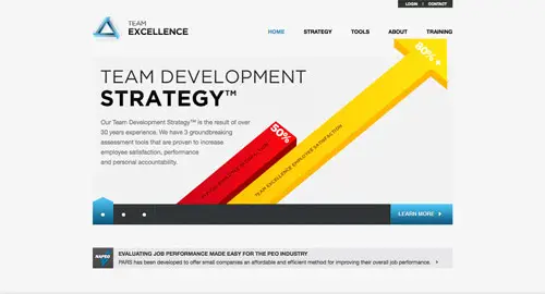
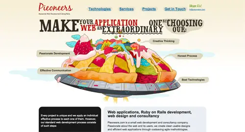
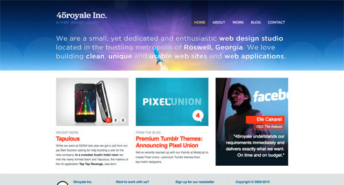
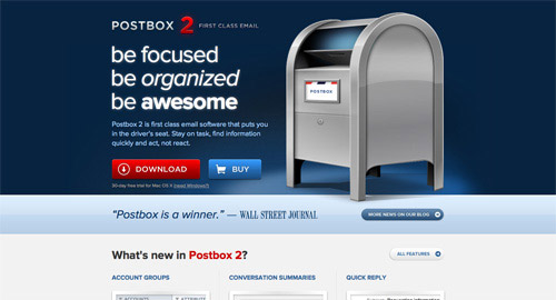
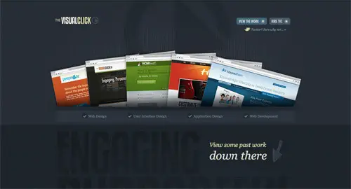
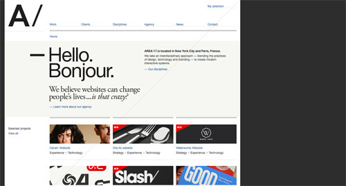
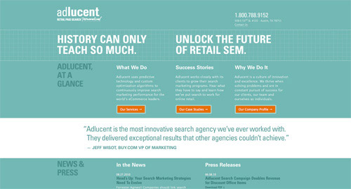
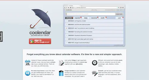
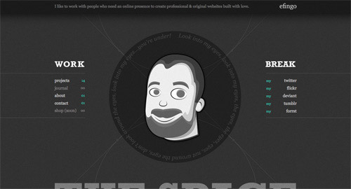
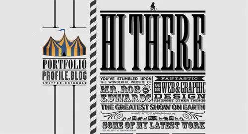
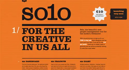
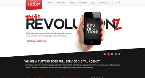
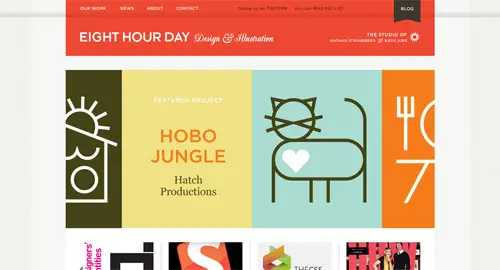
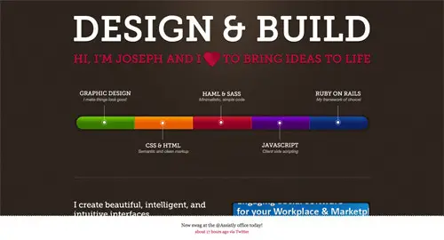
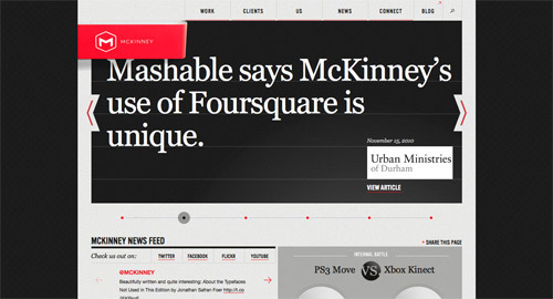
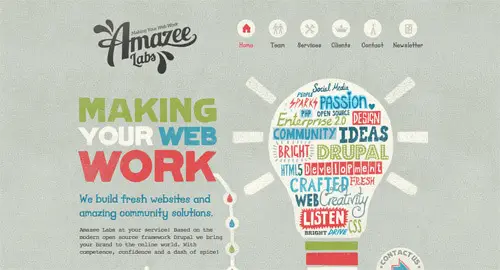
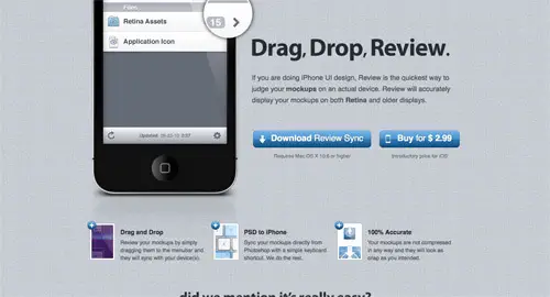
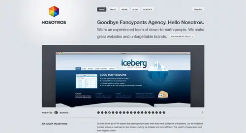
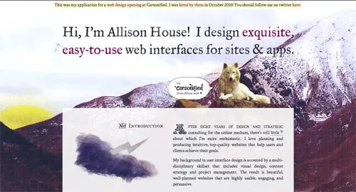
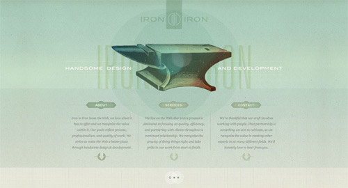
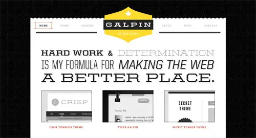
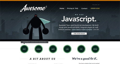
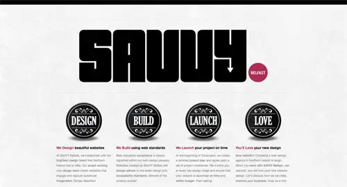
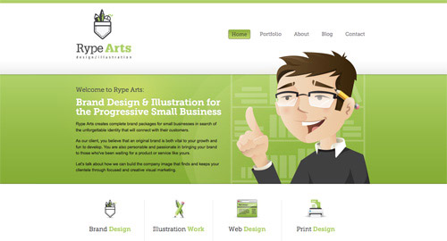
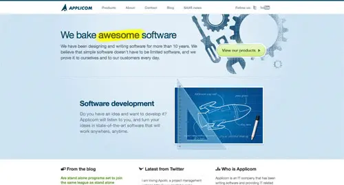
Throughout the year I’ve showcased my favourite website designs findings in the Line25 Sites of the Week roundups. This special end of year post showcases the best of the best, pulling together the awesomest designs from all the 2010 Sites of the Weeks into one showcase of super cool sites.
Posts Tagged ‘inspiration’
Olly Moss on Star Wars


In a world where modern film posters for the most part give us designers a sinking feeling, we thankfully have guys like Olly Moss out there. So much can be said about these beautiful re-imaginings of the best film trilogy out there, don’t even know where to start. Olly treated Star Wars with care and respect while breathing his own unique and clever vision in the designs.
According to Mondo, these posters will be for sale this Monday, December 20th at a limited run of 400 prints each. These will probably be gone faster then the Falcon can make the Kessel Run.
Beauty Of Nature: 100 Brilliant Examples Of Bird Photography
Bird photography is one of the most challenging types of nature photography, but remains an incredibly popular hobby for many people. The subject is usually small, may not stay still, moves rapidly from branch to branch, sits in less than favourable lighting conditions and is extremely aware of an approaching photographer. Tricky! In this showcase we have collected 100 beautiful examples of bird photography, and a few tips to help you out.
Examples and Inspiration
Red Kite
The lost prey
Every day is sushi day…
A certain smile…
Totally in Love
Food for the Kids
This is love
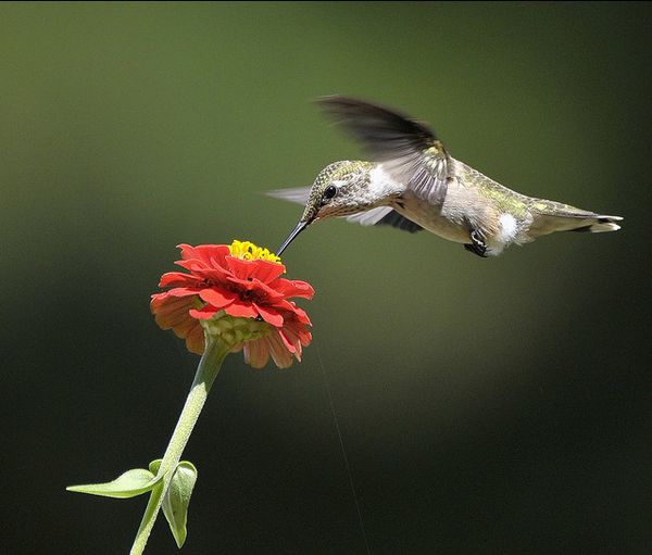
Ruby-throated Hummingbird
Palestine Sunbird.
attack
Common Tern.
As white as snow
White-throated Kingfisher
Kingfisher
Splash
Sealed with a kiss
Bombycilla garrulus
Siesta
Flying puffin
"Fly away from my branch!!!"…
Pop-up Breakfast
Eyes left
Shaking
Kingfisher and Dragonfly
Thirsty
The spaghetti incident
Kingfisher landing
"Measurement of the horses" – which is greater
Feeding
Egyptian Vulture
collared dove
collared doves
Sparrows in flight
bird reflection
A Robin for New Year
Parrot escapee!!!
Baby bird
Freedom dove now home!
mandarin duck in full colour
Love Bird
Toucan bird
Mystery Bird Eating Oceanspray
Birds
Flightless birds
Birds
Birds
Humming bird
Love Bird at g’pa bill
Buffy Fish Owl
The Seven Year Itch
Dopo il tuffo
Silly Walk
Eurasian Curlew
BABY BIRD IN NEST
Welcome to the New Year!
A Bird in the Hand
Wings of gold
Thirsty birds at St Ives village green.
Who’s afraid of red, yellow and blue
Woodland Kingfisher
Bird Bath
Blue Song
green ON green
Buffalo Buffet
Seconds from disaster…
Birds of a feather..
Lady Bird
Indian PeafowlÂ
See! I’m more than just a cottonball
Jonathan Livingston Seagull
stir-fried …
In Frozen Time
Birds’s Life!
Below Zero
Feed Me……!
Weapons
Reed Warbler.
Got a whole lot of Living to do…..
Three of a Kind
Ulula
Conversation
Vulgaris
Graceful Prinia.
We are The bird- Beatles
Food Fight!
Pekin Robin
Fulvous-faced Flycatcher Warbler
Hello world!
Within the Focus Point
robin redbreast
Under the wing
Taiwan Blue Magpie
Firecrest Superman
Bubo Lacteus
Allen’s Hummingbird
Firecrest
Bird on a fence
Black-winged stilt.
Loros
Tips & Resources for Bird Photography
Practice on Your Pet!
Home is where the heart is, and there’s certainly something to be said for starting out photographing your own pet. Granted, you’re unlikely to own a collection of exotic birds, but many animals offer similar challenges. It’s easy, risk-free, and you have all the time in the world to stalk around your house like a member of the feline paparazzi.
Let Nature Come to You
Keep your distance, stay still, and play the waiting game. If you’d rather practice in the comfort of your own garden, why not set up a bird feeder? You’ll know (more or less) exactly where to point your camera in advance, and it’s a simple way to get started with bird photography on your own turf.
Continuous Shutter
This one might go without saying, but using a continuous shutter is a great technique to practice when shooting a subject that’s liable to move quickly. Stock up on memory cards, and don’t be afraid to hold the shutter down for a few seconds when you’re close to getting that perfect bird shot.
Other Resources
Be sure to check out a few of these other articles and tips for perfecting your bird photography technique!
- Backyard Bird Photography
- Bird Photography Tips
- Nigel Blake’s Blog
- Mike Atkinson’s Bird Photography Tutorial
If you have any hints and tips of your own, I’d love to read them in the comments.
25 Beautiful Blog Designs
While the content is the most critical element to a blog’s success, having an attractive design can certainly help to capture the interest and to make a positive first impression with your visitors. In this post we’ll showcase 25 outstanding blog designs for your own inspiration. The selection here includes designs with a variety of different styles and blogs of many different types.
For more design inspiration please see:
- 25 Outstanding Magazine Style Website Designs
- 25 Beautifully Colorful Websites
- 27 of the Best Real Estate Websites
- 25 Flash Portfolios for Your Inspiration
- 30+ Websites of Higher Education Institutions
Design Inspiration: Text Art Showcase
Typography is a major aspect of web and graphic design. With text art, typography and text effects can be used in unique, creative ways to design. In this post we’ll showcase some beautiful examples of text art. If you see something you like, click on the image and you will be led to the source.
For more design inspiration please see:
- 35 Amazing Digital Paintings
- 25 Beautiful Examples of Black and White Photography
- Showcase of Beautiful Architecture Photography
- Showcase of Amazing Vector Art
- Design Inspiration: Graffiti Art Showcase
22 Awesome WTF! Posters
70+ Brilliant Examples Of Photo Manipulation Art
Throughout history, great designers always found new ways to show their creativity to express themselves and create new trends and techniques to remark their work apart from the rest of the crowd. Photo manipulation is an art in itself, that requires a skill and precision as we know, it is one of the most creative artforms to come out of the digital age.
This presentation shows an amazing collection of photo manipulation art related to nature, photography, objects, illustrations, HDR as well as some abstract and fantasy-related concepts. Hopefully, everybody will find something interesting to ignite their creativity.
You may be interested in the following related articles as well.
- Mind Blowing Photo Manipulations Art – Part I, Part II, Part III
- 88 Examples of Incredible Aerial Photography
- Mix Collection of 99 Stunning Photographs to Refresh Your Mind
- Enjoy Moments Of Reflective Photography – Part I, Part II
- Rainbow Colors Inspired Photos and Pictures – Part I, Part II
- Strange and Fantastic Buildings Architecture – Part I, Part II
Please feel free to join us and you are always welcome to share your thoughts even if you have more reference links related to other photo manipulation art that our readers may like.
Don’t forget to  subscribe to our RSS-feed and
  follow us on Twitter — for recent updates.
Brilliant Examples of Photo Manipulations Art
Photo manipulation can serve as an excellent source of inspiration. Infect, we, designers, can derive inspiration from almost everything around, and this collection can fulfills your design inspiration related needs as we can promise you that when you start browsing them further in details it will surely refresh your memory.
More Resources
- Photo Manipulation Flickr Pool
- Photoshoped Animals Flickr Pool
- Manipulations Flickr Pool
- Image Manipulation Flickr Pool
- Photo Manipulation Set from DeviantArt
Find Something Missing?
While compiling this list, it’s always a possibility that we missed some other great artwork. Feel free to share it with us.
Showcase Of Beautiful But Unusable Websites
“Form follows function†is a widely accepted — albeit controversial — principle that most designers in a variety of disciplines have adopted since its inception at the turn of the 20th century. On the web, we commonly refer to function as usability which is the ease of use and navigation of a website in order to achieve user’s goals.
In this showcase we present websites that sacrifice usability for beauty and present issues related to clutter, loading, navigation, archiving or visibility. Unfortunately, although the sites featured in this showcase are visually appealing, they are quite difficult to use. By studying such examples, we can learn what mistakes we can avoid in our designs and how not to strive for strong aesthetic appearances on the account of usability.
You may be interested in the showcase of Bizarre Websites On Which You Can Kill Time With Style as well.
Visual Clutter
Where do I look? Where do I click? What do I do? Visual clutter is one of the most serious issues a designer can present to an audience. Not only is the user unlikely to achieve the desired goals (because it’s hidden in the clutter), chances are they’ll just leave out of frustration before they do anything.
Creative With aK
Navigation overload! Not only are we unsure of where to look, we’re unsure of what’s clickable! Having to scan around the design with the mouse is not helpful for usability. And that’s if, and only if, you get past the load screen with no load progress bar. In addition to that, it takes a while until one has figured out that the welcome screen has to be closed to enable the actual in-site navigation. The inexistant scroll finally lets potentially interesting content disappear under the frame of the browser window.
Marc Ecko
Marc Ecko is an extremely successful businessman with countless ventures and he definitely wants us to know it. The problem is, he’s got so much business we don’t know where to start, provided you get used to the almost erratic horizontal scrolling feature! Getting the information you are looking for will take quite some time.
Content Of
Even after reading the “About†page and randomly clicking links, we’re still not sure what this page actually is about. Our best guess is a portfolio, but due to link clutter and no solid explanation of what the navigation does, we’re left confused.
There Studio
Half of the circles that look clickable aren’t; the other half jumble into a new rotation if you drag and drop them. Granted, the movement makes sense for the philosophy of the company, and there isn’t too much clutter, but it took us a minute to figure it all out and that’s 58 seconds too long. If you feel the need for more bubbles, click and drag on the empty space to add more to the confusion.
Loading Issues
As bounce rates increase, and time-on-sites decreases web-wide, it is becoming increasingly important to grab people’s attention immediately. By the time all of your effects load, chances are your user is back on Google or Facebook looking for the next cool site. Loading times, skip buttons, missing instructions on navigation and many other issues are all subject of considerations here.
Coke Light
One of the worst things you can do as a Flash designer is force an introduction on your audience. A long intro and no skip button means this site is likely to be abandoned by most of its visitors before they get in. Add an unclear “Call to Action†and no visual navigation indicators and most people will never encounter the beauty this site has to offer. Long transitions back to the home screen waste time the visitior could have spent successfully “travelling the worldâ€, searching for the numerous balloons hidden within the map.
Design Sul
We’ve never seen so many load issues on one site. Multiple load times for different elements, re-loads once you’re in to the site core, and no clear indication that loading is finished make for an extremely confusing and difficult to use website. Actually, discovering how to reach the content takes some time, what it all has to do with milk cartons is a different question.
Nicola Walbeck
A big loading wait-time at the beginning of the site is excruciating, but sometimes manageable once you enter a beautiful, usable website. Scratch that here, because once you get in, you’ll have to wait again and again for each individual image, forcing you to stare at blurred photographs. A better idea would be to use loading bars on the image to indicate that the image is loading. If you are on a broadband connection, then it’s fine, but if you are not, you start to get nervous very quickly. Add the fact that there’s no prominent back button and the experience could be a bit frustrating.
Navigation Issues
For content/category heavy sites especially, navigation is extremely important. Imagine driving without a map, or the grocery store with no aisle indicators. Navigation tells us where to go and how, or — in these cases — tells us very little. You might consider taking a compass with you, these examples make getting lost easy.
EContent
After quite a long load, this site requires the user to click “enterâ€. Okay, we’re in. Unfortunately, although there is a quick-menu, it does not draw attention and the user is required to blindly scroll over images to see categories. Navigate with caution and carefully look out for navigation buttons!
Prism Girl
Unusable sites have actually developed conventions. When we don’t see clear category navigation on a beautiful site, we poke around with our mouse looking for the category links. This site is beautiful (and complex) enough to poke around for an hour, but you’ll probably never guess you have to click on the mouse trailing icon to enter. Other than impressive design work, this site does not have much to offer.
On Toyota’s Mind
Slow load time leads to an unclear ‘Call to Action’, no visually clear navigation as well as a hard-to-find back action. Our question: What crossed Toyota’s mind when conceptualising this site?
Theologos
No button to skip intro. No visually clear navigation. Slow transitions. And here’s the kicker, a separate page to mute the music player. When visiting the site using a fast connection, the animations make the visit even less enjoyable.
Archiving/Category Issues
Your site loaded fine, it’s clear what you want people to do, you have a solid navigation, but once the user begins moving around, they can’t figure out your category structure. When you want meat, you go to the deli, not the dairy aisle. Some sites, unfortunately, get it wrong.
Self Titled
A hidden quick menu and unclear category organization make this site difficult to navigate. The actual information one gets when entering a category is rather scarce.
Vanalen
Image slivers make-up the category composition on this site, giving us very little information as to where/what to click on. If you’re new to the site, you are likely to spend a while until you find what you were looking for.

Grip Limited
The website does tell you to “click and drag†but finding this instruction amidst what looks like a typographic poster is something we suspect many people weren’t able to do. Realizing this might be a problem, Grip did create an “Open Menu†bar at the top of the page, but what are the chances you’re going to look there?
Kyle Tezak
Another example of an extremely talented visual artist who has great design work, but a small usability problem makes the user experience less enjoyable. There is no actual navigation on this page, just a floating header and illustrations of Kyle’s work. To find the designer’s contact information, you need to click on the “Information†link in the upper right corner. Using more traditional wording would improve usability: e.g. putting an e-mail right there or naming it “Contact information†or adding contact information at the bottom of the page would help. A nice example of how one little detail can improve site’s usability.
Visibility/Scrolling Issues
A site may be uncluttered and have great navigation, but if the magnification is off, or scrolling is dysfunctional, no one is going to see it. Visibility issues can quickly turn to invisibility issues as users navigate away from your site.
Real Casual
This site is invisible until you start hunting with your mouse, at which point different areas of the screen appear. A long roll-over hunt is followed by long load times, during which fade effects additionally take your chance to get a good look at content.
Lego Click
Scrolling is conventionally top to bottom or left to right, but this site starts at the bottom which is confusing. Add to that an inability to retrieve closed elements, and several other minor issues, and you get an extremely frustrating (but beautiful) website from Lego.
Journey to Zero
This site is rather large, but you wouldn’t know it. It starts magnified with no suggestion to drag scroll, leaving the user wondering where all the content is. If you scroll too far on the other hand, you might end up in empty regions of the site, making it hard to get back to the content. Very beautiful website that is difficult to use.
Faub (currently offline)
Another beautiful site that starts magnified and does not let you decrease the magnification, or suggest dragging for navigation.
Uniqlo
Uniqlo presents what looks like a beautiful and usable online store. That is, until you’ve added 10 items to your cart only to find out there is no check-out. Turns out it’s not a store at all, just a wishlist! A truely frustrating experience for every consumer willing to spend!
Bio Bak
Another drag navigation site that’s just too big for its own good. This is one of our favorite sites from a beauty/having fun perspective, but it does an awful job of presenting the design agency from a usability perspective. Using the mouse wheel by chance let us discover that the site has more to offer than what is visible on the first glace.
Summary
Design for function and communication. If your website ends up beautiful in the process, you kill two birds. Design for beauty only if the primary function of your site is to convey beauty.
Be wary of visual clutter, especially in navigation and on landing pages. Designing with too much clutter can make an audience unsure of how to use your site. In the worst case users won’t be able to load your page in the first place. Web customers don’t like to wait. Ensure that your site has a fast, clear load that conveys an easy understanding of how long it will take and when it is finished. This minimizes your risk of losing visitors to other sites in the meanwhile, keeping them occupied with joyous anticipation.
Once users arrive, you want to direct them to certain pages on your site. Always make clear what and where your navigation is, and what each element of your navigation does. Don’t make users guess or poke around to find an answer. On big sites, with lots of content, archiving and categorization is especially important. Make sure people can effectively navigate your archives. Try to make your menus self-explanatory, saving the users time, letting them invest it in effective exploration of your site.
Visibility is a huge issue most people don’t consider. In addition to designing for minimum resolutions, make sure your audience can clearly see the content you want them to at all times. If you’re designing to sell, make sure you’re designing to sell. This is especially important as your goal is to promote purchases. The more difficult you make it to buy your product, the less likely you’ll make money.
Related Articles
- Bizarre Websites On Which You Can Kill Time With Style
- 10 Useful Usability Findings and Guidelines
- Common Usability Blunders and 30 Usability Issues To Be Aware Of
- Common Mistakes in E-Commerce Design And How To Avoid Them
- Principles Of Effective Search In E-Commerce Design
(ik) (vf)
© Daniel Eckler, Glenn Manucdoc for Smashing Magazine, 2010. | Permalink | Post a comment | Add to del.icio.us | Digg this | Stumble on StumbleUpon! | Tweet it! | Submit to Reddit | Forum Smashing Magazine
Post tags: showcases, unusable website, usability
Crowdsourcing Erases Graphic Design as we know it
Small businesses and startups rarely have a treasure chest that they can squander at whim. (not initially anyway) While being small and nimble that means business owners or branding service advisors try to get the most quality for the smallest price. For this reason, many small-scale businesses lap up crowdsourcing as if it were nectar sent from heaven. Almost anything from: business names, logo designs, stationery, business cards, websites and general graphic design needs is being crowdsourced. What gives?

Relatively new, crowdsourcing takes advantage of the collective power of the “crowdâ€. It provides solutions for real-life or imagined problems or the creation of a product (such as a logo design). It is, in essence, an open (or semi-open) invitation to a “crowd†or community—usually a wide and public one, such as online communities of graphic artists—to solve a problem or create a product, with or without monetary compensation. Most often though, prize money is dangled like a carrot.
Being a marked deviation from the traditional, full-service design model, crowdsourcing has earned the close attention of players in the graphic design industry, many of whom almost fell off their seats during the rise of 50-dollar and 99-dollar logos.There was a time when 50-dollar and 99-dollar ready-made logos were peddled online, and many new business owners scrambled for such services. The “Wow! Cheap!†mentality, unfortunately, it gave most of them exactly just that—a logo worth 50 or 99 dollars. Such logos still abound on the Web.
At least, with crowdsourced logo design which is often in the form of an online competition—the quality of the designs submitted are becoming more refined and are more creatively successful. Generally, the greater the prize money being offered, the better the quality of the submissions which leads to more professional artists and graphic designers being drawn to the price money like moths to a flame. Who wins in this scenario? The company no less, as it often gets hundreds, even thousands of design drafts from competing artists. Though, there’s still a risk of paying for a logo design that makes viewers say, “I’ve seen that somewhere.†Similarity, is hardly any good for effective logos or for business branding especially when trying to carve out a niche. Your logo has to be unique and memorable.
Crowdsourcing has closed the gap between professional artists and the amateurs, as well as between the seasoned designers and the hobbyists. Nobody cares anymore if your logo was done by a 16 year old student or a tried-and-tested graphic artists with a portfolio and years of real world experience under his belt. Crowdsourcing has raised graphic design to the level of meritocracy. If your years of experience have sharpened your artistic skills, well and good. If you have sheer talent, that’s well and good, too. It’s all about getting the job done and according to the client’s requirements. Turnaround time is very fast and the more the clock ticks, the more design proposals come in. This simply means less time waiting for the design drafts, which during that time you can use to sort through the hundreds of design proposals. If you are the project owner, all you really need to do is pick one that suits your needs.
Where does this leave the traditional, full-service, B2B graphic design company? In it’s place. Crowdsourcing may be perceived as health competition, and one that will eventually sway the market back to the traditional business model. One reason is that the crowdsourcing model has inherent shortcomings, least among them: the quality of the output itself. This happens because of the absence of a personalized and intimate relationship between the designer and the client—something that a full-service company can easily provide. This intimacy between graphic designer and client often stokes the inspiration for a design draft coming from someone who is in the know about the client’s needs.
Another important reason is that more-traditional clients would prefer the red carpet treatment and exclusivity. Most importantly, they’d prefer to dip their fingers deep into the logo design process. After all, it’s their logo and their design—and they do not want it to be patterned after some design trend or some variation of a design theme. Yet, crowdsourcing and logo design contents are here to stick around for some time, and I hope they do, because the longer they hang around, the stronger their impact will be on improving design standards, which currently are lacking.
Sponsored by

Advertise on Fuel Brand Network.
Fuel Brand Network 2010 cc (creative commons license)
Crowdsourcing Erases Graphic Design as we know it
Collection a Day Project by Lisa Congdon
Ever since I was little I always loved collecting things. I was pretty big into collecting stamps growing up which I'm sure will earn me a small fortune as soon as I have the courage to sell it (probably never). But anyhow, you can just imagine my giddyness when I came across this project by San Francisco artist and illustrator Lisa Congdon where she photographs/draws/paints one collection a day for a full year, from January 1st 2010 to December 31st 2010.
Since I was a young girl, I have been obsessed both with collecting and with arranging, organizing and displaying my collections. This is my attempt to document my collections, both the real and the imagined. The practice of collecting and documenting collections is as old as the hills. I want onlookers here to know that I do not profess to be doing anything new or unique or ingenious. I am embarking on this project because I love my collections, and I want to document them in a way that makes sense to me, and share them with whoever might be interested in looking at them.
Check out Lisa's blog for the full project and let me know what you think via twitter!
About the author
I am Amanda Macedo - a student, photography enthusiast, and lover of life. I eat, sleep and breathe art, and I hope to share with you some of my thoughts and findings here at Abduzeedo as I further my discovery of graphic design. You can also find me on Twitter: @amlight
