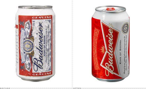
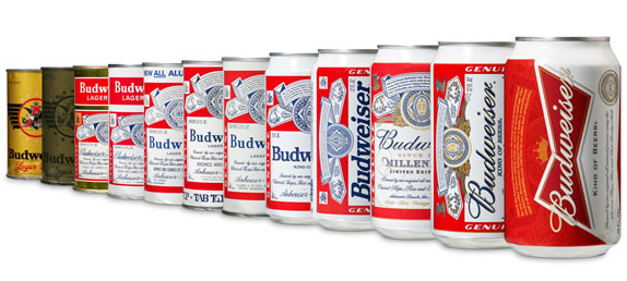
First brewed in 1876, Budweiser is one of the best-selling beers in the United States and probably one of the most recognized beers here and abroad. Budweiser is the flagship brand of Anheuser-Busch, that reportedly holds a 48.3 percent share of U.S. beer sales to retailers. This past Wednesday, Budweiser announced a new can design — the 12th redesign since 1936 when it began using them — focused on the "Budweiser bowtie" which, according to this explanatory diagram was created as a symbol to encourage people to order the beer by its full name, instead of just by "Bud". The new packaging was designed by London-based JKR. (So much for the "All-American" beer).
Our refreshed packaging design gives Budweiser an updated look, which dramatizes the iconic Budweiser bowtie and incorporates the brand hallmarks that loyal Budweiser drinkers will recognize and appreciate.
— Press Release
![]()
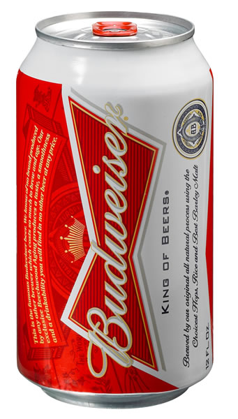
Using the same design principles as the newly designed can, the redesigned secondary packaging will be used for all package configurations and emphasizes the Budweiser creed, which highlights the beer's unique Beechwood Aging process and 135-year long commitment to quality.
— Press Release
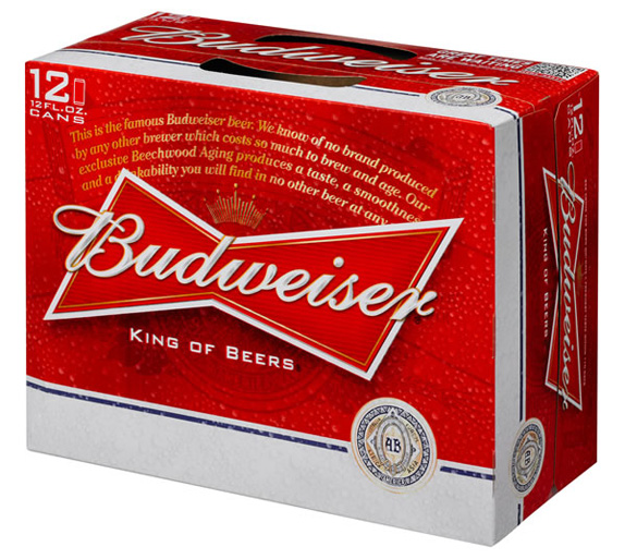
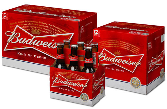
I have always loved Budweiser's can and bottle labels: the busyness, the wordiness, the medallion-ness. Totally over the top but very restrained. And highly recognizable with that striking red and blue on white. The new can has lost pretty much all of that beautiful contrast. The blue is nearly all gone leaving the can mostly red, now with yellow taking on as a secondary color and just some small fields of white coming through. The bowtie element… I don't drink Budweiser so I haven't spent hours philosophizing about its design while I drink (as I usually do when I do drink beer) but I had never associated the bowtie with Budweiser. It's not in any of the previous cans. So it seems a weird thing to be building the brand around.
The secondary packaging relies even more on the bowtie logo and it's big. The logo hasn't changed much from previous versions, it has just been cleaned and beefed up. Overall, the execution of the redesign is very well done, but it's the strategy that seems off. I guess when you hold such a stronghold on the beer market one can afford to make this kind of bold change and just count on the dominance for the packaging to eventually become as iconic, or at least recognizable, as the previous one.
Thanks to Jason Huebsch for first tip.

Don't forget to cast your vote about this post online