RSS
 

Posts Tagged ‘Social Media’

Facebook Changes Present Interesting Business Dilemma

10 Oct

Facebook Changes Present Interesting Business Dilemma

This content from: Duct Tape Marketing

Initially there was the Facebook persona profile and, since that was all we had, businesses jumped in and made the best of using this not so ideal business tool.

Then came business pages and again businesses embraced them and in many cases tried to separate business and personal with this approach.

With the recent overhaul of the personal profiles another kind of use has been created – one that may have some business folks moving back to the personal profile.

Facebook subscribe to public

Public personal vs. Page

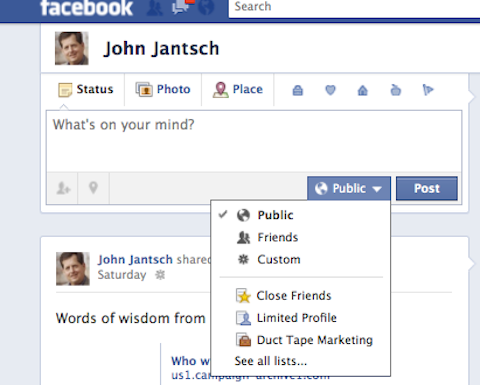
The subscribe function introduced recently allows Facebook profile owners to offer the ability for people who are not friends to subscribe to receive updates that are marked public. Now, couple this with the fact that Facebook has made it much easier to share with selected groups and you’ve got the makings of a nice business tool that is actually more suited for celebrities, authors, experts and independent business owners than a Facebook page.

How to manage the subscribe function

If you want people to subscribe to your public updates you must first turn this function on here. Once you do so you then must use the public setting to mark who can see an update. Of course, you’ll want to pay attention to that setting and make sure you only use it for things you want public.

Facebook claims that a tool, which would allow fan page owner to convert fans to subscribers of the personal profile is in the works. High profile Facebook employees, including founder Mark Zuckerberg appear to have done this migration already.

The new look is coming to all personal profiles this week

Facebook Cover

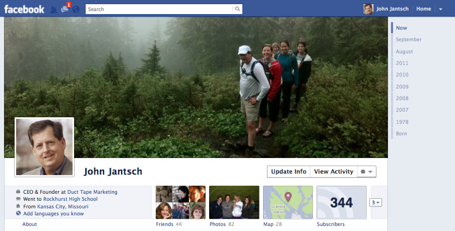
No matter which approach you take, get ready for an entirely new look on your personal profile. Facebook claims all profiles will be switched Oct 14th. (Want to switch yours today – here are the instructions)

Two big changes, the cover photo and the Time Line, offer the business user a better tool.

The cover photo is one dominating image that could be used very effectively by an expert wanting to showcase speaking for example.

The new view also presents the public information in a what I think is a more user friendly manner.

Get that cover image ready

Here is Facebook’s official information on the Cover image.

Expect designer types to have a blast hacking this image into some pretty cool things, but for now know that you need to look for an image with a width of 833px and a minimum height of 310px. Facebook makes it easy to position an existing image of most any size as well, but images that are already large in size will show better.

You can upload new photos or simply choose a photo in one of your Facebook albums to act as your cover photo.

MyFBCovers offers some simple ways to create custom cover images and cover collages made up of images of friends.


Facebook Changes Present Interesting Business Dilemma

10 Oct

Facebook Changes Present Interesting Business Dilemma

This content from: Duct Tape Marketing

Initially there was the Facebook persona profile and, since that was all we had, businesses jumped in and made the best of using this not so ideal business tool.

Then came business pages and again businesses embraced them and in many cases tried to separate business and personal with this approach.

With the recent overhaul of the personal profiles another kind of use has been created – one that may have some business folks moving back to the personal profile.

Facebook subscribe to public

Public personal vs. Page

The subscribe function introduced recently allows Facebook profile owners to offer the ability for people who are not friends to subscribe to receive updates that are marked public. Now, couple this with the fact that Facebook has made it much easier to share with selected groups and you’ve got the makings of a nice business tool that is actually more suited for celebrities, authors, experts and independent business owners than a Facebook page.

How to manage the subscribe function

If you want people to subscribe to your public updates you must first turn this function on here. Once you do so you then must use the public setting to mark who can see an update. Of course, you’ll want to pay attention to that setting and make sure you only use it for things you want public.

Facebook claims that a tool, which would allow fan page owner to convert fans to subscribers of the personal profile is in the works. High profile Facebook employees, including founder Mark Zuckerberg appear to have done this migration already.

The new look is coming to all personal profiles this week

Facebook Cover

No matter which approach you take, get ready for an entirely new look on your personal profile. Facebook claims all profiles will be switched Oct 14th. (Want to switch yours today – here are the instructions)

Two big changes, the cover photo and the Time Line, offer the business user a better tool.

The cover photo is one dominating image that could be used very effectively by an expert wanting to showcase speaking for example.

The new view also presents the public information in a what I think is a more user friendly manner.

Get that cover image ready

Here is Facebook’s official information on the Cover image.

Expect designer types to have a blast hacking this image into some pretty cool things, but for now know that you need to look for an image with a width of 833px and a minimum height of 310px. Facebook makes it easy to position an existing image of most any size as well, but images that are already large in size will show better.

You can upload new photos or simply choose a photo in one of your Facebook albums to act as your cover photo.

MyFBCovers offers some simple ways to create custom cover images and cover collages made up of images of friends.


Twitter-Mining Captures Global Mood Patterns

29 Sep

Hourly changes in average positive (top) and negative (bottom) affect, arrayed by time (X-axis) and day (color). (Golder et al./Science)

An analysis of mood patterns distilled from half a billion tweets has produced a civilization-scale picture of how moods rise and fall in tandem, over time and across the world.

The details seem intuitive: positive feelings peaking in the morning, dipping during work and rising at day’s end; negativity accumulated over the workweek dissipating late on Friday afternoon. But they’ve proved surprisingly tricky to measure.

“There’s a whole generation of lab work that’s been inconclusive,” said sociologist Scott Golder of Cornell University, co-author of the tweet analysis published Sept. 29 in Science. “Every study would have something different to say about what they saw in their subjects’ affective rhythms.”

Many studies of how moods — or, more technically, positive and negative affect — change from minute to minute and day to day rely on self-reported surveys, which can be inconsistent if not misleading. The subjects of these studies also tend to be undergraduate students from western colleges, a group that’s not always representative of humanity at large.

'A systematic daily pattern of positive mood is a fundamental part of human existence.'
Twitter users, of course, don’t represent humanity either. But the culture- and globe-spanning size of the software platform’s community, and their constant generation of data that can be cross-referenced and correlated and otherwise computationally investigated, make them alluring to researchers.

“Twitter and Facebook, market transactions on eBay and Amazon: This is the stuff of everyday life” for much of the world, said Golder. “For a social scientist to have access to these records is a fantastic new opportunity.”

Using Linguistic Inquiry and Word Count, a text analysis program that quantifies the emotional content of statements, Golder and co-author Michael Macy analyzed a total of 509 million tweets generated over two years by 2.4 million people in 84 countries.

What Happens When

Before Scott Golder and Michael Macy decided to analyze tweets for mood, they were interested in analyzing tweets for patterns of behavior. Out of that work came a website, www.timeu.se, that allows people to see how often a particular word is used at different times of the day and week.

"My favorite example is that bacon is more popular than sausage," said Golder, "but I'm counting on the internet population to visit and tell us their favorite examples." Co-author Macy's favorite search term is "happy hour," and the database also shows that Saturday night really is alright for fighting.
The resulting trends — positive moods starting high in the morning and declining through the day, peaking overall on weekends — held steady around the world.

Though the proposition that mood is governed by circadian and sleep cycles is widely accepted, other studies of mood fluctuations have found varying patterns, especially for positivity: A single afternoon peak, a day-long plateau, dual peaks at noon and evening or afternoon and evening, a mid-afternoon dip. Those discrepancies may be based largely on factors eliminated by the new study.

“The findings are exciting, particularly the robustness of the daily patterns in positive affect across vastly different geographical areas and cultures,” said Brant Hasler, a psychologist at the University of Pittsburgh School of Medicine. “A systematic daily pattern of positive mood is a fundamental part of human existence.”

However, said Hasler, “One must be very careful in extrapolating emotional state from a highly specific form of communication like Twitter.” People often present themselves strategically, and periods of especially intense emotion might be over- or under-represented.

The 140-character format itself might also be misleading, reducing the use of adjectives that would give more nuanced indicators of emotional tone, Hasler said.

According to Golder, analysis of crowd-generated datasets isn’t intended to replace other methodologies, but to complement them, providing yet one more way of investigating social patterns. Until recently, “there hasn’t been any practical way to observe large numbers of people in fine-grained detail,” he said.

“I applaud the creativity of the authors’ methods, and the ambitious scope of their sample,” said Hasler. “Now, we need to address two questions that follow from this: Why do these daily patterns exist? And how can we use this knowledge to improve our own lives and those of others?”

Image: Golder et al./Science

Citation: “Diurnal and Seasonal Mood Vary with Work, Sleep, and Daylength Across Diverse Cultures.” By Scott A. Golder and Michael W. Macy. Science, Vol. 333, September 30, 2011.

See Also:


How Airlines Have Taken Flight With Social Media [INFOGRAPHIC]

16 Sep


The Social Media Infographics Series is supported by Vocus‘ Social Media Strategy Tool, a free, six-step online tool that lets you build a custom social media framework tailored to your organization’s goals.

Thousands of flights each and every day transport millions of passengers all over the world. As we all know, traveling can make one irritable, and delays or lost baggage prompt many consumers to complain. Before social media, these complaints might dissipate in the ether or be left on hold for 30 minutes. Fortunately, the airline industry has taken note of the social web as a customer service tool, fielding complaints, inquiries and yes, even compliments, on Twitter and Facebook. Never has the airline industry been so responsive, helpful, compassionate and human.

But aside from customer service, airlines use the social web to build their brand and grow a fan base, whether that’s via YouTube webisodes, special Twitter-only fares or offering free entry to a terminal lounge for an airport’s Foursquare mayor — the mark of a frequent traveler.

Check out the infographic below to see what some of the most social airlines are doing to reach new heights with social media.


Series supported by Vocus

This series is supported by Vocus‘ Social Media Strategy Tool, a free online tool which lets you build your own custom social media framework in six easy steps. It helps you determine your organization’s goals, explore the latest MarketingSherpa research data, and create your own workbook packed with the strategies, tactics and resources you need. Try it today!

Infographic design by Lorena Guerra

More About: Airlines, features, infographics, Mashable Infographics, Social Media, Social Media Infographics Series

For more Social Media coverage:


The Brutally Honest Guide to Naming Circles in Google Plus

12 Jul

The Brutally Honest Guide to Naming Circles in Google Plus

This content from: Duct Tape Marketing

Users of Google+ are quickly coming to the conclusion that one of the game changing features offered up by this new social network is the following and sharing filter called Circles.

For those that have not yet wandered into G+, you can segment those you follow into groups (circles) with the idea that this gives you the ability to share selectively – business contacts get business stuff, family and friends get pictures of cats doing funny things, etc.

Google Plus Circle Naming

One of the things that is plain to see, even in just a week of exploring G+, the world of online users have learned a great deal more about how to use social networks than just 3 or so years ago when we all jumped into Twitter.

Instead of blindly building followings people seem to be using the Circles tool specifically as a way to meter the stream of information and perhaps focus on smaller numbers in an attempt to limit the eventual overwhelm and uselessness that comes with large unfocused followings.

In a way G+ is acting as a bit of a do over for the early business users of Facebook that now find it harder to keep business and personal separate. This is by no means a proclamation that Facebook is dead, I’m simply finding in the early stages of G+ that people are using G+ in a way that differs from some other networks. That too will likely evolve.

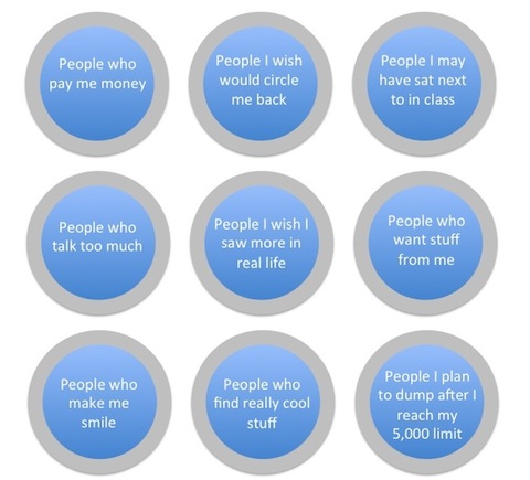
Because the act of creating circles and then determining who goes where is so central to G+ it presents an opportunity to address the thinking process that goes into how we analyze these circles. I for one think it illustrates one of the most profound changes in social network use.

Instead of simply categorizing the default sounding demographic type circles such as family, acquaintances and coworkers, I’m seeing a move towards circles that consist of a focus on content – or what you expect to hear and how you expect to interact with members of a circle being the guiding light.

While Google Plus suggests some generic names for your first circles you are free to create and name as many as you like (there may be a limit, but not aware of one).

The image in this post was my attempt (humorous or not) to illustrate how I believe people are really thinking about their circles. I first published this image on G+ and it was shared over 1000 times by users, so I think others are sensing this and feeling this and struggling with this as well.

If you’ll allow me to get a little geeky here, this to me is the exciting part of the world we live in today – not that we have this new, new thing to go on about, but that change, evolution and growth are all organic parts of the social web and what may seem valid or not today will surely change as more and more people come to grips with practical uses for each new member of the parade of tools.


New York Times Reduces Character Limit of Readers’ Comments by 60%

21 Jun


The New York Times has announced it’s cutting the character limit on site comments from 5,000 to 2,000. In Twitter terms that’s like going from 36 tweets to slightly more than 14 — a 60% drop.

According to a note on the site’s homepage Monday, “The shorter length will allow for an improved experience for commenters and readers alike.”

The statement is good news for readers who roll their eyes when commenters hog the soapbox. But for Internet users who view commenting as an opportunity to see reactions that would have otherwise been limited to personal letter or email, it’s a step in the wrong direction. Though 14 tweets’ worth of discussion is still a fair amount, the change opens the door for further character cutting in the future.

The new limit was inspired by feedback from readers and Times employees, Aron Pilhofer, editor of interactive news, told The Wrap.

“5,000 [characters] is a lot,” Pilhofer said. “That’s not a comment, that’s an article.”

The shorter character limit will change community behavior. Readers who are used to writing essay-length comments may become more blunt as they aim to get to their point faster. Or they may work around the limit by breaking thoughts into multiple comments. Still, the shorter length will help Times moderators get through comments more quickly, allowing them to quell inappropriate threads with greater speed.

In late May the BBC dropped its limit to 400 characters — 20 characters less than is allowed for a Facebook status update.

The BBC’s character cut inspired Martin Belam, lead user experience and information architect at The Guardian, to survey the comment character counts of a range of U.S. and UK news media sites. Here’s a sample of his findings, updated to include The New York Times‘ recent change:

Website,Comment Character Count
BBC News400
Facebook (status update)420
YouTube500
Daily Mail1,000
The Huffington Post1,800*
The New York Times2,000
The Sun2,000
The Washington Post3,000
The Times (U.K.)3,000
The Guardian5,000
Facebook (comment)8,000
CNN10,000
Al Jazeera10,000
The Telegraph10,000

*The actual limit imposed on Huffington Post is 250 words, which equates to 1,820 characters.

What do you think of The Times‘ comment character cut? Will it truly make for a more inviting commenting space or is the site infringing on commenters’ rights? Sound off in the thread below — we won’t cut you off.

Mashable’s comment character limit: 16,384

More About: commenting, comments, community, new york times

For more Media coverage:


Could Kickstarter Be Better Than Government Grants for Artists?

17 Jun


Artist Molly Crabapple has just been given $17,000 to lock herself in a paper-covered room for five days and make art until the walls are covered.

But that sum didn’t come from the National Endowment for the Arts or a wealthy patron; Crabapple, like many in her subversive art-making shoes, turned to Kickstarter to find funding for the stunt.

In her Kickstarter proposal, she outlined the basic premise of the project, dubbed “Molly Crabapple’s Week in Hell.” Anyone who donated a dollar to the effort would get to watch a live stream of the whole five-day shebang. Anyone who pledged $10 or more would get to name an animal for inclusion in the artwork; donations of $20 or more would get an actual piece of the ink-filled paper sent to them. And backers who fronted $1,000 or more would get an absinthe-infused lunch with the artist.

Crabapple set a $4,500 fundraising goal; so far, the total raised is $17,000 — enough to make a short film about the project, which Crabapple says will debut online shortly after Crabapple’s Week in Hell wraps.


Why Art Needs the Web


This is a project that Crabapple says could never have existed without the Internet.

“I mean, before the Internet, I could have gotten a room and markers,” she told Mashable in an email. “But funding it? Pre-selling an entire body of yet-to-be-created-art in an alternative space? Even the logistics of finding the space and gathering my staff would have been infinitely harder offline”

Historically, the kinds of projects that do best on Kickstarter are actually film and music. Over the past two years, these two categories have accounted for more than $32.7 million in fundraising — more than every other category combined.

Crabapple says the Week in Hell is her third Kickstarter project. She did a Kickstarter proposal last year to help fund SketchyCon, a gathering of organizers for Crabapple’s unique life drawing events, Dr. Sketchy’s Anti Art School. And she did ker second Kickstarter project just a couple months ago to fund a stop-motion paper puppet film.

“An artist like me (ie a poxy illustrator who dropped out of school) has basically no chance with the grant system, and Kickstarter has been amazing for helping me bring my most ambitious projects to life,” said Crabapple.


Why Grants Don’t Work


While entrepreneurship projects such as the ill-fated Diaspora do exist on Kickstarter, they get relatively little attention on the site when compared to the overwhelming popularity of the arts. For artists who seek funds to further their dreams, the crowdfunding model of Kickstarter is something of a godsend. Gone are the lengthy, difficult grant application processes and the endless pitching to would-be patrons.

As Crabapple told us, “I once sat through the introductory session for applying for a Brooklyn Artists Grant. In between the forms filled out in 8-plicate, having to have a nonprofit organization sponsor you, and the fact that the grant was forbidden from covering the entire cost of the project, I figured it was probably just easier to earn the money.

“A Kickstarter is populist and fast, where a grant is elitist and foot-dragging.”

Crabapple said she was surprised, though, that the project got so much interest and so many pledges.

“Week in Hell is a deeply personal project, and there’s always a risk of those coming off as horrifically wanky. I posted it with some trepidation on Sunday at midnight, and woke up to find it funded. In my fever dreams I never would have imagined such an incredibly warm, generous response.”

Keep an eye out for the Week in Hell event, as well as subsequent photos and film, to take place from September 3 through 8 in a secret location in Manhattan.

Image courtesy of Facebook, TheLegion

More About: funding, fundraising, grants, kickstarter, Molly Crabapple, National Endowment for the arts, NEA, trending

For more Media coverage:


Five important lessons Mark Zuckerberg taught us about business

09 Jun

Advertise here with BSA


You don’t get to 600 million friends without doing something spectacular. Mark Zuckerberg knows this more than anyone. But I wonder: do we have any hope of achieving similar success?

Facebook’s story begins, like most businesses, with a single idea and an ambitious person that executes it. Zuckerberg wasn’t a world-class genius, and Facebook was hardly a revolutionary idea. Yet here we stand: Facebook is one of the most valuable websites on the Internet, Zuckerberg is one of the world’s youngest billionaires, and MySpace… let’s not pick on them.

There wasn’t any magic, fate, or destiny at play here — anyone could’ve been in Zuckerberg’s position. However, just because anyone on this planet has the potential to achieve success, doesn’t mean that anyone else actually will.

There are factors at play: things like leadership, experience, timing, funding, and execution play their roles. But some things will always stand out above the rest, and many of the factors that really make a difference will never be taught at an ordinary business school. So let’s steal a few pages from Mark Zuckerberg’s school of business.

Lesson 1: Be passionate about what you do

If there is any way to create something that hundreds, thousands, or even millions of people will eventually use on a daily basis, you better be sure to create something that you would have passion and dedication in creating.

The aforementioned isn’t exactly a revelation to anyone, but if you are not genuinely interested in what you are creating, why would anyone else be? They wouldn’t. It’s a serious problem for many entrepreneurs of both young and old.

Lately we have seen entrepreneurs creating this businesses that some have little interest in actually investing their heart and soul into. Some of these startups look great on paper, but, in the end, the whole intention is to quickly flip these businesses to a company that has plenty of cash on hand. The investors, founders, and, if they’re lucky, employees get rich and everyone goes out for drinks to celebrate. If this is the measure of success, it is no wonder why we hear so much discussion about a potential tech bubble.

Mark Zuckerberg, however, is one of the most prominent examples in recent history of someone who has the passion. Not only did he care about his project, but he also turned down billions of dollars in order to let his company thrive. Turning away billions of dollars, and the opportunity to never have to work again, can’t be that difficult. Can it?

But the reality is that you, me, everyone needs to be reminded every once in a while that having a dedication and passion for what we do in life is key to happiness.


Lesson 2: Constant evaluation

There are generally two types of people in business: those who prefer to play it by gut instinct and those who analyze every little measurable detail. Both have their pros and cons; having a mix of both couldn’t hurt. Generally a person gravitates towards one or the other.

Mark Zuckerberg is the analyzer.

Zuckerberg always insisted that his employees create powerful analytics dashboards. Their purpose was simple: allow him and fellow employees to gauge the interest in newly released features to coordinate their global domination. While other companies were still figuring out which advertisements could be placed at which spot and generate the most return, Facebook focused on optimizing the performance of the user experience. He wanted to know which features worked and which did not.

Those who can gather enough data to garner an understanding of their users, while also being able to determine which features work and which do not, will ultimately be in a better position to achieve success.

The takeaway: do anything in your power (within reason, of course) to find ways to measure success and failure across the board, but don’t get so caught up in the data that you are unwilling to explore new avenues.


Lesson 3: Be willing to experiment

In Facebook’s infancy, its founder preferred to push out enhancements and never look back. This is, admittedly, easy to do when you have a few thousand users; they expect things to change at a rapid clip. But Facebook was different. People relied on Facebook in more ways than most other websites — it was a service that connected people to each other. At this point, failure is unacceptable.

Still, Zuckerberg preferred the gung ho method of development. He would regularly introduce new features — adding the “Wall,” introducing chat functionality, allowing third-party development, and changing the site’s layout (which I have had numerous complaints about before).

One has to admire the company’s insistence on pushing out features in a world where critical services tend to iterate slowly and safely (think Microsoft Windows). This insured that Facebook was a step ahead of the competition while also appearing innovative amidst growing competition.

Sure, there were those who didn’t appreciate these drastic changes (especially those dealing with privacy settings and layout), but when you have a vision, sometimes it pays to put in the extra effort and take the risk; explore it through to the end.


Lesson 4: Be aware of opportunity

Before Facebook, there was CourseMatch, an application that allowed students at Harvard University to compare their course selections for that semester. With this, Zuckerberg indulged students’ desires to know which classes their friends were joining. He exploited an opportunity.

Facemash was a similar expereince. It was Harvard’s Hot or Not for students. These students were interested in knowing where they stood socially — in some ways, we all do. And Zuckerberg, once again, saw an opportunity to exploit this as well.

Facebook was simply a culmination of all these previous opportunities into a single useful package.

It isn’t magic. But it does require looking at things in a different way — to see things for what they could be, as opposed to only what they have been or currently are. Zuckerberg’s ability to notice these opportunities and execute on them gave him the edge in creating and maintaining products that people believed in.

Opportunity exists everywhere — especially with the Internet, where the ability to reach millions is easier than ever. Perhaps there is so much opportunity out there that, perhaps, we have become ignorant to spot the most obvious of opportunities. But being able to spot opportunity is an invaluable skill.


Lesson 5: Make something useful

Facebook isn’t simply another interesting website to visit every once in a while. It is a tool that millions of people use to connect to each other. People use it for sharing experiences and creating new ones. Most importantly, Facebook does something that no other website has been able to do as efficiently, effectively, and with such impressive scale: it creates a virtual environment to interact with your real friends.

I don’t think it is necessary for me to explain how useful something like this is; the 600 million plus members does that well enough. Yet it is this usefulness that makes the company a success. It is a recurring theme that all successful companies build upon. It is also something that many startups don’t seem to comprehend.

If you want the best business advice out there, here it is: create something useful.

Explaining what makes a product or service useful is simple: it is something that people are using repeatedly and on a regular basis. Make something that you and others could use on a regular basis, and make this thing unique. If you do this, along with everything else mentioned here, you will have an opportunity to create and maintain a successful business.

And who knows? Maybe you will be the one creating the next Facebook killer.


What have you learned from Mark Zuckerberg’s success? Share your own lessons below or let us know what you think about the ones mentioned on this article…

Written exclusively for WDD by James Mowery. He is a passionate technology journalist and entrepreneur who has written for various top-tier publications like Mashable and CMSWire. Follow him on Twitter: @JMowery.


If you find an exclusive RSS freebie on this feed or on the live WDD website, please use the following code to download it: O1Rs1S


WordPress hosting for a full year for only $70


Source


Facebook Smear Campaign Has No Lasting Effect on Facebook or Google [STATS]

19 May


Despite major blowback from a Facebook-funded smear campaign against Google meant to raise questions about Google’s privacy settings, the perception of neither company has been significantly damaged.

According to data from social media analytics firm NetBase, which processed data from more than 70,000 news stories, blogs and forum posts, tweets and comments on social networks, the sentiment about both companies changed very little in the aftermath of the news.

Negative sentiment about Facebook — particularly mentions that also included Google — rose May 11, the evening the news broke, and peaked the next day. But by May 13, sentiment was largely positive again, and by May 17 sentiment about Facebook had returned to its pre-smear levels even when mentioned with Google. Google, it appears, was hardly affected.

Woe to the 24-hour news cycle and our short attention spans, I suppose.

Facebook Net Sentiment
Click for full-size view.

Facebook Sentiment, When Mentioned With Google

Google Net Sentiment

More About: facebook, Google

For more Social Media coverage:


How 5 Non-Profits Are Innovating With Mobile

19 May

phone nature image

Holly Ross is the executive director of NTEN: The Nonprofit Technology Network, where she helps her members put technology to use for social change. You can follow her on Twitter at @ntenhross and read the NTEN blog.


Even before that first cup of coffee, an increasing number of us are reaching for our mobile phones in the morning. That makes mobile the perfect fit for non-profits that want to capitalize on every and any moment an individual is inspired to act on behalf of a cause. 


While the Red Cross made text-to-give campaigns famous after the Haiti earthquake, there are a variety of additional opportunities to use mobile to engage your audience in a cause. In fact, it doesn’t take an expensive investment in a custom built application to make mobile work. Dozens of providers have emerged in the last several years to serve the non-profit market with off-the-shelf solutions for a variety of mobile needs.


Non-profits, both large and small, are using mobile to educate, activate, and engage audiences of all sizes. Here are five examples of non-profits rocking mobile for social good.


1. WNYC and NYT Bird Map


birdmap image


As it turns out, you don’t have to head to the Bronx Zoo to find wildlife in New York City. In fact, over 355 bird species live or spend time in New York throughout the year. To highlight the avian side of the city, WNYC and The New York Times asked their listeners and readers to text BIRD to 30644 and share their favorite bird-watching spots.

Results are compiled in an online map. Hundreds of people have responded so far, with the Red Cardinal topping the list of most-spotted winged creatures.


2. California Teacher’s Association


cta image


Wisconsin’s teachers may have been in the spotlight this February, but in California, where over 40,000 teachers have been laid off due to severe budget cuts, the California Teacher’s Association (CTA) is fighting to preserve teaching jobs and restore other education funding.

They are able to text their supporters and, when the supporter responds, automatically connect that supporter to their state legislator via a phone call. In the first few days of the campaign, hundreds of calls have been made because of the texts, saving CTA time and money compared to the traditional phone tree method.


3. Alliance for Climate Education


haiku image


Forget a string tied around a finger. If you want today’s teens to remember to do something, you need to text them. That’s what the Alliance for Climate Education (ACE) is doing. When ACE visits a school to present an educational assembly, instead of encouraging the audience to silence their mobile phones, they ask the kids to take them out and text in a pledge — one thing they will do to make the environment better.

Students are also asked for their email addresses that are integrated directly into the organization’s database, allowing them to follow up with each student about their pledge in multiple ways. So far, over 90,000 students have texted pledges and the organization is looking to integrate mobile into other campaigns, including a Halloween haiku contest.


4. Planned Parenthood Federation of America


planned parenthood image


Sexual health isn’t an issue most teenagers find easy to ask questions about, but having the right answers about it can change — and even save — lives.

Planned Parenthood Federation of America (PPFA) is making it even easier for teens who are looking for answers about delaying sex, birth control, STD prevention and treatment, emergency contraception, sexual orientation, pregnancy testing and abortion to get the information and services they need.

Spots on MTV and banners on the PPFA mobile site direct teens seeking support to text the organization with questions, which are answered by trained professionals who point to information and, in some cases, can book the teens for an appointment at their local clinic — all via text.


5. The Marine Mammal Center


marine mammal image

If you’ve ever visited San Francisco, chances are you went to Pier 39 and heard (if not saw) the famous sea lions. The Marine Mammal Center (MMC) wanted to capitalize on the popularity of the wildlife to educate a wider audience about their work to rescue and rehabilitate sick and injured marine mammals.

Using signs at the end of the pier, MMC offered new text subscribers a free seal ringtone. Subscribers got the ringtone, as well as an invitation to visit the nearby Marine Mammal Center. Since the campaign launched, they’ve recruited nearly 1,500 supporters to the cause.


The Future of Mobile and Social Good


While mobile is still a new strategy for the social sector, consumers are moving rapidly to this channel. “When people get online now, they are increasingly using their phone instead of a laptop or computer,” says Doug Plank, CEO of Mobilecause. “And when you look at the history of online giving, how quickly it was adopted by non-profits and donors, mobile is outpacing it. While mobile campaigns have begun to produce impressive results for causes on [their] own, it can be even more impressive as part of an integrated campaign that also includes email and even direct mail.”

“We know that the opportunistic timing of email and mail can boost response,” says Jessica Bosanko of M+R Strategic Services. “Non-profits are often seeing similar results with text messaging now — with supporters who are signing up for texts far outperforming the rest of the file, and strategically placed texts capable of increasing performance to email messages.” 


Michael Sabbat of Mobile Commons sees the sector getting smarter about how it uses mobile, bringing business intelligence to mobile strategies. “Organizations can be smarter about how they communicate with supporters. If the supporter uses the mobile web, they will be texted a link to donate. If the supporter doesn’t use the mobile web, they receive a phone number in their text. We’ve come a long way to know who the supporters are, so we are not just blindly sending everyone the same message.”


Has your non-profit embraced a mobile strategy? Share your experiences in the comments.

Disclosure: The PPFA is a member of NTEN


For more lists, how-tos and other resources on this topic, check out Mashable Explore!

Image courtesy of Flickr, Srdjan Stojiljkovic

More About: charity, Mobile 2.0, non-profit, nten, social good, social media, tech

For more Social Good coverage: