RSS
 

Posts Tagged ‘Web Development’

9 Essential Resources for User Interface Designers

16 Sep


The Web Design Usability Series is supported by join.me, an easy way to instantly share your screen with anyone. join.me lets you collaborate on-the-fly, put your heads together super-fast and even just show off.

Designing a great user interface can be a challenge, even for the most seasoned designer. Countless factors need to be taken into consideration and the difference between a good UI and a great one often boils down to paying close attention to the smallest details.

SEE ALSO: 7 Best Practices for Improving Your Website’s Usability

When undertaking such an important and often complex task, it’s helpful to have some handy resources for both education and inspiration. We’ve put together a list of some of our favorites below. Since we can only scratch the surface of the wide variety of UI design resources available, we invite you to share yours in the comments.


Design Inspiration


Let’s start off by taking a look at three great galleries for UI design inspiration.


1. MephoBox


MephoBox is a design showcase that catalogs sites with beautiful interfaces and also collections of common site elements, such as login forms, headers, pagination, and so on. If you’re looking for ideas or approaches to designing specific page elements, MephoBox collections can be a great source of inspiration.


2. UI Patterns


UI Patterns showcases user interface design patterns – com-only recurring trends and best practices in UI design for a variety of elements. Providing more detail than a basic gallery, UI Patterns showcases design patterns, discusses their usage, and the problems each pattern aims to solve, and in what way.


3. Pattern Tap


Pattern Tap is one of the more well-known UI design showcases and is similar to MephoBox in its design pattern collections. Unlike MephoBox, though, the collections are a bit more varied (the site currently baosts 45 collection catagories to MephoBox’s 16), including a showcase of elements like modal windows, slideshows, comments, adevertising design and placement, and more.


Reading up on UI Design


Sometimes it’s not enough to simply look at a design showcase. Often, you’ll want to read about a particular design pattern or approaches to a problem, as well. So here are three great educational resources for boning up on UI design.


4. Inspire UX


Inspire UX is a user experience design blog that features articles, quotes, case studies and explorations into the world of user experience and interface design. A great resource, Inspire UX articles cover a broad range of topics from book reviews to helpful tips and well-thought explorations into existing design patterns and implementations.


5. UX Magazine


UX Magazine is a user experience and design publication dedicated to “elevating user experience, one article at a time.” With plenty of original content as well as technical and inspirational design roundups from around the web, UX Magazine explores the details that make a great user experience. If you’re looking for information on best practices, creative problem solving resources or a better understanding of those problems, UX Magazine is chock full of great articles to assist you.


6. UI Scraps


This blog by designer Jason Robb showcases interesting and insightful user interfaces. The great thing about UI Scraps is that the site isn’t simply a showcase of great work. Robb brings you the bad along with the good, making it a great resource for learning what not to do. The tone of the blog is conversational and casual, but Mr. Robb’s remarks are spot-on and UI scraps is a fun, interesting resource for UI design practices.


Down the Rabbit Hole


Still what more? Looking for something a little more technical? UI design isn’t just about making a pretty picture. There’s a lot of science behind the methodologies and patterns we use every day. Here are a few sites that delve even further into the technical and scientific aspects of UI design.


7. Web Design Practices


If statistics are what you’re after, Web Design Practices is the place to be. The site showcases and describes several common web design elements, practices, and patterns and discusses frequency of use and effectiveness of each. Many examples are also provided and, wherever possible, links are provided to relevant research data, so you can take a first-hand look at the study yourself.


8. User Interface Engineering


UIE is a professional organization for user interface designers and UI experts. UIE provides education and training to its members and the public at large through conferences, articles, virtual siminars, and other publications. On the UIE site, you’ll find a plethora of great articles covering a variety of UI and UX design topics, many of which have plenty of scientific and research data to back them up.


9. Boxes and Arrows


Boxes and Arrows is another great online publication dedicated to exploring the art and science of UI design. It has articles and research materials on best practices, techniques, and user behavior and expectations. There are also a number of case studies, interviews and product reviews, as well as a podcats. If you want to truly understand UI design, Boxes and Arrows is an invaluable resource.

Image courtesy of iStockphoto, violetkaipa


Series Supported by join.me

The Web Design Usability Series is supported by join.me, an easy way to instantly share your screen with anyone. join.me lets you collaborate on-the-fly, put your heads together super-fast and even just show off. The possibilities are endless. How will you use join.me? Try it today.

More About: features, UI Design, web design, Web Design Usability Series, Web Development


7 Best Practices for Improving Your Website’s Usability

12 Sep


The Web Design Usability Series is supported by join.me, an easy way to instantly share your screen with anyone. join.me lets you collaborate on-the-fly, put your heads together super-fast and even just show off.

Writing content for web users has its challenges. Chief among them is the ease with which your content is read and understood by your visitors (i.e. its readability).

When your content is highly readable, your audience is able to quickly digest the information you share with them — a worthy goal to have for your website, whether you run a blog, an e-store or your company’s domain.

Below are a handful of dead-simple tips and techniques for enhancing the usability and readability of your website’s content.

These tips are based on research findings and suggestions by well-regarded usability experts such as Jakob Nielsen.

This list is not exhaustive, and is meant merely to arm you with a few ideas that you can implement right away. If you have additional tips to add, please share them in the comments.


General Goals of User-Friendly Web Content


Usable, readable web content is a marriage of efforts between web designers and web content writers.

Web pages must be designed to facilitate the ease of reading content through the effective use of colors, typography, spacing, etc.

In turn, the content writer must be aware of writing strategies that enable readers to quickly identify, read and internalize information.

As we go through the seven tips below, keep these three general guidelines in mind:

  • Text and typography have to be easy and pleasant to read (i.e. they must legible).
  • Content should be easy to understand.
  • Content should be skimmable because web users don’t read a lot. Studies show that in a best-case scenario, we only read 28% of the text on a web page.

What simple things can we do to achieve these goals? Read on to see.


1. Keep Content as Concise as Possible


It’s pretty well known that web users have very short attention spans and that we don’t read articles thoroughly and in their entirety. A study investigating the changes in our reading habits behaviors in the digital age concluded that we tend to skim webpages to find the information we want.

We search for keywords, read in a non-linear fashion (i.e. we skip around a webpage instead of reading it from top to bottom) and have lowered attention spans.

This idea that we’re frugal when it comes to reading stuff on the web is reinforced by a usability study conducted by Jakob Nielsen. The study claims a that a 58% increase in usability can be achieved simply by cutting roughly half the words on the webpages being studied.

Shorter articles enhance readability, so much so that many popular readability measurement formulas use the length of sentences and words as factors that influence ease of reading and comprehension.

What you can do:

  • Get to the point as quickly as possible.
  • Cut out unnecessary information.
  • Use easy-to-understand, shorter, common words and phrases.
  • Avoid long paragraphs and sentences.
  • Use time-saving and attention-grabbing writing techniques, such using numbers instead of spelling them out. Use “1,000″ as opposed to “one thousand,” which facilitates scanning and skimming.
  • Test your writing style using readability formulas that gauge how easy it is to get through your prose. The Readability Test Tool allows you to plug in a URL, then gives you scores based on popular readability formulas such as the Flesch Kincaid Reading Ease.


2. Use Headings to Break Up Long Articles


A usability study described in an article by web content management expert Gerry McGovern led him to the conclusion that Internet readers inspect webpages in blocks and sections, or what he calls “block reading.”

That is, when we look at a webpage, we tend to see it not as a whole, but rather as compartmentalized chunks of information. We tend to read in blocks, going directly to items that seem to match what we’re actively looking for.

An eye-tracking study conducted by Nielsen revealed an eye-movement pattern that could further support this idea that web users do indeed read in chunks: We swipe our eyes from left to right, then continue on down the page in an F-shaped pattern, skipping a lot of text in between.

We can do several things to accommodate these reading patterns. One strategy is to break up long articles into sections so that users can easily skim down the page. This applies to block reading (because blocks of text are denoted by headings) as well as the F-shaped pattern, because we’re attracted to the headings as we move down the page.

Below, you’ll see the same set of text formatted without headings (version 1) and with headings (version 2). See which one helps readers quickly skip to the sections that interest them the most.

What you can do:

  • Before writing a post, consider organizing your thoughts in logical chunks by first outlining what you’ll write.
  • Use simple and concise headings.
  • Use keyword-rich headings to aid skimming, as well as those that use their browser’s search feature (Ctrl + F on Windows, Command + F on Mac).

3. Help Readers Scan Your Webpages Quickly


As indicated in the usability study by Nielsen referenced earlier, as well as the other supporting evidence that web users tend to skim content, designing and structuring your webpages with skimming in mind can improve usability (as much as 47% according to the research mentioned above).

What you can do:

  • Make the first two words count, because users tend to read the first few words of headings, titles and links when they’re scanning a webpage.
  • Front-load keywords in webpage titles, headings and links by using the passive voice as an effective writing device.
  • Use the inverted pyramid writing style to place important information at the top of your articles.


4. Use Bulleted Lists and Text Formatting


According to an eye-tracking study by ClickTale, users fixate longer on bulleted lists and text formatting (such as bolding and italics).

These text-styling tools can garner attention because of their distinctive appearance as well as help speed up reading by way of breaking down information into discrete parts and highlighting important keywords and phrases.

What you can do:

  • Consider breaking up a paragraph into bulleted points.
  • Highlight important information in bold and italics.

5. Give Text Blocks Sufficient Spacing


The spacing between characters, words, lines and paragraphs is important. How type is set on your webpages can drastically affect the legibility (and thus, reading speeds) of readers.

In a study called “Reading Online Text: A Comparison of Four White Space Layouts,” the researchers discovered that manipulating the amount of margins of a passage affected reading comprehension and speed.

What you can do:

  • Evaluate your webpages’ typography for spacing issues and then modify your site’s CSS as needed.
  • Get to know CSS properties that affect spacing in your text. The ones that will give you the most bang for your buck are margin, padding, line-height, word-spacing, letter-spacing and text-indent.

6. Make Hyperlinked Text User-Friendly


One big advantage of web-based content is our ability to use hyperlinks. The proper use of hyperlinks can aid readability.

What you can do:

  • Indicate which links have already been visited by the user by styling the :visited CSS selector differently from normal links, as suggested by Nielsen, so that readers quickly learn which links they’ve already tried.
  • Use the title attribute to give hyperlinks additional context and let users know what to expect once they click the link.
  • For additional tips, read >Visualizing Links: 7 Design Guidelines.

7. Use Visuals Strategically


Photos, charts and graphs are worth a thousand words. Using visuals effectively can enhance readability when they replace or reinforce long blocks of textual content.

In fact, an eye-tracking study conducted by Nielsen suggests that users pay “close attention to photos and other images that contain relevant information.”

Users, however, also ignore certain images, particularly stock photos merely included as decorative artwork. Another eye-tracking study reported a 34% increase in memory retention when unnecessary images were removed in conjunction with other content revisions.

What you can do:

  • Make sure images you use aid or support textual content.
  • Avoid stock photos and meaningless visuals.

Series Supported by join.me

The Web Design Usability Series is supported by join.me, an easy way to instantly share your screen with anyone. join.me lets you collaborate on-the-fly, put your heads together super-fast and even just show off. The possibilities are endless. How will you use join.me? Try it today.

Image courtesy of iStockphoto, Kontrec

More About: web design, Web Design Usability Series


Hide Your Kids, Hide Your Wi-Fi: Mashable’s Favorite Wi-Fi Names

03 Aug


In honor of Wi-Fi Day Tuesday — 8.02.11 — Mashable asked our community to tell us about the best Wi-Fi network names they’ve seen.

We received a staggering number of responses. Submissions ranged from jeers at people stealing Internet, pop culture references (it seems our community loves Arrested Development and The Offspring), pranks and the occasional obscenity.

Here are some of our favorites (click here to see the rest):

  • Police Surveillance Van 2
  • Hide Your Kids, Hide Your Wi-Fi
  • Use This One Mom
  • Abraham Linksys
  • Series of Tubes
  • 404NetworkUnavailable
  • PlzBringVodkaToApt1310
  • Pretty Fly for a Wi – Fi
  • Bluth Model Hotel
  • The Banana Stand
  • I have Wi-Fi and You Don’t
  • Router? I Hardly Know Her
  • No Free Wi-Fi for You
  • Free Virus
  • SUPERThanksForAsking
  • Network Not Found
  • BAD ERROR 313: disconnect
  • SkyNet Global Defense Network
  • GET OFF MY LAN
  • AllYourBandWidthRbelongToUS
  • lookmanowires

Did we miss your favorite? If you think it’s worthy of inclusion, let us know in the comments.

More About: wi-fi, wi-fi day

For more Tech & Gadgets coverage:


7 Great JavaScript Resources

03 Jul


As browsers and server-side platforms advance, and libraries new and old grow and mature, JavaScript evolves as well. Staying at the top of your game is important. As a JavaScript developer, you’ll need to keep up with the latest news and learn new skills.

We’ve put together a list of seven of our favorite JavaScript resources to help save you time and energy along the way. Whether you’re a beginner or a seasoned pro, we think you’ll find the sites below both informative and beneficial. If you know of other great resources, feel free to share them in the comments.


1. Mozilla Developer Network


The MDN has become the de facto resource for JavaScript documentation, and is an excellent resource for beginners and seasoned developers alike. Here you'll find the official and complete JavaScript reference, as well as useful guides, tutorials and articles covering everything from the basics of how JavaScript works to its best practices and design patterns. The MDN also has a thorough DOM reference, which we highly recommend checking out as well.


2. JQAPI


JQAPI is an alternative to the official jQuery.com API documentation. If you're a client-side JavaScript developer, chances are you probably have used, or at some point will use, jQuery in at least one of your projects. Whether your use is occasional or daily, you'll want to keep up with the latest development and new features in JavaScript's most popular library. Each new release improves security and performance via a slick, responsive and intuitive interface for quick browsing and searching of jQuery documentation. The UI here really is top-notch, and as a bonus, there's an offline version available for download.


3. JS Fiddle


JS Fiddle is a JavaScript pastebin on steroids. Create, share, execute and test your JavaScript right in the browser. This is a great tool for collaborative debugging or for sharing code snippets. It's also a fun way to perform quick experiments and test out new ideas. Simply combine your JavaScript, HTML and CSS, then click the "Run" button to see the results. You can also validate your JavaScript code against JSLint and save your Fiddle for use later, or share with others. JS Fiddle provides a number of useful features, like the ability to load up common frameworks automatically (to test your jQuery or MooTools code, for example) and as-you-type syntax highlighting, just like you'd get by writing code in your favorite IDE.


4. Eloquent JavaScript


This free ebook is an introduction to programming and the JavaScript language, written by developer and tech writer Marjin Haverbeke. The book reads much like a tutorial, and introduces a number of concepts and real-world applications in a clean, concise style. Interactive examples are also available, which means you can read about various techniques. You'll also get a chance to see them in action, and tinker with the code yourself. We found a lot of positive reviews for this book, so if you're new to JavaScript, this is definitely a book worth checking out.


5. Douglas Crockford's JavaScript Videos


An undisputed expert in JavaScript, Douglas Crockford is Yahoo's JavaScript architect and is one of the individuals instrumental in the planning, development and future growth of the language. The videos and transcripts on the YUI blog derive from a series of talks given by Mr. Crockford about the history of JavaScript, its future and its use today. Though the series is now about a year and a half old, we still think you'll find the videos informative. We certainly recommend watching them for a better understanding of the language, where it's been, how it works and where it's going.


6. How To Node


Not all JavaScript development takes place in the browser. NodeJS is one of the web's most popular server-side JavaScript frameworks. Whether you're a seasoned Node developer or someone who's looking to add server-side JavaScript to his repertoire, How To Node offers a great collection of articles on NodeJS development. This community-driven site offers an excellent repository of Node tutorials that's proven itself useful on a number of occasions. No Node developer toolkit would be complete without it.


7. DailyJS


We've looked at some great tools and reference material, covered tutorials from our favorite libraries and frameworks and touched on both client and server-side JavaScript development. However, we're always searching for something new. DailyJS is a popular JavaScript-focused blog that brings you the latest and greatest JavaScript news, offers tips and techniques, and reviews libraries, plug-ins and services for JavaScript developers. If you're just itching for your daily dose of JavaScript goodness, DailyJS has you covered.

More About: design, dev, features, javascript, List, Lists, web design, Web Development

For more Dev & Design coverage:


How Schema.org Will Change Your Search Results & What it Means for Marketers

30 Jun

search image

Jeff Ente is the director of Who’s Blogging What, a weekly e-newsletter that tracks over 1,100 social media, web marketing and user experience blogs to keep readers informed about key developments in their field and highlight useful but hard to find posts. Mashable readers can subscribe for free here.

Algorithms aren’t going away anytime soon now that websites have a better way to directly describe their content to major search engines. Earlier this month, Google, Bing and Yahoo came together to announce support for Schema.org, a semantic markup protocol with its own vocabulary that could provide websites with valuable search exposure. Nothing will change overnight, but Schema.org is important enough to bring the three search giants together. Websites would be wise to study the basics and come up with a plan to give the engines what they want.

Schema.org attempts to close a loophole in the information transfer from website data to presentation as search results. As they note on their homepage: “Many sites are generated from structured data, which is often stored in databases. When this data is formatted into HTML, it becomes very difficult to recover the original structured data.”

Simply put, Schema.org hopes to create a uniform method of putting the structure back into the HTML where the spiders can read it. The implications go beyond just knowing if a keyword like “bass” refers to a fish, a musical instrument or a brand of shoes. The real value is that websites can provide supporting data that will be valuable to the end user, and they can do so in a way that most search engines can read and pass along.


How Schema.org Works


Schema.org was born out of conflict between competing standards. Resource Description Framework (RDF) is the semantic standard accepted by The World Wide Web Consortium (W3C). The Facebook Open Graph is based on a variant of RDF which was one reason that RDF seemed poised to emerge as the dominant standard.

Until this month. Schema.org went with a competing standard called microdata which is part of HTML5.

Microdata, true to its name, embeds itself deeply into the HTML. Simplicity was a key attribute used by the search engines to explain their preference for microdata, but simplicity is a relative term. Here is a basic example of how microdata works:

<div itemscope itemtype="http://data-vocabulary.org/Person">
<span itemprop="name">Abraham Lincoln</span> was born on

<span itemprop="birthDate">Feb. 12, 1809</span>.

He became known as <span itemprop="nickname">Honest Abe</span> and later served as <span itemprop="jobTitle">President of the United States</span>.

Tragically, he was assassinated and died on <span itemprop="deathDate">April 15, 1865</span>.

</div>

A machine fluent in Microdata would rely on three main attributes to understand the content:

  • Itemscope delineates the content that is being described.
  • Itemtype classifies the type of “thing” being described, in this case a person.
  • Itemprop provides details about the person, in this case birth date, nickname, job title and date of death.

Meanwhile, a person would only see:

“Abraham Lincoln was born on Feb. 12, 1809. He became known as Honest Abe and later served as President of the United States. Tragically, he was assassinated and died on April 15, 1865.”

Fast forward to the web economy of 2011 and restaurants can use the same technology to specify item properties such as acceptsReservations, menu, openingHours, priceRange, address and telephone.

A user can compare menus from nearby inexpensive Japanese restaurants that accept reservations and are open late. Schema.org’s vocabulary already describes a large number of businesses, from dentists to tattoo parlors to auto parts stores.


Examples of Structured Data Already in Use


Structured data in search results is not new. The significance of Schema.org is that it is now going to be available on a mass scale. In other words, semantic markup in HTML pages is going prime time.

Google has so far led the way with structured data presentation in the form of “rich snippets,” which certain sites have been using to enhance their search listings with things like ratings, reviews and pricing. Google began the program in May 2009 and added support for microdata in March 2010.

A well known example of a customized structured search presentation is Google Recipe View. Do you want to make your own mango ice cream, under 100 calories, in 15 minutes? Recipe View can tell you how.


The Scary Side of Schema.org


Google, Bing and Yahoo have reassured everyone that they will continue to support the other standards besides microdata, but Schema.org still feels like an imposed solution. Some semantic specialists are asking why the engines are telling websites to adapt to specific standards when perhaps it should be the other way around.

Another concern is that since Schema.org can be abused, it will be abused. That translates into some added work and expense as content management systems move to adapt.

Schema.org might also tempt search engines to directly answer questions on the results page. This will eliminate the need to actually visit the site that helped to provide the information. Publishing the local weather or currency conversion rate on a travel site won’t drive much traffic because search engines provide those answers directly. Schema.org means that this practice will only expand.

Not everyone is overly concerned about this change. “If websites feel ‘robbed’ of traffic because basic information is provided directly in the search results, one has to ask just how valuable those websites were to begin with,” notes Aaron Bradley who has blogged about Schema.org as the SEO Skeptic.

“The websites with the most to lose are those which capitalize on long-tail search traffic with very precise but very thin content,” Bradley says. “Websites with accessible, well-presented information and — critically — mechanisms that allow conversations between marketers and consumers to take place will continue to fare well in search.”


Three Things To Do Right Now


  • Audit the data that you store about the things that you sell. Do you have the main sales attributes readily available in machine readable form? Make sure you have the size, color, price, previous feedback, awards, etc. easily readable.
  • Review the data type hierarchy currently supported by Schema.org to see where your business fits in and the types of data that you should be collecting.
  • Check your content management and web authoring systems to see if they support microdata or if they are at least planning for it. Microdata is not just a few lines of code that go into the heading of each page. It needs to be written into the HTML at a very detailed level. For some site administrators it will be a nightmare, but for others who have done proper planning and have selected the right tools, it could become an automatic path to greater search exposure.

Image courtesy of iStockphoto, claudiobaba

More About: bing, business, Google, MARKETING, Schema, schema.org, Search, SEM, SEO, Yahoo

For more Dev & Design coverage:


Web Design Evolution: Two Decades of Innovation [INFOGRAPHIC]

17 Apr


The web has come a long way since Tim Berners-Lee created the first website way back in 1991. Here’s an infographic that takes you on a tour of web design, starting with those humble beginnings, and bringing you all the way up to the present day.

It’s like getting into a time machine, where the tremendous progress design has made on the World Wide Web over the past two decades is all laid out in front of you.

Follow along this extensively researched infographic from KISSmetrics, showing us exactly how far we’ve come from those early days where wide pages of text with hyperlinks in between ruled the roost. Do you remember when an animated .gif graphic of a letter folding up and flying into an envelope was seen as the highest of technology? We’re starting to feel nostalgic.

Please note: This graphic is so huge, we had to shrink it to fit our format, but if you’re having a hard time reading it, click the graphic for an enlargement.

Graphic courtesy KISSmetrics

More About: infographic, kissmetrics, Tim Berners-Lee, trending, web design, Web Design evolution

For more Dev & Design coverage:


U.S. Government Open-Sources IT Dashboard to Help Cut Tech Costs

31 Mar


The United States government has made its IT Dashboard, a cost-cutting tool for federal transparency, freely available for anyone, especially other governments, to use and customize.

The IT Dashboard gives citizens important information on how the government uses tax money for technology initiatives across various agencies. Citizens can see how government investments are paying off, and they can compare types of IT spending over time by accessing easy-to-reach charts and graphs.

But this clarity of and access to vital information isn’t just good for citizens; it’s also used by the Federal Government, including Congress, to make important decisions about IT budgets and spending. Open-sourcing this cost-saving tool is part of the government’s larger plan to save on IT by eliminating redundant efforts. In other words, the IT Dashboard already exists and has been paid for, and the government isn’t going to hide that light under a bushel.

Here’s a video demonstrating some of the features of the federal IT Dashboard:

The government is working with Code for America for this release. In am announcement, CfA said, “The IT Dashboard was a major component of the process the Federal Government employed to save over $3 billion in just its first two years of deployment.”

In addition to the Dashboard, the government is also open-sourcing the complementary TechStat Toolkit, a set of tools and processes for reviewing any yellow or red flags that might pop up while using the Dashboard.

In this video, U.S. CIO Vivek Kundra talks about the results the government has seen by using the IT Dashboard and how those results were achieved:


But open-sourcing something like this isn’t a cakewalk. The government worked with FOSS and government experts, Code for America and CfA’s Civic Commons project to get the job done.

Project lead Karl Fogel wrote on the Civic Commons blog, “We knew from the beginning that a high-profile project can’t be open sourced casually. It’s not enough to just put an open license on the code, move development out to a publicly visible repository, and call it done.”

He continued to note that for the Dashboard, Civic Commons had to ensure that all the code and documentation was safe for public use (i.e., not classified or a government secret) and audit the code; reduce dependencies on proprietary libraries; write documentation; ceate non-sensitive, non-classified sample data; work with the Drupal community; and much more.

Interested parties can download the Dashboard code now at SourceForge. While the Dashboard is intended to help governments cut costs and manage IT budgets, we can see such tools coming in handy at just about any large company, tech or otherwise.

Image courtesy of iStockphoto, GottfriedEdelman

More About: code for america, it dashboard, open source, U.S. government

For more Dev & Design coverage:


Is There Money in Open Source?

13 Mar

Is There Money in Open Source?

Web development and free and open source software (FOSS) have gone hand in hand since the beginning of the web. Popular scripting languages and web development frameworks such as PHP, Rails and Python are all open source, and many of the most popular platforms built on top of them, like WordPress and Drupal, are too.

Open source has leveled the playing field by reducing the costs of creating software and web services, as well as nurturing innovation and sharing in the web development community.

However, even though the languages and platforms are free — and infrastructure to host them on are getting cheaper and cheaper by the minute thanks to cloud services and affordable hosting solutions like virtual private servers — a booming economy has evolved around the development of products and services for use with open source software.

This economy includes a range of software and services from premium themes for popular open source platforms such as Drupal, Joomla and WordPress to the use of open source web development frameworks like jQuery and Ruby on Rails for creating subscription-based web applications.

Free and commercial open source are symbiotic and complement each other by allowing software products and services to emerge in the marketplace that would not have been possible without open source. Commercial extensions increase the versatility and competitive viability of open source products while also creating a self-sustaining economy.

The Commercial Side of Open Source

Drupal, Joomla and WordPress are three of the top open source CMS platforms and are all built on PHP (also open source). Plenty more lesser-known content management systems exist, and are also viable platforms to build sites on.

WordPress is possibly the most popular one of the bunch. Like its counterparts, the core WordPress package is free and open source, but they also offer premium services to end-users. Drupal core is free and open source, but has premium products and services geared toward enterprises offered through the Acquia network. Selling premium products and services for open source projects is a common strategy for monetizing open source development, especially for such widely used systems.

Some open source products take a different approach by licensing the basic product as free and open source, and then selling premium versions and services of it under a commercial license. One example of this is MySQL, a popular relational database management system that offers a community edition (free) and several enterprise editions under a commercial license. Magento does the same for its open source e-commerce platform, and Alfresco for their enterprise CMS.

A smaller scale example of the free and commercial open source relationship is the creation of commercial plugins and modules for popular open source platforms such as WordPress, Joomla and Drupal. Plugins and modules offer functionality outside of the scope of the core package, empowering end-users by making the systems more versatile while creating an incentive for professional web developers to create better solutions for the community of users.

Commercializing Open Source Development

Making money on open source web development has pros and cons. A very active debate on the programmers’ question and answer site, StackExchange, shows just how varied opinions are on the subject from a developer’s perspective.

By releasing extensions through an existing platform, developers are able to utilize the community’s forums and marketplaces to make their work available to thousands, if not millions, of users.

However, unless you have a marketing team and a solid distribution channel in place, it is an uphill struggle to gain visibility for your product.

Software marketplaces — a portal for selling digital goods — can give you the ability to put your work out there.

Below is a short list of software marketplaces. The list isn’t meant to be comprehensive (because there are a ton of open source marketplaces out there), but rather, it’s just to give you an idea of the viability of commercializing development for open source projects.

Chrome Web Store

Chrome Web Store

Google’s Chrome Web Store offers themes, extensions, and apps for users of the largely open source browser, Google Chrome.

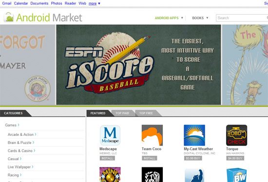
Android Market

Android Market

The Android Market offers thousands of paid and free apps, all built on the open source Android mobile app platform.

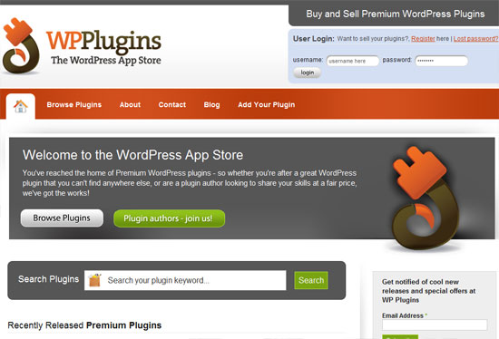
WP Plugins

WP Plugins is a niche software marketplace for WordPress plugins. They offer premium WordPress plugins for extending WordPress with features such as e-commerce capabilities.

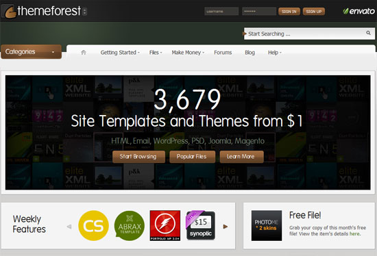
ThemeForest

ThemeForest

The popular marketplace by Envato with over 600,000 members, ThemeForest is a place where you can find premium themes for WordPress, Drupal, Joomla, and many others.

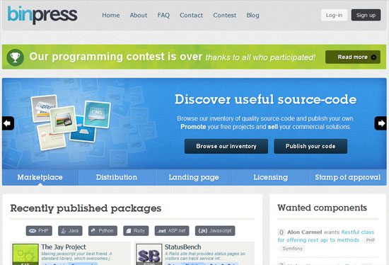
Binpress

Binpress

This is a marketplace for source code for languages like PHP and JavaScript.

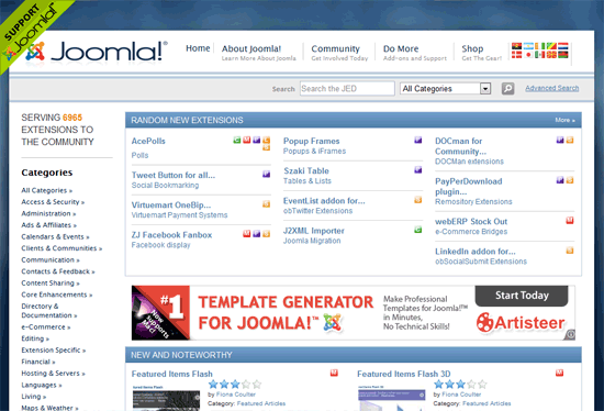
Joomla Extensions

Joomla Extensions

Joomla has its own extensions directory, some of which have commercial/premium versions.

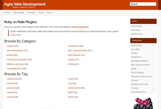
AgileWebDevelopment

AgileWebDevelopment

This is a directory for Ruby on Rails plugins; the site currently lists over 1,600 plugins, and that number is growing.

Make a Living on Free and Open Source

Creating products and providing services for open source software is a viable way for web developers to diversify their income channels. If you have reusable code that you use in most of your projects, or have a good idea for a project that fulfills a need not answered by free solutions, then publishing a commercial alternative might give you some relief from the freelance project hunting cycle or that 9-to-5 day job. In many instances, developers can even make a living solely on products and services for free and open source software.

Related Content

About the Author

Rosston Meyer is a freelance web designer based out of Delray Beach, FL. He has collaborated on interesting projects over the years, including the Ocean Energy Council with family members and with Wizard Sleeve Toys on designer toy production and marketing efforts. You can find his work and social profiles at Rosstamicah New Media Design.


10 Tips for Decreasing Web Page Load Times

07 Mar

10 Tips for Decreasing Web Page Load Times

Patience is a virtue, but for many, it is often a difficult concept to practice. That is especially true for web users visiting a website that takes a long time to load. Users are enamored with speedy websites, and when a site responds slowly, visitors lose their patience and are less likely to come back.

Improving the speed of your website is important not only to users, but to search engine rankings as well. Last April, Google announced that they are now including website speed in their search ranking algorithms.

While this inclusion doesn’t hold the same weight as many of Google’s other ranking signals, it is still something that should be considered when planning out your website’s SEO efforts.

The following are some tips for decreasing your web page loading times.

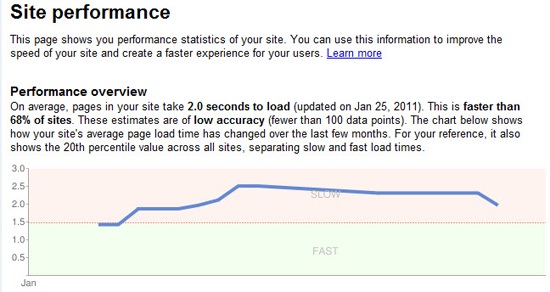
1. Check the Current Speed of the Website

The first thing you will want to do is to analyze your current page speed. This allows you to track your improvement and ensure that any changes you make positively improves your page load times.

There are many free tools out there for checking how long it takes to load your website. Here are a few of them:

  • Pingdom offers an easy-to-use site speed test that mimics that way a page is loaded in a web browser.
  • Page Speed is an open source Firefox add-on that helps you assess the performance of your web pages. It also provides suggestions on how to fix performance issues.
  • Web Page Test is another great tool that shows you the speed and performance of your website in different browsers.

2. Optimize Your Images

Know when to use the appropriate file format for your images. Changing to a different file format can dramatically decrease the file size of an image.

  • GIF is ideal for images with few colors like logos.
  • JPEG is great for images with lots of colors and details like photographs.
  • PNG is the choice when you need high quality transparent images.

Check out these resources to learn more about optimizing images:

3. Don’t Scale Down Images

Avoid using a larger image than you need just because you can set the width and height attributes of <img> elements in HTML.

If you need a 100x100px image and you have a 700x700px image, use an image editor like Photoshop or one of these web-based image editors to resize the image to the needed dimensions. This lowers the file size of the image, thus helping to decrease page loading times.

4. Compress and Optimize Your Content

The task of compressing your website content can have a huge impact on reducing load times. When using HTTP compression, all of your web page data is sent in a single smaller file instead of a request that is full of many different files. For more information, see this Wikipedia article on HTTP Compression.

You can also optimize and compress your JavaScript and CSS files by combining them and minifying the source code.

5. Put Stylesheet References at the Top

Moving your stylesheet references to the <head> of your HTML document helps your pages feel like it is loading faster because doing so allows your pages to render the styles progressively. In addition, it doesn’t hurt that it’s the W3C standard.

6. Put Script References at the Bottom

Browsers can only download two components per hostname at the same time. If you add your scripts towards the top, it would block anything else below it on the initial loading of the page. This makes it feel like the page is loading slower.

To avoid this situation, place script references as far down the HTML document as possible, preferably right before the closing <body> tag.

7. Place JavaScript and CSS in External Files

If your JavaScript and CSS are directly in your HTML document, they are downloaded every time an HTML document is requested. This, then, doesn’t take advantage of browser caching and increases the size of the HTML document.

Always place your CSS and JavaScript in external files; it’s a best practice and makes your site easier to maintain and update.

8. Minimize HTTP Requests

When visiting a new web page, most of the page-loading time is spent downloading components of that page (e.g. images, stylesheets, and scripts).

By minimizing the number of requests a web page needs to make, it will load faster. To reduce HTTP requests for images, one thing you can do is to use CSS sprites to combine multiple images.

If you have multiple stylesheets and JavaScript libraries, consider combining them to reduce the number of HTTP requests.

9. Cache Your Web Pages

If you use a content management system that dynamically generates your web pages, you should statically cache your web pages and database queries so that you can decrease the strain on your server as well as speed up page rendering times.

When you cache your page, it saves a static version of it to be presented to the user instead of recreating it every time it’s requested.

For WordPress, check out WP Super Cache and W3 Total Cache (also read this WordPress codex entry on optimizing/caching WordPress). Drupal core has native caching.

10. Reduce 301 Redirects

Every time a 301 redirect is used, it forces the browser to a new URL which increases page-loading times. If possible, avoid using 301 redirects.

Conclusion

Web page speed is a metric that should not be ignored if you are concerned about providing an optimal user experience.

Want more information on decreasing your website’s page load times? Read Google’s section on page speed, which provides tools, articles, and community feedback regarding website speed. Good luck and happy optimizing!

Related Content

About the Author

Adam Heitzman is a web designer/developer with a strong background in SEO. He’s a Managing Partner at HigherVisbility, a Memphis-based internet marketing agency that offers a full range of marketing services ranging from SEO, Pay Per Click Marketing, Web Design and Development, and Social Media Marketing. Connect with HigherVisibility on Facebook and Twitter.


10 Tips for Decreasing Web Page Load Times

07 Mar

10 Tips for Decreasing Web Page Load Times

Patience is a virtue, but for many, it is often a difficult concept to practice. That is especially true for web users visiting a website that takes a long time to load. Users are enamored with speedy websites, and when a site responds slowly, visitors lose their patience and are less likely to come back.

Improving the speed of your website is important not only to users, but to search engine rankings as well. Last April, Google announced that they are now including website speed in their search ranking algorithms.

While this inclusion doesn’t hold the same weight as many of Google’s other ranking signals, it is still something that should be considered when planning out your website’s SEO efforts.

The following are some tips for decreasing your web page loading times.

1. Check the Current Speed of the Website

The first thing you will want to do is to analyze your current page speed. This allows you to track your improvement and ensure that any changes you make positively improves your page load times.

There are many free tools out there for checking how long it takes to load your website. Here are a few of them:

  • Pingdom offers an easy-to-use site speed test that mimics that way a page is loaded in a web browser.
  • Page Speed is an open source Firefox add-on that helps you assess the performance of your web pages. It also provides suggestions on how to fix performance issues.
  • Web Page Test is another great tool that shows you the speed and performance of your website in different browsers.

2. Optimize Your Images

Know when to use the appropriate file format for your images. Changing to a different file format can dramatically decrease the file size of an image.

  • GIF is ideal for images with few colors like logos.
  • JPEG is great for images with lots of colors and details like photographs.
  • PNG is the choice when you need high quality transparent images.

Check out these resources to learn more about optimizing images:

3. Don’t Scale Down Images

Avoid using a larger image than you need just because you can set the width and height attributes of <img> elements in HTML.

If you need a 100x100px image and you have a 700x700px image, use an image editor like Photoshop or one of these web-based image editors to resize the image to the needed dimensions. This lowers the file size of the image, thus helping to decrease page loading times.

4. Compress and Optimize Your Content

The task of compressing your website content can have a huge impact on reducing load times. When using HTTP compression, all of your web page data is sent in a single smaller file instead of a request that is full of many different files. For more information, see this Wikipedia article on HTTP Compression.

You can also optimize and compress your JavaScript and CSS files by combining them and minifying the source code.

5. Put Stylesheet References at the Top

Moving your stylesheet references to the <head> of your HTML document helps your pages feel like it is loading faster because doing so allows your pages to render the styles progressively. In addition, it doesn’t hurt that it’s the W3C standard.

6. Put Script References at the Bottom

Browsers can only download two components per hostname at the same time. If you add your scripts towards the top, it would block anything else below it on the initial loading of the page. This makes it feel like the page is loading slower.

To avoid this situation, place script references as far down the HTML document as possible, preferably right before the closing <body> tag.

7. Place JavaScript and CSS in External Files

If your JavaScript and CSS are directly in your HTML document, they are downloaded every time an HTML document is requested. This, then, doesn’t take advantage of browser caching and increases the size of the HTML document.

Always place your CSS and JavaScript in external files; it’s a best practice and makes your site easier to maintain and update.

8. Minimize HTTP Requests

When visiting a new web page, most of the page-loading time is spent downloading components of that page (e.g. images, stylesheets, and scripts).

By minimizing the number of requests a web page needs to make, it will load faster. To reduce HTTP requests for images, one thing you can do is to use CSS sprites to combine multiple images.

If you have multiple stylesheets and JavaScript libraries, consider combining them to reduce the number of HTTP requests.

9. Cache Your Web Pages

If you use a content management system that dynamically generates your web pages, you should statically cache your web pages and database queries so that you can decrease the strain on your server as well as speed up page rendering times.

When you cache your page, it saves a static version of it to be presented to the user instead of recreating it every time it’s requested.

For WordPress, check out WP Super Cache and W3 Total Cache (also read this WordPress codex entry on optimizing/caching WordPress). Drupal core has native caching.

10. Reduce 301 Redirects

Every time a 301 redirect is used, it forces the browser to a new URL which increases page-loading times. If possible, avoid using 301 redirects.

Conclusion

Web page speed is a metric that should not be ignored if you are concerned about providing an optimal user experience.

Want more information on decreasing your website’s page load times? Read Google’s section on page speed, which provides tools, articles, and community feedback regarding website speed. Good luck and happy optimizing!

Related Content

About the Author

Adam Heitzman is a web designer/developer with a strong background in SEO. He’s a Managing Partner at HigherVisbility, a Memphis-based internet marketing agency that offers a full range of marketing services ranging from SEO, Pay Per Click Marketing, Web Design and Development, and Social Media Marketing. Connect with HigherVisibility on Facebook and Twitter.