RSS
 

Archive for February, 2011

Software Calculates Appearance Of The Average Woman in 41 Countries

10 Feb


What does an average French woman look like? Here’s your answer and a whole lot more, where thousands of faces have been averaged into a composite face for each of 41 different countries.

Face Research created the software, asking its user to define a dozen points on a face, and then it’s possible to determine an average face when comparing two photos or thousands.

Although the photos used for these composites are not available for our recreation, the site offers a smaller group of faces with which you can experiment, or lets you upload your own for custom averaging.

In this project, it’s not clear how many subjects were averaged together for each nationality, but the result is remarkable, with all the faces beaming with nearly perfect symmetry and blemish-free skin. Take a look at a gallery of the various nationalities:


Face Research, Group 1


Face Research, Group 2


Face Research, Group 3


Face Research, Group 4


[via Photoxels]

More About: average woman, Face Research, gallery, software, websites

For more Tech & Gadgets coverage:


Video: JIRA with an IT Consultant

10 Feb

Today we hosted a webinar with Gregory Kneller, IT Consultant, who helps companies arrange effective collaboration on projects and tasks. This is a fantastic overview to JIRA and its numerous use cases!

Gregory walked us through his use of JIRA for general business purposes. He uses JIRA for sharing project documents, tracking work, time and user roles as well as for business intelligence. Gregory covered his implementation approach and user training. He also explains how JIRA has helped pave the agile road towards BPMS.

While providing a concrete example of helping BPS Bavaria Property Services GmbH, Gregory detaied his customization of some JIRA fields to help non-IT business users. I found it especially clever and useful to change 'Project' to 'Department', 'Assignee' to 'Responsible', 'Reporter' to 'Customer' and 'Watchers' to 'Stakeholders.' In this example, these custom fields made more sense for this user.

Watch the video now to learn more about JIRA and some other tips for making it work for your particular use case:


For past webinars, please hop on over to Atlassian TV where you can sort videos by products and categories. For upcoming webinars, please visit our events page. If you would like to be in our webinar series, please contact us.


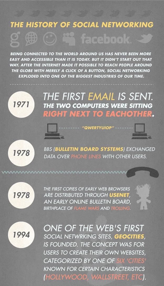
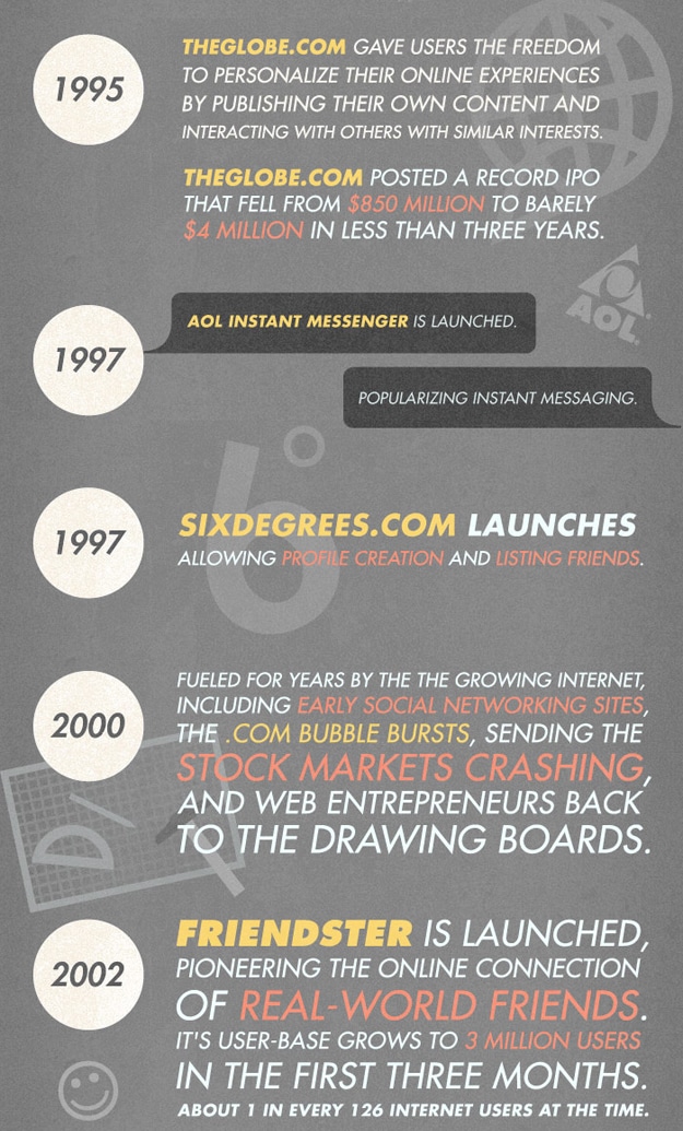
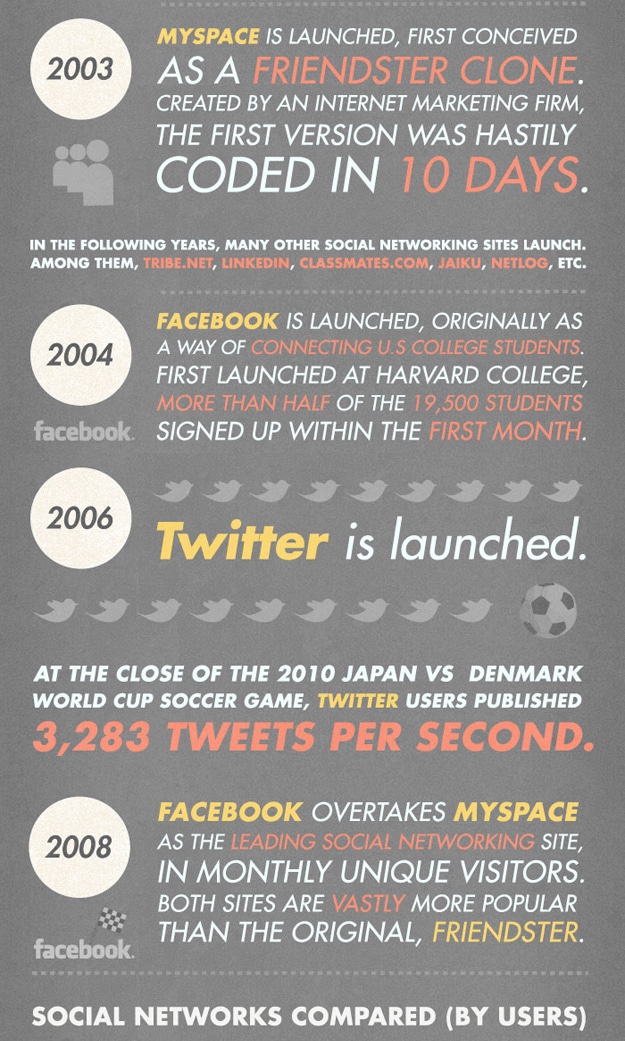
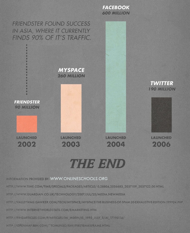
The Social Media World Before Twitter And Facebook [Infographic]

10 Feb

A world without Twitter or Facebook seems distant and almost non existent. Yet still there was a time, long ago (hrmm..), when they didn’t exist. As a matter of fact, Facebook didn’t even exist 8 years ago and Twitter even less. So, if you feel like you’ve been using Twitter or Facebook for ages, well then you’re wrong. Some say Social Media was invented at the same time as the Internet was. The reason why is because at that point we all got a forum where we could interact with people all around the world. However, the real term Social Media really started way later. There are literally hundreds of social networking services on the Internet today, and many that you have never heard of.

You might not know it, but there were actually a few successful social networking services before Twitter and Facebook even though when reading their names you might not recognize them at all. Some of us used the Internet purely to look up information and send files back and forth. Some even used chat rooms and message services like ICQ or AOL Instant Messanger.

But mostly, we never touched the social networking world or even came close to it before Facebook and Twitter. You will be surprised to know that there were actually quite a few services that you would file under the category of Social Networking Services. The whole thing started with an email, and it is on that road that we will soon come to Facebook and Twitter. Watch the whole pre-Facebook and pre-Twitter world unfold in front of your eyes with this awesome infographic designed and created by Online Schools. Interesting indeed!

The History Before Facebook TwitterThe History Before Facebook TwitterThe History Before Facebook TwitterThe History Before Facebook Twitter


Star Wars: A New Hope Retold In 32 Icons

10 Feb

There are many ways to explain the story of Star Wars, and no matter how you tell it, people are always going to be fascinated by the science fiction world. I think I have seen everything from YouTube clips of clueless people trying to tell the story of Star Wars, to complete pocket comic books retelling it. I always enjoy the way people see this huge adventure differently. The characters seem to have their own individual lives in a galaxy far far away, for real that is. It’s a great way to escape reality every once in a while, and I think we will be laughing one day when we have droids of our own and compare them to C-3PO and R2-D2. It’s completely beyond me, by the way, how thin that guy (Anthony Daniels) who played C-3PO must have been back then.

So how many ways can you come up with to retell the Star Wars story, any episode that is? I think until today, I could come up with quite a few, but never did it occur to me that you could completely retell it in small icons that make the story even more interesting. It’s almost like checking out a timeline, but with a whole different aspect to it.

Designer Wayne Dorrington is a master of the icons, and the force is strong with him. He designed and created this awesome Star Wars: A New Hope retold in icons, and you can be sure it’s going to be about the coolest thing you have seen all week. Now to all of you Star Wars fans out there, this is what a real fan does. Now it’s up to you to come up with something that is better. Brilliant!

A New Hope Retold In Icons


Introducing iframe Tabs for Pages

10 Feb

Today we announced major updates to Facebook Pages to help Page admins manage communications, express their brands, and increase engagement. As part of these changes, we are also updating the model for building apps on Pages.

Using iframes in Page Tabs

Many useful applications have been built for Facebook Pages like BandPage for artists to share their music with fans and Shop Now to help Pages sell merchandise on Facebook. As of today, you can build your Page Tab apps using iframes rather than FBML. This means you can now build apps that run across Facebook (including Pages and Canvas applications) using the same simple, standards-based web programming model (HTML, JavaScript, and CSS). In addition, you can easily integrate social plugins and the Graph API within your tab.

How to Add an iframe Page Tab

Enable iframes by editing the Facebook Integration settings on the Developer App:

Specify a Tab Name and a Tab URL that is loaded when the user selects your Tab on a given Facebook Page. Finally, to add the app to a Page, an admin of the Facebook Page must navigate to your app's Profile Page and select "Add to my Page.” You can see step by step instructions in our guide.

Updated signed_request

When a user lands on the Facebook Page, she will see your Page Tab added in the left-hand menu. When a user selects your app in the left-hand menu, the app will receive the signed_request parameter with one additional parameter, page, a JSON array which contains the ‘id’ of the Facebook Page your Tab is hosted within, a boolean (‘liked’) indicating whether or not a user has liked the Page, and a boolean (‘admin’) indicating whether or not the user is an ‘admin’ of the Page along with the user info array. If a user has authorized your application, the signed request will also contain an access token and the user id for the current viewing user so you can personalize your application for them.

In addition, your application will also receive a string parameter called app_data as part of signed_request if an app_data parameter was set in the original query string in the URL your tab is loaded on. For the Shop Now link above, that could look like this: "http://www.facebook.com/MollySimsOfficial?v=app_135607783795&app_data=any_string_here". You can use that to customize the content you render if you control the generation of the link.

{
   "algorithm":"HMAC-SHA256",
   "expires":1297328400,
   "issued_at":1297322606,
   "oauth_token":"OAUTH_TOKEN",
   "app_data":"any_string_here",
   "page":{
      "id":119132324783475,
      "liked":true,
      "admin":true
   },
   "user":{
      "country":"us",
      "locale":"en_US"
   },
   "user_id":"USER_ID"
}

Policy Revisions

We’ve also revised our Platform and Page policies to ensure that apps on Page Tabs maintain a high quality user experience and do not share information between Pages.

FBML Roadmap

With our recent launch of Requests and the support for iframe on Pages Tabs, we are now ready to move forward with our previously announced plans to deprecate FBML and FBJS as a primary technology for building apps on Facebook. On March 11, 2011, you will no longer be able to create new FBML apps and Pages will no longer be able to add the Static FBML app. While all existing apps on Pages using FBML or the Static FBML app will continue to work, we strongly recommend that these apps transition to iframes as soon as possible. Lastly, we want to be clear that our deprecation of FBML does not impact XFBML, such as the tags that support social plugins.

We are excited to see the new types of apps you build using iframes in Page Tabs. Please leave any comments or questions below.


33 Developers you MUST Subscribe to as a JavaScript Junkie

09 Feb

As JavaScript developers, we have quite crazy requirements. The playing field is in a state of constant flux and one of the best ways to keep up is interacting with other developers and reading their code. Blogs, such as the one you’re reading, are a perfect amalgamation of these two activities.

Today, I’d like to bring your attention to a number of blogs written by pretty well versed developers, focusing on JavaScript development, that you owe yourselves to bookmark.


A Quick Word on my Choices

Even though these blogs aren’t updated often, in fact a lot of them get updated maybe thrice a year, the content they do have are worth their weight in, well, smartly written JavaScript. The developers below vary from wildly popular to almost obscure but they have one thing in common — their passion for JavaScript.

I’ve limited myself to a cliff notes version of each dev to keep it short. Don’t loiter around — click on those links and get reading!


John Resig

Developer Image

Douglas Crockford

Developer Image

Dean Edwards

Developer Image

Nicholas C. Zakas

Developer Image

Dustin Diaz

Developer Image

Brendan Eich

Developer Image
  • Find his musings on JavaScript at his blog.
  • Inventor of the JavaScript language.
  • Works at Mozilla.
  • Remember to check out his podcast, as well.
  • Tweets at @BrendanEich

David Flanagan

Developer Image

Thomas Fuchs

Developer Image

Paul Irish

Developer Image

Yehuda Katz

Developer Image

Juriy Zaytsev

Developer Image

Peter van der Zee

Developer Image
  • Find his musings on JavaScript at his blog.
  • Creator of the JS1K competition
  • Tweets at @kuvos

Stoyan Stefanov

Developer Image

Dmitry Baranovskiy

Developer Image

Lucas Smith

Developer Image
  • Find his musings on JavaScript at his blog.
  • YUI team member
  • Tweets at @ls_n

Ben Alman

Developer Image
  • Find his musings on JavaScript at his blog.
  • Contributor to the jQuery and Modernizr projects.
  • Creator of so many jQuery plugins that we’re ethically obligated to use the word buttload.
  • Tweets at @cowboy

Rey Bango

Developer Image
  • Find his musings on JavaScript at his blog.
  • jQuery team member.
  • Works at Microsoft.
  • Tweets at @reybango

Remy Sharp

Developer Image

Cody Lindley

Developer Image

James Padolsey

Developer Image

Oliver Steele

Developer Image

Ben Cherry

Developer Image
  • Find his musings on JavaScript at his blog.
  • Works at Twitter.
  • Github repos here.
  • Tweets at @bcherry

Michael Bolin

Developer Image

James Coglan

Developer Image

Angus Croll

Developer Image
  • Find his musings on JavaScript at his blog.
  • Works at Twitter.
  • Tweets at @angusTweets

John-David Dalton

Developer Image
  • Find his musings on JavaScript at his blog.
  • Author of the FuseJS library.
  • Github repos here.
  • Tweets at @jdalton

Andrea Giammarchi

Developer Image

Peter Michaux

Developer Image
  • Find his musings on JavaScript at his blog.
  • Dude is a darn enigma, wrapped in a riddle, shrouded in mystery. The articles are pretty much one of the best you’ll get to read so don’t miss out.

Christian Heilmann

Developer Image

Dion Almaer

Developer Image

Rebecca Murphey

Developer Image

David Walsh

Developer Image

Addy Osmani

Developer Image
  • Find his musings on JavaScript at his blog.
  • Member of the jQuery team [bug triage and API docs].
  • Tweets at @addyosmani

That’s a Wrap!

I’m sure a lot of you are frothing at the mouth by this list not including someone. Fret not! Chime in below and I’ll make sure to keep this list periodically updated.


How to Significanty Increase Your Blog Subscribers

09 Feb

Your most important asset as a blogger is not the people who visit your blog daily or those who comment on your blog but those who take the pain and time to subscribe to your blog so that they can be receiving more updates from you in the future. A lot of bloggers now make a very deadly blogging mistake of focusing on getting more daily visitors instead of subscribers. Your subscribers are the ones who trust you, they’re the ones who read your content regularly and truly know you and they are the ones that will most likely take action based on what you preach or buy from you in the nearest future. This post will be giving you some tips to significantly improve your blog subscribers.

Focus on Getting Quality Traffic

There are many factors that come into place as far as increasing your blog subscribers is concerned; one factor is conversion and another major factor is the quality of the traffic you get. You shouldn’t expect to see any significant conversion if your traffic are from paid to click sites, pop unders or other aggressive traffic generation strategies.  Trust is a major factor that has to be associated with any traffic you get before there can be any significant result; for example, if someone like Darren Rowse interviews me or writes a post in which he encourages his readers to visit and subscribe to my blog it will bring more results than from someone discovering my blog through a comment on another blog even if they result in the same number of visitors.

There are a lot of ways to get quality traffic and I wrote a post here recently on getting quality traffic – I suggest you read it. While tactics are great and sometimes important real results only come from trust. There will be more interaction and result when people start spreading the word about you and encouraging others to read your blog. This type of traffic can only be gotten by you producing great content that builds trust with your readers.

Have a Great Design

It doesn’t matter how great your content is you also need a great design. While you can give a lot of examples of people writing great content with bad design the truth is that many of these bloggers are getting less results than they would have gotten if they had a better design.

People need to be able to interact with your site and not just read your content. A great design makes it easy for people to share your content and spread the word about your blog, a great design makes it easy for people to locate your subscription options and subscribe to your blog and a great design makes your content more presentable.

I saw this in action recently when I paid a custom designer to help me make a unique design for my blog; this design was recently released and since its release I have noticed a significant increase in the number of people subscribing to my blog. In fact, the number of people subscribing to my blog daily have doubled and this was only possible because of the great design my blog has.

Be Transparent

The internet is a free world where any content can easily be circulated, the internet isn’t censored and anybody from anywhere in the world can easily set up a blog and begin to teach people what he/she knows nothing about. A great way to significantly increase the number of people subscribing to your blog is by letting people know that you can be trusted and the best way to do this is by being transparent on your blog.

I recently started displaying my income report on my blog every month, ever since then I have noticed a significant increase in my subscriber base (especially on the first day) and my first income report is my most popular post this year – it still keeps on getting links and traffic even after a month of me posting it.

You don’t necessarily need to be displaying your income report on your blog since our reasons and aims for blogging are different and what we want to achieve is different. All you need to do is look for a way to build credibility on your blog, this can be by showing live examples of the results you get, by doing a lot of things to prove that you truly know what you’re saying and by getting true expert endorsement for your work.


Copyright © 2011 Blogging Tips. This Feed is for personal non-commercial use only. If you are not reading this material in your news aggregator, the site you are looking at is guilty of copyright infringement. Please contact us so we can take legal action immediately.

POSTLINK

Blogging Tips Books
A selection of e-books to help you improve as a blogger. Find out more at www.bloggingtips.com/books/


The Design Matrix: A Powerful Tool For Guiding Client Input

09 Feb

Advertisement in The Design Matrix: A Powerful Tool For Guiding Client Input
 in The Design Matrix: A Powerful Tool For Guiding Client Input  in The Design Matrix: A Powerful Tool For Guiding Client Input  in The Design Matrix: A Powerful Tool For Guiding Client Input

I used to think the beginning of a website design project was the best part. Hopes are high. People are full of great ideas. Nobody is disappointed yet. But as I gained experience, I found that learning about a client’s brand, competitors and customers doesn’t always give clear direction about design goals.

Brand discussions can generate goals like “be modern,” but they don’t necessarily determine how to accomplish those goals. Competitor reviews can devolve into cherry-picking sessions that spawn “frankencomps” rather than provide helpful feedback. And mood boards, which communicate a general feeling, don’t help to articulate or prioritize design goals. With a design matrix, you can guide discussions and establish clear direction.

Hey, You Got Math In My Art…

Sometimes the abstract nature of design is enough to make you envy the people over in accounting, with their definite answers and proven formulas. While the beauty of design is that it transcends the world of definite answers, introducing a little math in the form of design matrices can help you create better websites by providing a clear picture of where the website design is today and where it should go tomorrow.

Design matrices don’t require any serious math skills because they’re based on the coordinate system. Chances are you’ve seen a competitor matrix that ranks brands according to two key attributes on X and Y axes (for example, value could be plotted against profit margin). A design matrix is essentially like a competitor matrix but ranks the client’s website against competitor websites, and it uses design attributes (“clean” and “warm,” for example) instead of other points of competitive comparison.

Carmatrix211 in The Design Matrix: A Powerful Tool For Guiding Client Input
A typical competitor matrix ranks brands according to rational factors. (This example, which compares a few car models, was created for illustrative purposes only.)

Screenshot2 in The Design Matrix: A Powerful Tool For Guiding Client Input
A design matrix ranks website designs according to design attributes. (This example, which compares airline website designs, was created for illustrative purposes only).

Design matrices are powerful tools for determining the path of the website design process, because: they force you to determine two design attributes to focus on; they build consensus within a team; they guide the clients’ perception of competitors; and, most importantly, they lead to differentiated website designs.

The Art (And Math) Of Building A Design Matrix

Step 1: Gather Information

To build a design matrix, you will need to know the client’s core brand attributes and main competitors. You should also have a broad understanding of what the redesign aims to accomplish (from a design perspective): “the website is cluttered” or “our website is not engaging.” The good news is that information gathering is a normal part of the discovery phase.

A design matrix should not be the only piece of work involved in the discovery phase, but it can replace some other approaches. Creating or documenting a brand’s position and defining the key redesign goals are essential. However, a design matrix could potentially replace mood boards. A mood board is a collage or grid of images that capture the “feel” or “tone” of a brand. They are valuable tools for providing direction to new brands, but they provide a less concrete direction than a design matrix. If the brand is in its nascent form and needs broad high-level direction, then mood boards work well; but if you are working with an established brand or a client who prefers a concrete approach, then a design matrix is the best bet.

Brandposition in The Design Matrix: A Powerful Tool For Guiding Client Input
Document the brand’s position before creating a design matrix. (For illustrative purposes only.)

Imagespark in The Design Matrix: A Powerful Tool For Guiding Client Input
Image Spark is a great resource for creating online mood boards—particularly useful if you are working with a company that requires high-level brand definition.

Another common discovery activity that design matrices can replace is the “competitor website review.” Looking at competitors’ websites can generate lively discussion, but too often it either shifts the focus to feature sets instead of design direction, or it becomes a cherry-picking session for disparate design elements from a variety of websites that the designer is somehow supposed to mash together into a single coherent website design.

Create a design matrix that shows the current website in relation to competing websites. This way, you are less likely to get distracted by feature sets or be expected to combine all sorts of design elements. That said, if you are looking for an energizing group activity, competitor reviews can generate more brainstorming than a design matrix. Doing both is an option, but if you do that, then do the matrix after the walk-through of competitors.

Screenshot3 in The Design Matrix: A Powerful Tool For Guiding Client Input
Delta Airlines’ website.

Screenshot4 in The Design Matrix: A Powerful Tool For Guiding Client Input
United Airlines’ website.

Looking at these individual airline websites, rather than comparing them on a design matrix, can lead to a less design-oriented and more feature-focused conversation.

Step 2: Determine Your X and Y Axes

Narrowing down a design direction to two attributes can be uncomfortable for those of us accustomed to creative briefs that list a litany of brand attributes to guide our design. How often have we heard that a design should be “clean,” “inspiring,” “warm,” “engaging,” “approachable” and “trustworthy”? How do we even accomplish just two of these attributes? And if we must choose only two, how do we decide?

Understand that a design matrix is not intended to limit the final design to two attributes. That would be almost impossible. It is intended to illustrate the two most important attributes for taking the website design to the next level and differentiating it from that of competitors.

To determine your X and Y axes, ask yourself the following questions:

  • Of all the brand’s attributes, what will make this client stand out from the crowd? Which design traits reinforce those brand attributes?
  • What are the competitor websites’ strengths and weaknesses?
  • What does the design need to do better in order to accomplish the website’s goals?

The X and Y axes should not be nearly synonymous (for example, “warm” and “engaging”), nor should they be mutually exclusive (“innovative” and “traditional”). There should be a slight tension between the two attributes.

The airline websites, for example, are ranked according to how “clean” and “personable” their designs are. There is a slight, but not negating, tension between these two attributes. Clean websites can come across as cold if they don’t have a distinctive voice or warm color palette. Personable websites are often less functionally organized. Achieving a high ranking for both attributes is a worthy challenge, and stepping up to that challenge will definitely create a distinctive website.

You might find that you change the labels of your axes as you place the websites on the matrix (see step 3), but the above process should get you pretty close to determining what the final axes should be.

Step 3: Play a Little

You know the competitors. You have a clear idea of what is important, brand- and design-wise. You have determined your x and y axes. It’s time to try some things out.

Place all of the websites on your matrix as you would rank them off the top of your head. As you begin to place them, you will most likely rearrange some as you compare them to others. This is a natural part of the process because the matrix shows relationships as well as individual rankings.

Screenshot5 in The Design Matrix: A Powerful Tool For Guiding Client Input
I was influenced by Jet Blue’s overall branding and so originally ranked its website’s personality fairly high. Later, when I compared it to the Delta and Virgin America websites, I revised the ranking.

Design matrices do not have to be limited to ranking competitors. They can also show a client’s website’s position among affinity brands (i.e. brands with a similar “feel” and customer base). Mini USA and Apple, for example, might be considered affinity brands because they both exemplify modern design and appeal to similar customer types.

Step 4: Get Serious

Things will take shape fairly quickly, but there is a final step before declaring your design direction matrix done and dusted. Before sharing the matrix with the client team, make sure you can defend it. Show it to others in your agency and see if they agree with your placement decisions. Ask these key questions:

  1. Do my axes represent the two most important design attributes?
  2. Can I clearly articulate why I placed each website where I did?
  3. Will the redesign be able to get the website to the top-right corner? If not, what is holding it back?

If you answered yes, yes and yes (or yes, yes and yes if we do a certain thing…), then your website design direction matrix is ready to share with the client.

Creating Buy-In With Design Matrices

Everyone loves talking about design, but with everyone talking, we don’t always hear other ideas. If you show a client a design matrix before creating the initial comprehensives, then you will visibly and quantifiably show that you are on the same page; and because of that, you’ll likely be successful in the long run.

The design matrix will clearly show which websites you think best capture the desired attributes and where the current website falls into the mix. It is a tangible foundation for a conversation about design.

Invite the client to participate actively in this stage of the design process. Clients usually want to feel like they have had direct input in the design, and designers always prefer that the input comes sooner in a high-level, directional form (“The design feels cold”), rather than later in an overly specific form (“Make that element blue”).

Discuss the following questions:

  • Does the matrix address the two most important design attributes?
  • Do we all agree on the placement of competing and/or affinity brands?
  • Do we all agree on the placement of the client’s brand?
  • If we end up in the top-right corner, are we where we want to be?

Using a design matrix can be risky, mainly for one reason. Some clients have difficulty prioritizing the two most important design elements, and then they dig their heels in and declare that there are in fact four equally important elements. Hopefully, the matrix demonstrates how your choice of attributes distinguishes the website. If you meet with a lot of resistance, just create two matrices or conduct a competitor review (as discussed in step one).

Be prepared to explain your rationale and defend your position — but also be open to suggestions. Maybe there are good reasons to focus on different attributes, or maybe the team feels that the placements of some website are not quite right. Revising a design matrix is much easier than revising a design.

Truly Going The Distance

Creating a design matrix is a great first step, and getting client feedback is an awesome second step, but the most important step is to use the matrix as a resource as you design and when you present your designs to the client.

Ultimately, the purpose of a design matrix is to move a website design in the right direction. Specifically, move it to that space in the upper-right corner that represents the best of both worlds. As you design, continually refer to the matrix and see where your new iterations might fall on it.

Think about these questions as you design, and take notes for upcoming presentations:

  • Do the new iterations embody the key attributes?
  • Are they better than the competing and affinity brands?
  • How do they accomplish the design goals?

When presenting designs to a client, review key findings and recommendations made during the discovery phase. Before presenting your designs, review the matrix with the client, and revisit the matrix at the end of the presentation to show that progress has been made.

Training Wheels: A Step-By-Step Overview Of A Design Matrix For Cannondale

The following walk-through illustrates the design matrix process in its entirety and addresses the kinds of decisions that need to be made when creating a matrix. The exercise below is entirely theoretical. I do not work, nor have I ever worked, for any major bicycle manufacturer, including Cannondale. Thoughts about what design attributes Cannondale might strive for are purely my opinion. Thoughts about competing website design attributes are informed by looking at their websites and general industry expertise — just as yours will be.

Screenshot6 in The Design Matrix: A Powerful Tool For Guiding Client Input
How would you create a design matrix for Cannondale? (This example is purely illustrative.)

Step 1: Understand

For the purposes of this exercise, let’s assume that Cannondale has chosen you to redesign its website. Your first step will be to understand its brand, its competition and the desired attributes of its new website. Let’s also assume that you left the initial discovery meeting with this information:

  • Cannondale’s key competitors are Trek, Giant, Diamondback and Fuji.
  • Its brand is about performance, innovation and a superior craftsmanship that inspires riders.

When you ask about the desired design attributes, Cannondale’s representatives say the website should capture the sense of elation that comes with a successful bike ride. They also want the website to showcase technical innovation, dedication to quality and devotion to the individual rider. Your notes read, “inspiring, innovative, technical, individual, quality.”

Step 2: Determine Your Axes

The X and Y axes reflect the client’s most important and desired design attributes, but do look at competing websites before naming the axes; they will inform your direction and give you ideas about what would be distinctive.

Upon viewing the competitor websites, I found both Trek’s and Fuji’s to be “immersive” and “powerful,” with clean, bold imagery. Fuji’s was slightly colder and more “technical.” Diamondback has an inspiring home page, but the website loses steam and doesn’t showcase the individual bikes distinctively. Giant has a strong focus on teams and individual riders and helpful bike selection tools, but the design is flat.

So, how does all of this play into naming the axes and creating the matrix? Going back to your note about desired design attributes, we see that Cannondale wants to showcase technical innovation, which Trek and Fuji do well on their websites; Cannondale wants to inspire, which Trek and Fuji do through immersive imagery; unlike Giant, though, Cannondale doesn’t want to focus on racing.

At first, it may seem that “inspiring” and “innovative” would be good axes names, but those attributes don’t have quite enough tension. They are not synonyms, but there is no balance either. “Inspiring” and “quality” may come to mind, but “quality” is not a design attribute; it’s something the client wants to showcase (it’s an attribute of the product, not the design).

I chose “inspiring” and “technical” for the desired design attributes. “Inspiring” works because the client wants to inspire riders. “Technical” is a good second attribute because it captures innovation and product quality while striking a balance with “inspiring.” There is a healthy tension between the two words. Capturing both emotion and technical detail is difficult. Accomplish that balance and you’ll leave the competition in the dust.

Step 3: Place Websites on the Matrix

I always start by plotting all of the websites roughly where I think they fall on the matrix, and then I move them around as I consider the relationships between the websites.

I originally placed Cannondale’s website in the lower-left corner but, as I compared it to the other websites, I realized that it’s actually more technically focused than others, including Diamondback and Giant. That said, the Trek and Fuji websites are still more technical, with their bold product showcases and detailed imagery.

Inspiration-wise, the current Cannondale website seems to be on par with Giant’s: there is imagery of bikers, but it feels flat and diminutive.  Diamondback’s immersive home page raises it a bit above the others. Trek’s warmth and voice put it in the lead for inspiration. I originally had Trek in the upper-right, but I ultimately decided that Fuji’s website has a more technical feel to it.

The final matrix (below) is informative on many levels. It shows where Cannondale currently is and where the websites are that it needs to surpass in order to get to where we determined it needs to go. Naturally, the final design will have a unique flavor, but looking at the competing designs will partly uncover how to get there.

Screenshot7 in The Design Matrix: A Powerful Tool For Guiding Client Input
A design matrix informs the path of the design process.

Step 4: Consensus

This is a purely illustrative example, so I did not show this to a team (or the client) for feedback. Typically, feedback focuses on the desired design attributes (“Is this where we want to go?”) and the placement of all of the websites on the matrix. The most important thing is to agree on direction, of course, and then to determine the goal. The hard part is to design a website that gets there.

Step 5 (the Big One): Using It

The last step is not so much a step as a big stride. Once you’ve created the matrix, the important part comes: using it to create a better website. Make a copy for everyone involved in the project (including those in other disciplines) and have them put it up somewhere to serve as a daily reminder and motivator.

Refer to the matrix as you design. Are the decisions you are making moving you toward the upper-right? For example, if you were choosing images for the Cannondale website, ask yourself relevant questions:

  • Is this image inspirational?
  • Does it convey the technical expertise of Cannondale?
  • How can the design be more inspiring?
  • How can I better convey the technical passion of the brand?

As mentioned, revisiting the matrix when showing comps to the client will help justify your approach, but the real reason to create a matrix isn’t to sell comps or do a fun exercise during discovery; rather, it is to remind us of the path we are on. We could take so many directions, and going down a road that looks good but doesn’t take you where you want to be is all too easy.

Think of your design matrix as a compass. It’s not as precise (or cold) as a GPS; it’s an old pocket compass that wobbles a bit as you walk but still gets you to the summit.

Do’s And Don’ts

The beauty of design matrices is that they provide a new way to look at competitors and a tangible foundation on which to begin discussions with clients. They also enable you to play a little as you tweak the axes’ names and the websites’ placement to get them just right. There is wiggle room in the methodology and application, so have fun with it. That said, there are a few set guidelines worth adhering to for success:

  • Don’t be afraid to experiment.
  • Do get your ducks in a row. Verify the desired design attributes and the competitor and affinity brands with a client before proceeding, so that the matrix is relevant.
  • Don’t base your insights on home pages alone. A website’s design is more than the home page. Your matrix might use a home page screenshot, but include it only if it represents the overall design of the website.
  • Do share your toys. Get team input about the placement of websites on the matrix. It’s not an altogether scientific approach, but be as objective as possible.
  • Don’t carve it in stone. Be open to recommendations from clients. Changing a matrix is easier than changing a comp.
  • Do use it to sell your work. Present the matrix as part of your comp presentation in order to explain your rationale and sell your comps.
  • Don’t matrix and run. Don’t abandon the matrix after the discovery process. Refer to it regularly.

Enjoy the process of creating a matrix and of seeing opportunities to design a distinctive website for your client.

Further Reading

(al) (vf)


© Bridge for Smashing Magazine, 2011. | Permalink | Post a comment | Smashing Shop | Smashing Network | About Us
Post tags: , ,


Webcast: Guidance to a Successful Installation, Deployment, and Customization of Lotus Connections 3.0 – February 16, 2011

08 Feb
Abstract

The IBM Lotus Connections team will host a customer Webcast call about Guidance to a Successful Installation, Deployment, and Customization of Lotus Connections 3.0 on Wednesday, February 16, 2011 at 10AM ET (15:00 UTC).

Content

Members from the IBM Lotus Connections Test and Development teams will give an audio and video presentation about installation, deployment and customization. Questions from the attendees will be answered after the presentation by the presenter and other Subject Matter Experts.

There are more details here -> https://www-304.ibm.com/support/docview.wss?uid=swg21461173 <- including links to allow questions to be posted, LotusLive URL, Wiki etc.


Now on SlideShare – SHOW202 – Enterprise 2.0 Hero – a Beginner’s Guide to Installing IBM Lotus Connections 3.0

08 Feb
[Cross posted from blog.collaborationmatters.com]

At Lotusphere 2011, my good friend Rob Wunderlich and I presented a Show and Tell session on installing Lotus Connections 3.0.

Here it is on SlideShare (all 289 slides!):


It is also available for download from the SlideShare site, as well as on LS Online.

Please do share with your colleagues, and use for your own benefit.  However, if you'd like to use the content for your own presentations, please ask for permission first.

Obviously, if you have any questions, or need some assistance with your own Lotus Connections 3.0 deployment, please let me know!