It seems from the comments on the Duke Nukem comic that a lot of people don’t really understand what Uncanny Valley is, or why it’s horrible and creepy and something no designer should approve of unless they’re in the horror business (in which case you need to push it to the limit). “Uncanny Valley†does not necessarily refer to things that are trying to be realistic, nor does it mean “anything you think is uglyâ€. Specifically, the term “Uncanny Valley†was meant to refer to robots, saying that people will like things that look like obvious abstractions of people, and people will like things that look exactly like people, but people are repulsed by things that look almost like people but not quite.
You can hit up the Wikipedia page on the matter for an in-depth explanation of exactly what it means, but I broke it all down into easily digestible pictures of how this all relates to design because I felt like drawing toasters and gluing eyes on lions when I got home from work today.
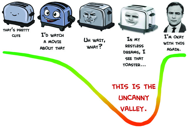
If we made a graph of how much people enjoy watching something move around VS level of realism, the “Uncanny Valley†is that dip where something is too much like a person without actually looking like a person for people to respond positively to it. It’s basically why Tweenbots and Arnold Schwarzenegger have an easier time making friends than the Japanese speaking robot mouth thing.
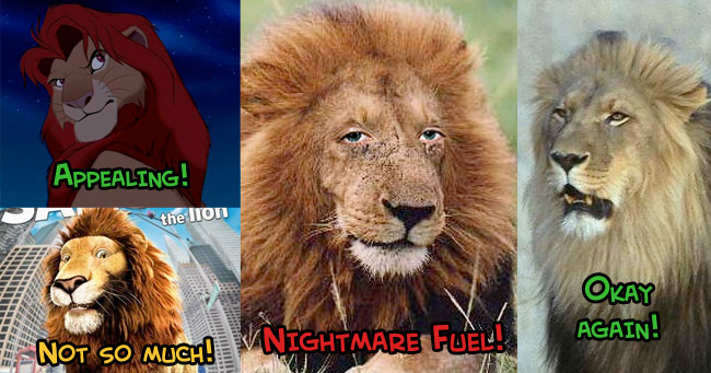
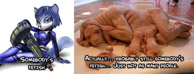
If you want something non-human to emote like a human, you can’t just slap human eyes on it and call it a day. Back in the day sometime in first year animation class we were doing four-legged animal walk cycles, of animals randomly chosen out of a hat. The teacher warned us that people who got things like cats and dogs were probably going to have a harder time than people who got things like bears and raccoons, because people are so familiar with those animals that they’ll always notice right away if something looks wrong. This goes for anything people have a point of reference for. I would assume that furry art wouldn’t be quite as popular as it is if the cute cartoon girls were replaced with realistic human-animal mashups, at least.
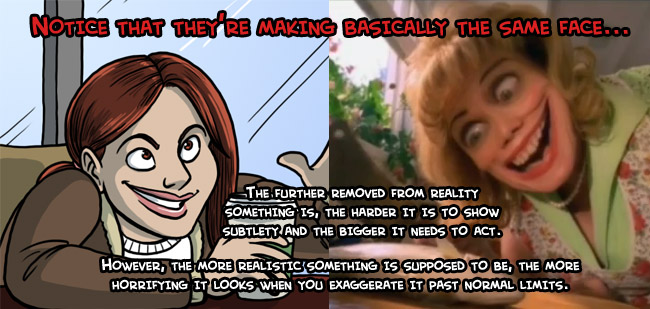
It’s important to understand the limits of a style you’ve chose to work in. Realistic designs have to move realistically, stylized cartoons have to move like cartoons. Disney’s Cinderella can’t make the same boisterous exaggerated acting that her stepsisters do because her design is so much more conservative than theirs that it would look absurd and out of place. When cartoony characters move like humans, you get that cheap rotoscope/mo-cap look, but when real people move like cartoons you get the Black Hole Sun music video;
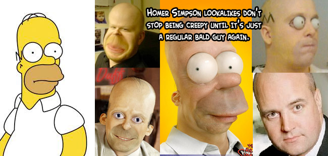
Which nicely segues into the rule of uncanny valley that most CG studios seem to be actively ignoring these days, which is that things should only have realistic texture if they have realistic proportions. Personally, I really hate the idea that cartoon animals should have hyper realistic fur. It makes them look like kids’ plush animals made out of real animal pelts (This is a real thing I have seen done, there is no worse way to show off that prized lynx you bagged than by skinning it and making a plush bunny out of it). Peter Jackson is all excited to talk about his realistic CG Tintin movie where you’ll be able to see all of Tintin’s pores and hair follicles, but honestly, cartoon characters with human skin stretched over them just look horrible.
This is all really informal and I didn’t really have a conclusion planned, so I’ll just remind you to look at the Muppets with People Eyes tumblr every time you start feeling like Uncanny Valley isn’t all that bad.