Archive for May, 2011
The Moon may have the same proportion of water as Earth does [Video]
Lulu Guinness: Be A Pin Up!
 Just in from the UK ~ Justine just checked out Clerkenwell Design Week!
Nostalgia just hit ~ remember those pin art toys from the… 80s? Just lost a little time ending up on searching for the old ones! Found info on it on Wikipedia - random fun fact? “The pinscreen was popularized in the 1985 music video for the Midge Ure song “If I Wasâ€, which included a giant body-sized version.†They are even still available on Amazon!
But i digress… this installation from Clerkenwell Design Week is “Be a Pin Up!†from Lulu Guinness, there she is with it above (pics from her blog). The giant frame of pins is situated in front of the iconic London landmark, St John’s Gate and lets the public create full body sized portraits using the 6,000 chromed capped aluminum pins. Here are a few pics of the images created by passerbys. Check out the pics on the next page!
TO PAGE 2 of "Lulu Guinness: Be A Pin Up!"! ----->(Want more visual goodness? See NOTCOT.com + NOTCOT.org)
Jaguar C-X75 Concept Car
 Just in from the UK ~ Justine just checked out Clerkenwell Design Week!
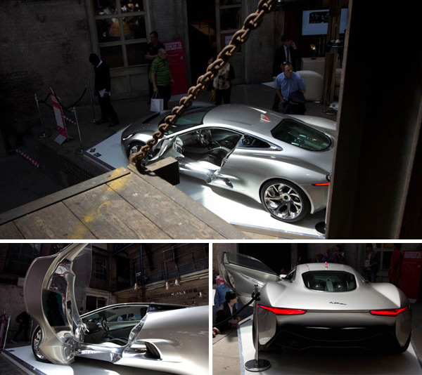
One of the highlights of Clerkenwell Design Week is Jaguar’s C-X75 concept car. Jaguar will produce 250 of the striking hybrid supercars in association with Williams F1. As for design inspiration - “The C-X75’s designers found inspiration in the innovative engineering and functional design elements of cars like the 1950s C-Type and D-Type racers and unique 1966 XJ13 Le Mans prototype.†Additionally it’s leather is sourced from the Scottish Bridge of Weir, one of the most environmentally efficient leather producers in the world… and up to 50% of the C-X75’s structure is made of recycled aluminium! Stunning, right? Especially in contrast to the old industrial, woody setting of the Farmiloe Building that was once home of Victorian lead and glass merchants! Despite how much the display tries pull you in to photograph it, it’s pretty irresistible. But enough talk, more photos after the jump!
TO PAGE 2 of "Jaguar C-X75 Concept Car"! ----->(Want more visual goodness? See NOTCOT.com + NOTCOT.org)
What Are The Hardest Languages To Learn? (Infographic)
It is common sense that many Romance languages are gauged as “easy,†based on their similarity to English, but I was surprised that Russian is only “medium.†Arabic, Chinese, Japanese, and Korean comprise the list of “hard†languages to learn for native English speakers.
More Infographics.
Click to Enlarge.

Source: voxy
30 Inspiring “About Me†Pages
"About me" pages have the ability to engage and inform your site visitors in a personal and friendly way. For web professionals, our "About me" page can be critical in establishing a true connection with potential clients, and it can set us apart from a sea of other designers and developers.
For different types of websites, keep in mind that the About page could be structured differently. For example, an About page for a blog or news site can be vastly different when compared to the same page for a portfolio website.
In this collection, I’ve rounded up 30 excellent "About me" pages from the web portfolios of amazing designers, artists, illustrators, and developers. Enjoy!
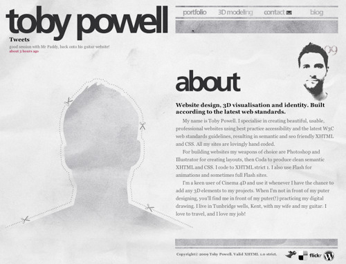
Toby Powell
An interesting use of a cutout/silhouette sets this designer’s About page out from the crowd. A halftone self-portrait and a concise biography of the site owner rounds out this web page’s design.
Guomundur
Most designers use a professional headshot photo of themselves on their About pages, but this designer from Sweden presents an interesting and unique perspective with his overhead shot. Bold typography draws you in to create added visual interest.
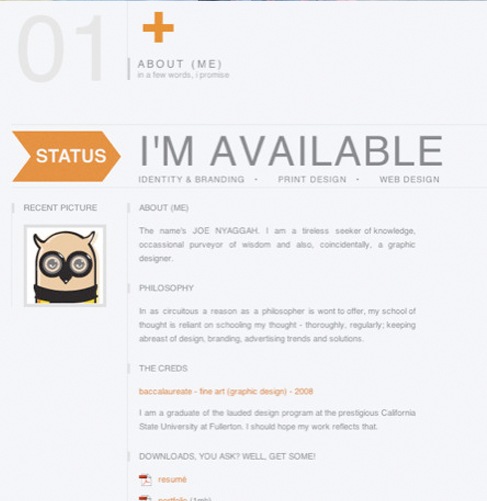
Dan Joe Design
The designer used a grid layout in the layout of his About page. Contemporary colors inform you of the designer’s style, while a status message of his availability to take on new projects makes it clear to prospective clients whether he’s available or not.
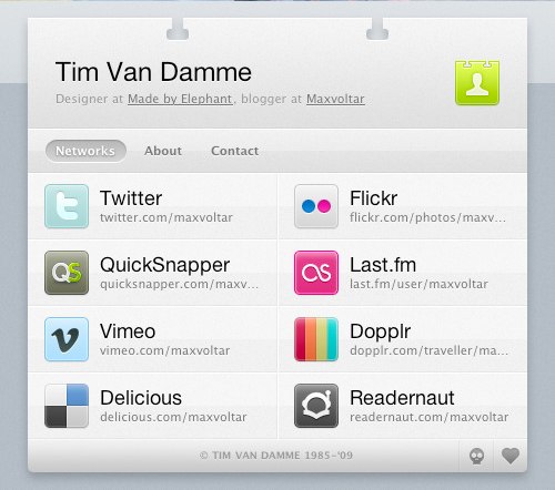
Tim Van Damme
A unique and effective way of organizing your personal information on the web is to create an online business card (vCard). In doing so, we learn who the designer is, other places to connect with him, and how to get in touch with him.
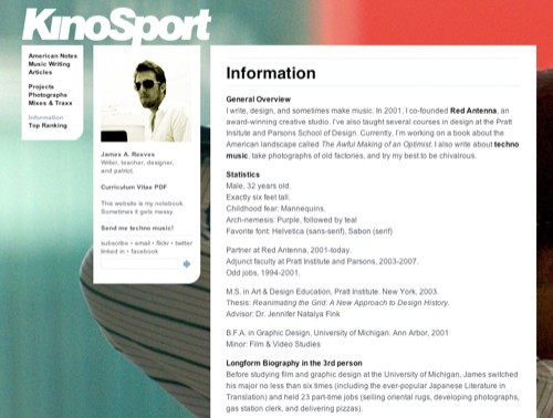
James A. Reeves
The About page for James A. Reeves is simple and modular, allowing for the large-scale photography in the background.
Janis
The artistic design of Janis’s website is very captivating. It gives you a glimpse into the designer’s personal aesthetic style, while supplying the information you need to hire him for your next project. The use of large photography can leave a lasting impression on the visitor if done effectively, as shown in this About page.
Dan
Here’s another example where the designer used a self-portrait in a unique and engaging way. Including a large self-portrait on your site gives a potential client a real person to relate with.
Jared Christensen
Jared Christensen used a humorous, catchy self-portrait on his About page to not only allude to his sense of humor, but also allow the client to see his creative side a little more personally.
Jason Reed
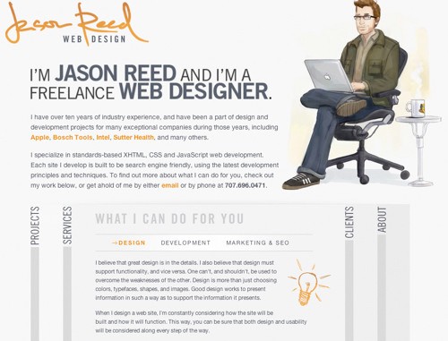
Jason Reed uses a nice illustration of himself in his About page. The use of an illustration is another way to grab the visitor’s attention and add a more character to your About page.
Soh Tanaka
This designer organized his credentials in an easily digestible format. Large photography offsets the information and gives you an idea of the site owner’s style and influences.
Emerge and Bloom
On this website for a design studio, information is organized efficiently, both giving you an idea of their services while presenting attributes of the designers behind the company.
KitFolio
Here’s another striking About page. As you can see, the design is simple, but fun and illustrative.
Alex Dawson
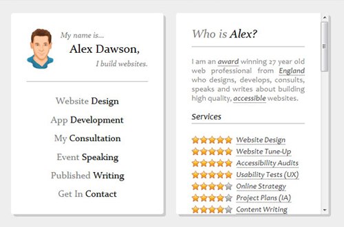
Alexander Dawson (a Six Revisions writer) presents his About page in a very efficient, functional manner. From looking at his credentials, you get a quick overview of who he is, what he does, and the services he excels in. It’s really all you can ask for from an "About me" page, right?
Adham Dannaway
Through the use of a grid layout, Adham Dannaway achieves a simple, straightforward About page that also gives you an idea of his skills, illustrated as graphs.
egopop
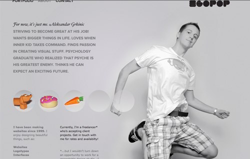
The About page for egopop presents a large-scale photo of the designer as well as a simple biographical statement about himself and his history as it relates to his profession.
Monkeyworks
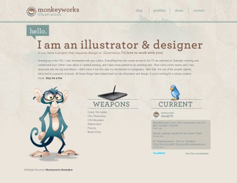
Monkeyworks uses a clean, structured layout on their About page. Not only are the illustrations captivating, but the typography stands out and the graphics used add a nice touch.
Darren Hoyt
Great use of typography is what stands out in this "About me" page. Not only does the type make the page easy to read, the grid layout increases readability as well.
Mark McGall
The designer took their About page to the next level by superimposing their face on Mount Rushmore. Tastefully done, this tactic adds a unique and memorable visual to an otherwise straightforward page.
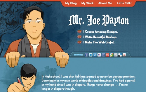
Mr. Joe Payton
The About page of Joe Payton presents a short bio about him in a beautifully laid out format. The designer also presents information for following him on various social networking sites.
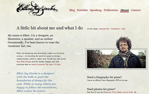
Elliot Jay Stocks
The About page of Elliot Jay Stocks is laid out rather simply, but the typography is carefully thought-out and makes you want to explore this designer’s work further. The designer, who is also a speaker and author, presents you with links to pertinent information related to his professional activities.
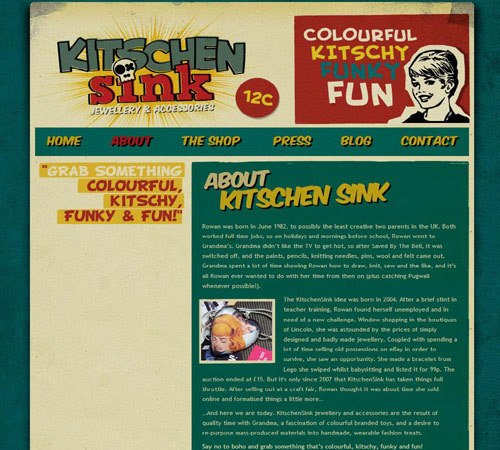
Kitschen Sink
The compelling website for Kitschen Sink made me want to explore the About page. I found out that they’re a jewelry and accessories shop and I learned the history behind the company. Although it’s laid out very simply, captivating branding led me to the About page through curiosity.
Matt Mullenweg
Matt Mullenweg sets the backdrop for his About page on a highly textured background. These visual layers compelled me to read more about the founder of WordPress.
Who is Leon
This beautiful About page features animations and depth to draw the visitor in. Clear typography and a monochromatic color scheme set this About page apart.
Amour Chaleur
This designer’s About page is really simple and straightforward. It includes a short bio, links to relevant info, and her library. It’s always the neatly designed pages that attract me the most.
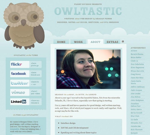
Owltastic
This beautiful About page of designer Meagan Fisher lets you know all the pertinent information about her and the services she provides. Included are links to social networks and other affiliated websites, all organized into a clean and inviting format.
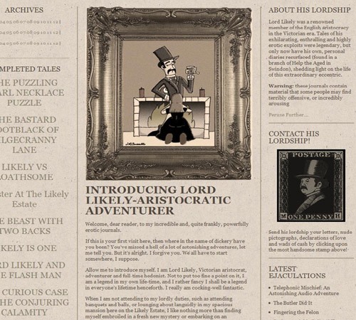
Lord Likely
This compelling About page’s character is what draws the visitor in. Inspired by Victorian-era design, the designer implemented old-world style in creating a unique and professional page that serves as an introduction to himself.
Dustin Curtis
This unique About page presents a timeline of the site owner’s life — from birth to his projected death.
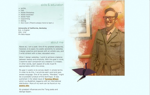
Ian Mintz
The beautiful watercolor illustrations grabbed my attention on this website. As you can see, his About page is laid out very simply and elegantly. We get a sense of his design influences, on top of his skills and education, through this clean and straightforward approach.
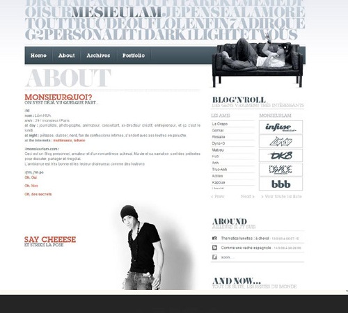
Monsieurlam
Large-scale photography is what sets this "About me" page apart. The page is laid out in a clear format, providing information about the designer and where he can be found.
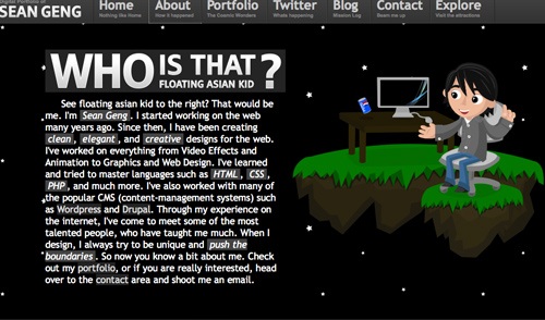
Floating Asian Kid
The interaction on this website intrigued me enough to explore its About page. You can see from his short biography what the designer specializes in and how to reach him.
Related Content
- What Your Web Design Says About You (Infographic)
- Common Misconceptions About Web Designers
- 8 Things They Don’t Tell You About Being a Web Designer
- Related categories: Design Showcase / Inspiration and Web Design
About the Author
 Stephanie Hamilton is a freelancer graphic and web designer who runs her own design studio, Stephanie Hamilton Design. You can find her on Twitter @SHamiltonDesign and Linkedin.
Google Correlate: Find Search Queries that Correlate with Real-World Data

I guess Google Correlate [googlelabs.com] is a dream come true for any person appreciating statistics and social science (or just likes to explore which line graphs match up). It is Google's newest addition to its already rich and powerful collection of data tools, which already include Google Data Explorer, Google Trends, Google Insights for Search, Google Fusion Tables, Google Visualization API, Google Chart API, or Google Wonder Wheel. The online service allows users to find search query patterns which correspond with those of real-world trends, such as those that correlate with winter time (i.e. 'alpine touring', 'colds' and 'wedding soup').
Alternatively, users can upload their own time series data, and let Google's algorithmic wizardry and computing power let do all the hard work in identifying the search queries that match best over time (e.g. those that match 'visualization' or 'crisis'). In addition, queries can be correlated according to their location according to U.S. states, so that it becomes a statistical fact that the annual geographic distribution of rainfall corresponds to search queries like 'Disney vacation packages', 'mildew remover' or 'pink raincoats'.
Oh, and if you really want to know: 'infosthetics' correlates best with 'wikipedia how' and 'tn580', a Brother laser printer.
In other words, Google Correlate provides a glimpse in our our crowd-sourced psyche like never before.
More information available at the Official Google Blog.
Newly Discovered Bacteria Lives on Caffeine
Think you live on caffeine? You're still no match for a newly described bitty bacteria called Pseudomonas putida CBB5. These little guys can feast on pure caffeine all day--and presumably all night--long. And researchers have now located just how they accomplish this arguably admirable feat.
Celebrated and cursed, caffeine is actually an alluring blend of carbon, hydrogen, nitrogen and oxygen, and the clever bacterium uses specialized enzymes as it "breaks caffeine down into carbon dioxide and ammonia," Ryan Summers, a doctoral researcher in chemical and biochemical engineering at the University of Iowa, said in a prepared statement.
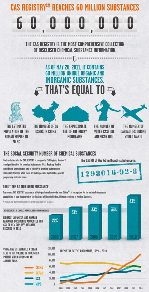
[More]60 million chemicals
There are now 60 million chemicals in the CAS Registry, that’s a number equivalent to 3G users in China, the population of the Roman Empire in 70 BC, the age of the Rocky Mountains in years, the number of casualties in WWII, and the votes cast in American Idol. The last time I mentioned the CAS count was September 2009, when it reached 50 million entries. I remember it reaching the 10 million mark in 1990 (a year or so after I’d started working for the Royal Society of Chemistry, RSC). That seemed like a major achievement given that it had taken CAS 33 years to go from 0 to 10 million.
Â
The 60-millionth substance in the CAS registry is a putative antiviral agentt and has the CAS # 1298016-92-8. It was discovered by researchers at the Institute of Materia Medica, in China and is a patent pending derivative of 2-amino-1,3,4-thiadiazine.

Related Posts:
60 million chemicals is a post from: Sciencebase Science Blog
Capitalists never liked capitalism
Capitalists tend not to like capitalism. Milton Friedman pointed this out long ago. Too much competition. Too much risk. Much better to have the government keep out competitors and subsidize losses. Floyd Norris at the New York Times has just discovered this in an article called “Capitalists Who Fear Free Markets†(HT: Catherine Rampell):
Capitalism is supposed to produce losses on bad investments.
But all too often it has not.
In Tokyo this week, corporate executives were outraged when a Japanese government official suggested that banks might have to take losses on loans to the company that produced a nuclear catastrophe.
Yukio Edano, the chief cabinet secretary, had the temerity to say “the public will not support†the injection of government money into Tokyo Electric Power, also known as Tepco, unless banks share in the pain. Tepco says it would like to pay compensation to victims, but needs government cash to do so.
The president of Japan’s largest bank, Mitsubishi UFJ Financial, was shocked by the very idea that a bank should lose money if it lent to a company that could not meet its obligations. Mr. Edano’s remarks “came out of the blue,†said the executive, Katsunori Nagayasu. “I felt there was something wrong about them.â€
Consumers like capitalism, not business people.
Â


