

Natalie’s family took a picture of her every day, from birth up until she turned ten years old, and cut all the photographs together to this impressive time-lapse video clip.
via kottke.org and matt

On October 30, Oleg Nikolaenko flew from his home in Moscow to JFK airport, and then on to Las Vegas. He checked in to the Bellagio Hotel, where he attended the Speciality Equipment Market Association car show, a show he had attended last year as well.
Bad move—because the feds nabbed him in Vegas just before the show ended, leaving his wife and young son back in Russia. At a November 4 hearing before a judge in Las Vegas, Nikolaenko needed a Russian interpreter and a public defender, but it didn't take much interpretation to see that he wasn't about to go free. That's because Nikolaenko was one of the biggest spammers in the world.
Nikolaenko doesn't come across in court documents as a man who learns his lessons well. He's allegedly one of the parties behind the Mega-D botnet, at one time "the largest botnet in the world, accounting for 32 percent of all spam," according to the FBI.
Yet he keeps coming to the US. When he was in Vegas for the 2009 car show, a security firm called FireEye actually managed to cripple Mega-D by shutting down its US-based command and control servers and redirecting much of the botnet traffic to "sinkhole" locations. Nikolaenko, poor guy, had to leave the US two days early to "repair the damage caused by FireEye."

So how did the FBI get its man this time around? By busting the US-based distributor of fake Rolex watches who used Mega-D to send a good chunk of his spam. That led them on a trail that culminated in ePassporte, a money transfer service, and they found Nikolaenka's name and e-mail addresses attached to his account.
Nikolaenko had made another mistake: the e-mail accounts were Gmail addresses, and it was no trouble at all for the US to get a subpoena, forcing Google to cough up the account information. FBI agents found copies of the botnet software and much else of interest among the e-mails.
With what they needed in hand, they waited—and it didn't take long for Nikolaenko to enter the US again at JFK. A few phone calls later and he was located at the Bellagio in Vegas. The FBI obtained and then executed an arrest warrant, and now Nikolaenko faces CAN-SPAM Act charges in, of all places, Milwaukee (where the FBI agent tracking him was located).
Read the comments on this post

|
Today we held a webinar on a tool which extends JIRA for Project Management.
Onepoint's JIRA Connector extends JIRA's project management capabilities by integrating them into a complete, but still easy-to-use enterprise project management solution. By combining the strengths of JIRA's dynamic agile task management environment with Onepoint's built-in resource management and project controlling & reporting capabilities, you can seamlessly integrate JIRA-based product backlogs and agile projects into one IPMA or PMI-compliant PM solution.
If you enjoy working with JIRA and you need more project and resource management functionalities, then please watch this video:

For past webinars, please hop on over to Atlassian TV or here where you can sort videos by products and categories. For upcoming webinars, please visit our events page. If you would like to be in our webinar series, please contact us.
Also, don't forget about following us on![]()
Yes! You are correct.

[IMDb]
Read more posts by Amanda Dobbins
Filed Under: clickables, imdb, movies, spinal tap

NASA reveals arsenic-bred organisms, search for life gets broader parameters originally appeared on Engadget on Thu, 02 Dec 2010 14:18:00 EDT. Please see our terms for use of feeds.
Permalink  |Â NASA  | Email this | Comments
 Why Do Google Maps’s City Labels Seem Much More “Readable†Than Those of Its Competitors?


For months, I’ve been trying to figure out why Google Maps’s city labels seem so much more readable than the labels on other mapping sites.
To me, Google’s labels seem to “pop†much more than the other sites’ labels. Major cities also seem to stand out much more. [1] And whenever you’re quickly scanning the maps, the label you’re searching for seems to stand out just a little sooner on Google’s maps.
 Take a look for yourself:
 (Above — click image to enlarge) The exact same area on Google Maps and Bing Maps. Notice how the city labels on the sample from Google seem easier to read. They also seem less cluttered.

 (Above — click image to enlarge) The same area on Google Maps and Yahoo! Maps. Notice how, once again, the labels on Google’s sample seem easier to read.
 This post will investigate the reasons behind the superior “readability†of Google Maps’s city labels.

Label Densities?
At first I assumed Google Maps was more “readable†on account of its city label densities—i.e., that perhaps Google’s maps had fewer labels, making them more readable. I’ve since found that this isn’t the case. In fact, Google Maps’s label density is not all that different from the other sites:

 (Above — click image to enlarge) If you count all the city “dots†that appear entirely within the image above, you’ll find that Google displays 86 city labels.

 (Above — click image to enlarge) Over the exact same area, Bing shows 91 city labels—only five more than Google.

 (Above — click image to enlarge) Yahoo!, meanwhile, shows 83 city labels—only three fewer than Google.
As you can see from the samples above, there’s not really an appreciable difference between the number of city labels on any of these sites. If Google’s superior label readability isn’t on account of it having fewer labels than the other sites, then what other reasons can account for it?

THE 3 UNIQUE EFFECTS THAT GOOGLE APPLIES TO THE TEXT OF ITS CITY LABELS
I’ve found that there are three unique effects that Google applies to the text of its city labels, and that these three effects seem to greatly enhance their readability…

1. White Outlines (That Completely Obscure All Background Data)
I can see you thinking it now: “Waitâ€, you say, “Doesn’t Yahoo! Maps also have white outlines around the text of its city labels?†It certainly does—but there’s a key difference: the white outlines of Google’s city labels are thicker, and you can’t see maps’ background details (roads, rivers, etc.) behind them.

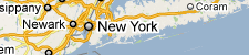 (Above) Google’s label for New York City. Notice how you can’t see any roads or any other map details behind the “Nâ€, the “eâ€, or any of the other letters.
Contrast this with Yahoo!’s approach:
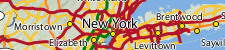 (Above) Yahoo!’s label for New York City. Like Google, Yahoo! also outlines the text of its labels in white—but Yahoo!’s outlines are much thinner than Google’s. And unlike Google’s labels, the map’s roads are visible behind Yahoo!’s, making them harder to read.
 As you can see, Yahoo!’s decision to allow background map information to remain visible underneath its city labels harms their overall legibility. Individual letters are broken up by other dark lines, forcing users to give a second look to many labels. I, myself, find that whenever I’m looking at Yahoo’s maps, I’m often deciphering labels—instead of simply reading them.
Let’s see what happens to Yahoo’s map if we enlarge the white outlines given to the text of its city labels:
 (Above — click image to enlarge) A world a difference ensues when we enlarge the outlines of Yahoo! Maps’s city labels. Look at how much more readable the map becomes (especially around New York City) with the enlarged outlines. Clearly, Google’s on to something here.

2. A Greater Number/Diversity of Label Classes
In addition to the thicker white outlines, Google typically uses more classes of city labels, at a time, than the other two sites…
 (Above — click image to enlarge) Google uses four different types (or classes) of city labels on the map above.

 (Above — click image to enlarge) In contrast to Google, Bing only uses three classes of city labels on the map above.

 (Above — click image to enlarge) Like Bing, Yahoo! also uses only three classes of city labels on the map above.
 With Google’s use of one additional label class, fewer city labels look alike, creating an expanded hierarchy of labels. This expanded hierarchy, in turn, allows smaller cities to fade into the background, while promoting larger cities to the foreground. The larger cities (often used as reference points) stand out much more, making the map easier to navigate.

3. Different Label Shadings (i.e., Smaller Labels are Lighter, Larger Labels are Darker)
While the primary difference between each site’s city label classes is their size, Google takes this one step further by also using color to differentiate its city label classes. In that, the smallest city labels on Google’s maps are significantly lighter in color than the largest ones. These lighter labels, in turn, enable smaller cities to fade into background, while allowing the larger cities to stand out.

 (Above) Notice the comparatively lighter color given to Google’s “Class 4†labels.Â
 On the surface, the effect of these lighter labels might not seem that drastic—but look what happens when we make Bing Maps look a little more like Google Maps (we’ll give Bing a fourth class of labels, with lighter text than the other three classes)…
 (Above — click image to enlarge) Here we take two of Google’s techniques—a fourth label class, with lighter text and smaller fonts—and apply them to Bing’s map. The result is nothing short of astonishing: the map instantly becomes less cluttered, and all without removing any of its detail. In fact, by adding a fourth class of city labels, we’ve arguably added even more detail to the map. (The fourth label class I created, above, is comprised of all of the map’s cities with populations fewer than 50,000.)

 (Above — click image to enlarge) Zooming-in once, the changes are even more dramatic.
As you can see, Google’s use of a fourth label class, combined with the effect of lighter text, seems to serve as a far better, and even more visually appealing, way of organizing information on its maps. It’s clear that part of the reason why Google’s maps are so “readable†is that the labels of smaller cities are subdued, making the maps seem less cluttered.
Let’s investigate a few more tricks that Google uses to enhance the readability of its maps…

OTHER VISUAL TRICKS
Beyond the three effects that Google applies to the text of its city labels, Google also seems to apply a few interesting visual tricks to its maps, as well…
 VISUAL TRICK #1:Â Label Decluttering Outside of Metro Areas
For several months now, I’ve noticed that Google shows more cities on its maps of Iowa than on its maps of Illinois, and while this doesn’t happen on every zoom-level, it happens on quite a few:
 (Above - click image to enlarge) On Google Maps’s seventh zoom-level, 68 Iowa cities are shown, while only 41 Illinois cities are shown.
This struck me as odd considering that Illinois is both larger than Iowa (in terms of land area) and has many more cities than Iowa:

In trying to make sense of this, I noticed that Iowa is uniformly covered with cities, while Illinois is not: central Illinois is uniformly covered with cities, but there are portions of the maps immediately outside of Chicago and St. Louis that are relatively devoid of cities.
I, then, closely examined other states and noticed that many of them with large metro areas also had comparatively fewer cities on the maps. Even more interesting, though, I discovered that pretty much every major U.S. metro area has a ring of white space immediately outside of it on the maps.
Three examples:

Atlanta


Minneapolis-St. Paul


St. Louis

Interesting, isn’t it?
These white space “rings†outside of major cities are even more apparent when you remove everything else off the maps using Google Maps API 3…
 St. Louis


Atlanta


Dallas-Ft. Worth

It seems that by removing cities immediately outside of major metro areas, Google is actually making these metro areas stand out even more on the maps. This, in turn, makes it easier for many users to navigate the maps, because they’re often using major cities as reference points when browsing. In any event, the removal of cities immediately outside of large metro areas also makes the maps appear less cluttered.

VISUAL TRICK #2: Absence of City Clusters
Unlike some of the other sites, Google also seems to avoid clustering cities too closely together. Revisiting some of the images from earlier in this post, look at the distribution of cities on Google Maps, compared to Bing:
 (Above — click image to enlarge) Look at how Bing clusters cities together, especially in the cores of the Baltimore, Washington, and Philadelphia metro areas and throughout Connecticut. In contrast, Google seems to use larger spacings between cities.
The relative lack of city clusters on Google’s maps (especially around major cities) seems to make them easier to read.

CONCLUSION
It turns out that Google uses a variety of techniques and visual tricks to help make its city labels much more readable than those of its competitors. From the use of different shadings to the decluttering of areas outside of major cities, it sure seems like Google has put a lot of thought into how it displays the labels appearing on its maps. I have no doubt that little touches like these are among the many reasons why Google remains the web’s most popular mapping site.

Notes
[1] Bing’s maps are a notable exception here: major cities stand out far more on Bing’s maps than on any other mapping site.
See this comparison of the New York metropolitan area on Google Maps and on Bing Maps.
Securing the Washington Monument from terrorism has turned out to be a surprisingly difficult job. The concrete fence around the building protects it from attacking vehicles, but there's no visually appealing way to house the airport-level security mechanisms the National Park Service has decided are a must for visitors. It is considering several options, but I think we should close the monument entirely. Let it stand, empty and inaccessible, as a monument to our fears.
An empty Washington Monument would serve as a constant reminder to those on Capitol Hill that they are afraid of the terrorists and what they could do. They're afraid that by speaking honestly about the impossibility of attaining absolute security or the inevitability of terrorism -- or that some American ideals are worth maintaining even in the face of adversity -- they will be branded as "soft on terror." And they're afraid that Americans would vote them out of office if another attack occurred. Perhaps they're right, but what has happened to leaders who aren't afraid? What has happened to "the only thing we have to fear is fear itself"?
An empty Washington Monument would symbolize our lawmakers' inability to take that kind of stand -- and their inability to truly lead.
Some of them call terrorism an "existential threat" against our nation. It's not. Even the events of 9/11, as horrific as they were, didn't make an existential dent in our nation. Automobile-related fatalities -- at 42,000 per year, more deaths each month, on average, than 9/11 -- aren't, either. It's our reaction to terrorism that threatens our nation, not terrorism itself. The empty monument would symbolize the empty rhetoric of those leaders who preach fear and then use that fear for their own political ends.
The day after Umar Farouk Abdulmutallab failed to blow up a Northwest jet with a bomb hidden in his underwear, Homeland Security Secretary Janet Napolitano said "The system worked." I agreed. Plane lands safely, terrorist in custody, nobody injured except the terrorist. Seems like a working system to me. The empty monument would represent the politicians and press who pilloried her for her comment, and Napolitano herself, for backing down.
The empty monument would symbolize our war on the unexpected, -- our overreaction to anything different or unusual -- our harassment of photographers, and our probing of airline passengers. It would symbolize our "show me your papers" society, rife with ID checks and security cameras. As long as we're willing to sacrifice essential liberties for a little temporary safety, we should keep the Washington Monument empty.
Terrorism isn't a crime against people or property. It's a crime against our minds, using the death of innocents and destruction of property to make us fearful. Terrorists use the media to magnify their actions and further spread fear. And when we react out of fear, when we change our policy to make our country less open, the terrorists succeed -- even if their attacks fail. But when we refuse to be terrorized, when we're indomitable in the face of terror, the terrorists fail -- even if their attacks succeed.
We can reopen the monument when every foiled or failed terrorist plot causes us to praise our security, instead of redoubling it. When the occasional terrorist attack succeeds, as it inevitably will, we accept it, as we accept the murder rate and automobile-related death rate; and redouble our efforts to remain a free and open society.
The grand reopening of the Washington Monument will not occur when we've won the war on terror, because that will never happen. It won't even occur when we've defeated al Qaeda. Militant Islamic terrorism has fractured into small, elusive groups. We can reopen the Washington Monument when we've defeated our fears, when we've come to accept that placing safety above all other virtues cedes too much power to government and that liberty is worth the risks, and that the price of freedom is accepting the possibility of crime.
I would proudly climb to the top of a monument to those ideals.
A version of this essay -- there were a lot of changes and edits -- originally appeared in the New York Daily News.
I wish I'd come up with the idea of closing the Washington Monument, but I didn't. It was the Washington Post's Philip Kennicott's idea, although he didn't say it with as much fervor.
Typography is a major aspect of web and graphic design. With text art, typography and text effects can be used in unique, creative ways to design. In this post we’ll showcase some beautiful examples of text art. If you see something you like, click on the image and you will be led to the source.


For more design inspiration please see: